In the Russian science fiction classic “Roadside Picnic,” the brothers Arkady and Boris Strugatsky depict a story of an extraterrestrial event called the Visitation that takes place in half a dozen separate locations around the earth. Neither the visitors themselves nor their means of arrival or departure were ever seen by the local inhabitants living inside the six Visitation zones. These zones exhibit strange and dangerous phenomena not understood by humans and contain artifacts with inexplicable, seemingly unreal properties. Supposedly in the zone, nothing is what seems to be. Looking at it from outside, it seems okay. But as you experience being in the zone, nothing is ever quite right in a perverting, confusing and sometimes uncanny kind of way.
It would not be too far-fetched to say that Cairo shares a few attributes with the zone from Roadside Picnic. Both earn their spot as places where reality is intangible, where strange things occur and nothing is what seems to be. Objects have strange functions or no function at all. Everything is almost always nudged, sometimes slightly, sometimes by a lot. As you experience Cairo, you could not quite grasp any one thing to its fullest.
The disorder you experience is profoundly disorienting which consequently, requires a great deal of mental processing. That is because your brain is constantly struggling to reverse this disorder to make sense of the environment. At times, merely existing in it can cause most people to feel depleted and overwhelmed. If you are like me in that you are infected with the curiosity bug, you would have this question lurking beneath the surface that would arise at every possible chance: What is going on here? You may even attempt to answer that question in your head and internally iterate: if only we do this, this particular problem would be solved.
This process of constant questioning naturally unfolds in the mind as you go about your day. Although to arrive at any meaningful answer to the question posed is a task that is far from self-evident, nor is it simple. The answer to this question is bound to be complex precisely because this question is always contextual (historically, socially, and politically) and interconnected.
This essay is the first in a long series that examines the different aspects of what constitutes the visual identity of Cairo. Subsequently, this will involve delving into history to provide a basic foundation and context for our understanding of how and why things are the way they are. Investigative and, at times, speculative. Throughout this series, I will attempt to examine the city’s visual environment through its physical forms and functions.
None of these different aspects exist in isolation or detached from their surroundings -ourselves included. Therefore, we shall not consider ourselves as mere observers but rather as part of the ongoing spectacle.
Each essay will pin down a corpus and work towards an understanding of it by deconstructing, mapping, and decoding its systems which would hopefully help us untangle the complexities embedded in these aspects. Some of these essays might be broken down into smaller ones if they end up being too long. Additionally, it is worth noting that these essays should be considered a preliminary exploration, an attempt to examine, frame and reframe ideas and problems in order to talk about them in-depth – not to prove a fact in a determinate way.
The city is a hyper-complex and dense urban organism with infinite sub-organisms that simultaneously coexist, correspond, and interact with each other’s morphological characteristics and systems at all times.
There has been a wealth of literature written about “cities”; one important and seminal piece among these writings is the book titled “The Image of the City” by Kevin A. Lynch, who opens the book by saying:
“Like a piece of architecture, the city is a construction in space, but one of vast scale, a thing perceived only in the course of long spans of time. City design is, therefore, a temporal art.”
―
This analogy of the city is helpful as it breaks the perceptual impossibility embedded in thinking about the totality of the city. Compared to something that is more or less familiar and smaller, it is then made easy to perceive and conceptualize. The book examines the visual quality of the city by studying the mental image that its inhabitants hold. Kevin focuses on one attribute, which is what he calls the legibility of the cityscape.
He defines legibility as:
“The ease with which its parts can be recognized and can be organized into a coherent pattern/Just as this printed page if it is legible can be visually grasped as a related pattern of recognizable symbols, so a legible city would be one whose districts or landmarks or pathways are easily identifiable and are easily grouped into an overall pattern.”
Source: Google Earth
This is an exercise worth engaging with: what kind of clear mental images does the city of Cairo imprint on us?
Here is mine; its narrowest and widest streets always contrast with one another, often congested with people, cars, and things (as ambiguous as the word “things” might mean). Where sidewalks exist, they are either crooked, unusable, populated with commercial messages and traffic signs or interrupted by garage entrances. The sky is blocked with a boundless horizon of aggressive billboard structures that are always asking, demanding, or suggesting something. The pedestrian crossing is a dangerous sport that, when observed from a distance, resembles the ridiculousness of the famous Japanese telematch games. There are no clear traffic lights nor road marking systems. Seldom does one find vegetation spaces or open spaces. The abundance of the fortified fragments defines the landscape. It has more enclosed spaces such as fences and walls of compounds than open communities and social spaces. An abandoned, rickety billboard in the desert, bent polls on the sidestreet. Cold concrete walls are used as barriers and territory borders, often used as advertising spaces for local goods and services—popped bricks on the sidewalks. The overall color is brown, and its Nile is dark green. Not only is it the city of the thousand minarets, but it is also the city of the thousand everything, i.e., the speed pump variations. Public school buildings look precisely like prison buildings, which look exactly like hospitals. Last but not least, there is garbage everywhere, all the time.
What mental image/s do you have of your city?
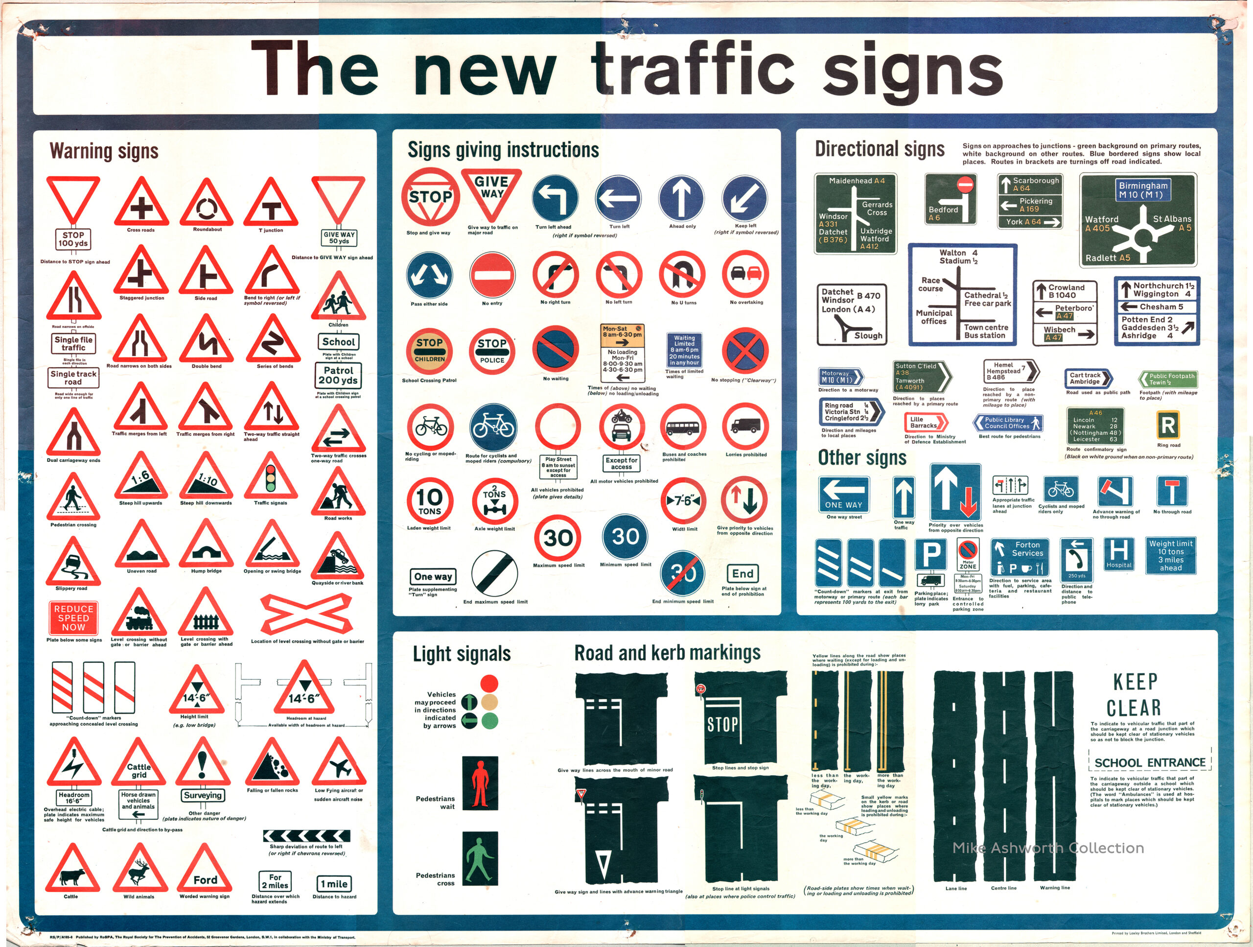
We can say that one of the first inventions in the history of cities was road networks for both human and non-human mobility. As human beings progressed, traffic organization was inescapable. Thus, the complex road systems, traffic control devices, and signs that we are now familiar with (vaguely in Egypt) have emerged over hundreds, if not thousands of years.
Archaeology of traffic control systems:
Traffic control systems are supposed to be one of the most visible and foundational elements in the urban city infrastructure. These systems contain many elements such as traffic signs, signaling devices, and road markings.
To understand the problem that we currently have in Egypt regarding traffic control, you would first have to experience a functioning system (as functioning as it can be) to compare it to. Second, we have to understand the history of the system we have as it is, which is, more or less the same in most places, or at least we toggle between two extensive systems that most places derive theirs from while altering as needed.
Let us focus on history since it is more plausible to write about. Nonetheless, with a close reading of “A history of” traffic control systems, one can still come to understand why the current system in Egypt does not work. Traffic control systems in Egypt are merely a facade and appear to be more of a memorized answer to a question than a thoughtful, planned or calculated one. In a mindless application of a system, we do not understand how it works nor are we able to apply it adequately.
Here, one shall say “A history” because while investigating the dominant narrative that traces the history of these systems from different sources, there seems to be an obsession to identify and pinpoint the first instance of traffic signs. An obsession that is not so foreign to the West as we can see in some of Derrida’s work. This gets manifested in what seems to be either an intentional or possibly unconscious neglect of anything that stems from the global south. This dominant narrative starts with a confident and somewhat arrogant conviction that the first glimpse of a traffic sign manifested in what is known as “milestones”, coming allegedly from the Romans.
However, we must contend with this claim because identifying and structuring the environment is an innate human ability we share with all animals; thus, why would that start with the Romans and not previous civilizations?
Therefore, with a skeptic’s attitude, one can notice that this history presentation is unilateral as it surpasses all preceding ancient civilizations like Mesopotamia, the ancient Egyptian and Chinese civilizations. For example, the early and impressive archaeological work on the ancient Egyptian civilization revealed early roads constructed and used for mobility on land. Though they depended heavily on the Nile for their trade and mobility, they also used constructed roads. Specific archaeological discoveries show two routes that begin near the Mastaba El-Faraun at Dahshur and lead to the northern, southern Fayoum, respectively.
These were first discovered in 1887 and were, on average, over 25 meters in width. It has been identified that the more southerly road was furnished with distance markers placed at intervals of about 3.3 kilometers.
Therefore, the Romans may have inherited this from the ancient Egyptians or other former civilizations. Or perhaps not. But the fact remains that it is not certain that they did.
Nevertheless, it is fair to say that the Romans certainly made great use of those distance markers and designed an excellent road system at the center of the Roman empire’s legacy.
These distance markers were called milestones. They were generally cylinder-like columns of stone that spread across the Roman empire and distributed away from Rome to measure the distance to the city. Their primary function was to bring armies back faster and bring in people and goods. At the time, this constituted a robust road system that contributed to the flourishing of the Roman empire.

120-211
Source: British Library
The inscription reads:
“The Emperor Caesar Trajan Hadrian Augustus, pontifex maximus in his fifth year of tribunician power, father of his country, thrice consul: from Kanovium 8 miles.”
The number of miles relative to the road it was placed on was inscribed at eye level, and information about who had commissioned, constructed, or repaired the road was added on the milestone, helping passer byers identify the distance to Rome. That is why all roads led to Rome because all roads had indicators that led anybody back to the city.
Back then, the way that people traveled was different. Travel was either by walking or horseback, in carts pulled by oxen. So, there was not a dire need to regulate traffic or conceive of it as traffic at all.
Moving forward, we also find that the prevailing narrative available on the history of traffic signs pays no heed to the Islamic civilization, immediately moving from the Romans to Europe’s middle ages, as though the Islamic golden age did not occur. As I read through the relevant Wikipedia page, there was no mention of distance markers in the Islamic civilization, which can only be characterized as either uninformed or disingenuous.

Source: Wikipedia
So my intervention here was to dig out these distance markers (also known as milestones) and include them on the Wikipedia page. It was removed again by the Wiki admin for reasons that had to do with the copyright’s declaration of the image, which I am currently working on obtaining.
As we identify these historical gaps and Eurocentric biases, we should not take the matter lightly or gloss over it. Instead, it provides an opportunity to examine how our history is being overlooked, feeding into the unidirectionality of the global historical narrative and, therefore, lending us the chance to fill that gap.
Source: Here
Another reason why it might always remain “A history” is that archaeological discoveries happen every day. So, any writing of history should be open-ended and non-definitive.
Soon after, wooden and metal multidirectional signs were appearing and commonly used to indicate the different directions of villages, towns, and markets.
In 1686, the first known traffic regulation instance in Europe can be traced and attributed to King Peter II of Portugal. This marble plaque can be considered the first available placement of priority signs as we know them. See it in google street view here.

Lisbon, 2021
Source: Medium
This plaque had this inscription on it, which translates approximately to:
“THE YEAR OF 1686 / HIS MAJESTY COMMANDS / THAT COACHES, SEGES, AND LITTERS THAT / ARE COMING FROM THE GATEWAY OF SALVADOR STREET / TO RETURN TO THE SAME WAY”
As mobility on the roads became more prevalent, with people, animals and vehicles sharing the same space, things started to take a complex form. That became clear with the invention of one of the best technologies we have so far, the bicycle.
With the gradual introduction of the bicycle as a mode of transport, an apparent problem emerged that would only worsen over time: street traffic and the lack of a system of organization. As most of the inventions we will come across in this essay, the bicycle did not develop overnight, and there has been much controversy as to who exactly is the sole inventor, if it can be said that there is one. It is fair to say that it was not invented by one person only; it was developed over hundreds of years by different people who iterated on the same idea.
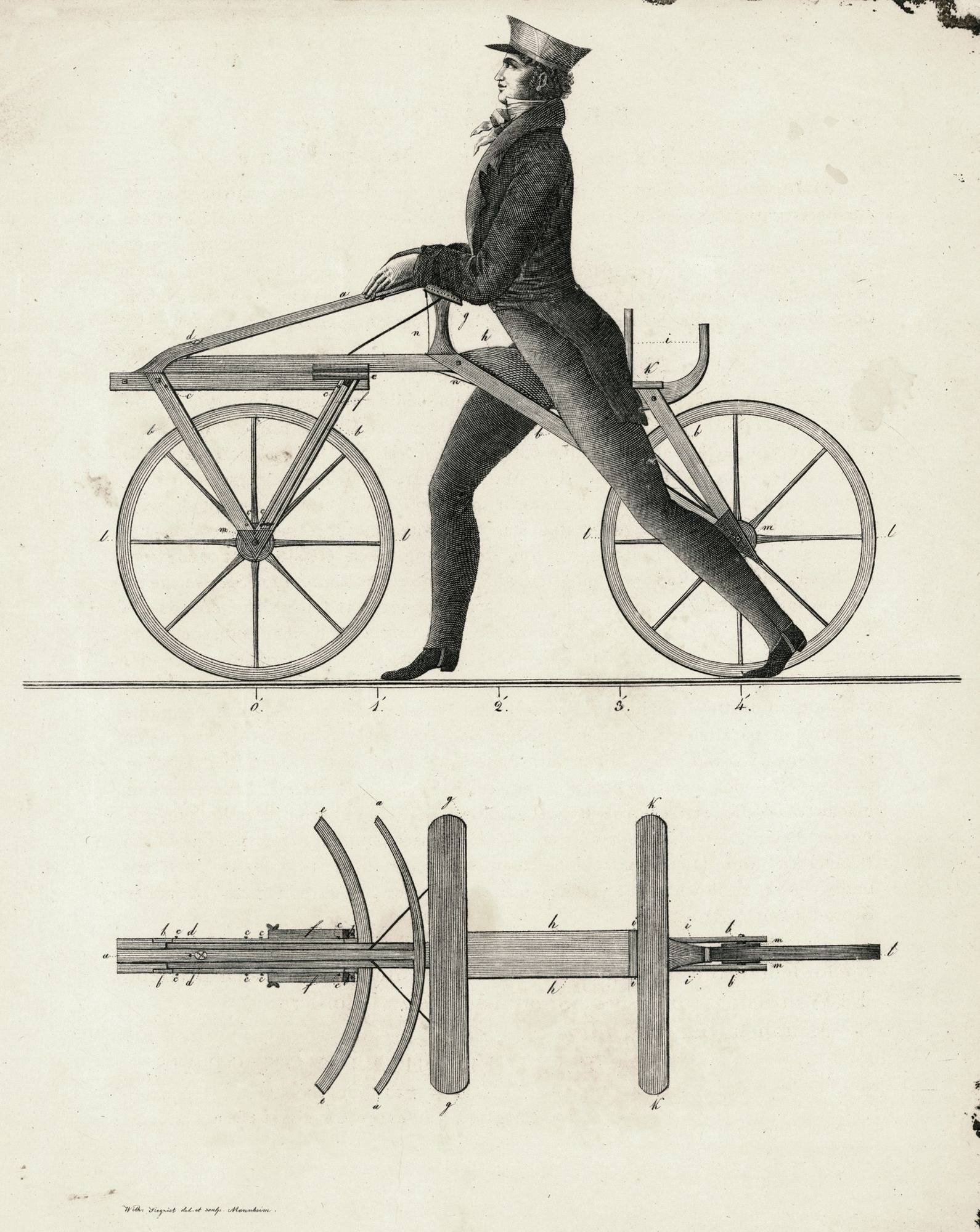
Some early sketches of the bicycle are said to date back to 1418, by the Italian engineer Giovanni Fontana. He invented what was known as the human-powered device, a 4-wheeled “bike” with a rope connected by gears. Later sketches can be found, but their authenticity is not fully verified, and some historians consider them a hoax.
1817 is when the more common bicycle started to take shape, known as Draisienne by the German inventor Karl von Drais. It goes by a few other names, some of which are the “running machine” and “the hobby or dandy horse.” This version of the bicycle had no pedal, and a handle steered the front wheel. The rider had to move the bicycle by moving the feet and pushing against the ground, which gave it a gliding effect. The Draisienne was the first appearance of the two-wheeler bicycle idea.
As with most inventions in the history of humankind, it came out of a necessity to address a human problem. The Draisienne responded to a need for an alternative mode of transit that did not rely solely on horses for many reasons including the Napoleonic wars and the Year Without a Summer (1817), wherein a widespread crop failure and food shortage resulted in mass starvation and the death of thousands of horses in Germany. So, the bicycle was created to aid the movement of people and ultimately eliminate the sole reliance on horses which were commonly used for movement at the time. The Draisienne, however, went out of popularity not long after because of its inefficient use.
Source: RNZ
France, 1867-1869
Source: Wikipedia
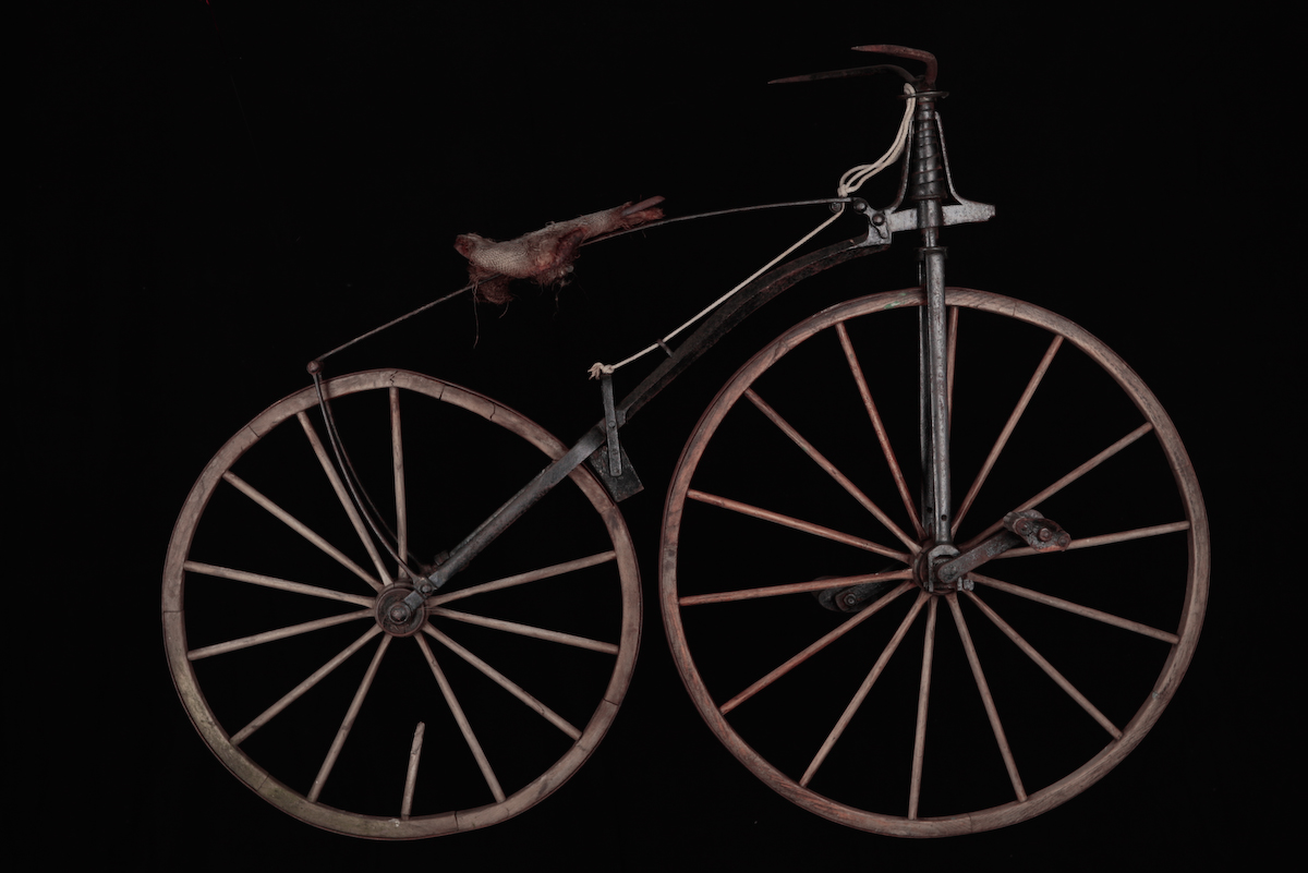
Almost 50 years later, the idea was picked up again and reintroduced with the addition of pedals. This new iteration on the Draisienne was known as the Velocipede. Again, it is also not clear who invented the Velocipede, but Pierre Lallement, a French carriage maker, obtained its patent in 1860.
This version of the bicycle was also short-lived because of the damage it did to its riders. It made for a bumpy ride, thus given the name “Boneshaker”. That was primarily because of how it was produced. It was made out of a stiff iron frame, wooden wheels, and surrounded by tires made of iron.

England, unknown
9. Right: Safety Bicycle Unknown, 1891
Then came the famous “High Wheeler,” an improved iteration of the Velocipede. Quickly after, the “Safety bike” was introduced in 1885 by the Englishman Harry John Lawson. With pedals and “two equally-sized wheels,” it looked very similar to modern bikes we are familiar with today. Indeed, there have been many variations in between, but these were the most recognizable milestones we can draw on.
The 19th century bore a few revolutionary inventions in transportation indeed. By the end of it, bicycles were being mass-produced, and with the growing number of bicycles on the streets, traffic began to be congested and arbitrary, consequently leading to more accidents. Cycling organizations and local authorities began to erect signs to help warn cyclists of steep hills, mainly, and other street hazards.
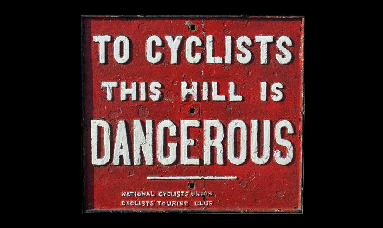
National Cyclist Union
UK, unknown
Source: The online cyclist museum
The automobile, once introduced, started to gain popularity as the new mode of transport. As with the invention of the bicycle, the automobile also took some time to be fully realized. The same controversy as to who is the sole inventor of the automobile is glaring. However, it is widely accepted that Karl Friedrich Benz is the one who invented the first gasoline-powered automobile around 1885/1886.
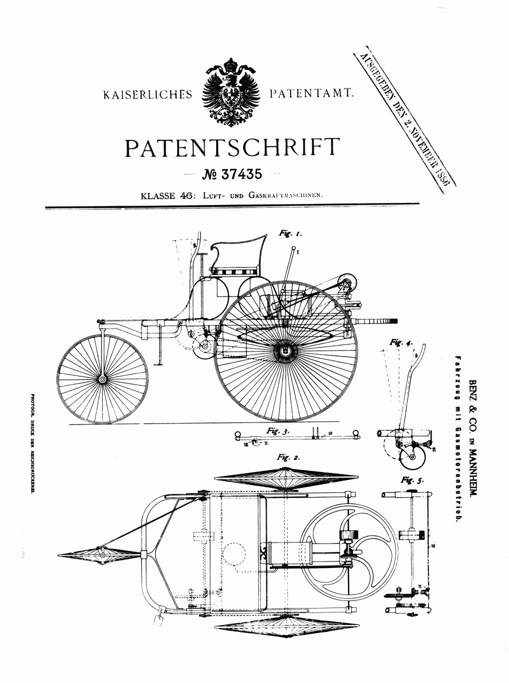
1886, Germany
Source: Here
In 1893, brothers Charles Edgar Duryea and Frank Duryea established the first automobile manufacturing company in the United States, which led to a boom in manufacturing automobiles and using them, hence their ubiquitous existence on the roads.
The picture below can help readers visualize what it was like in the 1900s, U.S. It was a bizarre experience to the extent that the period between 1900-1930 was often referred to as the years of driving dangerously.
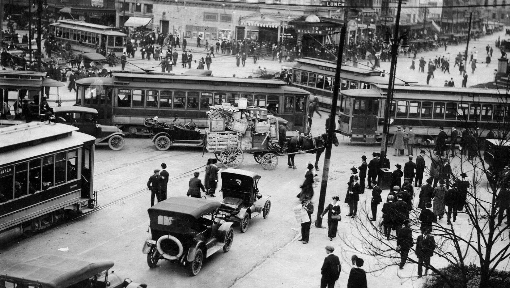
Source: The Detroit Archive
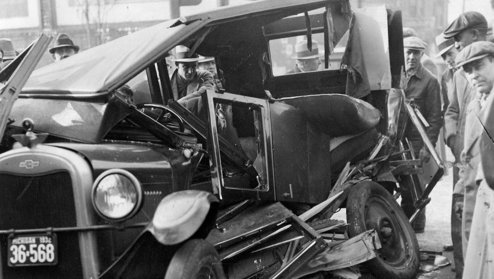
USA, After WWI
Source: Library of Congress
Jamming automobiles with bicycles, carts, trolleys, wagons, horses, pedestrians into the already narrow and chaotic roadmaps that existed at that point meant that the speed on the road started to vary. Points of friction multiplied, accidents were prone to happen, making the road a dangerous place. For that, there was a greater need for some order as matters started to get out of hand.
At that point, the traffic crisis was particularly amplified in the United States unlike Western Europe, where automobility spread slower. The reason being that incomes were less than the United States, cars more expensive and fuel was heavily taxed. The United States was one of the central places where automobiles were rapidly manufactured. Therefore, it suffered the most from this chaos. One might say, quite controversially, that the United States 120 years ago looked like how Cairo looks today to some degree, if not worse. We will examine why that is later in the essay.
The slightest suggestion to address traffic problems was considered novel. One of these was the STOP sign. Although subject to general uncertainty, in 1914, Detroit installed the first STOP sign, a two-by-two-foot sheet of metal with black lettering on a white background. In the same year, the first electric traffic signal (not the first traffic signal – there had been many iterations before that) was installed in Cleveland. Here it is worth noting that the early traffic signal development built on the practices of railroad signal as the basis for traffic applications, practices such as the Semaphore signals and mid-intersection towers with police in them. These practices also informed the colors of traffic signals which were derived from maritime signals and maritime signals from lighthouses.
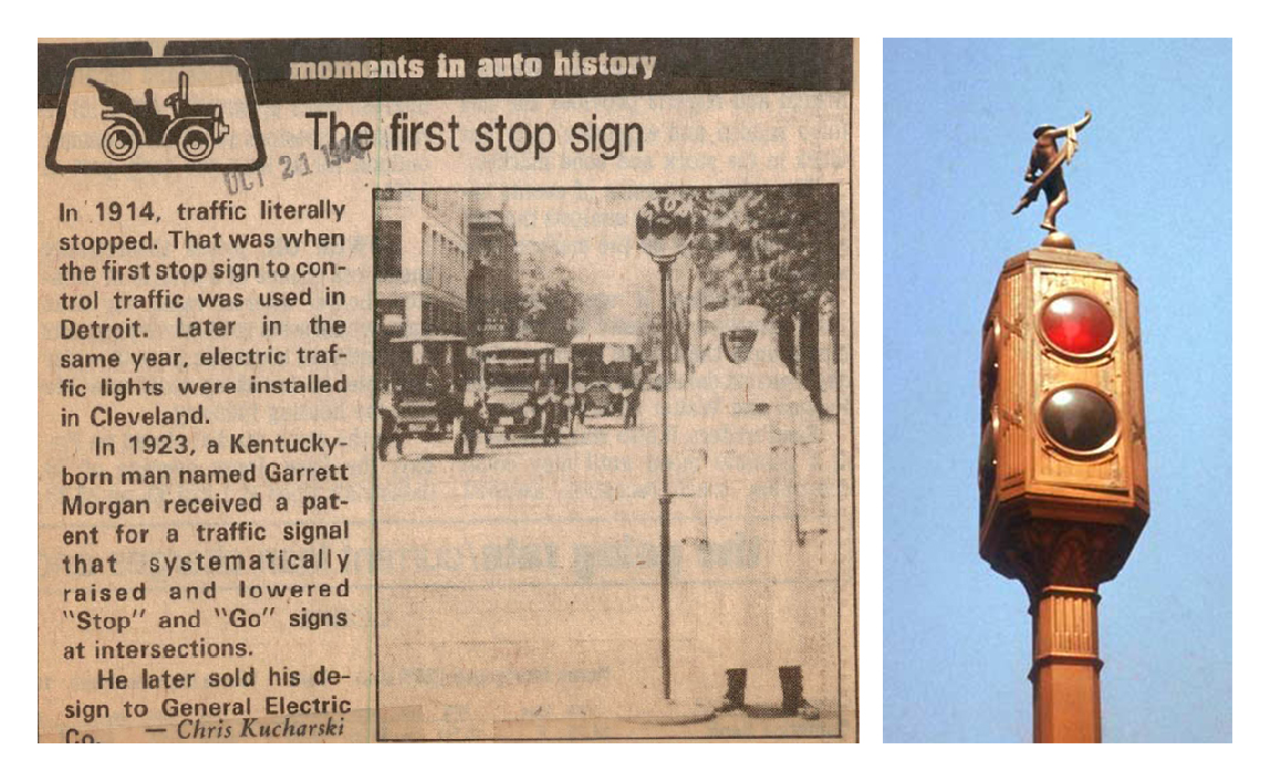
15. Right: Red and green traffic signal with a Mercury statue on top, Brooklyn, 1931
That is why the first traffic signals did not have a yellow light on them. Instead, it was a simple STOP and MOVE in the image of railroad signals, with a manually controlled buzzer to announce the switch between the two. On New York’s Fifth Avenue, the stop lights were adorned with small statues of Mercury, the Greek god of speed, which has its own story that readers can check here.
The STOP sign faced much pushback, creating controversy and debate regarding its effectiveness in reducing accidents. There are competing claims about who invented it, but its invention is attributed to William Eno, who is considered the first traffic expert and, at the same time, ironically an amateur enthusiast and philanthropist from New York. He was also credited with the invention of the one-way street, the traffic circle, pedestrian sidewalks, and the taxi stand. At the time, these were no small feat. They were genuinely brilliant steps. It can be easy to dismiss these as trivial or self-evident now, but they were not at the time. Ultimately, it is the iterative and cumulative process of these seemingly small steps that shape our modern understanding of cities, mobility, and real-world navigation. Even the simple line in the middle of the street that divides lanes was something of a revelation.
Source: Wikimedia Commons
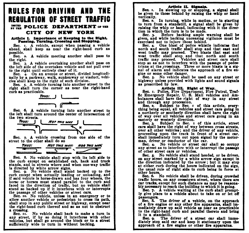
Eno’s thinking lives beyond his name. A close reading of this traffic regulation code he published in 1909 can give readers a deeper insight into this point in time and the significance of these steps. The outcome of this code is still in use to this day in some places.
From as early as 1899, there had been a need for traffic signs. This need, subsequently, created a void that got often filled by individual interventions from motor clubs. Indeed, like most individual intervention that is not part of a well-thought-out system, these attempts hurt more than helped and over-time, became part of the problem by adding more clutter to the overall environment. Eventually, this defeated the purpose of organizing, creating confusion amongst people rather than clarity.
There was an aggressive competition between different motor clubs to sign famous routes. In many instances, passing along a route, one could find multiple signs warning you from essentially the same danger but sponsored by different clubs— each with its distinct design, colors, shapes, fonts, and positioning. One study concluded that it was common for 40 to 50 percent of the more traveled roads to encounter as many as 11 different signs for one single trail or route.
It can be said with certainty that standardization and uniformity were urgently needed, and it took years to start finding and refining this sought-after uniformity. The United States embarked on a journey towards that standardization and uniformity where the American Automobile Association (AAA) played a crucial role in the overall development of the traffic control system.
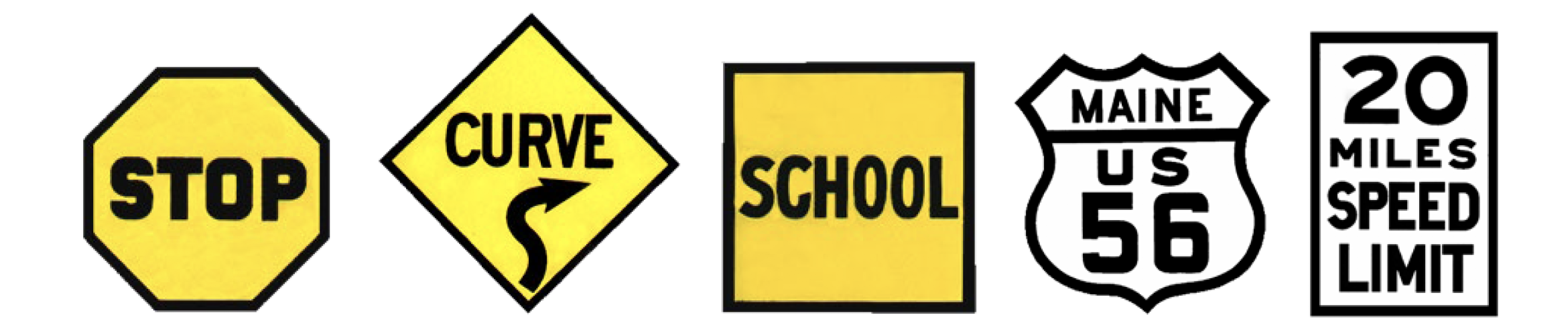
As these rules were developing, many significant design decisions had to be made, for instance, regarding the sign’s shape, color, and size. Most of these decisions were made by engineers who were glorified for their importance in this process as the profession of Design was still in its very early stages. Nonetheless, it can be said that these engineers were designers too. An article published in the NYT states that the engineers (designers) making the call wanted to create and reinforce associations between geometry and safety. The decision to associate geometry with the different levels of messages is an eminent one. They decided to classify geometry according to the level of danger presented to drivers on the road. It was decided so that drivers were given a chance to respond to the sign’s shape before reading it. Here we can detect a glimpse of a systematic approach that seeks order, consistency, and organization. It was not an arbitrary assigning of shapes to messages, as what we see now in Cairo, for instance. In Egypt, any message can be in any shape. A STOP sign can be inside a round, an octagon, or whatever shape that might be available. Having no set meaning and function ascribed to shapes and colors makes them meaningless. They change with every sign haphazardly with no prior thought process.
According to Hilary Greenbaum and Dana Rubinstein, authors of the article:
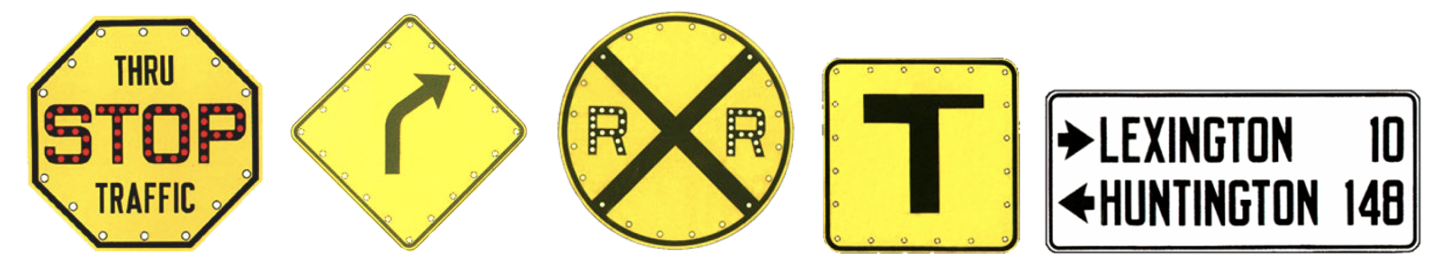
“The recommendations were based on a simple, albeit not exactly intuitive, idea: the more sides a sign has, the higher the danger level it invokes. By the engineers’ reckoning, the circle, which has an infinite number of sides, screamed danger and was recommended for railroad crossings. The octagon, with its eight sides, was used to denote the second-highest level. The diamond shape was for warning signs. And the rectangle and square shapes were used for informational signs.”
The initial shapes of traffic signs started in 1922 when three men, W. F. Rosenwald of Minnesota, J. T. Donaghey of Wisconsin and A. H. Hinkle of Indiana, roamed through several states seeking to come up with some standardization and uniformity to mark and sign roadways to counter the fast-growing clutter.
They reported their findings at the 1923 annual meeting of the Mississippi Valley Association of State Highway Departments (MVASHD). After some debate, the organization agreed on some distinct shapes to be used for various situations. Some of the results are still in use today. The shapes were as follows:
- Round: Railroad crossing warning
- Octagon: Stop
- Diamond: Precautions needed in a specific area
- Square: Some care needed occasionally
- Rectangular: For directional or regulatory information
All signs were to have white backgrounds with black letters or symbols instead of being hand-painted on wood, as they were in the past. The border and the lettering or symbols would be embossed — or pushed into metal. The signs were then dipped into paint, and the lettering, symbol and border were painted black. This process allowed signs to be made in larger quantities. However, the technology at the time could only make signs a size of approximately 61 cm, so this was taken to be the standard size of a sign.
In 1924, the first National Conference on Street and Highway Safety (NCSHS) was held in Washington, D.C. The Secretary of Commerce called the conference to devise means and make recommendations to lessen the numberless accidents that now kill so many of their citizens.
The conference made many recommendations for improving highway safety, including recommendations for improving signs, signals, and markings. It was one of the first that called for sign uniformity throughout the United States. The conference report recommended adoption of the code of colors for both signs and signals as indicated below:
- Stop: red for signals, white on red for signs
- Proceed: green for signals, white on green for signs
- Caution: yellow for signals, black on yellow for signs
- Cross Roads: purple or other distinctive colors for signals, white on purple for intersections.
In 1925, the American Association of State Highway Officials (AASHO) created the Joint Board on Interstate Highways to formulate and promulgate a system of numbering and mark highways of interstate character in this report.
Source: WIkisource
This report informed important distinctive iterations like the one in 1927, which suggested the distinctive shield used to designate U.S highways.
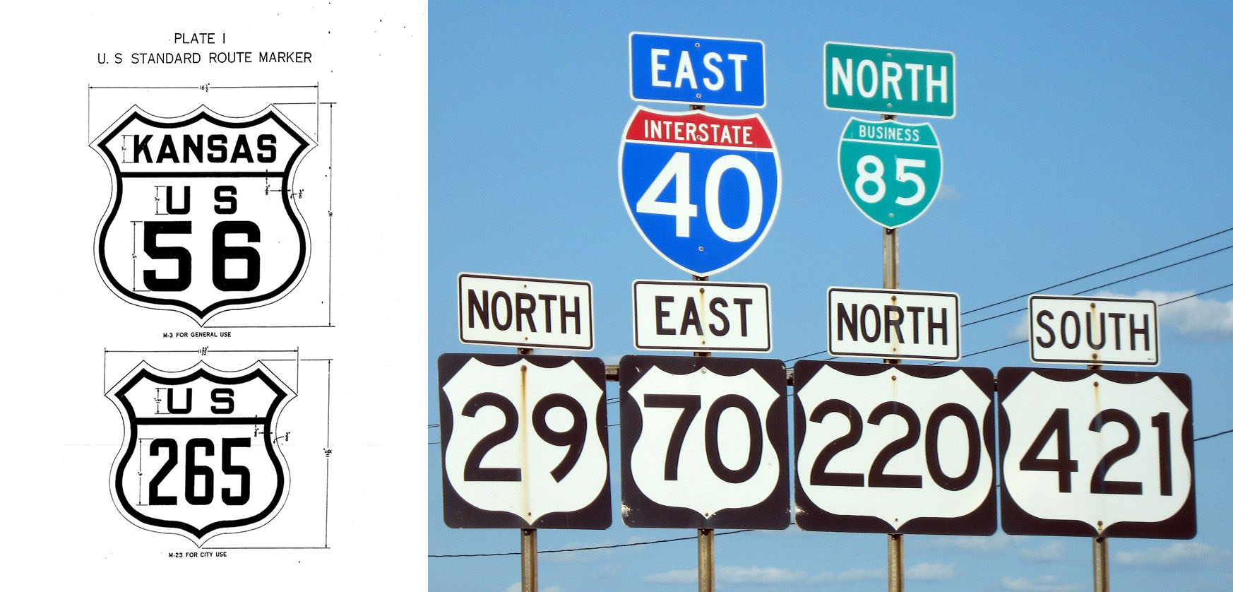
19. Right: Us highway shield signs, unknown
The national conference and the joint board ultimately led to parallel efforts in the United States, which got compiled to create one national manual, which would eventually lead to the first Manual of Uniform Traffic Control Devices (MUTCD) in 1935.
Source: MUTCD
After that, each iteration of this traffic manual in the United States would have a significant new step towards solidifying the whole system. Some manuals did not add much, while others had what can be considered profound additions or exclusions.
During modern wartime, particularly WWII, an event known as “The Blackout” was often enforced. Much of traffic sign manuals had to rethink their strategies and codes under new circumstances imposed by wartime.
The United States released a War Emergency Edition of the MUTCD in 1942 to address these issues. This manual was essentially a condensed version of the 1935 one while re-examining production material of signages to address the lack of material during the war and moving during blackout conditions.
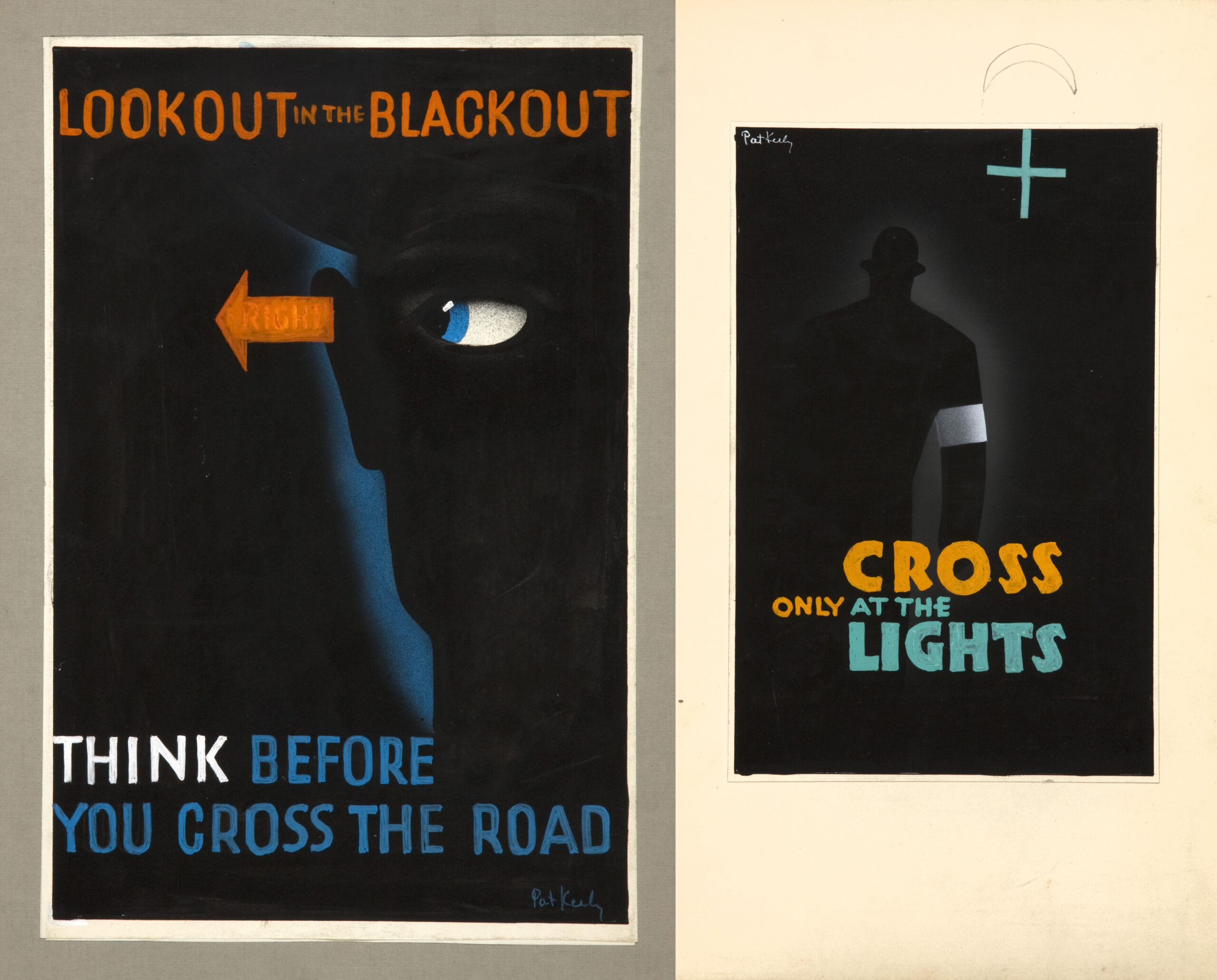
22. Right: Cross only at the lights, Pat Keely, 1939 and 1946
It would be interesting to dwell for a moment on what The Blackout is and look at some examples of traffic control alterations that resulted from it. A blackout referred to the common practice of minimizing outdoor lights to prevent crews of enemy aircraft from identifying targets on the grounds by sight during wartime. Different countries had their specific advertising campaigns (public-interest propaganda) – some of them were awareness campaigns, and others were to warn people about the dangers of moving during blackouts. The blackouts posed a real problem because they forced the people on the streets to attempt to find their way in the complete darkness, which led to many civilian casualties.
That is why the United Kingdom, for instance, enforced what is known as blackout regulations. Among them were regulations like blocking all windows and doors with heavy thick material that ensures no glimmer of light slips out from inside the house.
Source: Here
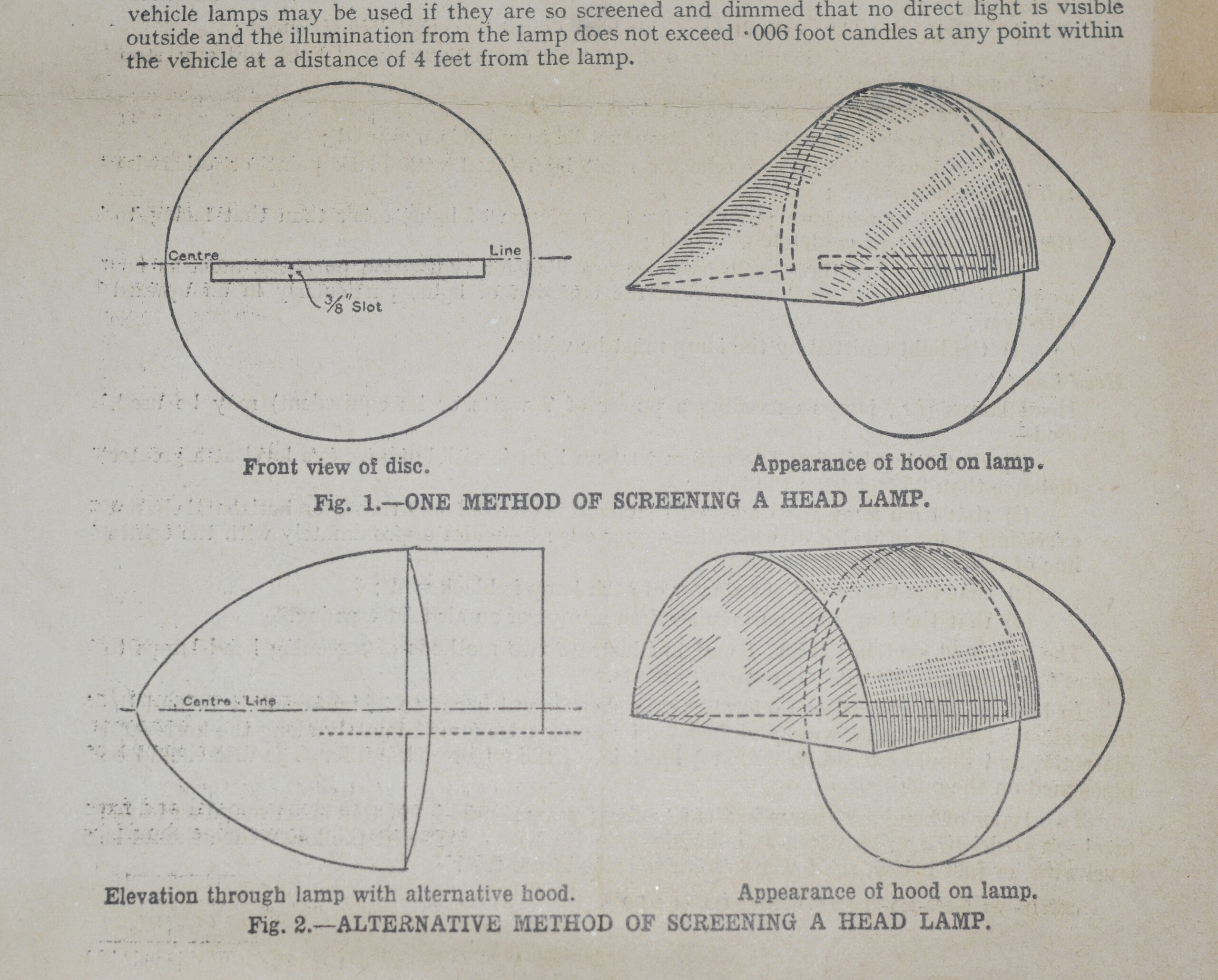
Street lights were immediately switched off or dimmed by deflecting the light downward. The same applied to automobiles. Most of the time, these blackouts would happen abruptly, and when they did, all lights had to be turned off instantly. That meant that people using the roads had to move with extreme caution and in line with the regulations in place. Only a few automobiles would be able to move with an approved blackout light installed and even then, it was still challenging and would often cause accidents.
The blackout condition for vehicles was a candle-like light that extended to about 6-30 meters. All light was deflected downwards on the ground, so seeing traffic signs at their regular height was nearly impossible. So, during that time, signages were adjusted slightly and lowered to ground level. They still used the same poles but added the same sign at ground level so that drivers could see them. This tiny adjustment was made to address the traffic difficulties caused by wartime.
In the 1954 U.S versions of the MUTCD, which were initially a revised version of the preceding one, contained a transformative suggestion. It suggested changing the colors of the STOP sign from black letters on a yellow background to white letters on a red background.
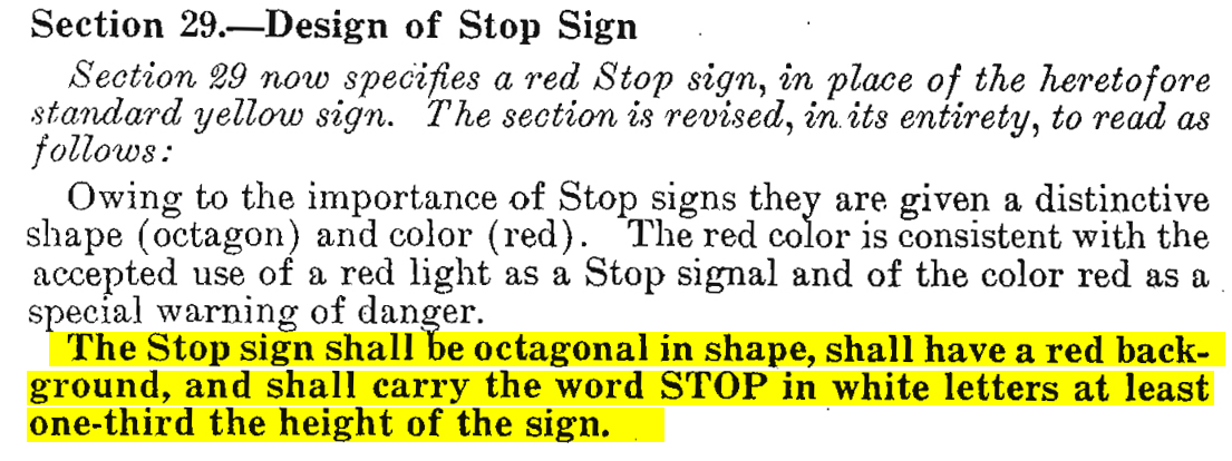
Source: MUTCD
This version of the MUTCD also contained a few other significant changes. For instance, it prohibited using secondary messages with the STOP sign, a clear move towards simplicity and clarity.
Source: MUTCD
The 1971 version introduced the color orange for construction signs and work zone devices. This is also the first time school areas were addressed, and the pentagon-shaped school sign was introduced.
The 1988 MUTCD (Gene Hawkins’ site at Texas A&M) manual shall be noted as it is the one mentioned as the reference for the Egyptian code published in 1998.
2000 MUTCD (FHWA website)
2003 MUTCD (FHWA website)
Since then, there have been many versions of the MUTCD. The latest one was in 2009, which was effective from 2012 with a comprehensive guide on standard highway signs.
It took an incredible amount of work to arrive at this highly complex manual. At the moment, the manual goes through revisions rather than changes as it stabilized over time. The MUTCD influences a big part of the world’s traffic control and sign systems and continues to do so as people relentlessly continue to work towards making it better. The most recent MUTCD revision process in a webinar talk in 2021 can be seen here.
A comparison of MUTCD-influenced traffic signs can be found here, and a comparison that illustrates the slight variations in color, fonts, shapes and symbols within road systems in Europe can be found here.
These comparisons will show the nuance and flexibility in using, adapting and adopting these systems in different countries. However, every country usually alters the systems slightly to fit its environment and may introduce its specificity to the system.
When it comes to specifics of the system’s design, throughout this essay, we will pay particular attention to the British system as it had the most influence on the Egyptian one.
As the United States was progressing, the United Kingdom was also working on its system in a lagged parallel.
Let us rewind to the 50s for a moment. What the United Kingdom created (derived from the European and American systems) would soon become one of the two main and comprehensive systems we know today alongside the American one.
Before uniformity or pre-standardization, roads and signages in the United Kingdom were a total disaster.
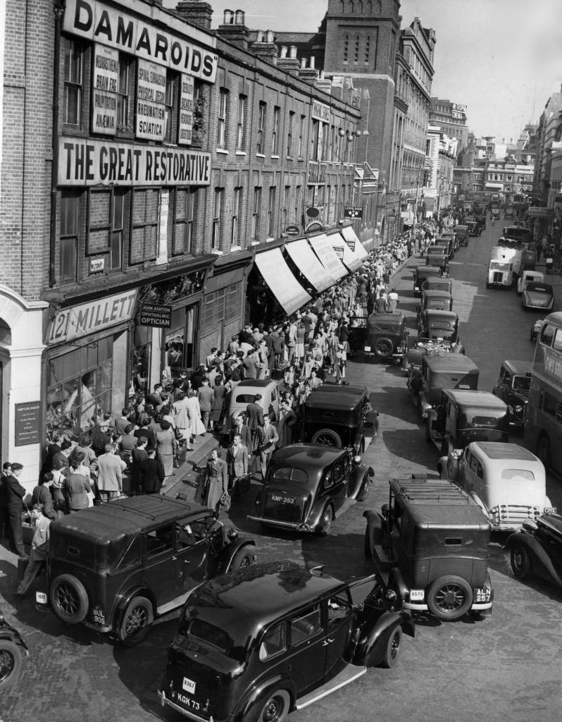
London, 1950
Source: (Photo by Ron Case/Keystone/Getty Images)
The most transformative steps started with an advisory committee, known as the ‘Anderson Committee‘ assembled in 1957 to design signages for the United Kingdom as previous signage practices had proved inadequate. The committee took inspiration from the United States and some parts of Europe, including France and Germany, for their approach. The British designer Jock Kinneir was asked to detail the committee’s recommendations. After winning this project, he employed the designer Margaret Calvert as his assistant, who eventually became his partner.
The committee was formed to develop designs for the United Kingdom’s motorways before the first main motorway road Preston By-pass opened. It was a chance to test out the system that the committee suggested. The result was a report, and one of the transformative points on that report was the use of mixed-case letters, something that went against the conventional practices at the time. This decision was based on learnings from European and American practices.
For the United Kingdom, the road sign system happened between WWII, 1945 and the Worboys committee report in 1963. After the successful installation of motorway signage on the Preston By-pass, another committee known as the Worboys committee also commissioned Kinneir to design a signage system for all UK roads.
The committee closely examined the standard European designs and the protocols of the Vienna Convention (which established international standards in traffic signs) and came up with several ideas of its own.
Source: Wikipedia
UK, 1965
Source: Flicker
Kinneir and Calvert grew up in a time in the United Kingdom. when there was no “Graphic Design” per se; it was called the Commercial Arts. Nevertheless, at the time, the two designers showed great conceptual and design rigor and precision in their process and study of the subject. Phil Bains said, on the system that was designed:
“The road signs, like the protocol, comprise a hybrid set: part iconic, part alphabetic and part symbolic. What ties them together and makes them distinctive is the quality of their drawing. Diagrammatic road layouts are ruthlessly concise, while the pictograms give both people and vehicles a personality that in no way detracts from their efficiency.”
Germany, 1931
Source: Typo 17 magazine
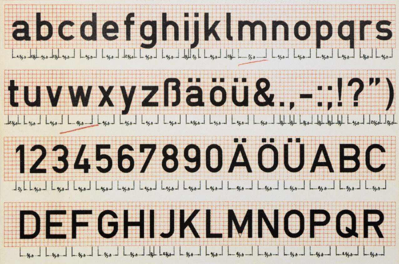
Throughout developing the designs for traffic signs, Kinneir had been presented with a few challenges. One of them in the form of a suggestion to use the German DIN typeface for the signs, which he rejected on aesthetics grounds, favoring a letterform that had open counters and clearer shapes. According to Phil Bains, he could not find that in any of the typefaces that existed at the time; so, he and Calvert ventured out to design one themselves. The result was the now-famous typeface: Transport, which would come to be known as the handwriting of Britain.

31. Middle: Johnston Underground typeface
32. Right: Kindersley serif typeface
At the time, there was a lot of pushback and heated debates within the design community from outraged typographic traditionalists. To settle the debate in the most democratic fashion, the Road Research Laboratory conducted what now seems like a rather comical legibility test. Several volunteer airmen from Benton airport in Oxfordshire were to sit on a platform in the middle of the airfield while a car drove towards them with alternate combinations of signs mounted on the roof. The signs were composed of names of places in three different fonts: Kindersley, Transport, and for good measure, the 1933 Johnston-based standard, still to be found in parts of central London. After a while, Jock and Margret’s typeface won.
Source: A2-TYPE
35. Right: Sign for Britain motorway, 1958, UK
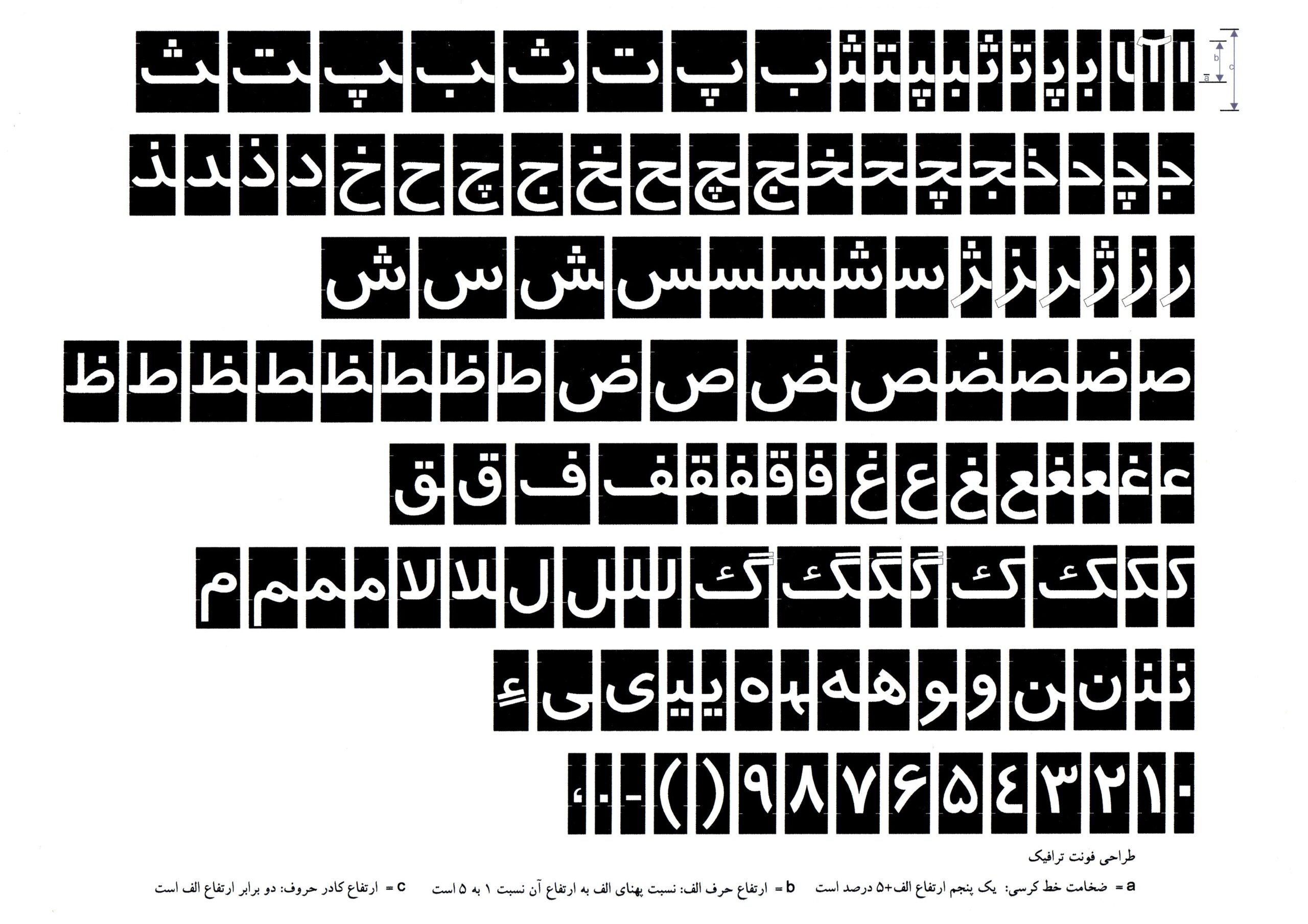
Transport was adopted and/or adapted in Hong Kong, Spain, Iceland, Portugal, Greece, Italy, the majority of the Middle East and elsewhere. Adopting the typeface for similar languages based on Latin letters does not sound problematic if proved effective; however, adapting it to the Arabic script is where it can become troublesome. Some examples of the adaptation to Arabic letters can be found in Iran and Egypt. The Persian typeface was named “Traffic” and was designed by Mohammad Reza Baghapour. According to the Iranian designer, Amir Mesbahi Reza was assisted by Jock Kinner himself. Another adaptation (or, as we will come to realize, more of an unplanned match) in Egypt, where it was given the name “Fathi” after the designer who worked on it.
Source: Amir Mesbahi, published at Tehran Special Report in 1993
Source: Fathi Gouda
The result of many years of studying, learning, experimenting, failing, iterating, careful planning, constantly revising and designing is a traffic system that remains essentially the same almost 70 years later and is still met with much acclaim.
Equivalent to the United States’ MUTCD, the United Kingdom has the TSRGD (Traffic Signs Regulations and General Directions) with a very comprehensive companion, a manual comprising eight different documents.
Since 1965, the acclaimed system has been tweaked several times, but no need has ever been identified to change anything on a larger scale. If anything, this proves that the system was a success and serves its purposes to this day. Indeed, the system is not without criticism but for better or for worse, it works.
Like most countries, the United Kingdom. relied heavily on the Vienna Convention on Road Signs and Signals in 1968, which defined the categories of signs as follows:
A. Danger warning signs
B. Priority signs
C. Prohibitory or restrictive signs
D. Mandatory signs
E. Special regulation signs
F. Information, facilities, or service signs
G. Direction, position, or indication signs
H. Additional panels
These categories changed depending on their location. Sometimes, other categories were added to address specific location problems, but these are the more generic, widely spread ones. Egypt did not sign the Vienna convention but signed the Geneva convention in 1957. However, the grounds upon which the Egyptian authorities base their code seem to be mutated and raises confusion as sources state contradictory information.
In Roadside Picnic, the strange, inexplicable phenomena that the zones exhibited were caused by extraterrestrial beings who visited and departed the earth. In Egypt, these phenomena are caused not by alien beings but by the inhabitants themselves.
As will be argued in this series of essays, the people working within the institutions connected to traffic control in Egypt who are tasked with making decisions can be diagnosed with an inability to comprehend, engineer, design and execute complexity.
Consequently, to answer the question of why things are the way they are, it is imperative to examine the competence of the decision-makers that shape the current environment in Egypt as it is to examine the environment itself.
In the broadest sense, if anything can be said about the current traffic system in Egypt, it would be that it is a non-system. To a great degree, it cannot be perceived according to uniformity but can only be perceived and defined by that which is not similar, not cohesive and not consistent. If we consider pattern recognition to be the lens by which we attempt to understand the current traffic system, this lens will prove inadequate as it is virtually impossible to identify any pattern within its structure.
Every cluster of elements within the system appears to be in a realm of its own with no guiding principles to unify them, and nothing connects with anything. To top it all, there seems to be no sign (pun intended) to identify this as a problem, let alone address it. So, an alternative mode of understanding and examining that system can be to deconstruct the different elements, find and expose its contradictions and relentlessly exhaust and question the information provided. That is, a shift in the method of questioning. From the horizontal overview (which seems to be a popular mode nowadays and should be denounced as arbitrary) to the vertical archeological view.
Over time, Egypt’s visual environment has become a bizarre landscape of meaningless arrangements and what can be described as hesitant, incompetent or unthoughtful accumulations of historical developments (Remember the U.S in 1900?). This includes, but is not limited to, the elements that constitute the traffic control system adjacent to architectural developments, shop signages, bridges and most of all, urban sprawls.
The traffic control system in Egypt has even reached the status of being a candidate for the famous joke format “what something means and what someone thinks it means.” Of course, in this article, the joke utilizes exaggeration to amplify the absurdity of the meaninglessness of the system with an embedded underpinning mockery of society.
To understand further why this is the case, we have to examine our modern and relatively short history with traffic signs. Unsurprisingly, like most things that have to do with history broadly and design history specifically, the history of the traffic control system in Egypt is a little bit foggy, uncertain and entangled. That is why there will be a slight shift in language, from factual to speculative only where plausible—stitching historical events narrated by different people and sources. This fogginess is a little bit less than ideal if we are after a comprehensive understanding; that is why it is helpful to articulate some of the reasons that are causing this fogginess.
- The poor documentation and organization practices of the parties involved in that history
- The stiffness of facilitating access to documents and information by governmental and private institutions
- The lack of understanding of the field of Design as separate from the arts by local authorities
- The almost shameful retreat of designers in investigating, engaging and writing about that history as it was happening. That is primarily why the practice of writing history is such a rusty space.
A lot of the below information is extracted from two separately conducted interviews. One is with Dr. Fathi Gouda and the other, with his assistant professor Reham Mohsen from the University of Applied Arts in Cairo.
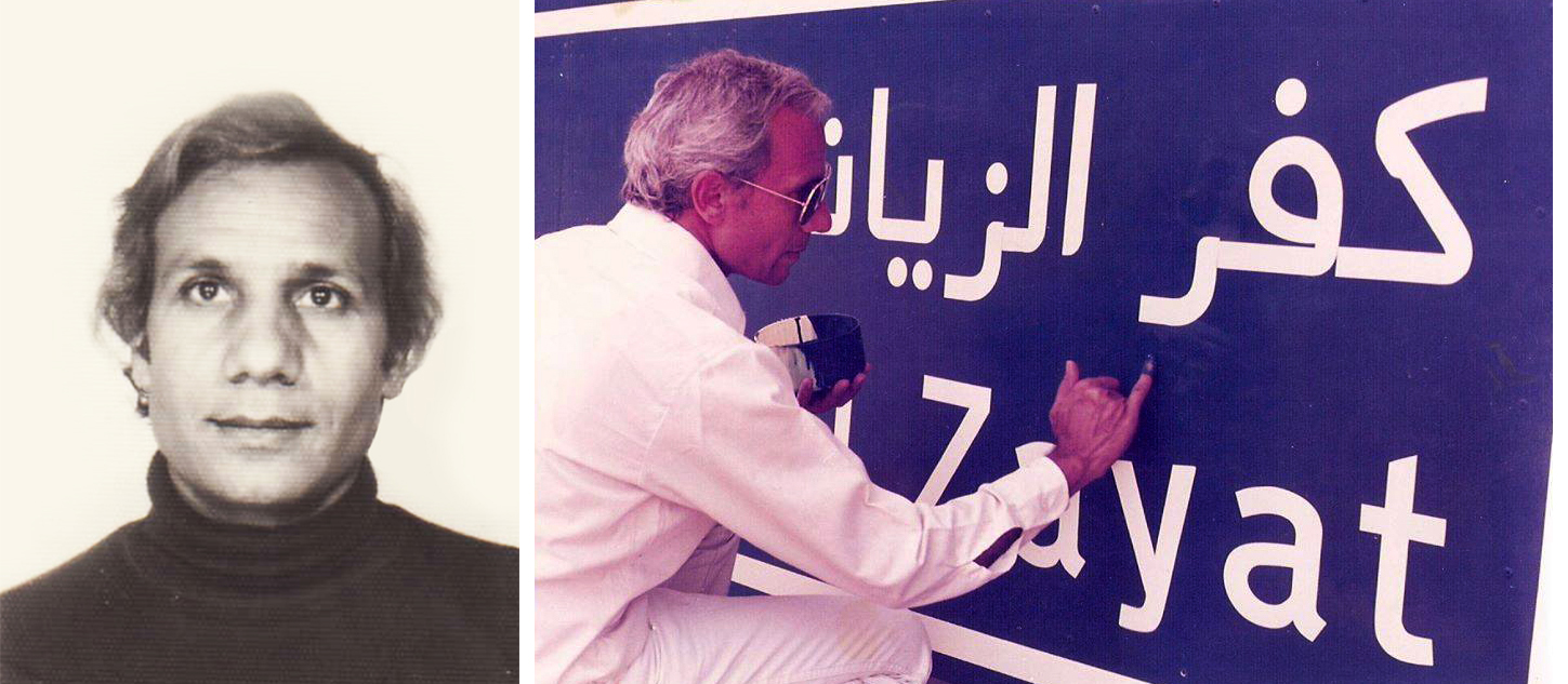
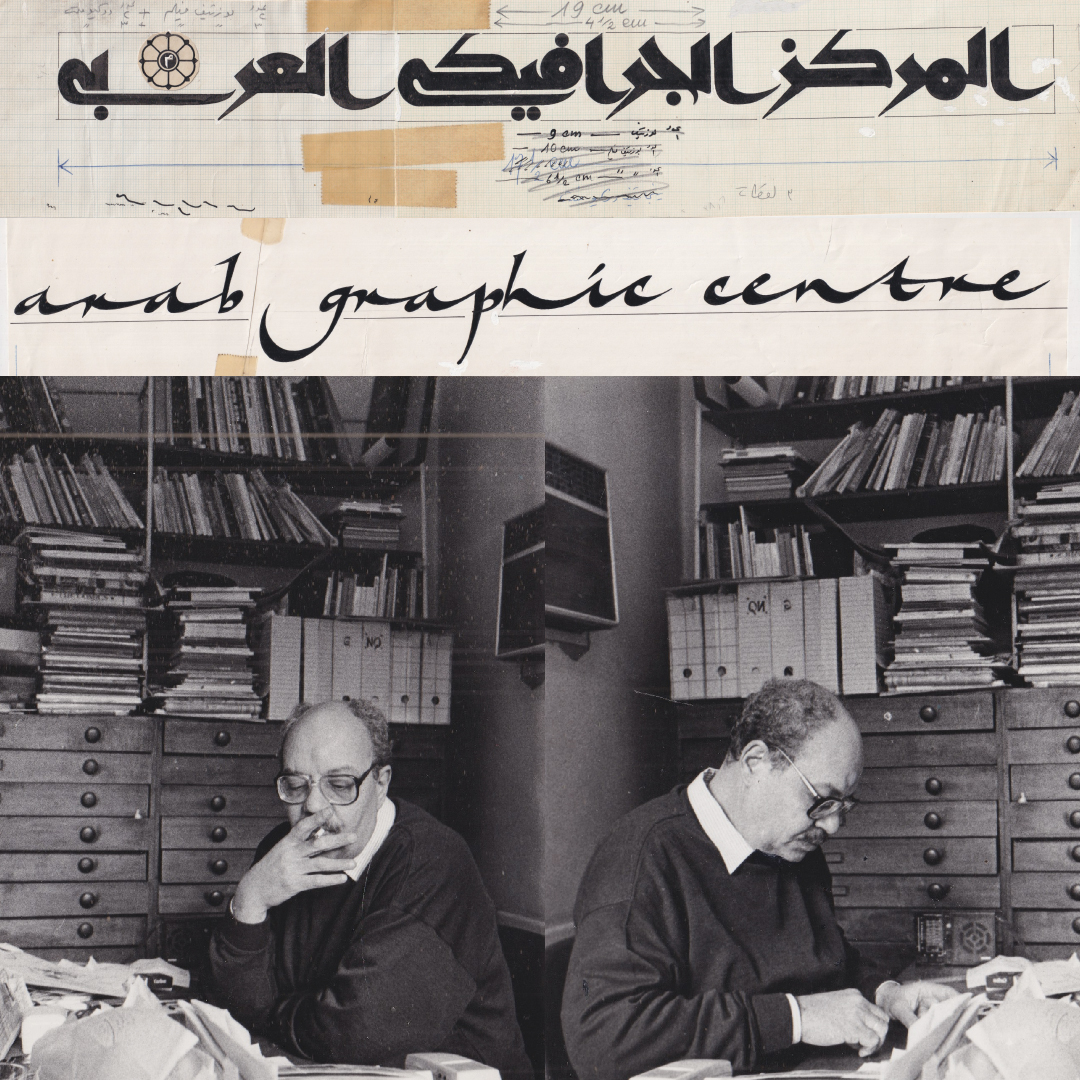
40. Right: Fathi Gouda working
Source: Fathi Gouda’s personal archive
Fathi Gouda Saad Hassan is an Egyptian designer, educator and artist. He was born in Beni Suef and then moved to Asyut to attend middle school. Soon after, he moved and settled in Cairo, where he studied and currently teaches at the University of Applied Arts in the Decorative Arts department. According to Reham Mohsen, he received a scholarship to study at Ravenna, Italy, between 1977-1980, where he studied sign formation design, sign design in recent terms.
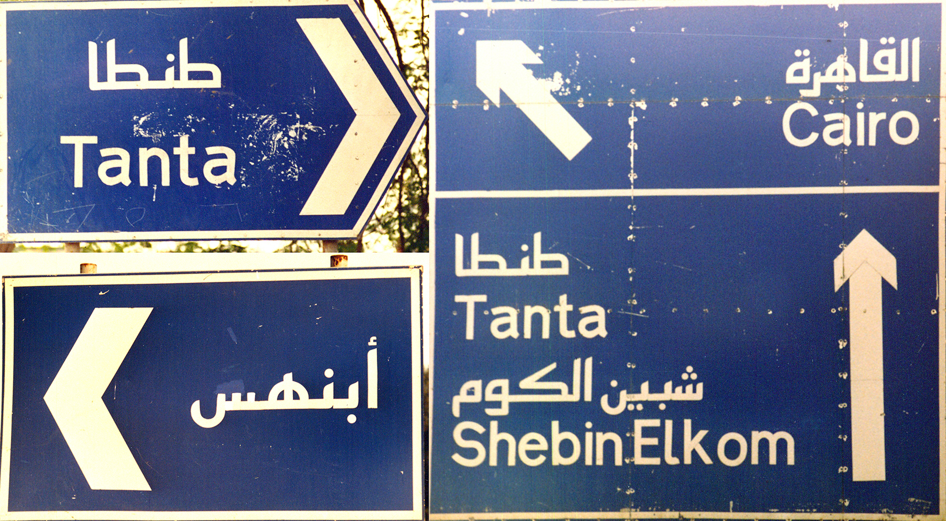
He described himself as a passionate educator and practiced artist. According to him, he was the first to adapt traffic signs that adhered to international standards. When he was a student, he worked at Al Joumhouria newspaper where it was in his fourth year working at the national printing and publishing house when he encountered problems using the Arabic script in publishing. At the beginning of his career, he was doing many experiments with Arabic lettering (and still is) and type design that was a reaction to his direct experience and a response to the challenges he faced with Arabic in modern printing. Most of his early experimentations were simplified—reductive Arabic letterforms. These forms were, according to him, “modern” and inevitable modifications of Arabic letters. Reham Mohsen adds that he excelled in using grids and experimented with shape-based forms of the letters much before working on traffic signs. How he worked on traffic signs was a bit of a coincidence, a divine serendipity, if you will. Which is not so different from how Jock Kinneir got the job to work on the British sign system. He says that his neighbor had recommended that he meet someone from the Ministry of Transport to show them his designs. When he went, he met with Mr. Mohamed Shaker, who led the Egyptian design department at the General Authority for Roads, Bridges, and Land Transport (GARBLT). At the time, they used to design and manufacture traffic signs by hand, mostly using Ruqʿah, Naskh and Nastaʼlīq styles combined with randomly chosen English typefaces.
When Mr. Mohamed Shaker met Fathi, he realized the similarity between Fathi’s typeface and the one designed in the United Kingdom (Transport) in that it felt almost as geometrical (simplified) as the Latin and matched both the X-height and descenders. Somehow, this also solved what was considered a problem: the height of the existing Arabic letters had to be 1.5 bigger to match the strength and presence of the Latin letters on the sign. This caused a problem when the department tried to apply the sign size matrix initially designed for Latin letters. Before Fathi, the signs were made by calligraphers, who treated signs primarily as commercial calligraphic pieces with little consideration to spacing, consistency, layout, composition or Design.
The department then had a small project of making new signs in Hurghada, in which they decided to use Fathi’s designs to test his font there on the signs. They must have thought it was a success because Mr. Mohamed Shaker then commissioned Fathi to design the Cairo – Alex road as a start in 1983. From that point on, Fathi designed many highways and roads in and out of the city. Many of the directional signs at that point were sponsored and installed by the Egyptian Auto Club, in which they made sure their contribution to the urban environment was visible. They usually branded (signed) the signs they produced.
Designed by Fathi Gouda, Cairo, 1980
Source: Fathi Gouda’s personal archive
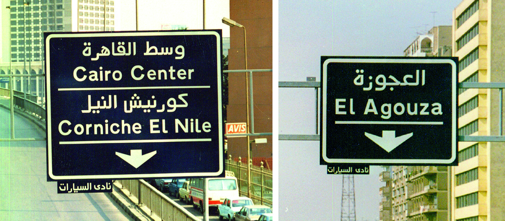
Once Fathi Gouda was the go-to designer for traffic sign design, he expanded his offering by becoming a designer and producer of his signs.
Cairo, unknown
Source: Fathi Gouda’s personal archive

Fathi Gouda
Source: Fathi Gouda’s personal archive
He also left his signature on the signs he produced- a common practice in the arts and, more importantly, to distinguish himself and enforce ownership and authenticity unto the signs. Competition trying to capitalize on this new business opportunity had started to appear. As Fathi gained popularity, the competition started to emulate signs that Fathi did with a hybrid font based on the Fatimid Kufic Script and Fathi’s font.
Eventually, Fathi Gouda and the Egyptian department decided to send the typeface to the United Kingdom for legibility approval, according to Reham Mohsen, wherein it was (supposedly) approved. This was an attempt to further legitimize the government’s choice of Fathi’s font versus others.

Source: Fathi Gouda’s personal archive
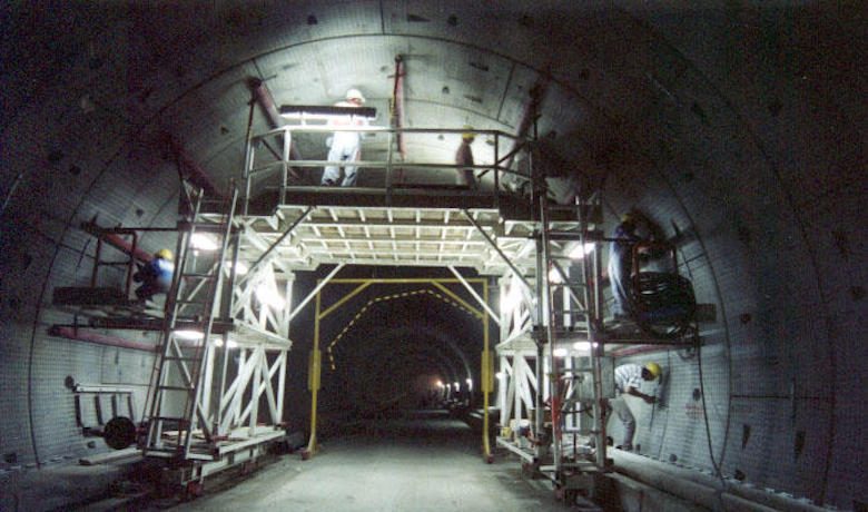
Between 1982-1987, the Cairo Metro was under construction by a French company that demanded that the signs used be designed by a specialized academic. As Fathi Gouda was the only one who met these standards, he was brought in for the task. He did half of the first metro line and questionably used the same typeface and other graphic elements that he was using for traffic signs. Some of these signs are still in use today, while others got replaced by newer versions in the name of renovation.
According to Fathi, they have considered the British research and standards to be the best practice and, therefore, borrowed a lot of the thinking and conclusions arrived at by the road research laboratory, specifically when it comes to typeface legibility. Nonetheless, he says that it was by sheer coincidence that what he was already working on matched the Latin typeface Transport.
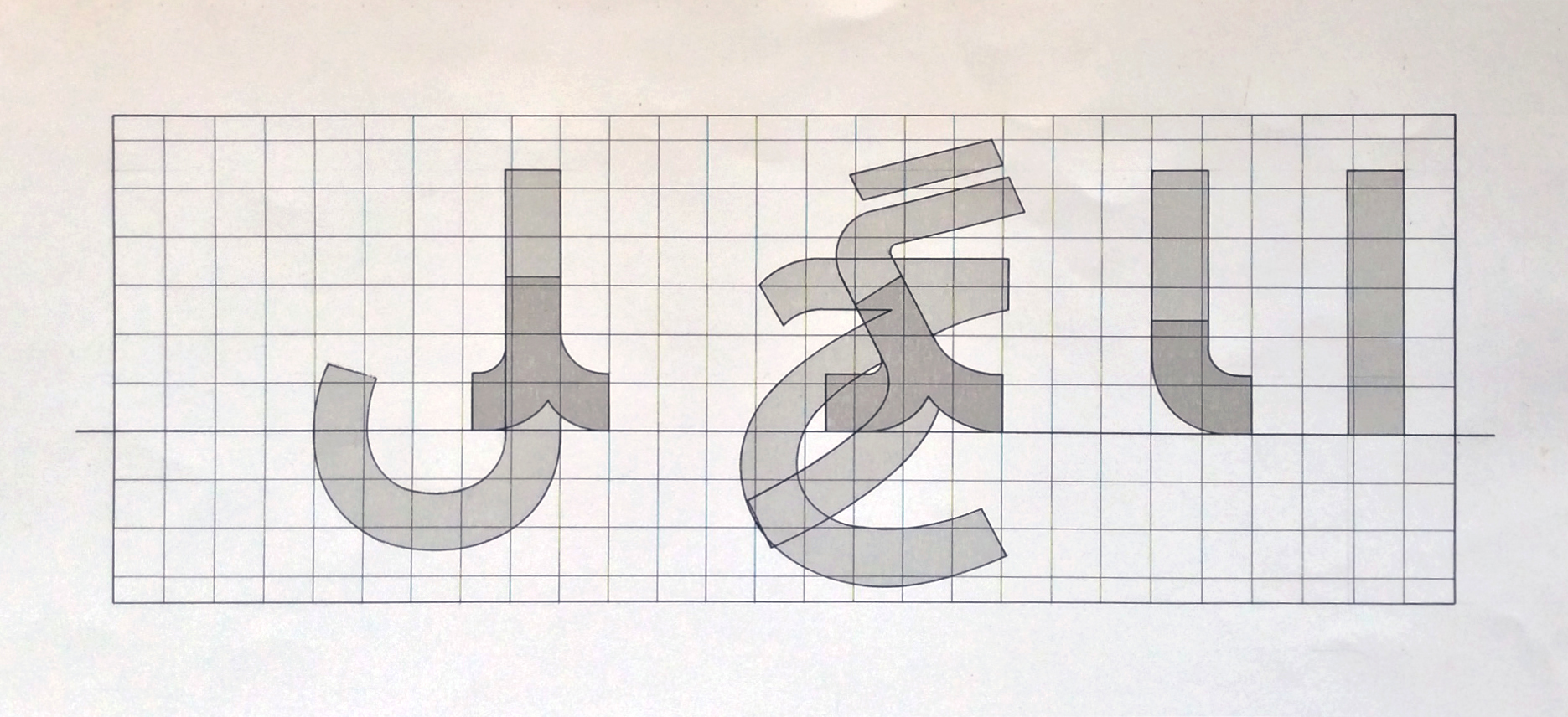
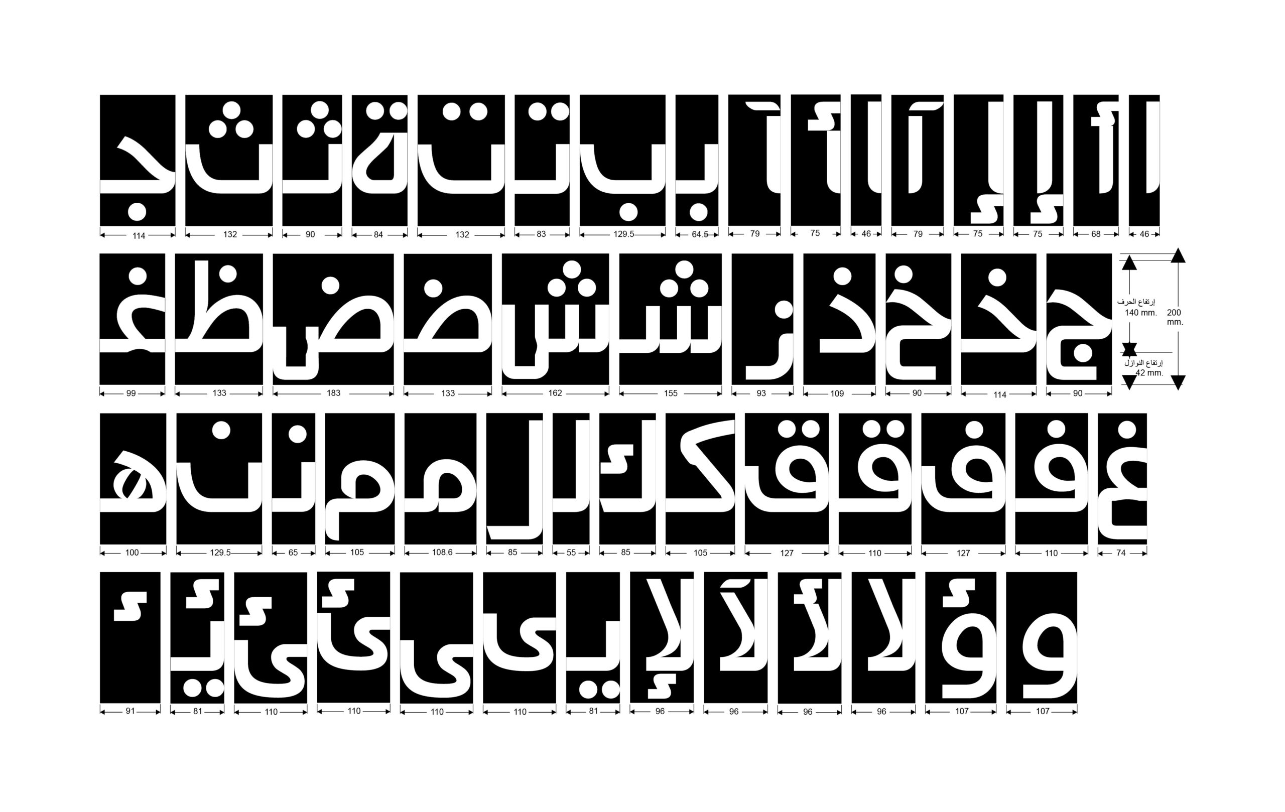
He named the Arabic type he designed “Fathi” and designed a few landmark icons for the signs alongside the typeface. Many of them are still in use today, along with some quirky new additions accumulated by other designers that appeared over time. According to Reham Mohsen, he also altered the Latin typeface (Transport) to follow the same typographic anatomy of having a fixed stem width across all and named it “Gouda.”
1980-1988, Cairo
49. Right: Fath’s typeface alphabet with some landmark icons
1980-1988, Cairo
Source: Fathi Gouda’s personal archive
Source: Vinci

Cairo, 2001
Source: Fathi Gouda’s personal archive
In 1998, the French construction company VINCI began working on Al Azhar tunnel project in which they also demanded (according to R.M.) that a specialist would design and execute the signs. Once again, Fathi Gouda was commissioned.

Cairo, 2001
Source: Fathi Gouda’s personal archive
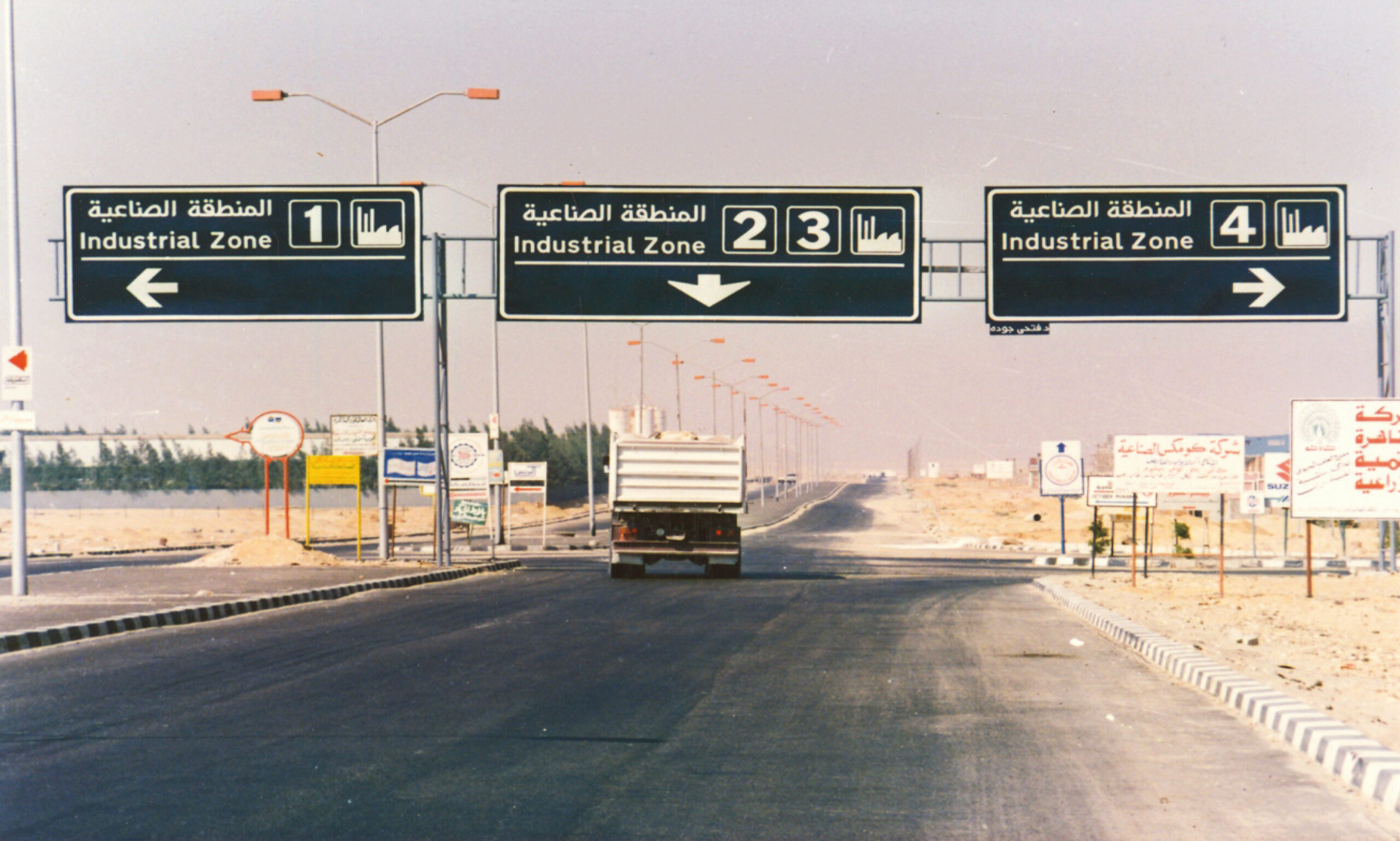
One might think that we were off to a good start with these signs. Surely, they are not without criticism (into which we will dive into it in the following essay). Nevertheless, it could very well have been a foundation to build the system further and develop it for the better. However, with the explosive urban sprawls since the 80s, it is now very apparent, and we can confidently say that the system aged poorly.
There is more to this story which we will continue in another part of this essay.
In the spirit of not wanting this to be a painstakingly long read, this piece will have a follow-up essay where we can continue this exploratory journey through Egypt’s traffic sign system.
As new information appears, the essay will be reframed accordingly.
I have received an email from the British Ministry of Transport to inquire about the authenticity and accuracy of approving the Arabic typeface “Fathi” as a match to “Transport,” which might alter the content of this essay.