The Desk is in-depth interviews with Arab designers and makers in which their desk is the focal point. This is an interview with Engy Aly.”The Desk’s” name is borrowed from Mark Gardner’s film with the same name. Mark’s short documentary sought to explore the relationship between a worker and their desk and how that reflects their personality. Design Repository is curious to explore the same while adding an intention of scribing these interviews in the Now and therefore attempts to record a moment in time for future generations so that they can find something about now when they look back.
The interviews will be running around the year, with a new designer/maker and a new desk each month. Our third interviewee is the Egyptian designer: Engy Aly.
Q: Please introduce yourself (Name, age, nationality, and title) and what do you do?
| Name | Engy Aly |
| Age | 39 |
| Nationality | Egyptian |
| Title | Graphic Designer |
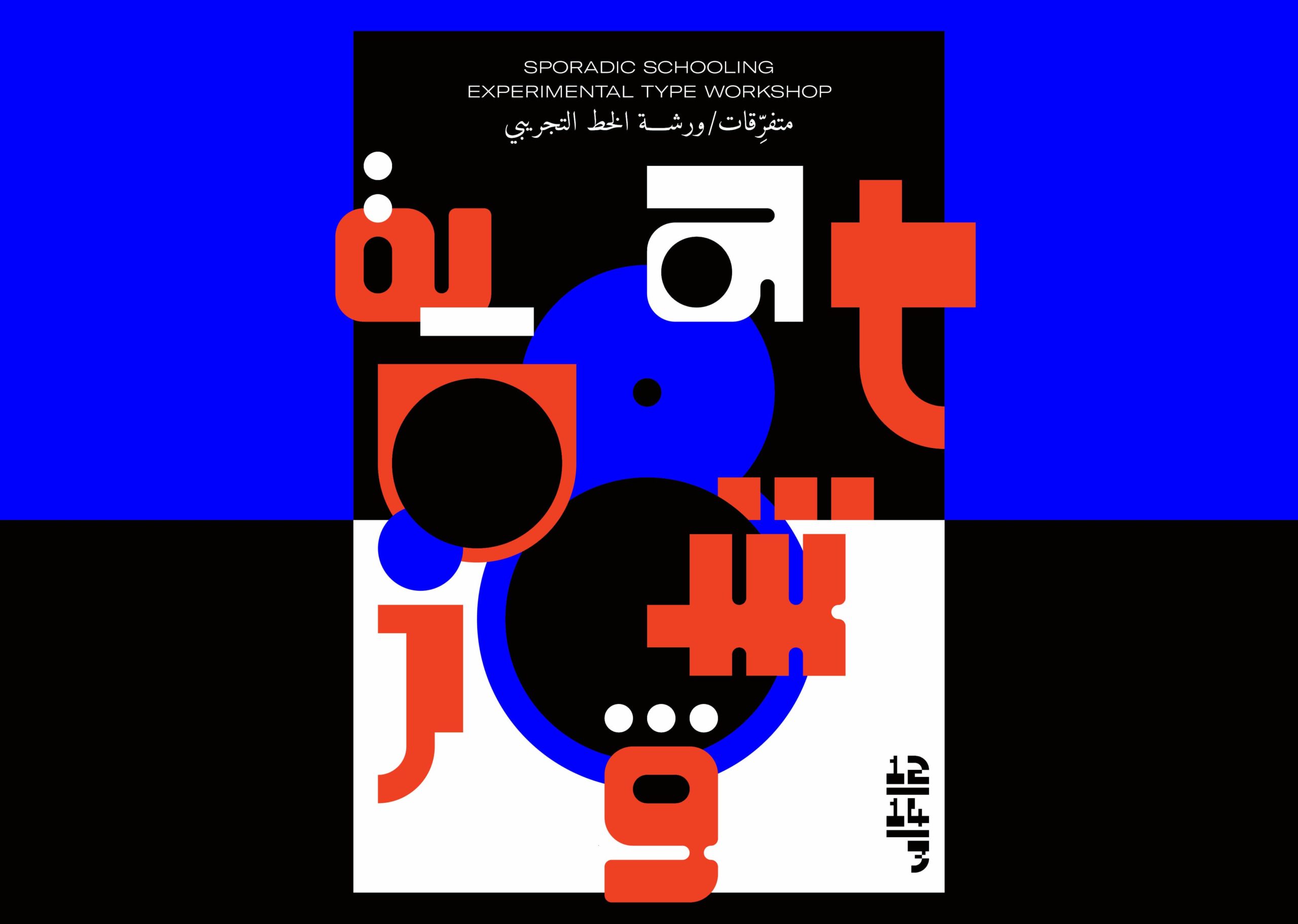
I’m a “full-time-plus plus” independent graphic designer and I mostly work within the cultural realm, I also organize workshops and exhibitions that revolve around graphic design and visual cultures under the framework of a project titled ‘Sporadic Schooling’ – which was unfortunately put on hold when the pandemic struck, and sometimes I teach subjects within the graphic design curriculum. I also cook, take care of my plants, and play a LOT of tetris. My current tetris high score is 244,440 – level 30!
Q: What made you get into Design?
✎
I’m not so sure, during school I had no particular career direction in mind. I liked drawing and reading, which for years I did under the desk during some of my school classes. For the last few years of school I started collecting printed material that I found interesting; chocolate wrappers, tickets, business cards etc..
Only after I graduated from high school and started discussing possible university enrollments with my parents did I realize that I wanted to study design – specifically graphic design and not interior design, which is what they had both studied and still practice to this day. I still like interior design and am obsessed with certain home furniture and home accessories designers but have never done it professionally.
Q: You are now based in Cairo, before we delve in your design process, how do you process Cairo? As in, it could be visually overwhelming with a lot going on at all times, so how do you extract visual input from the city?
✎
I extract visual input from the memories and impressions others left us.
Other than my two years in Basel, Switzerland for my MFA, I have always lived in Heliopolis, Cairo. I can’t and don’t process the city. I find it extremely overwhelming – the overloaded sensory stimulations, the lack of understanding of personal space, the diminished idea of privacy and the abundant visual stimuli, and the juxtaposition between all these elements and the deserted and abandoned spaces around the new suburbs is a contrast I’m unable to process. So I live in my (somewhat versatile) bubble – I compartmentalize. Even before the pandemic, I used to only leave my home/studio around twice a week. The rest of the days I’m here working + resting + whatever else.
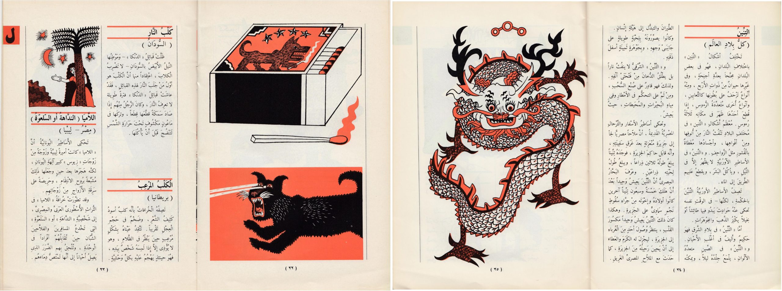
But that doesn’t mean the city doesn’t affect me, visually and otherwise. I just don’t intentionally look for inspiration or elements to extract and reuse, I don’t walk around researching or documenting a specific design era or visual element for example, because I no longer feel the sense of belonging to the majority of our urban landscape (more on that is in the text piece, ‘The Gradual Disappearance’). The traces left by those who lived in the city before us are what I find interesting, the pre-computer typographic signs, mostly on shops around the older neighborhoods, from the 60s to the early 90s, the diverse architectural structures between Modernist, Art Deco, and Art Nouveau, the reliefs and patterns on some buildings, bits and pieces all around. These are elements I can connect with and profoundly appreciate for their aesthetics, craftsmanship and endurance. But they also spark sadness because they are soon to vanish.
Q: Can you take us through your design process? Choose your favorite project and please walk us through its process from start to finish, challenges, and learnings?
✎
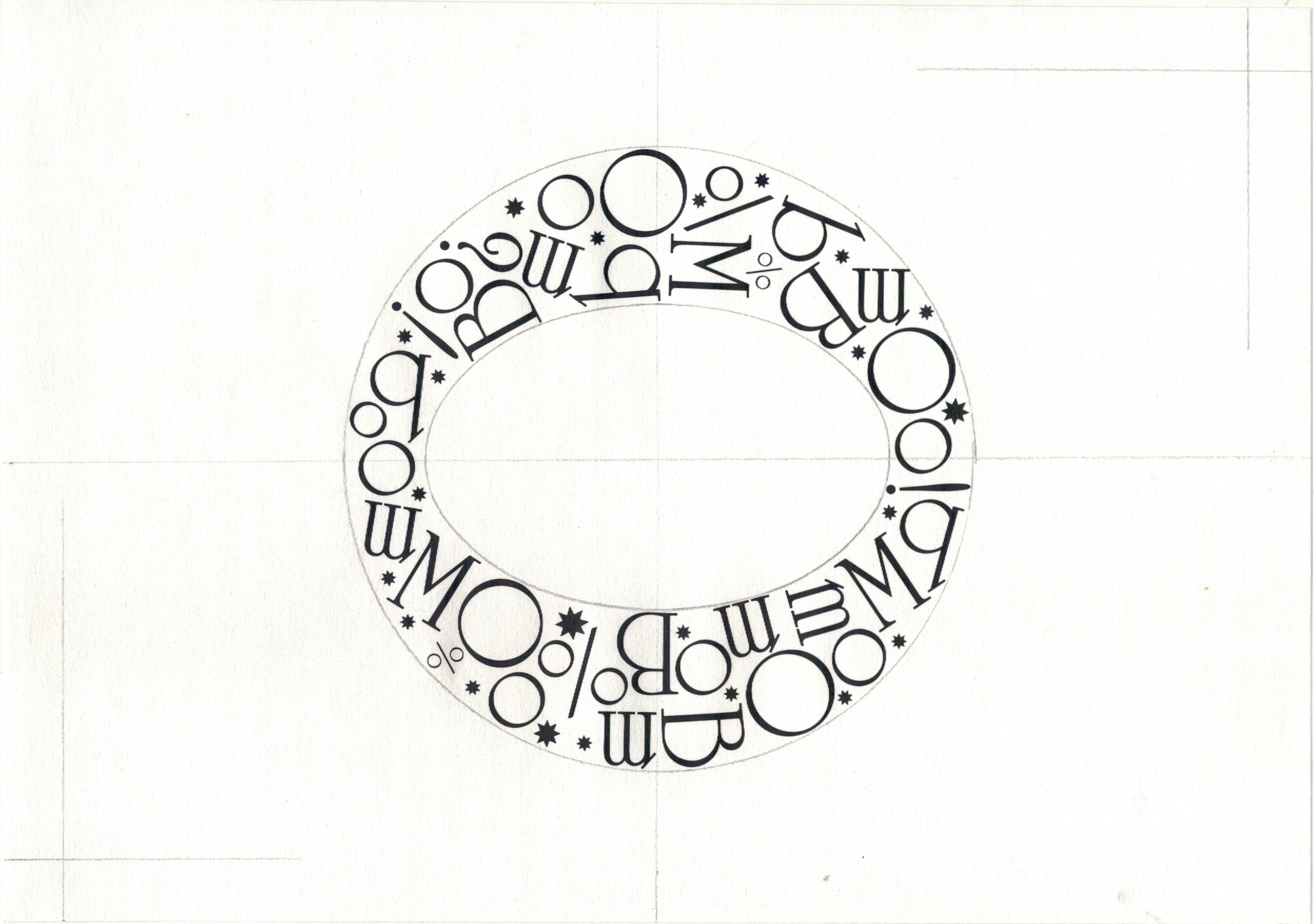
The project I would like to share is a personal project, not a commissioned one. It’s a project I’ve been working on for around 4 years – titled ‘Life Diagrams’.

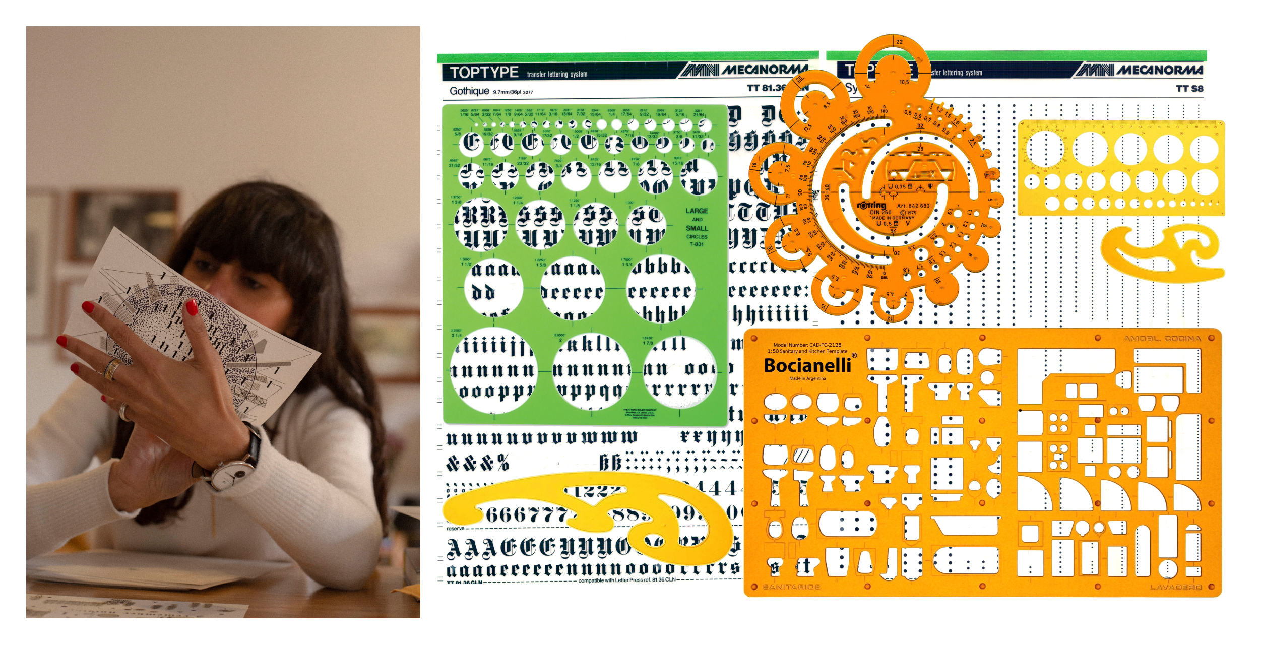
These compositions emerged from my love of working manually, with analog tools and, from a curiosity about the tools and templates that architects use, my fascination with both natural and man-made organized structures and with the world of architecture in general. In the 70s and 80s architects worked on a lot of typographic shop signs and visual identities, as did artists, so there was an overlap that funneled into the visual output of that time period that I found interesting and was actually inspirational for this project. I also needed to take a break from commissioned projects and do something more spontaneous where the end result is neither expected nor calculated. So I started with the idea of drawing something resembling an infograph, a diagram that discusses or mocks patterns of living, situations and dilemmas. All the compositions are around A5 in size but come from two different sketch pads and are on two different kinds of paper.
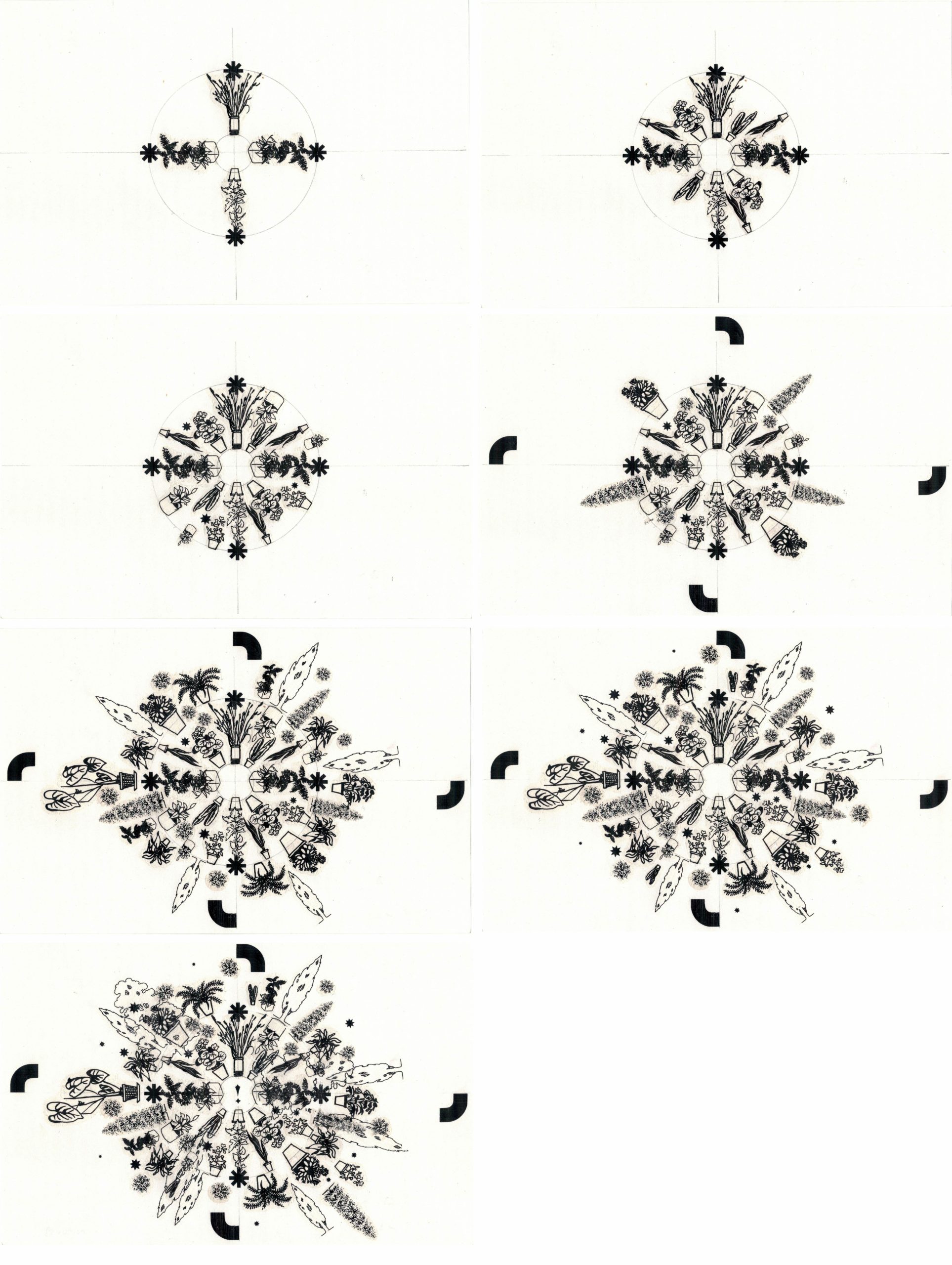
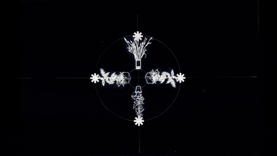
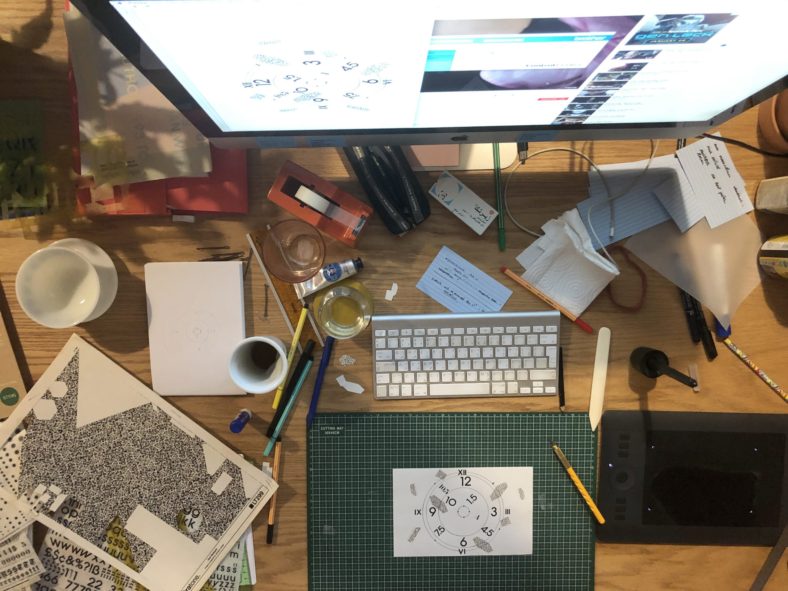
I start with a simple and completely underdeveloped sketch, just a few lines or shapes here and there, as well as a title – usually a phrase or sentence with a satirical undertone. Because both title and visual elements are interrelated they shape each other throughout the process.. The way the composition develops is spontaneous and possibly slightly subconscious. Guided by the initial sketch, I start by putting one single element on the paper, using either pen, Letraset transfer sheets or Letraset stickers, that element inspires what comes next and so on. It’s free flowing in a way. Each step is dictated by the one that precedes it. Each new shape, form, texture or letter is also a reaction to what came before. I scan the different stages while working, which means I get to look at them with something of a fresh eye with each scan. I only get up from my desk when the composition is finished. And once done, I create an animation out of all or some of the steps I scanned along the way. The animation sometimes explains the way the composition has been built, and sometimes introduces new visual information endemic to the animation process such as a jittery movement enticing anxiety.
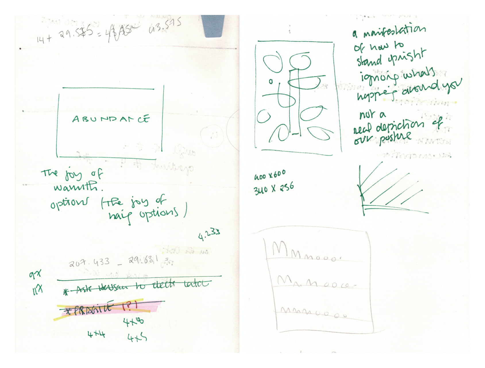
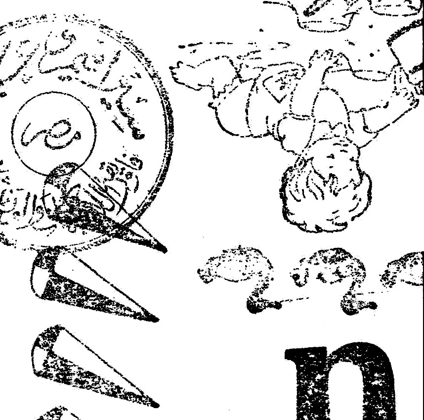
Right: Sketch for ‘A manifestation of how to stand upright ignoring what’s happening around you’, unrealized, 2022
The topics are personal but humorous, like comparing my age to the size of my clothing, noticing the start of the appearance of multiple gray hairs, the stress caused by work emails, the general lack of sense in life – light stuff!
All compositions are in black and white, and some are inverted on photoshop just to play around with the visual weight of the elements, but other than that, there is usually minimal digital interference.
I work with a mix of material that was passed down to me from family friends and family members who worked as architects, and some new material that I can still find in stores. I have a large collection of Letraset sheets, both old and new (I love and treasure them deeply) and a large collection of architectural rulers and templates. So in a way I use a myriad of pre-existing forms, but I put them together, and ask them to converse in a new language; one that is humorous and spontaneous yet refined and calculated . Aiming to find a balance between the playfulness of the composition, and the meticulous nature of it as well.
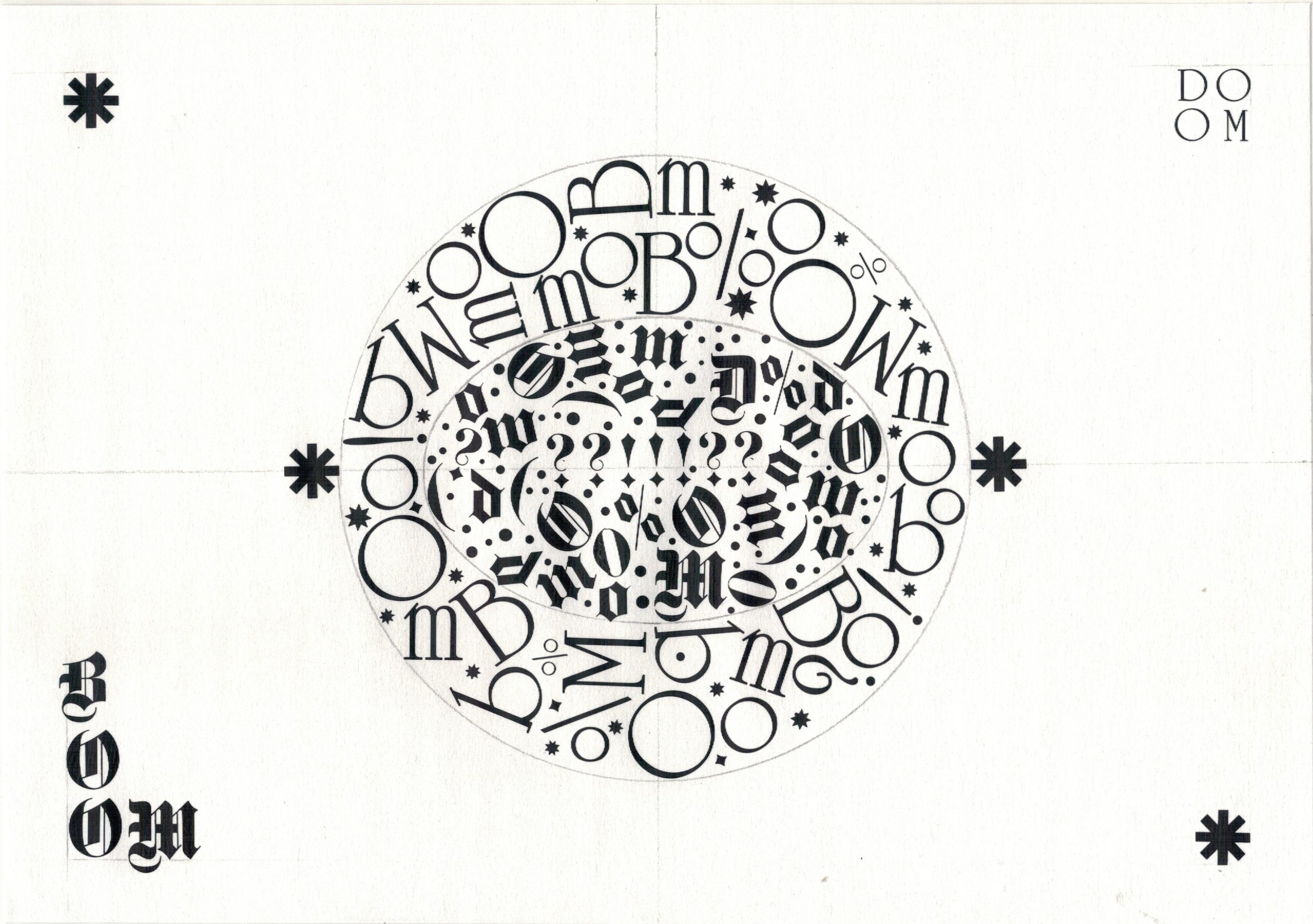
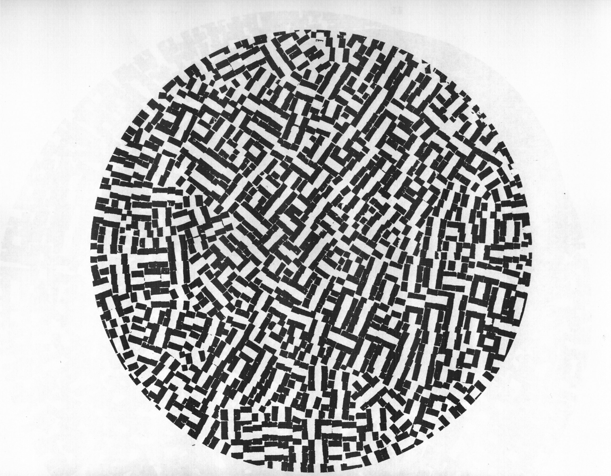
A good example of this is the latest piece in the series, ‘Waiting for the World to Collapse’, A5, Mecanorma transfer sheets in Celtic and Gothique in addition to Mecanorma Symbols. This composition is from January 2021, which tells me I haven’t been in a proper mindset to create more since then. Except for one commissioned composition for Waraq in Beirut, Lebanon a few months ago.
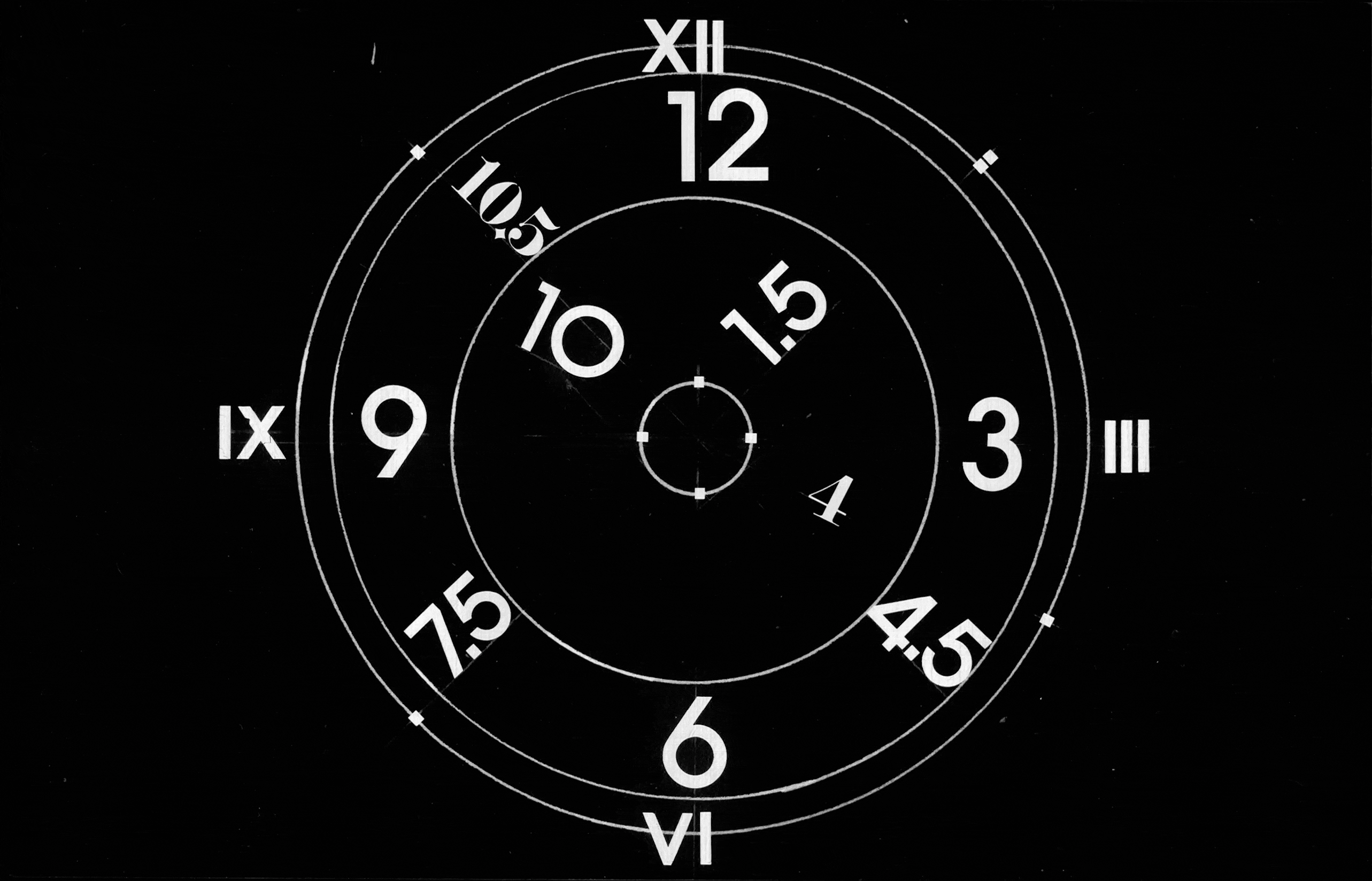
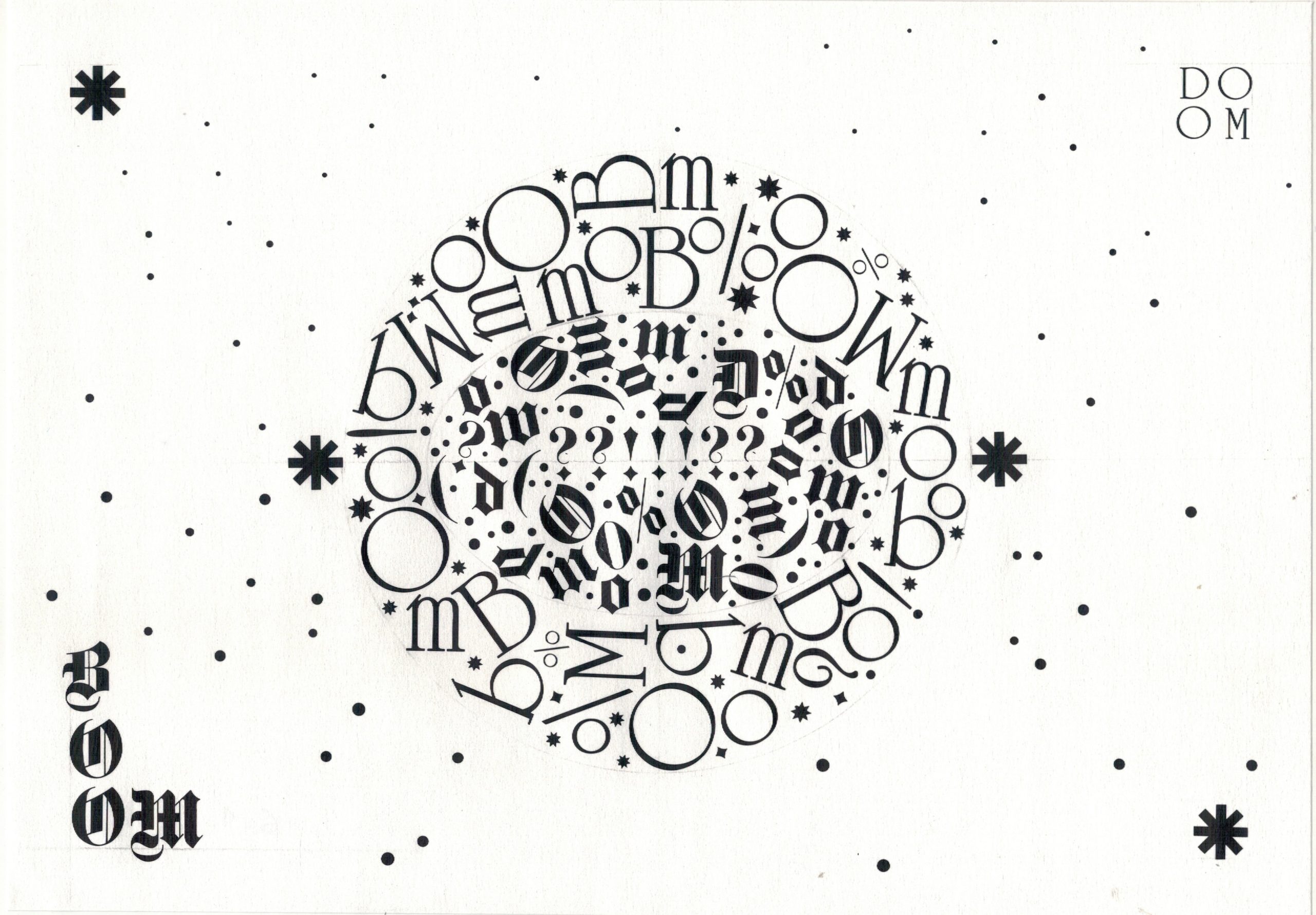
The composition discusses the constant state of uncertainty we are living in, from a slightly pessimistic view that suggests the end may just not be a positive one. I started with two concentric oval shapes and began adding elements from the inside out. I knew I wanted it to depict an explosion, but a slow and organized one.
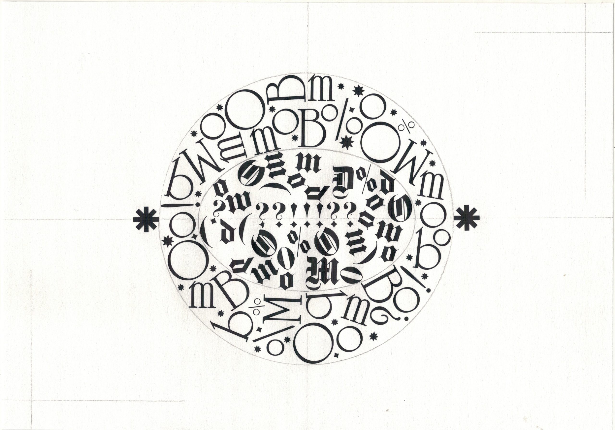
The inner circle is composed of the letters forming the word DOOM, set in Gothique 36 pts, and the outer circle is set in Celtic 20 and 48 points. It’s an imaginary restricted explosion in outer space…
Q: If you had to write a definition of Graphic Design for academic purposes, what would that be? And would you have a different definition of Arabic Graphic Design? If yes, what would it be and in what ways is it different?
✎
Depending on who I’m addressing it could be: ‘Translating a written brief into a visual, or a group of different format visuals, while taking into consideration the limitation of time, budget, and the requirements of the commissioner’. This would be one of the definitions I would give students for example. Or ‘Working with different visual elements to create a composition that portrays a message, a feeling or gives an abstract impact’.
I wouldn’t define Arabic Graphic Design differently, it follows the same basic rules and parameters but originates from the region: either directly through the designers living and working in the region or maybe more obliquely through designers with a regional background living elsewhere or also possibly just through the topic, content and use of relevant design elements.
Q: Who are your favorite Egyptian designers/artists? One old and one current?
✎
Mohieddine Ellabbad, not only because he was a great designer but because he was also a writer and he established different entities and workshops, so to quote Eames once again (as I have in an essay before), he took his pleasure seriously!
I find his work conceptually profound yet instinctive in its aesthetic quality.
Choosing a single current designer is more tricky because I like a lot of people’s work for different reasons. So please spare me this question.
Q: Who are your favorite non-Egyptian designers/artists? One old and one current?
✎
Naming just one puts that person in a holy and elevated position which is something I would like to avoid, so here are a few of my favorites:
Ikko Tanaka (1930–2002)
Wolfgang Weingart (1941–2021)
Charles and Ray Eames (1907–1978, 1912–1988)
HAY – to me, their products make life a little more enjoyable!
Q: You are not only a designer, you are an educator too, can you tell us why you were drawn to teaching, and what you learn from it as a designer?
✎
I don’t currently teach, but I look forward to going back to teaching sometime. So I’m not sure if the label fully fits.
I think there’s a certain form of isolation when you freelance. And that’s what drew me to doing my MFA at The Basel School of Design (HGK FHNW) in 2012, I was in a joint program with the University of Illinois in Chicago. By being exposed to different mentors from both universities and through their different forms and styles of sharing knowledge, I became intrigued by the relationship between teacher and student and thought I’d find it enjoyable. Of course teaching is at times quite frustrating, but it’s fulfilling to see students develop with time. Some of their results are always great surprises, and in general, if it’s a good academic environment then it’s fantastic to be working with people who have the same interests and concerns. I also learn a lot from the students through the ongoing class conversations.
In addition to that, as a designer in Cairo, I already live in a bubble, teaching is an intersection of this bubble with other bubbles – people who are academically interested in some of the topics I am interested in, opening room for collaborations and discussions.
Through teaching, the idea that process and experimentation are the most important elements became even stronger.
Q: You were amongst the people who were working for fileclub? Some might say that there is a similar thread weaving through the works of all the people who worked there. Do you think if we look back at that moment, we can identify a design school?
✎
Mmmm.. I don’t see any similar threads, maybe that’s an interesting point you and I can discuss over coffee sometime.
Fileclub was definitely a phenomenon – it was a group of talented and inspiring individuals who produced wonderful work, work that was locally way ahead of its time. I was lucky to be part of that studio environment for a few years. But it was not a school, a school creates a direction, invents or develops a style. This was not the case. We were good at digesting Western design trends and finding a way to use the concepts for local projects – but these ideas in themselves were not novel and were certainly not our invention. I was in Fileclub from 2006 to 2009 and they closed in late 2009 I think.
Q: I personally think of you as a secret mentor? Do you have a secret or non-secret mentor?
✎
I appreciate that, Moe. Nice to know! I’m flattered!
I maybe have an imaginary one; Wolfgang Weingart.
Weingart, was a typographer who’s work transcended typography, he worked with a multitude of tools, paper, ink, type,film, and even tissue paper to name a few. His work was serious but humorous and was always full of surprises. He worked with trial and error as a way of discovery. I find his experiments, printing using the back of the metal type characters for example, to be astonishing, wonderful, concrete, abstract and poetic – mixed with a dose of darkness due to the nature of the material.

His myriad experiments with the letter M, which he began in 1962 and systematically developed over the years, are phenomenal – especially when you see the originals. I wish I could shrink and live inside those printed pages for a few hours! Just imagine yourself walking through the letters with their repetition and distortion, navigating your way around them and stepping out and walking through the white spaces too..
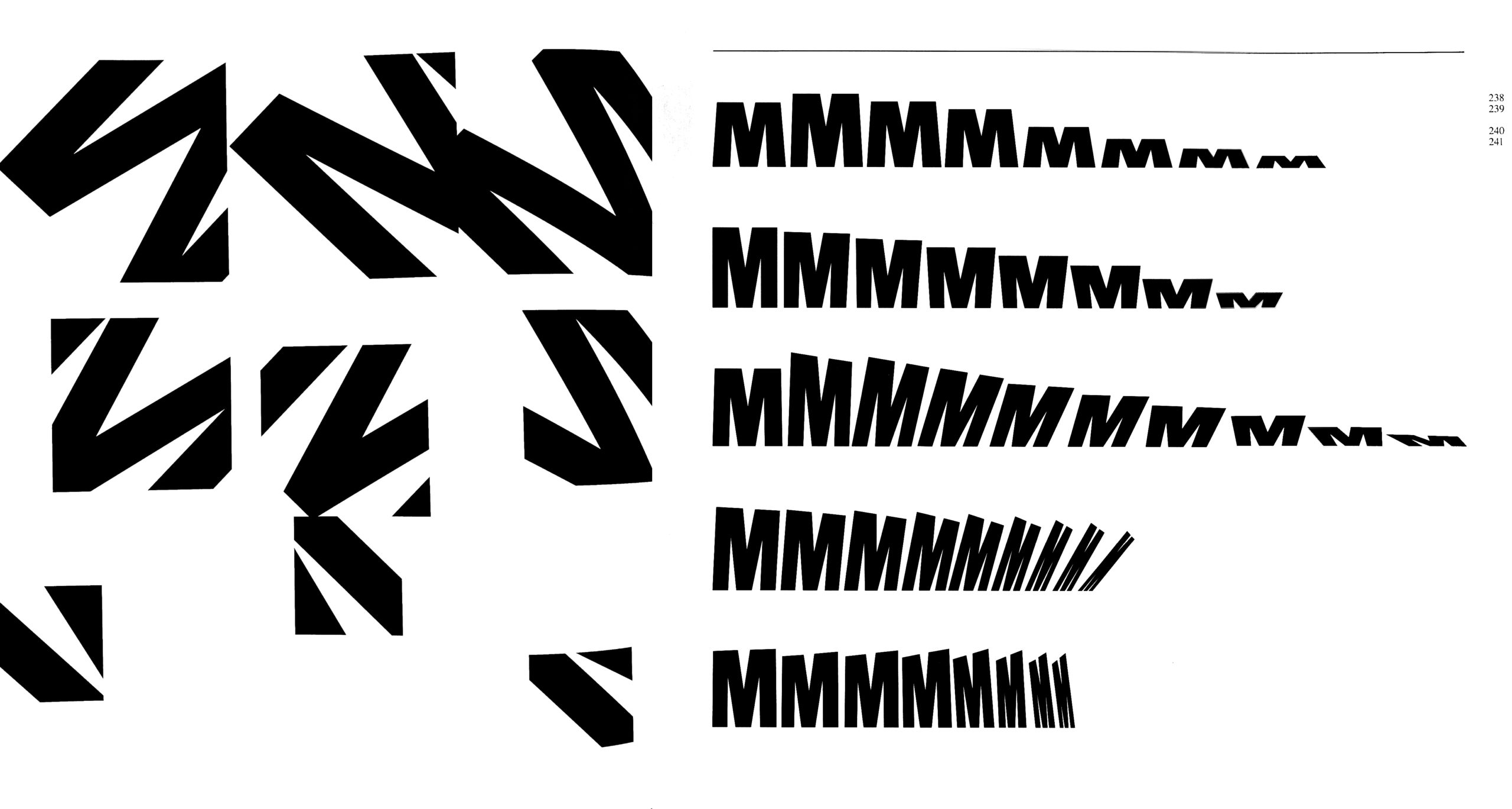
One of the things I admire immensely is that some of his typographic work was less dependent on legibility and more focused on the potential of surprising results through the manipulation of the image by using simple acts like rotation, repetition, slanting, distortion and scaling. Seems basic but it isn’t.
I had the pleasure of meeting Weingart in person in 2014 at the Museum für Gestaltung in Zürich where he had his retrospective exhibition ‘Weingart Typography (Weingart Typografie)’, so the imaginary and the real intersected, which made his work even more tangible to me.
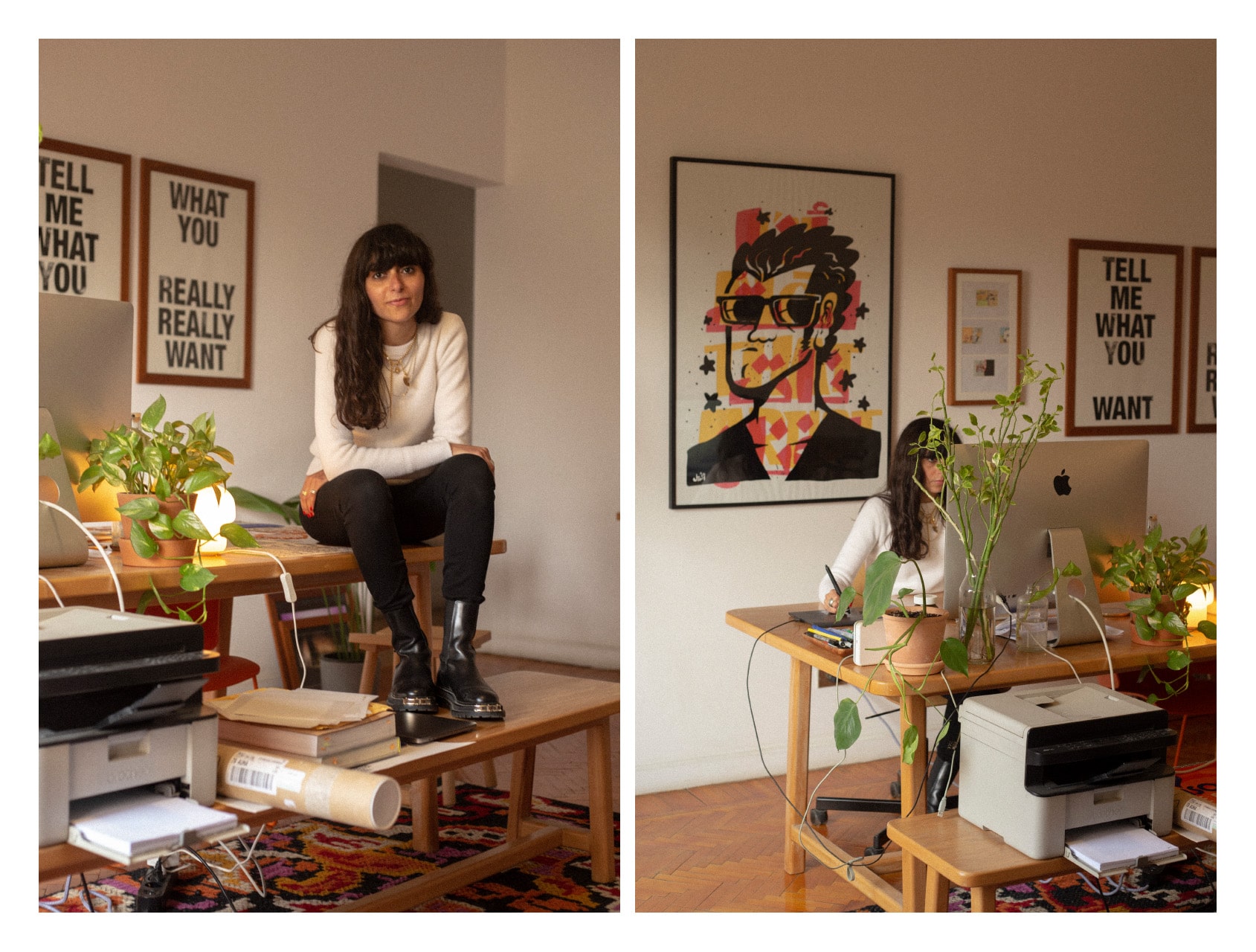
Q: Describe what does your desk mean to you?
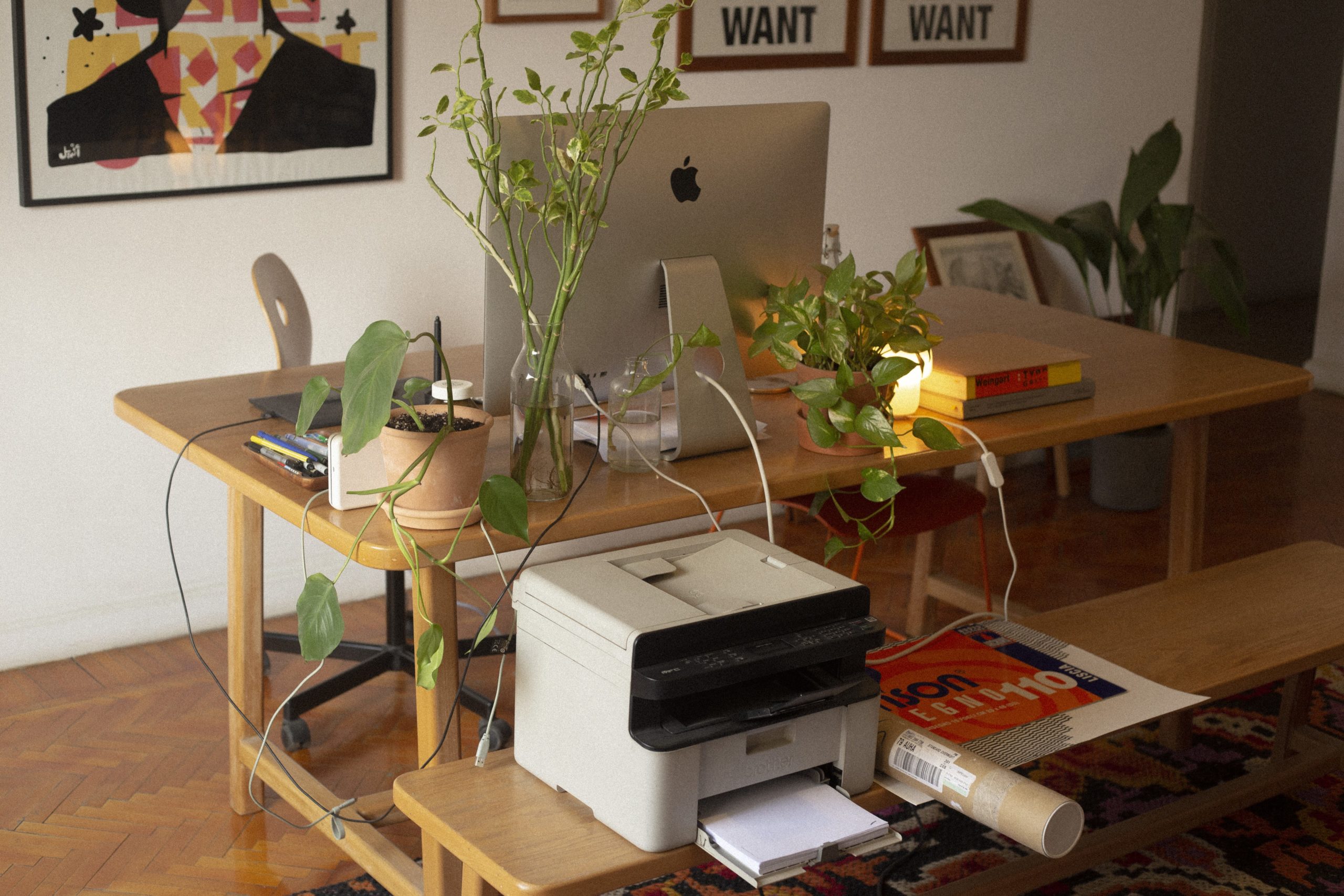
✎
Office space, dining space, the reason for my knee pains!
My office space is my main space, my desk is in the main open area of the apartment, strategically close to the kitchen! The area also functions as a living room, and when I have guests over for dinner, I move the computer to another room and the desk transforms into a dining table. I spend a looooot of time on that desk.
Q: When you are creatively blocked what are some of the ways you overcome this block?
✎
I mostly realize that I’m blocked when I notice that I haven’t produced anything worthwhile in a few hours. I usually try to find a way around that but when it does not work, I get out of the house for a bit, if it seems that the blockage will not clear up anytime soon I ask for a deadline extension!
I was lucky, the past two years, to work with people who were truly understanding, and we all accommodated (within production timelines and limitations of course) each other’s physical and mental health needs and slowed down or paused projects when needed.
Q: Post pandemic, do you intend to continue Sporadic schooling?
✎
I think the term post pandemic means different things to different people. I am personally only starting to get out of my bubble and am not yet confident or comfortable with the idea of inviting guests and organizing events. So for now I’m keeping the program on hold while also reassessing some of my programming choices, structures and formats. The reward of all this will be that I have to go through the excruciating process of applying for funding again!
Q: What are 3 pieces of advice you can give to a young designer embarking on a journey similar to yours?
✎
I would prefer not to give advice. Being older doesn’t necessarily mean I know better. This older-person-giving-younger-person-advice-thing makes me uncomfortable. It’s always a little patronizing no matter how it’s phrased. I would instead maybe ask us to make our lives more enjoyable through:
Sharing references and research material whenever possible.
Openly discussing pricing and finding a way to regulate the calculation of the fees so we all get fair payments for the work we do.
Push for better work conditions.