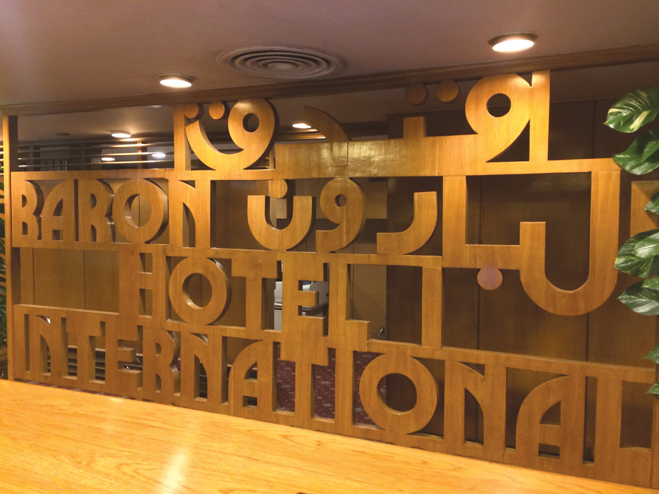
Cairo is a city where the only constants are change and randomness. The fluidity of traffic regulations, deficiency of pedestrian sidewalks, lack of structure of residential models, the rapid sprouting of organic clusters of brick units occupied by people all come together to produce a chaotic, dysfunctional, shifting tapestry of stimuli. The inhabitants of this city find themselves surrounded by signs, symbols and visual abstractions of ideas all manifest in different styles and mediums. Up to the 1980s this visual landscape was dominated by typefaces and hand lettering representing various design trends and directions, that appeared on facades of buildings from different architectural schools all across the city. Though the process through which the designer’s ideas are formalised is largely shaped by the double influence of tradition and technology, manually produced typography that went beyond the rigid constraints of Arabic calligraphy was very common in the public space before the advent of the digital age. Examples include unconnected letters, modular and mono-spaced typography, bilingual signage and organic typographical treatments. Graphic signs were always more than just carriers of their primary information, allowing us to witness the close relationship between the different visual disciplines coexisting in the urban context; mainly graphic design, typography, architecture and illustration. Architects, who at the time were also largely in charge of creating the identities of the spaces they were designing from store fronts to printed elements, were the primary shapers of this visual language and their roles overlapped largely with typographers, aided by the invention of Arabic Letraset dry transfer sheets in the mid-1960s. It was an inspiring place to grow up in in the 1980s.

Baron Hotel Check-in Desk Heliopolis, Cairo
2015
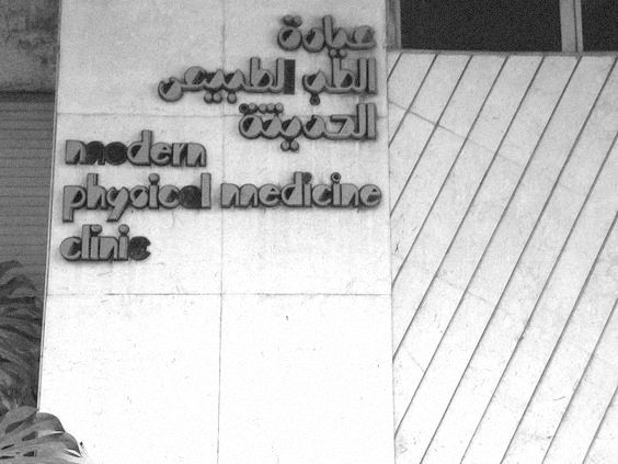
At the time, the relationship between city and citizen was well reflected in the tactile connection between the related disciplines of design and architecture. Many other sister cities, like Beirut and Amman, functioned under similar conditions. The public production of the designers of the period were well documented in these multi-layered cities offering several viewpoints, solutions and degrees of complexity. Their interests and refreshing tendency for experimentation were visible in an urban visual language that bore witness to modern, complex and multilingual societies. This dense, visual panorama opened up a space for stimulating debates about form, function, praxis, and aesthetics. A debate that remains pertinent to this very day.

Bilingual ‘Modern Physical Medicine Clinic’ signage Zamalek, Cairo
2015
However, now there is a gap between context and occupant that is constantly expanding, turning citizens into strangers that are desperately trying to either belong to the city, or to escape it completely.
In the late 1990s and early 2000s there was a search for spatial memories. This drove the development of new visual languages that produced new memories. These developments were most visible in printed mediums that suddenly blitzed the walls of the city, especially posters communicating and documenting cultural activities, music, film screenings and contemporary art exhibitions. Such manifestations showcased the possibilities of the translation of ideas in diverse fashions, revealing the presence of a new generation of designers and a public that was open and receptive to new visual languages.
Over the past 15 years the visual impressions of the past decades have been slowly replaced by new materials and forms; inconsistent grids of fluorescent tubes locked in stretched plastic for example – design primarily driven by new technologies. What that led to was an amnesia of the visual production of the recent past; our memories of those streets are gradually disappearing. Although those contemporary mediums offer speed, flexibility, the possibilities of maximalism and a democratisation of practice that sometimes leads to surprising kitsch visuals, they also – due to their ease and speed – make it easy to avoid thinking conceptually about the design process as well as glossing over the aesthetic qualities of the form.
“No design can exist in isolation. It is always related, sometimes in very complex ways, to an entire constellation of influencing situations and attitudes.”
– George Nelson
By questioning our common delusions and allowing our questions to take an organic form that embraces the possibility of error and surprise, we begin new conversations. This process attempts to rigorously observe, and track trends, discovering commonalities and differences in the world of graphic design and illustration in the region. We aim to produce new memories, to initiate a conversation with our surroundings and to point towards a possible alternative future.

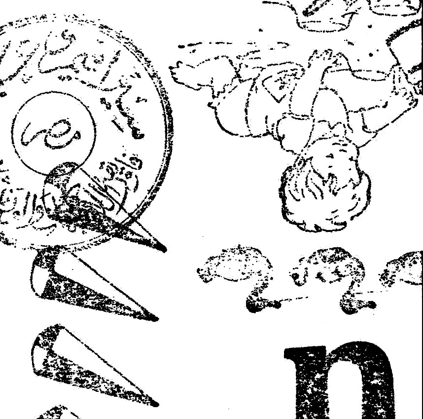
Letraset Boutros Bold, Mourad Boutros, 14.0mm Scan
Personal Archive
“Take your pleasure seriously.”
– Charles Eames


