

Dark Mode
Month: November 2020
Dark Mode
Under the Surface of Style
Dark Mode
Arabic Film Titles Archive
Researchers:
The Arab Film Archive is an initiative that aims at collecting and digitizing classical Arab films in order to make them accessible for educational and research purposes. It is a project that provides a temporary answer to the ongoing monopoly of hundreds of Arab movies that were sold under complete exclusive rights to private TV networks back in the ‘90s and early 2000s without any consideration of the need to provide them on an institutional right basis for education and/ or individual research. The Arab Film Archive is founded by Ahmad Ameen, a film researcher and writer currently based in Amman.
Dark Mode
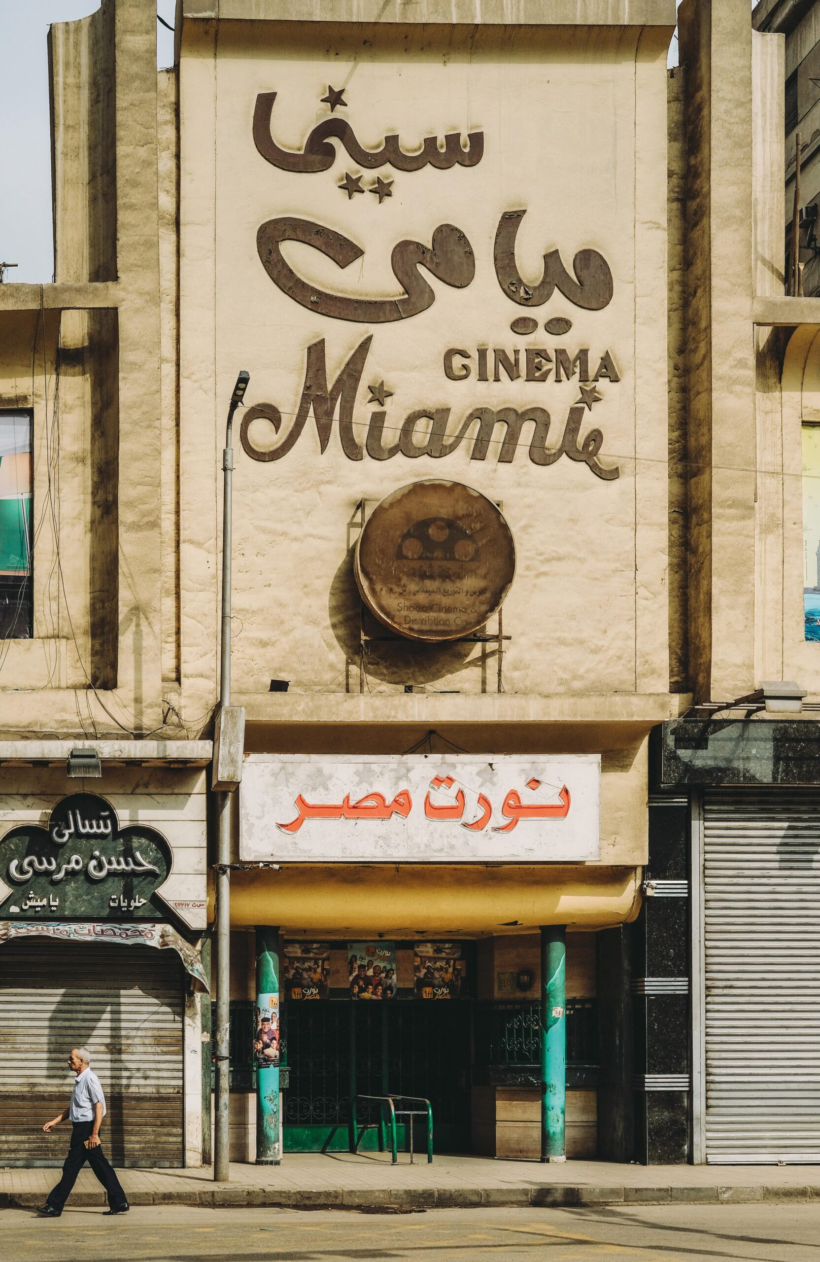
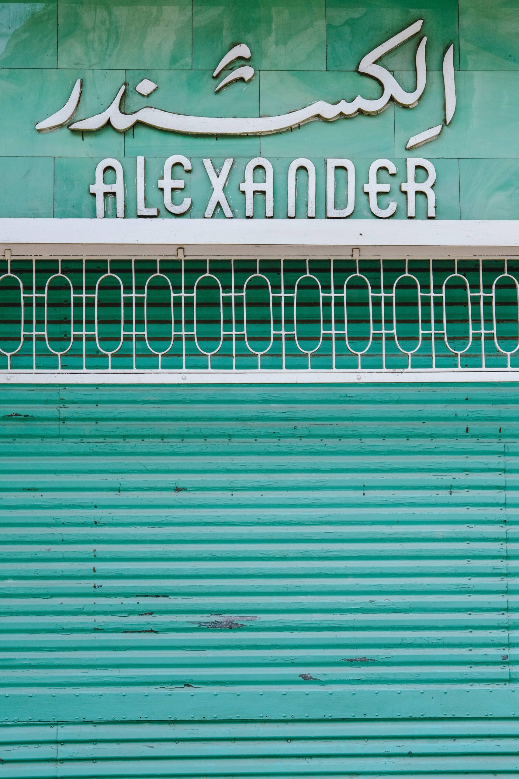
Arabic Design Archive (ADA)
The Arabic Design Archive is a research initiative that is aiming to preserve, document, and disseminate historical material about Arabic design. The project’s goal is to make these materials available for scholars, students, and practitioners to facilitate research and publishing about the history of Arabic design. The project has a collection of book covers, stamps, posters, lobby cards, flyers, film titles, cassettes, VHS tapes, and other materials.
Researchers:
Moe Elhossieny, Nourhan, Elbanna, Omaima Dijani, Yaman To’ma, Karim Fouad, Sophia Alami
Press:
VICE ARABIA
SCENE ARABIA
CAIRO SCENE
ITS NICE THAT
AL AHRAM
Al FANAR
Print Mag
Frizzifrizzi Mag
Creative Review
Egyptian Streets
Dark Mode
Arabic Commercials Collection
Arabic commercial archive is an extension of the Arabic cover design archive project. This project unearth commercial design from books, magazines, and publications from the 30s to mid-90s.
By:
Dark Mode
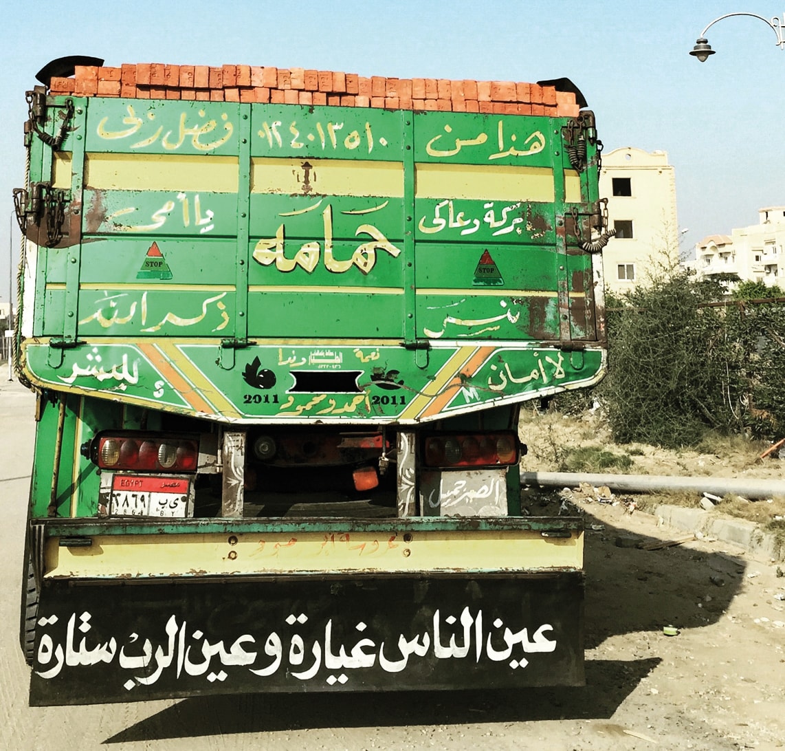
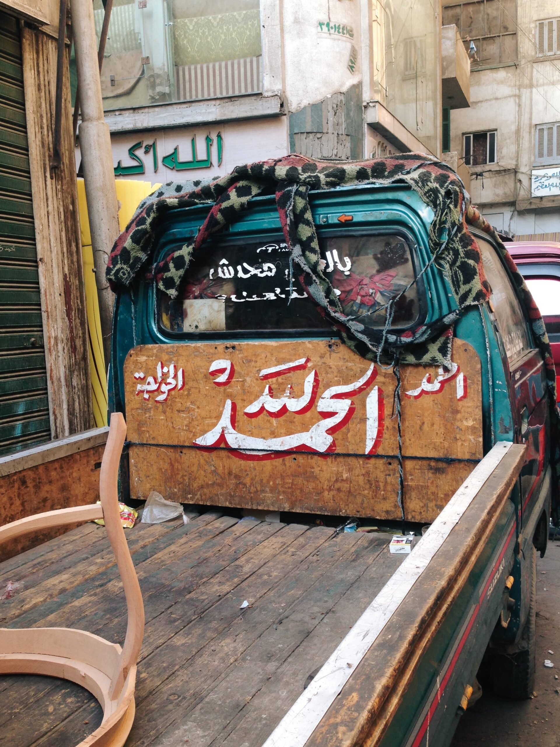
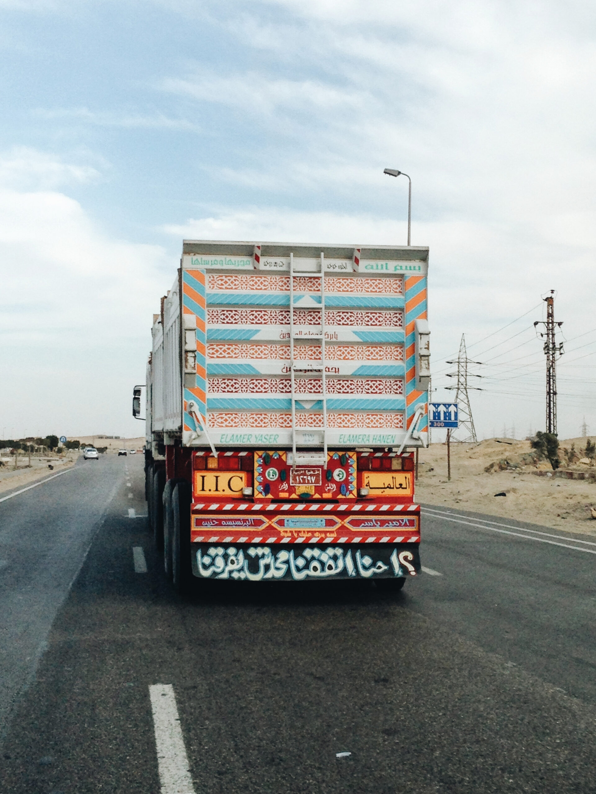
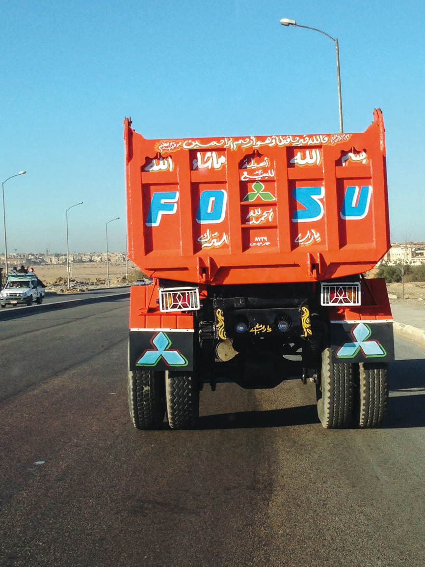
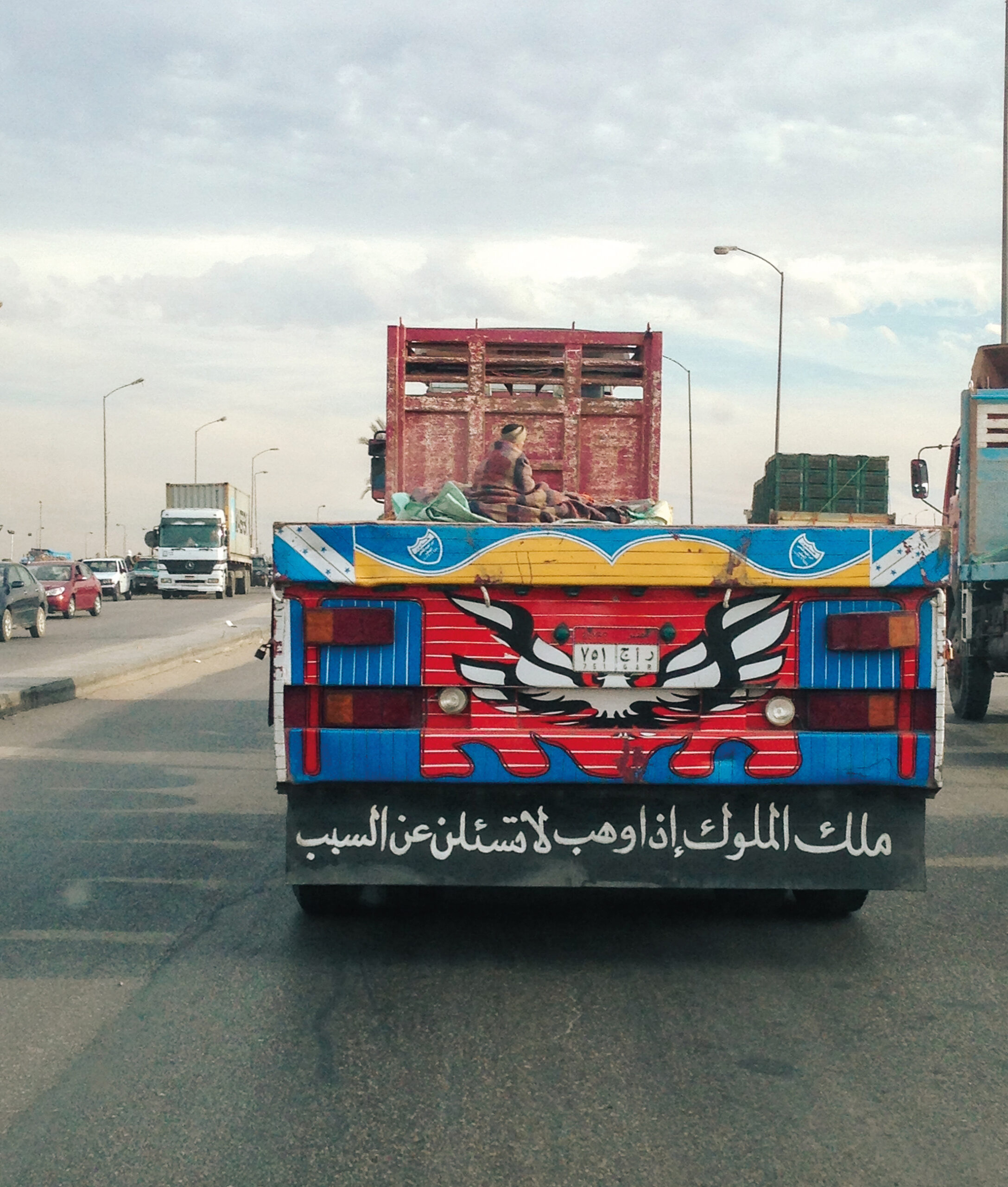
Trucks: A Moving Canvas
Buying a truck is expensive in Egypt, not something many can afford, and therefore the object of great envy. The truck represents a means, no matter how meagre, of economic advancement. While in many cases drivers are employed by the owner of the truck, regardless of ownership and financial liability, driving a truck in Egypt is a dangerous and risky business, both economically and physically. Egyptian roads and motorways are among the most dangerous in the world, and life and limb are at stake on every trip, along with the investment of the truck itself.
The truck is the driver’s most prized possession; it is his source of livelihood and it is how he feeds his children. It is also his eternal companion. Egyptian truck drivers are not minimalists, and it is rare to see a truck of any size that is not richly decorated. Driving through Egyptian roads, the common practice of decorating trucks, with calligraphy, stickers and all manner of other object, is hard to miss. Serving several functions, the decorations’ first objective is safety and protection from the evil eye, hence the use of written verses from the Qur’an or Bible, or invocations for protection through the Prophet, saints or other holy persons. Decorative stickers spell out such invocations; specific quasi-religious themes, such as the Hand of Fatima, are represented across a range of mediums; and physical objects are also employed, like the hanging of a blue eye stone, prayer beads or a baby’s shoe. All are attempts to protect the truck and its driver from the dangers of the road, envy and the misfortunes of destiny.
Beyond the appeals to higher powers and the workings of fate, purely decorative motifs also abound. Illustrations and stickers of Disney characters, juxtaposed against the rough worn out trucks, are always ironic, while giant illustrations or sticker collages of fierce animals, like lions or eagles, promote a masculine aesthetic. There are also standard auto signage staples everywhere, like stop signs and hazard triangles.

Noha Zayed

Noha Zayed
Despite there being a taxonomy and catalogue of repeated or copied motifs, patterns and expressions, no two trucks are the same. This shows how the truck itself is a medium for self-expression. It is a chance for the driver’s socioeconomic reality to be presented through the mouthpiece of the driver’s heroic alter-ego, producing writing which includes not only verses from the Qur’an, hadiths and other expressions of faith – religion being the most popular cloth to wear – but also movie or song quotes, witty declarations, the nicknames of his children, his stances on love and women, a name he’s given the truck (‘the confused songbird’ and ‘monster of the road’ are some examples), statements reflecting the confidence of his own grandeur, declarations of advice, warnings or anything else that can reflect the driver’s philosophy, beliefs, dreams, ethics, or grievances. In a way, it becomes his public voice.

Noha Zayed
Noha Zayed
Noha Zayed

Noha Zayed
Noha Zayed
Noha Zayed
Noha Zayed
For myself, I imagine a further function, unconnected to the driver, one that I can’t quite put my finger on. From personal experience, it seems that just at the moment I need to know it, be reminded of it, be told of it – I look up and there it is, the message I was missing: a verse of scripture, a line of poetry, a quotation or a time-worn piece of advice. Serendipity always seems to rule the road – visually amusing, thought-provoking fun that always has me chasing them down the motorways to get a photograph.
* This essay was first published in Khatt book in 2018.
Dark Mode
Language and Message:
Developing the Arabic script in Egypt
Travelling through the streets of Egypt, one cannot escape the overpowering role of language in the urban landscape. Words and phrases adorn buildings, vehicles, shopfronts and advertisements. Layers of time have rendered Egypt an urban palimpsest, where computer-generated fonts compete with traditional calligraphy and experimental lettering. The words on the streets are created by master artisans, graphic designers and craftsmen, and all have one common function: to communicate a message through language.
Thousands of years ago, the Ancient Egyptians were one of the first civilisations to utilise written language to communicate and preserve their existence. Their temples, tombs and papyri document royal and domestic affairs, tales of war, religious instructions, and even hymns and poems. Scribes attained a superior position in Pharaonic society where the art of writing was considered the language of the gods, closely associated with the divine. Not surprisingly, the language of Egyptians today, Arabic, is a descendant of hieroglyphics. The Arabic alphabet is derived from Nabatean, which descended from Phoenician, an offspring of the proto-Semitic alphabet. A small group of inscriptions (proto-Sinaitic) found at Serabit el-Khadim in the Sinai Peninsula – dating back to the sixteenth century BCE – are hypothesised to show an intermediate step between Egyptian hieroglyphs and the Phoenician alphabet developed in 1300 BCE. In pre-Islamic times, the Arabic script was established in North-Eastern Arabia and flourished in the fifth century CE among the Arabian tribes who inhabited Hirah and Anbar. It spread to Hijaz in Western Arabia, and its use was popularised among the aristocracy of Quraish, the tribe of the Prophet Muhammad.
Gamaliya
Warraq Island
In the seventh century, Islamic conquests moved from the Arabian Peninsula through the Middle East, North Africa and the Iberian Peninsula, spreading the Arabic language and Islam. In a few decades, Arabic became a leading world language and the intellectual medium which united most of the civilised world.
Arabic calligraphy flourished into its current system of discipline and elegance during the Islamic civilisation. Under the Umayyads and Abbasids, court requirements for correspondence and record-keeping resulted in many developments to the cursive scripts, and several styles were devised to fulfill these needs. Ibn Muqlah, (Abu Ali Muhammad Ibn Muqlah, 886–940 CE, Baghdad), was one of the most accomplished calligraphers of the Abbasid Age and the inventor of the Naskh script, the first proportional cursive style of Arabic calligraphy. His development and standardisation of cursive scripts, elevated them to a place of prominence, replacing Kufic as the standard for writing the Qur’an. A balance between clarity and aesthetic was crucial to the formation of this art form, which embodies a ‘disciplined freedom.’ Calligraphy reached its peak during the Ottoman era, when calligraphers invented and perfected several styles. They refined and developed the art of calligraphy over a period of nearly five hundred years, attaining the highest level of expertise in the nineteenth and twentieth centuries.
The Khedival period of Egypt (1805–1914 CE) was marked by dramatic cultural changes, producing a visual culture that borrowed from European aesthetics. Muhammad Ali ruled Egypt from 1805–1849, and was often referred to by historians as the ‘founder of modern Egypt’, responsible for its reform and modernisation. As this cultural and economic period developed, so did the need for calligraphic applications on products, public spaces and state publications.
At first, calligraphic expressions were traditional manifestations of rule-based calligraphy (one that follows proportional standards) that reached prominence in the Ottoman era, and typography was confined to the limitations of the printing press and the rigidity of movable type.
Siwa Oasis
Then the 1879–1882 Egyptian revolt led by Ahmed Urabi, an officer in the Egyptian army, called for an end to the rule of Muhammad Ali’s family and to limit the European influence in Egypt. This signalled the birth of a primordial form of nationalism, one which celebrated Egypt’s heritage and geography. This nationalism was further bolstered by the 1919 revolution against the British occupation, led by a follower of Urabi, Saad Zaghloul, and other members of the Wafd party. The revolution, along with the establishment of the Wafd party, the birth of modern archaeology and the discovery and transporting of ancient Egyptian monuments into Europe, had a significant influence on Egypt’s intellectuals. Artists and writers, in pursuit of a national identity that rejected foreign occupation, extracted iconic forms from their visual heritage to represent what it meant to be truly Egyptian, and thus moved away from the power-laden mode of visual presentation attributed to colonial hegemonic power. During that time, the Royal School of Calligraphy was founded in Cairo in 1922 by King Fouad, and can be considered the first school in the Islamic world with the goal of preserving the art form by creating a new generation of skilled calligraphers.
Downtown
The creation of new political parties, rapid technological changes and development of the arts and media cultures all contributed to Egyptian society’s departure from the pre-colonial world. New image-making technologies were employed to serve political print cultures such as magazines, newspapers, banners and posters. Audiovisual industries including the film and music industries were significant components of popular culture. Industrialisation produced a consumer culture, and mass media contributed to expanding creative production. To support this, there was a need for typographic expression that the technology at the time could not provide. Calligraphers utilised their knowledge of the Arabic script and fused it with an experimental approach, creating modern manifestations of lettering that departed from Ottoman calligraphic standards. Simultaneously, many attempts at simplifying or even ‘Westernising’ the Arabic script were attempted, with the Academy of the Arabic Language in Cairo leading a number of competitions in the 1930s to reform the script in order to work with Western printing conventions. However, many of these proposals were rejected, and hand calligraphy and lettering continued to dominate popular culture.
In the 1950s, Nasser’s nationalisation of the Suez Canal, major industries and the banking sector brought Egypt closer to a vision of self-sufficiency, producing everything from the ‘needle to the rocket’, as he preached in one of his iconic speeches. This created a need for the branding of Egyptian products to reflect an identity that was distinct from the Europeanised monarchy that preceded it, and this continued through the 1960s, 1970s and 1980s, where calligraphers were commissioned on a regular basis to render shop signs, movie posters, adverts, titles of books and magazines, and even newspaper headlines.
Today, Egypt is still considered a calligraphy hub that possesses a rich tradition of education and production, currently boasting 390 calligraphy schools, annually graduating 12,000 calligraphers. Despite this, Arabic calligraphy is still endangered. Digitisation of the Arabic script has led to the decline in the demand for hand-drawn lettering and calligraphy and beautifully rendered, hand-drawn urban expressions are replaced with computer-generated fonts that are often limited in their design. A key reason for the lack of quality of Arabic fonts used for commercial purposes is the slower development of Arabic type-design in the Middle East, due to the complex nature of the Arabic script along with technological limitations in addressing this complexity. This improved a great deal with the introduction of OpenType technology in the 1990s, which allowed type designers to integrate language-specific font behaviours and honour Arabic script grammar. However, access to well-designed typefaces remains limited to expert graphic designers with exclusive knowledge of software and typography. Furthermore, there are only about one hundred Arabic typefaces available to designers today, compared to thousands of fonts for Latin languages. As a result, the visual typographic expressions on the streets of Egypt are a mishmash of various hand lettering solutions, calligraphic expressions and digital fonts.
Downtown, Cairo
Arabic type design continues to evolve at a rapid pace, and young type designers, aided with enhanced technologies, are shattering the limitations of computer-generated fonts, allowing them to function in innovative and groundbreaking ways. Yet despite this, there is a nostalgia associated with handwritten lettering that can never be replaced with a digital alternative. A nostalgia that is potent in urban Egypt. You can see it in the faces of the people on the street, smell it in the hustle and bustle of the traffic, hear it in the sound of car horns and street vendors, and read it in the words that adorn everything you see, words that weave the rich and complex tapestry that is Egypt.
* This essay was first published in Khatt book in 2018.
Dark Mode
The Culture of Dummies:
A Mapping of Tutorialism
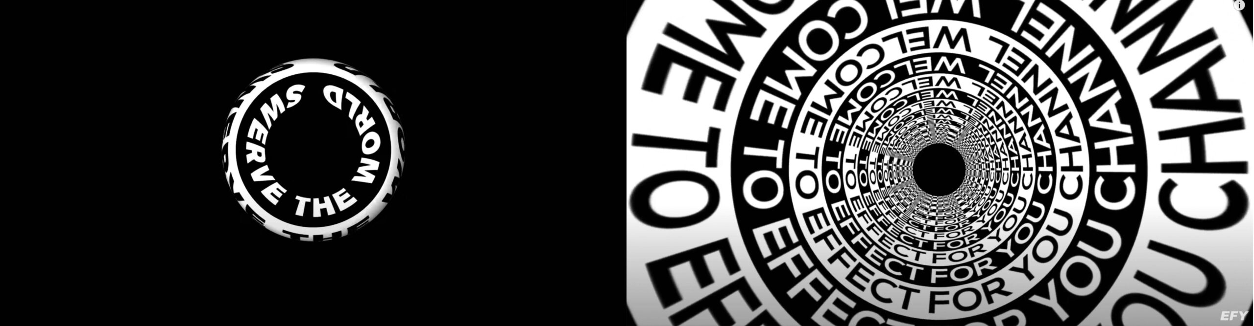
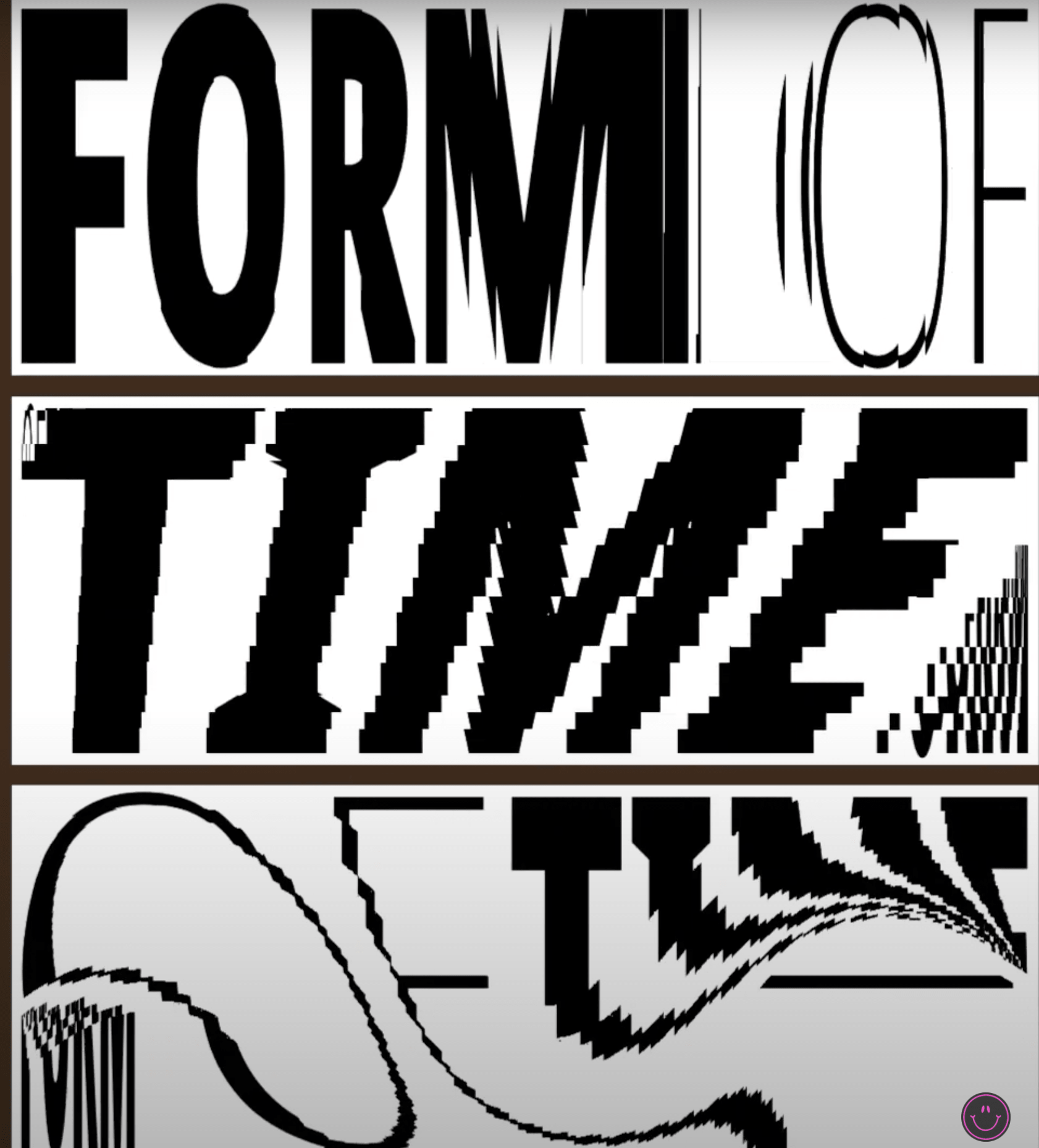
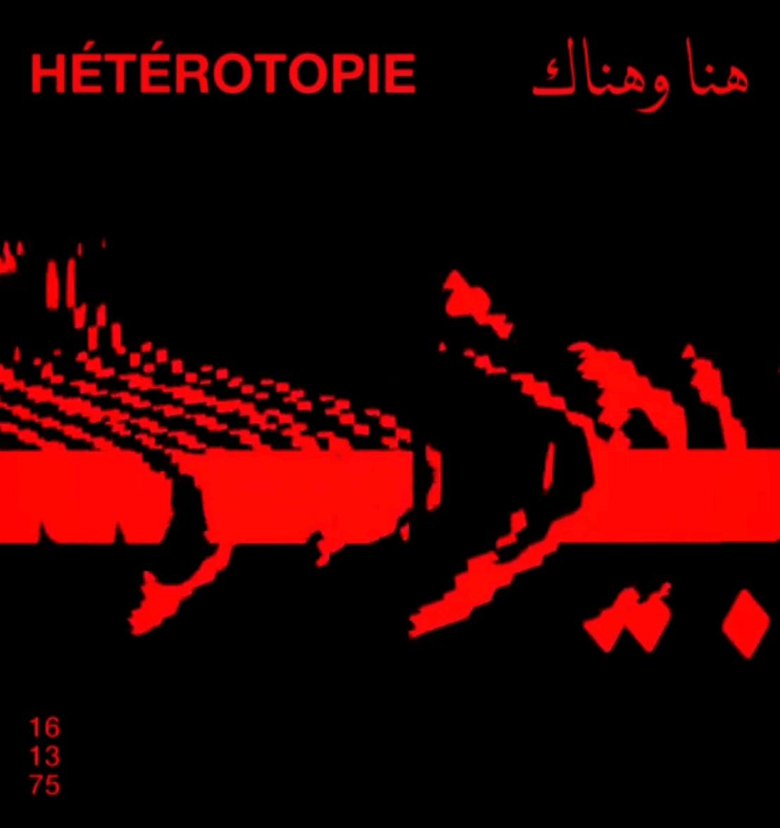
Over the past year, I have observed a flow of crude visual output, making debuts on several platforms ranging from social media and websites to billboards. They are what is technically known as kinetic typography, i.e. a fancy term for moving text. These images and clips appeared visually striking and had bold typographic treatments; contrasted with black/white backgrounds and, in some cases, wrapped around an arbitrary geometric 3D object. The swirling visuals had a hypnotic trait in that they were animated in space. They were either rotating, moving across the screen in delayed intervals, or maintaining a POV that granted a deep sense of immersion. With the visual’s design and aesthetic direction geared towards a distinct all-embracing feel, the viewer gets an Op Art-esque treatment to the moving typography.
a Youtube tutorial
The Op Art movement arose in the early 60’s. It used a framework of purely geometric forms as the basis of its effects. It also borrowed inspiration from color theory and the psychology of perception. It was primarily concerned with creating optical illusions through the use of certain visual attributes, thereby tricking the viewer’s eyes to perceive depth or an illusion of movement.
Time Magazine, where the Op Art term was first coined, claimed that it simultaneously pulled the viewer in and attacked their eyes. This movement is also considered a form of Kinetic art, wherein artists began exploring the idea of how time can potentially be experienced in an art piece. Op Art had strong and fresh visual results, alas, short-lived. By the end of the 60’s, it gradually integrated itself into pop art and minimalism. But its influence can be discernibly observed to this day.

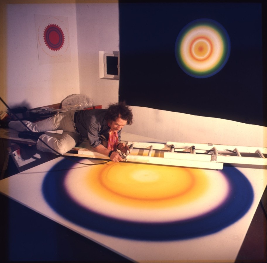
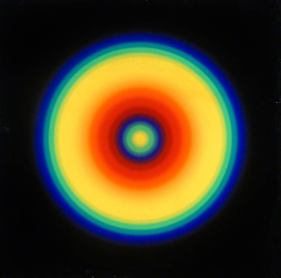
Bridget Riley
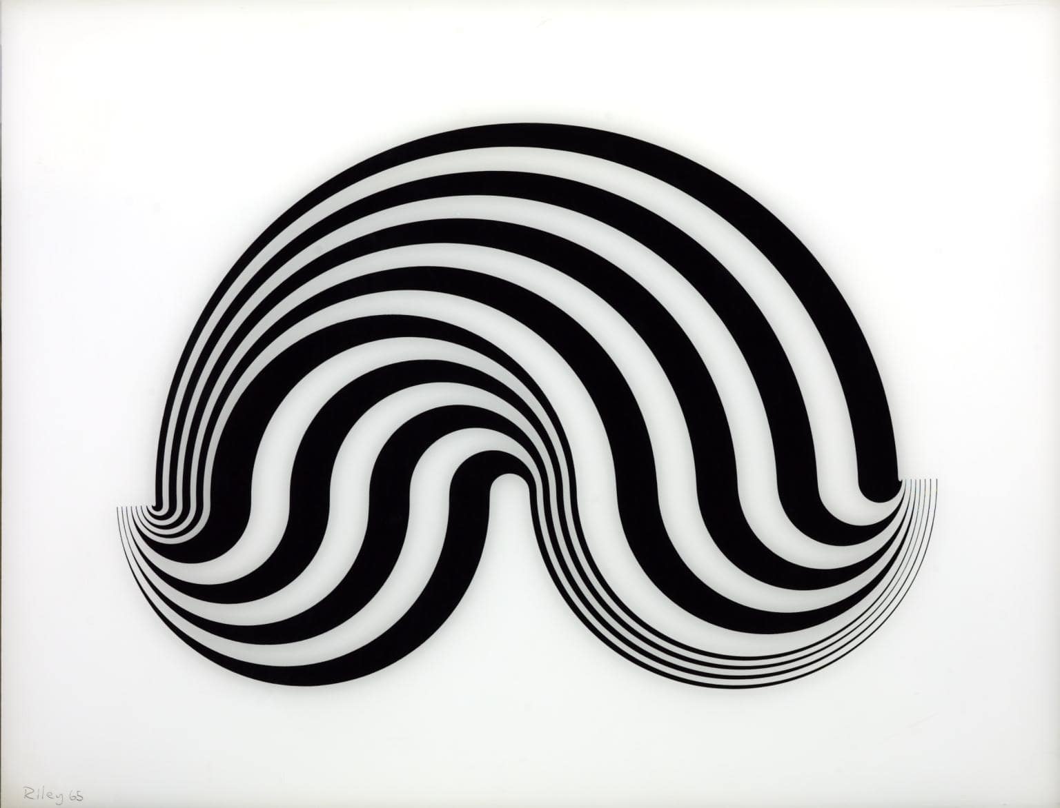
[Fragment 5/8]
Bridget Riley
Above are a set of visuals, one taken from YouTube and another from Bridget Riley, a prominent figure from the Op Art movement. By a simple juxtaposition of the two, one can see the resemblance these visuals have to Op Art. An art enthusiast with an eye for design can easily bridge the connection between the two. However, upon further inspection, this resemblance is not the result of a deliberate decision that said designers came to revisit the Op Art and Kinetic movements. It was not by the natural means of drawing inspiration from the movements, examining the visuals further, and consequently, experimenting with the visuals in a modern context, on Adobe After Effects. It is rather sobering that this familiarity we are noting is the mere doing of these designers following the same YouTube tutorials.
These so-called “designers” have entered a rabbit hole of uniformity. On the one hand, there is the designer that put together the tutorial and curated most of the design choices that brought about a particular visual aesthetic, leaving countless designers, on the other hand, to use that same tutorial that may as well be dummy text – filling in their material and claiming it as their own. This is evident in a tutorial posted around a year ago on a YouTube channel called Dope Motions. The channel is owned by Nikhil Pawar, a Motion & Graphics Designer, according to the About section on his website. He released a series of tutorials demonstrating how the coupling of particular After Effects functions can lead to the creation of several visual languages.
Throughout the past year, a few more tutorials of the same nature were released by the same channel, now, with packs of ready-to-use templates available for purchase from a variety of websites.
What struck me was the heaps of young designers racing to imitate these tutorials, only to produce carbon copies of the original visuals. To make matters worse, the outcomes are then shared as novel design experimentation or as actual work.
Similarly, contrasting colors have shown a recent spike (coincidentally, the black and white trend is gradually dimming) following the introduction of a new flow of tutorials involving C4D and AE from a channel by the name of madebytiger. It goes by the same concept, except it features more 3D objects from C4D, pop colors and better lighting.
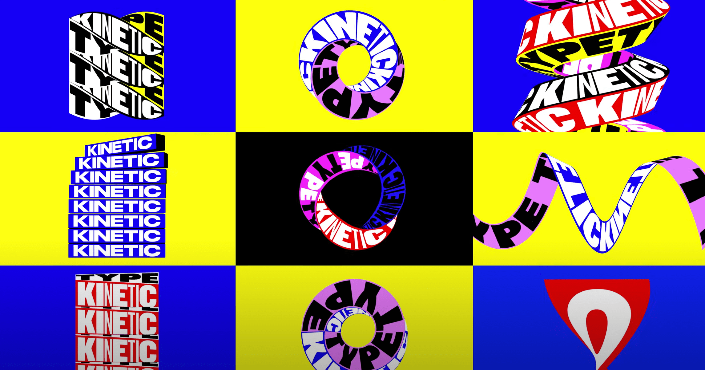
Madebytiger
The same approach can be seen, but with more technical sophistication. Presenting bold typography and 3D effects, these tutorials have shown to be useful in my experience; upon watching a few, I have grasped a great deal of technical prowess and seen the untapped potential of After Effects and C4DI took the liberty to interview Tiger Zhang, the Boston-based designer behind the channel madebytiger, to gain insight into why he is creating these tutorials.
Q: What made you start creating these tutorials in that specific visual aesthetic? What was your inspiration behind it?
I shared my short videos about kinetic typography, and viewers asked for the tutorials in the comments. So, I started recording videos when designing the kinetic typography in After Effects or Cinema 4D.Frank Gehry’s work inspired me because there is movement in his architecture.

Frank Gehry


Las Vegas
Frank Gehry
Were you influenced by the Op Art movement from the 60’s?
I got insight from Op Art. The tutorials that I uploaded to YouTube are my experiment projects with the question of how I can imitate a three-dimensional environment in two-dimensional form.
Do you intend for your tutorials to be replicated exactly as they are? If not, what is the purpose of your tutorial?
No, I do not. Through my tutorials, I hope I can show that the combination of typography and motion design can deliver more value and express emotions to our audiences.
Is there anything you would like to advise people watching your tutorials in terms of how they should include that in their workflow?
I think technologies such as After Effects and Cinema 4D are easy to learn. The tool is not the answer, the designer is the answer – so, stop following the herd.
In a humble 4 questions to Tiger Zhang, one can deduce the intention behind these tutorials and better understand the inspirations he drew from.

Taking a glimpse at the lackadaisical attitude of today’s designers, one can easily speculate that this technology will gain traction and give rise to a new trend. The culture of mimicry will transpire leading one to anticipate the impressions of seemingly identical designs.
Now, let us examine what it means to imitate with little consideration, curiosity to investigate, or desire to build on technical skills learned. To begin with, this suggests that the mere act of following steps has the capability to produce work that possesses aesthetic or conceptual properties. On the contrary, it can be the dreariest, if not the most degenerative, activity a creative can perform. It may as well be done by a computer programmed to follow the same sequence with the permission to alter a few extra variables. The product would be roughly the same.
What is the value a designer brings to the table when sharing such work? What is the work’s inherent worth? The posed questions deserve some reflection. It is a cynical reality in which the creative industry is a passive bystander to these primitive propositions, only to be met with praise that is, quite frankly, out of place. In fact, it reflects a deeper flaw in the grounds upon which one defines ‘design’ and how the field respectively measures creativity.
With the lack of better education and the deficit in design criticism, both internal and external, these templates are deemed the one-stop-shop for a creative process. The outputs they create, unobstructed by much-needed criticism, subsequently leave unrelenting scars on our design history. The widely accessible blueprint opens the door to the general adoption of this practice, giving it false credibility as a means of creation.
A few keywords that could define this new wave are: Skimming, scanning, hover over, scroll, and swipe.
All terms that deal with the surface-level inspection of the subject in question.
All too often, designers look to the work of others as the source of inspiration while scouring the internet for visual references. Rarely was the source of inspiration art itself. It comes as no surprise that this practice was adopted by many designers in Egypt, dictating a style that appeals to anyone without the exposure necessary to detect the banality of the work in the eyes of designers and non-designers, alike.
It is crucial to highlight the risks that the lack of sufficient internal design criticism have posed, leaving visual culture to a roll of the dice, perpetuating poor critical thinking and peer reviews with no substance.
Instead of shaping a designer with a clear-cut, distinct style, it is leading to the prototype of a designer with short bursts of style that come and go with the seasons.
Design criticism is a dodged practice in Egypt and more often than not, it is taken as a personal attack, rather than professional, constructive feedback. One reason I wrote this essay is to break the taboo of design criticism and normalize it as a practice that I believe is to the benefit of visual culture. Another reason is in efforts to develop the healthy practice of critical thought, analysis and understanding of design. Through this, I aim to question myself and challenge my own thought processes and practices.
I believe that design criticism is aimed at untangling the mysteries and intricacies of design for oneself, first and foremost – given the designer harbors a keen sense of curiosity. Secondly, for the community of design in creating a healthy discourse surrounding given topics. And lastly, for the public, in making design more understandable and accessible to the untrained eye.
Going back to the matter at hand; in parallel to Op Art, where patterns, shapes and colors were selected for their illusory qualities rather than for their substantive content, there is the general aesthetic treatment of these tutorials. The designers originally producing these tutorials know the exact reason behind every choice made, be it the high contrast, the bold typography, or the particular shapes. They are carefully designed to attract the viewer’s attention, even hypnotize, as they reveal themselves on the thumbnail of a video on YouTube.
And so, designers fall prey to the allure of the visuals, follow the allocated steps and possibly pick up a few pointers about the software. The designer produces a work and plays with a couple of trivialities to more closely represent their identity, and proceeds to share it with their ecosystem. Some may credit the source where they arrived at this visual style from, while others hope that this aspect goes unnoticed, as they edit “Your Text Here” to “Summer Vibes”, or appropriate Arabic text as an effective concealer.
One of the arguments in favor of this practice is that it is considered as experimentation, and therefore, should be tolerated under that. The fact of the matter is, it should not be.“The word ‘experiment’ has come to justify a multitude of sins”, as Steve Heller, the design critic, pointed out. He was referring to the indifference that arises as a result of inadequate definition of ‘experimentation’ in university projects.By definition, creative experimentation is the process by which a designer engages with an idea in exploration of its full potential, through the utilization of the tools available at hand or new ones.
The process can involve several different methods; to mention a few: repetition, tracing, juxtaposing, alteration, association, adjustment, filtering down, clarifying amongst others. All of which usually happen simultaneously unless the designer intentionally designates specific attributes to work with.Experimentation, as most skilled designers know, is essential to any successful project. It can often be ugly and messy but other times, deeply intriguing. It is the fuel of the design process. Steve defines its formula as a mixture of elements, to which I will contribute some of my own:
Intuition, intelligence, creativity, discipline, curiosity, and constraints.
Take the Ames’ Guide to Self-Instruction in Practical and Artistic Penmanship as an example of commitment and dedication in experimentation.
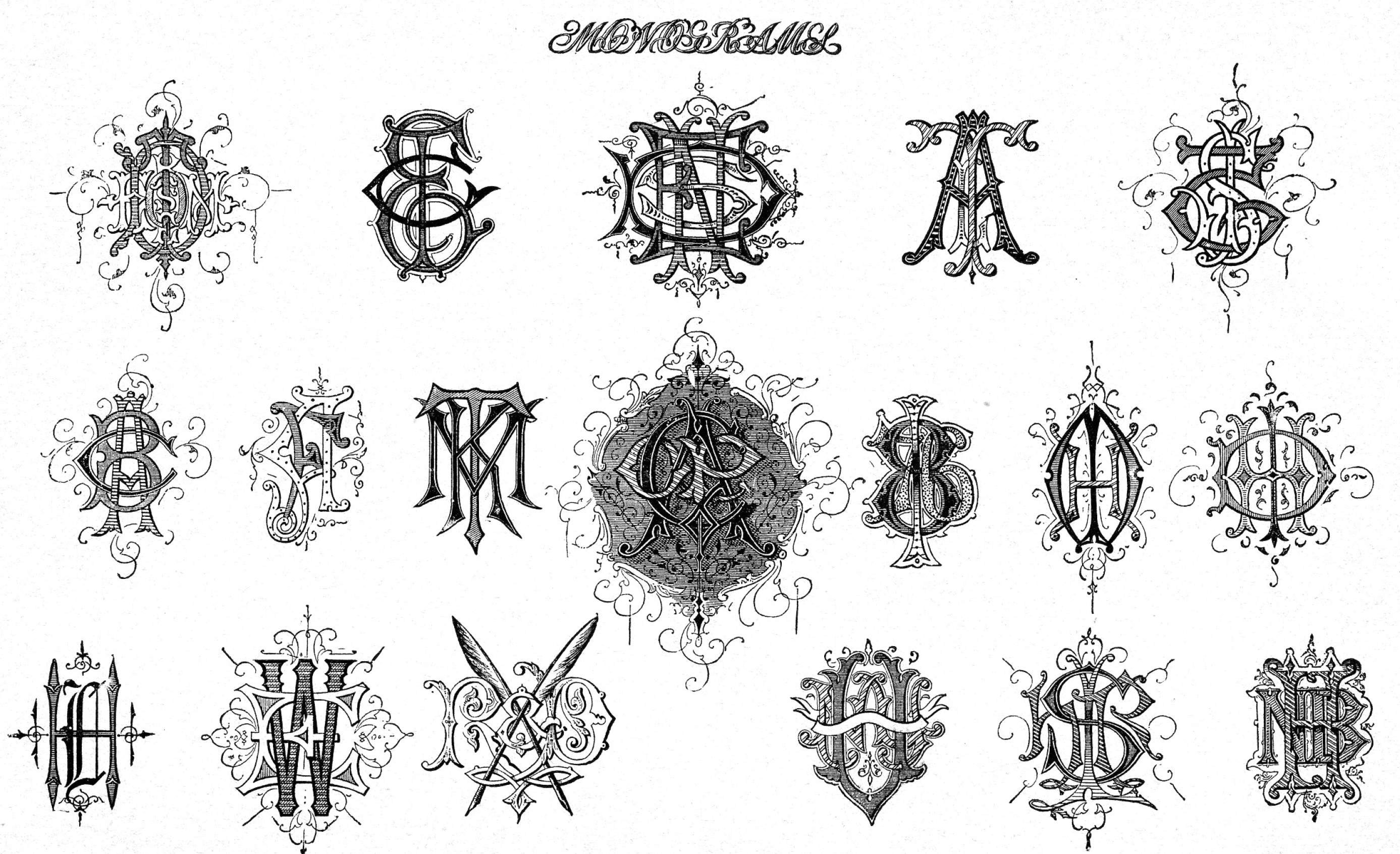
of hand lettering and type experimentation HERE
Another example of this exercise that was made by the Italian designer Bruno Munari, aiming to expand a person’s idea of what a face looks like using variation and repetition. Munari used a familiar icon and asked a simple question: how many variations of the front of the human face can I imagine?
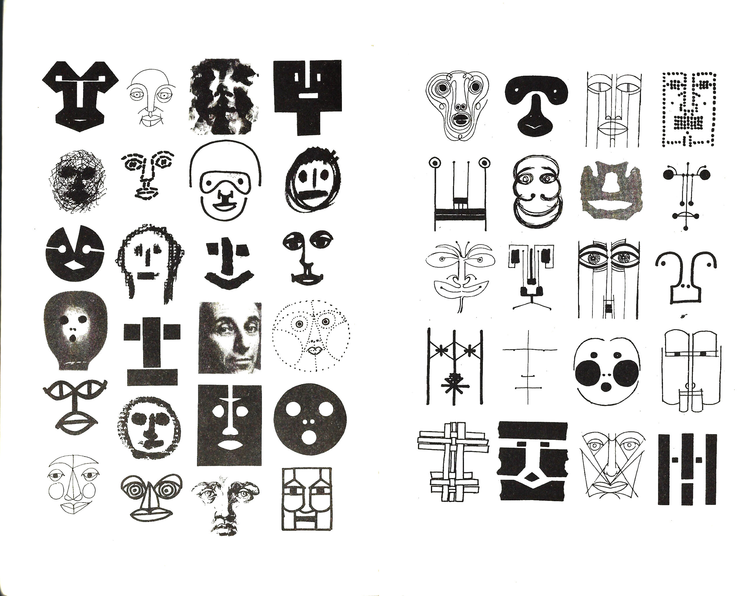
Bruno Munari
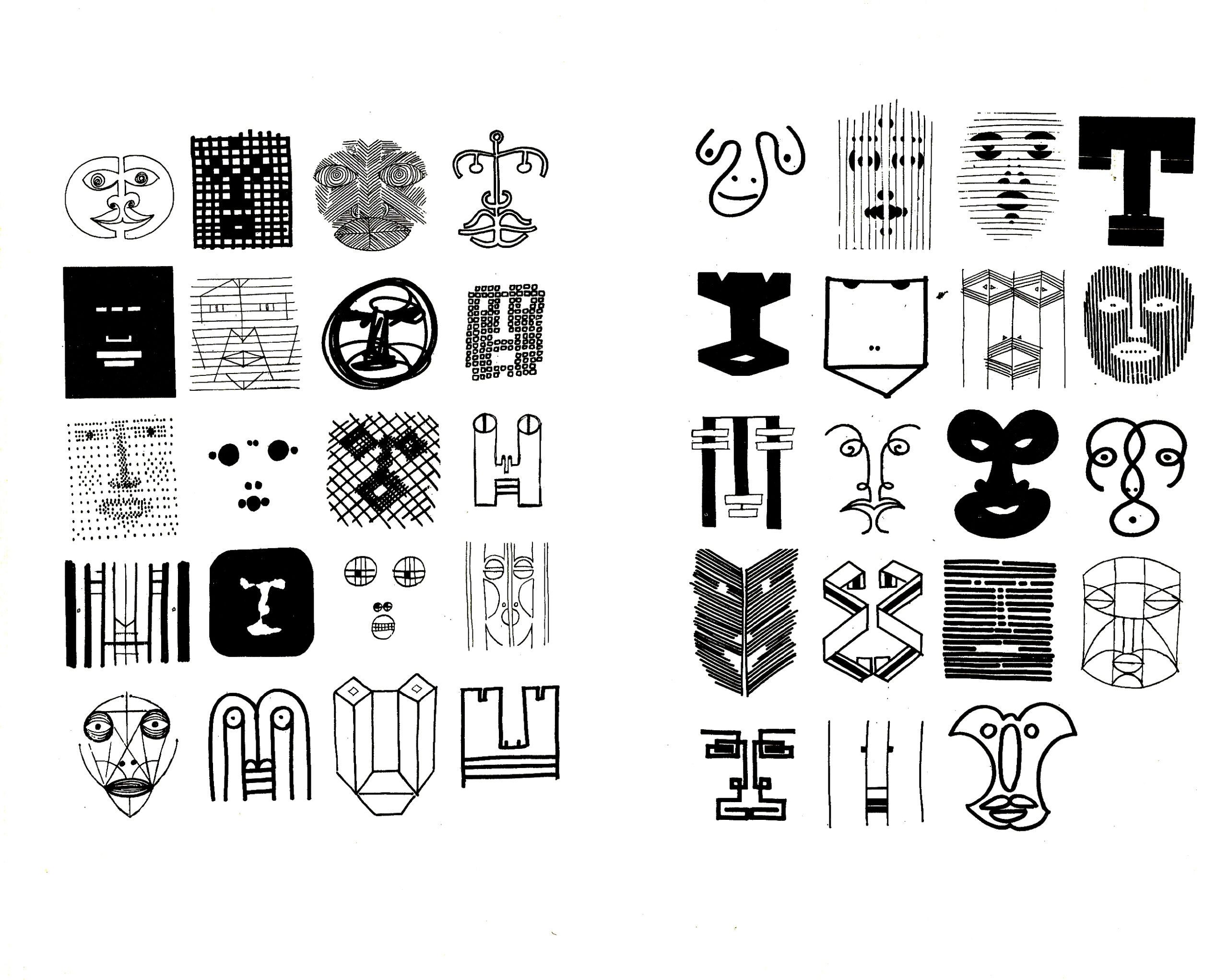
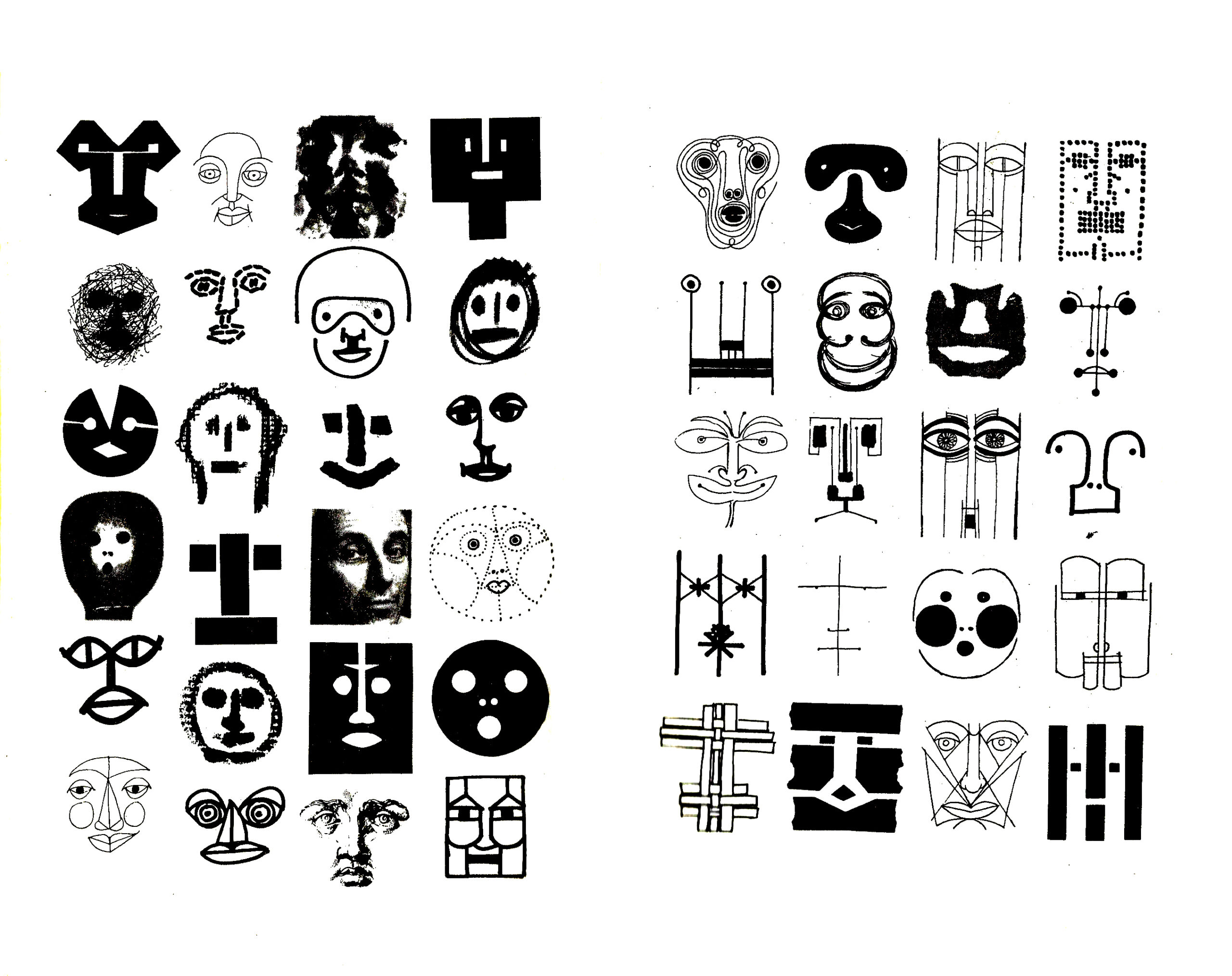
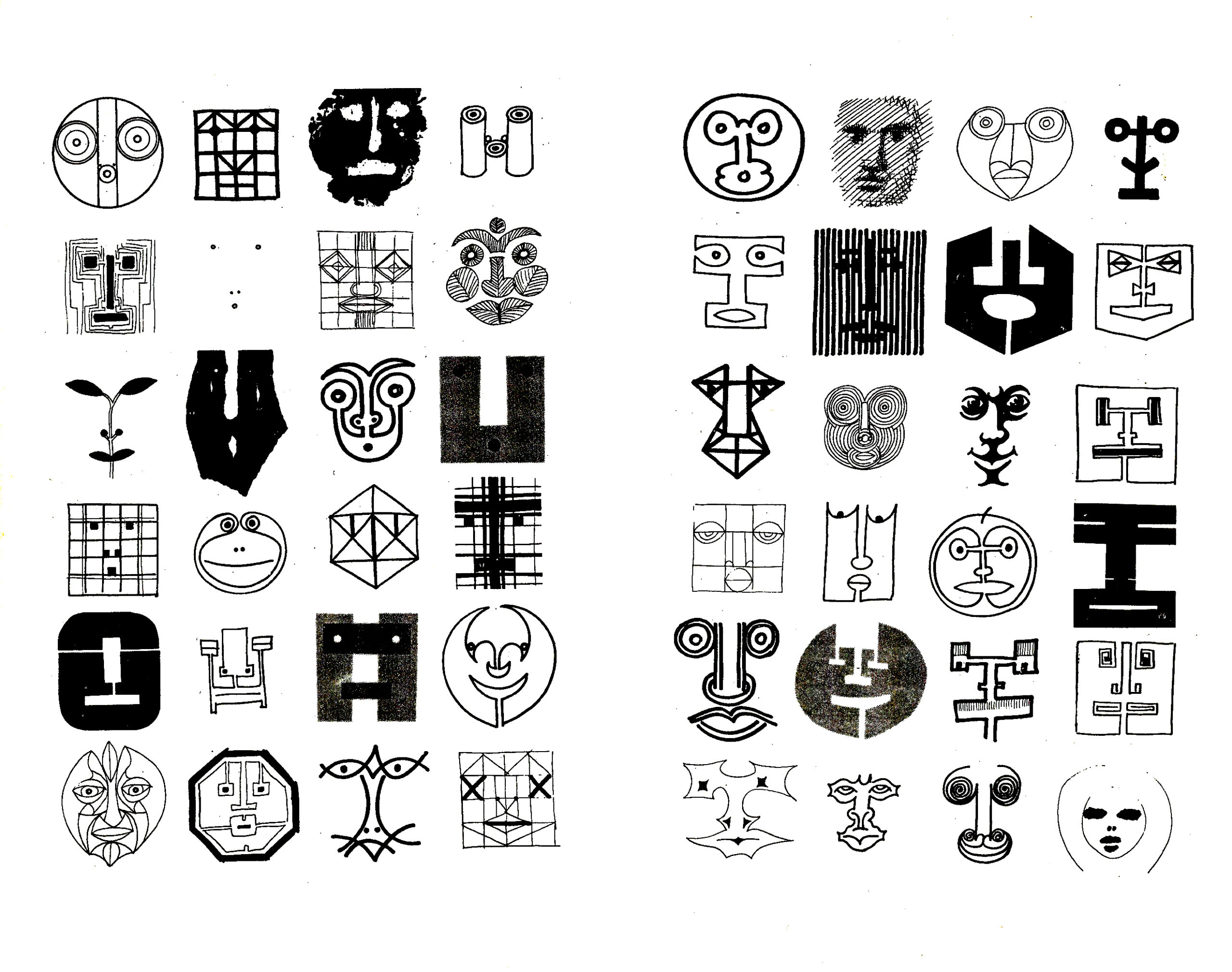
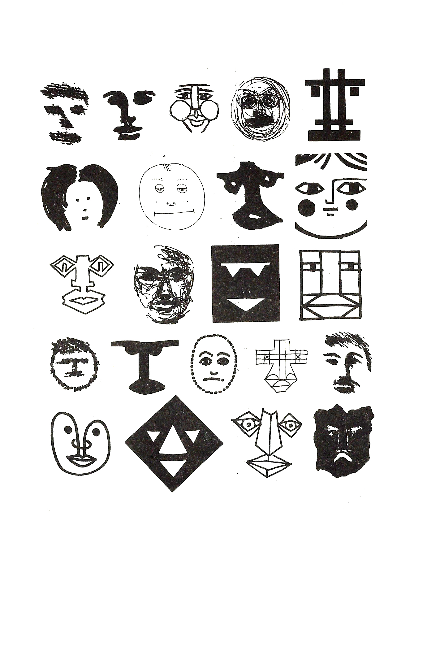
The results are fascinating, to say the least. Such an exercise was useful in that it involved a process of deep vertical thinking of a myriad of possibilities that could arise from zeroing in on one visual element. It also challenged the normative image of the face in the mind, using repetition to force the brain to find new relationships, juxtapositions and displacements that led to unorthodox results. These results would not have been possible had this exercise not been explored in its totality.
Comparing this definition and execution of the creative experiment to that of following a tutorial, exposes the superficiality of the process and outcome of the latter. So, the main problem of this argument is that it flattens the definition of what experimentation is. These visual reproductions are starved of intention, curiosity, constraints, rigor, or creativity. They are predesigned templates that use dummy text and a dummy visual language that is only intended to showcase a way of working and not to impose aesthetic choices.This fault is not only limited to the definition of experimentation, but, to a disconcerting extent, reflects the state of the Egyptian designer; one that uses pre-cooked formulas, scans visual elements horizontally and never digs into one symbol vertically. The current culture of mockups is one that places more emphasis on the designer’s portfolio than their actual work. It creates fictional parallels of visual outputs: The designer’s portfolio including clean 3D mockups and predesigned templates vs. The actual work. It also goes to say how modern-day Egyptian designers place unwarranted value on how their work performs in the real world as well as their skewed perception of the design process, where it begins and ends.If the presentation of the work in a designer’s portfolio matched that of their acumen in reality, we would witness a much higher-caliber visual environment, but that is a topic to cover in depth in another essay.
“It is said that imitation is a good start, but when imitation becomes the creation, then creativity becomes flat reproduction.”
This phenomenon is not a novel or foreign one. Remember the glitch, warp, slit-scan animated typography? or the don’t blink effect animation?
This culture has existed for years. For the sake of convenience and so that we can reference it back in the future with a name, let’s call this phenomena Tutorialism.
a youtube tutorial
by studio Akakir
The aim of this essay is not merely to highlight the problems of the current design scene but also, to give pointers that would hopefully inspire. Taking the example of Op Art, there are several noteworthy pieces that can be studied deeper. The notion of ‘study’ should be treated as intrinsic to the design process and be demonstrated consistently
by the designer.For example, the extraordinary works of artists Peter Sedgley and Victor Vasarely.
Peter Sedgley
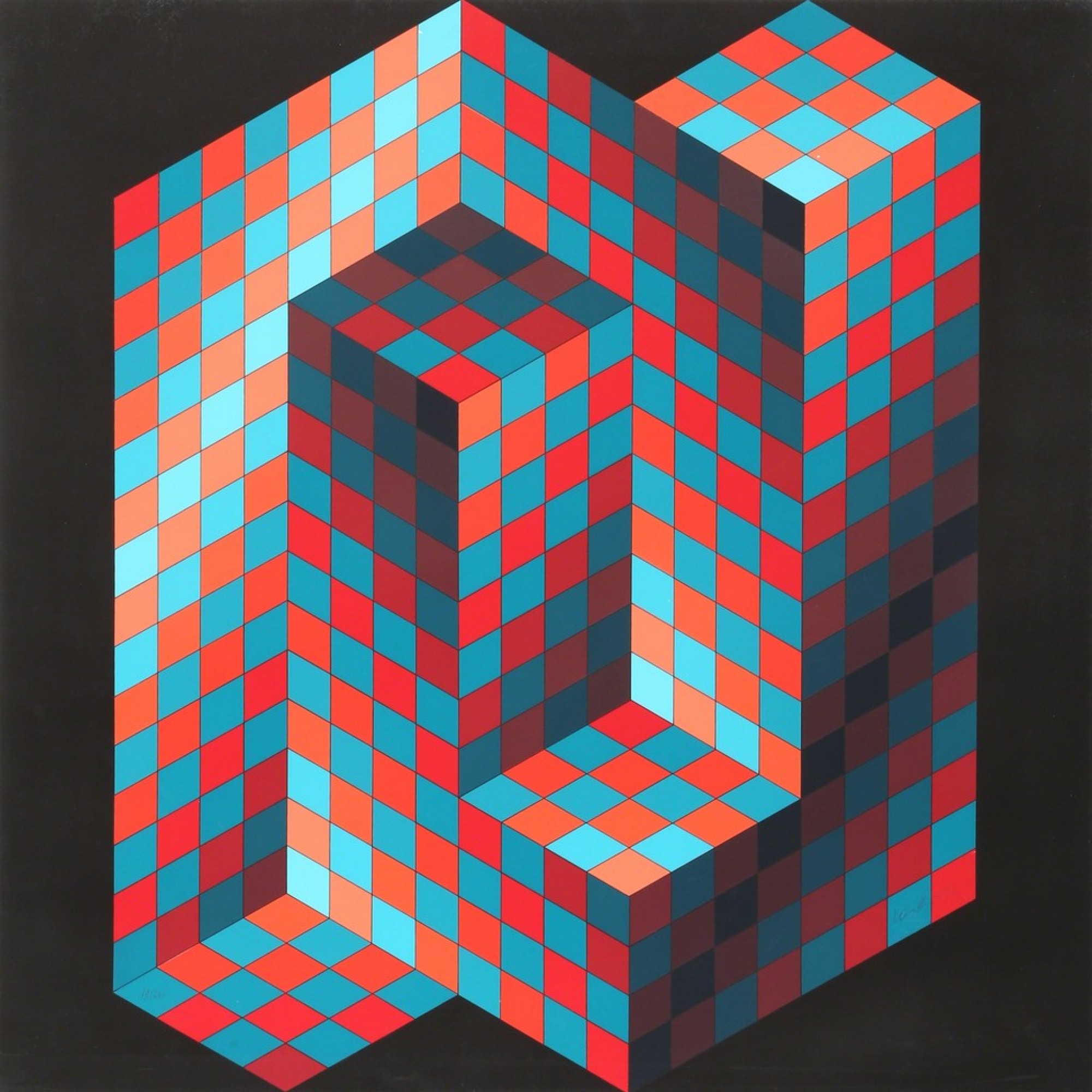
Victor Vasarely
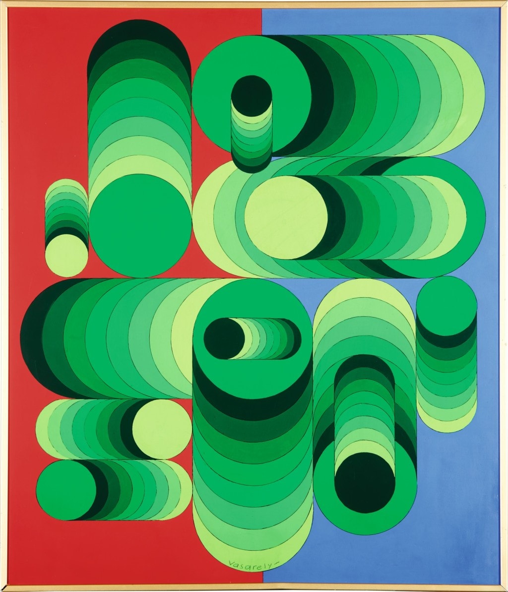
Victor Vasarely
It could serve designers better to feed their mind the works of said artists, to deeply immerse oneself in the study of their processes and examine their mindful choices. It could even serve as a better visual stimulus than the urge to share their easy productions in return for transient external validations. I believe the real validation to be sought is an internal one; one that comes about from the knowledge of having exhausted all the possibilities for the work at hand; that it is thoughtful, experimental and perhaps original.In his book The Conduct of Life, Ralph Waldo Emerson notes:
“the secret of ugliness consists not in irregularity, but in being uninteresting”.
Tutorialism is a far cry from real ingenuity in design. It is as uninteresting in its process for the imitator as it is for the viewer. And if it is uninteresting then it is ugly, according to Emerson.Ultimately, these visual reproductions are highly dependent on the lack of criticism from within the field and receive validation from the untrained eye. By flattening the creation process to become a matter of replacing dummy text and dummy visual language, they perpetuate dummy mass visual culture which ought not be tolerated.