Design history is commonly defined by European, colonial, capitalist, and patriarchal values. In this short essay, I will share six orientalist posters that served as advertisements promoting a fantasized Morocco in the 19th century yet are overlooked in the history of graphic design. Advertising and publications shape everyday life culture, values, beliefs, and lifestyles. In this context, oppressive and colonial narratives have been disseminated. That is, orientalist enthusiasts of all things oriental employed colonial and stereotypical associations on Morocco to design posters.
The first posters can be traced back to the early 1890s when the P.L.M. network (Paris, Lyon, Mediterranean) expanded to Algeria and Tunisia, a few years before the protectorate lasted from 1912 until 1956. Because of the development of transportation and travel companies promoting tourism, the genre experienced a massive boom. These posters were first full of colonial exoticism. Later, the colonial perspective became more subtle, with the commissioned artists focusing on the landscape, the nuances of the color palette, and the light as persuasive means for Europeans to visit Morocco. In the second half of the 20th century, printed media started to replace paintings and illustrations with typographic compositions to attract tourists, which certainly coincides with the flourishing modernist movement and, on the surface, the dismantling of an exoticized representation of Moroccans.
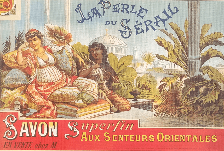
La Perle du Sérail, chez M
Translation of messages:
The Pearl of Harems, superfine soap with an oriental scent, Sold at M
La Perle du Sérail’s soap advertising for “M” follows a Victorian aesthetic mixing several typographic treatments, colors, and textures. Its tone is colonial, reinforcing the imaginary of racist and sexist exoticism. That is, this advertisement is used to portray a sense of luxury associated with an “oriental scent.” In addition, it is promoting cleanliness by depicting white skin, a common marketing argument following the standard of beauty of that time. Indeed, we see a Moroccan woman with white skin wearing traditional clothing, laying passively on several pillows next to her enslaved Black woman, who is using a leaf to keep her cool. Both look content with their situation. The palace and vegetation in the background further add to the oriental lavish stereotype.
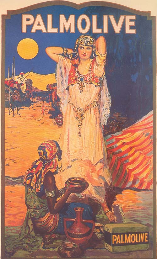
Palmolive, 20th century
Translation of messages:
The Pearl of Harems, superfine soap with an oriental scent, Sold at M
Similarly, this early 20th-century poster promotes the whitening benefits of the Palmolive soap, which first appeared in 1898. The sand, the tent, and the man on a horse in the background refer to the Moroccan Sahara. In the foreground, we have a sexualized amazigh woman with white skin adopting a sensual posture. Next to her is her enslaved seated Black woman holding a bucket of water for her. This poster is another racist, sexist and stereotypical depiction of Moroccan life.
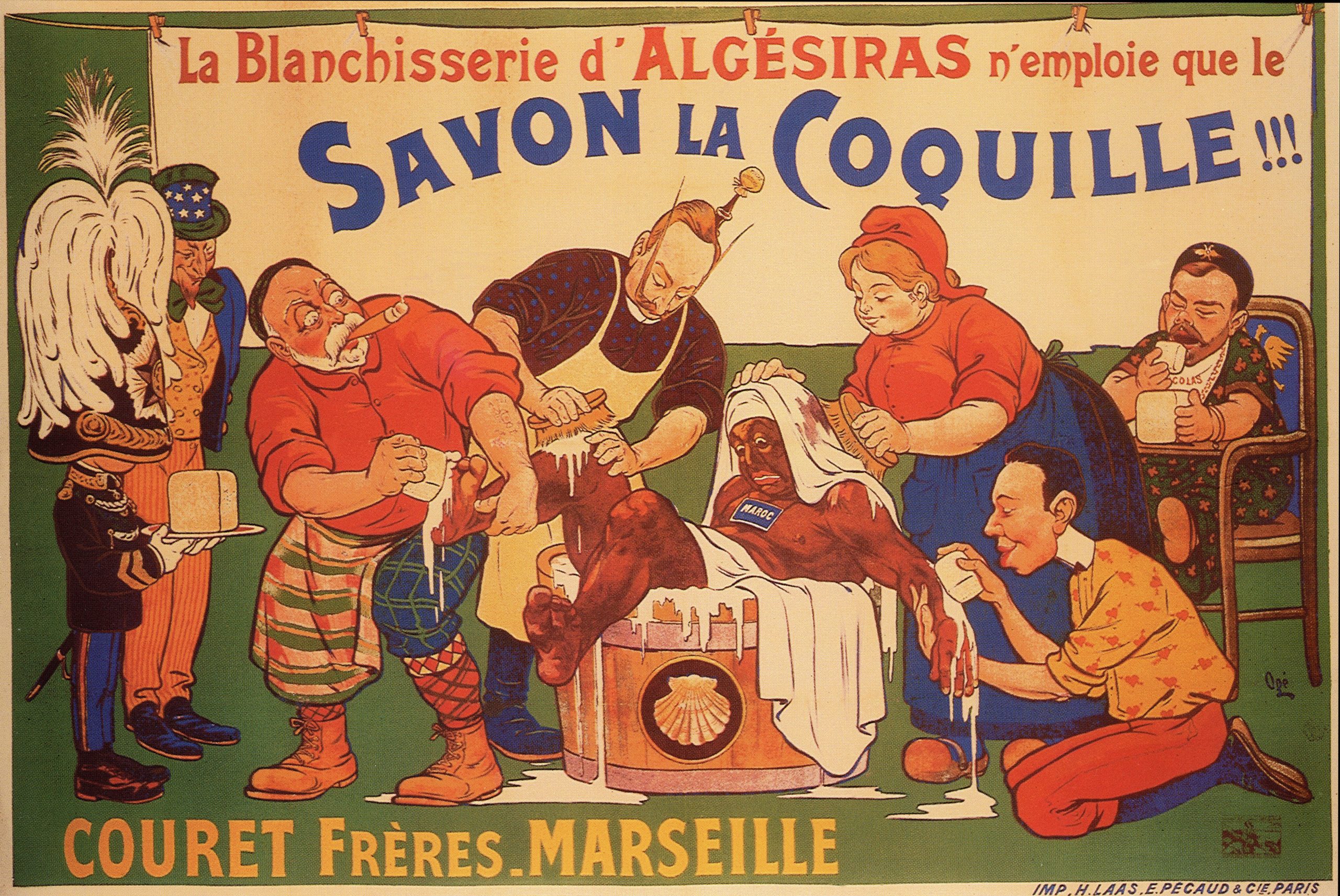
La Blanchisserie d’Algésiras n’emploie que le Savon La Coquille, Ogé, 1906
Translation of messages:
The laundromat of Algeciras only uses La Coquille soap, Ogé, 1906
This advertisement promotes a laundromat that uses the popular soap, Savon La Coquille, only on the surface. The poster shows Marianne, Guillaume II, Edward VII, and Alphonse XIII scrubbing, in a small bucket, a helpless and struggling Sultan of Morocco, Moulay Abdelaziz, under the watch of Uncle Sam. The Sultan carries a sign around his neck spelling Maroc (Morocco) in all caps. Under his oversized helmet, Victor Emmanuel II blindly holds a bar of soap. Finally, Nicholas II is portrayed as a child, wearing a bib and slurping soap.
In this visual, Ogé illustrates the main imperialist European powers whitewashing Morocco, playing with the same racist belief that darker skin is dirty. The Sultan is further portrayed as a bestial character, implying the inferiority of his existence simply for being a brown man. This poster was published after the Treaty of Algeciras was signed on April 7, 1906, which forced Morocco into the Franco-Spanish protectorate that followed. Its virulent tone is undeniable.
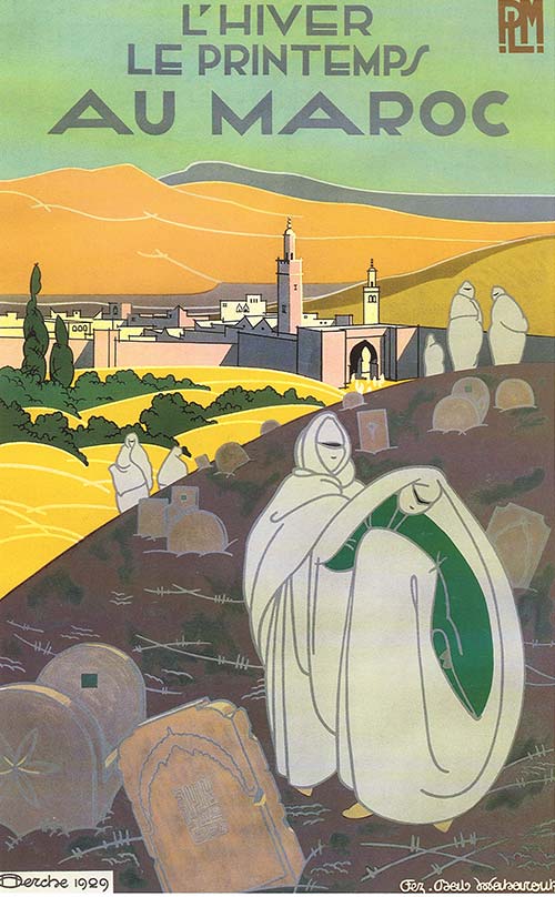
L’Hiver, le Printemps, au Maroc, Derche, 1929
Translation of messages:
Winter, Spring, in Morocco, Derche,1929
In this 1929 poster designed Jules Henri Derche for PLM, we can see eight women wearing their white haik in a cemetery. Because women are not allowed to attend funerals in Morocco, we can assume that they are simply visiting loved ones who passed away. In the foreground, we see the Shahada—the Muslim declaration of faith—written on a tombstone using the square Kufic, a variation of the Kufic script that was designed for architectural purposes. In the background, the old city of Fez and the Mabrouk Bab (door) are lit with pastel colors. The art deco Latin letterforms translate to: “winter, spring, in Morocco.”
It is certainly unconventional to advertise a city by putting a cemetery in the foreground. And in some regards, this advertisement is moving further away from the blatantly racist language that the orientalist posters displayed in the past by centering around an everyday life scene. However, I would still argue that the visual is objectifying Moroccan women in a way that imposes the white male gaze.
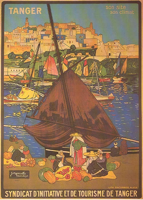
Tanger, son site, son climat, Jacques Majorelle, 1924
Translation of messages:
Tangier, its landscape, its climate, Jacques Majorelle, 1924
Printed by Baconnier in Alger, this lithograph was designed by Jacques Majorelle. He produced multiple posters for Morocco, reinterpreting architecture, urbanism, and ethnographic characteristics to promote tourism. With a romantic color palette, Jbalas—amazigh merchants—recognizable from their iconic outfits, are painted selling produce during sunrise. The poster also depicts boats on the Mediterranean Sea, referring to the port of Tangier, in front of the old Medina (old city). According to Abdelaziz Ghozzi, this poster for the Initiative and Tourism Syndicate of Tangier was very successful and was printed during the inauguration of the first berth in its port in 1933. This is not an uncommon scene in Tangier even until today and in many ways is the furthest away from the previous colonial stereotypes, yet does not remove exoticism from its visual language.
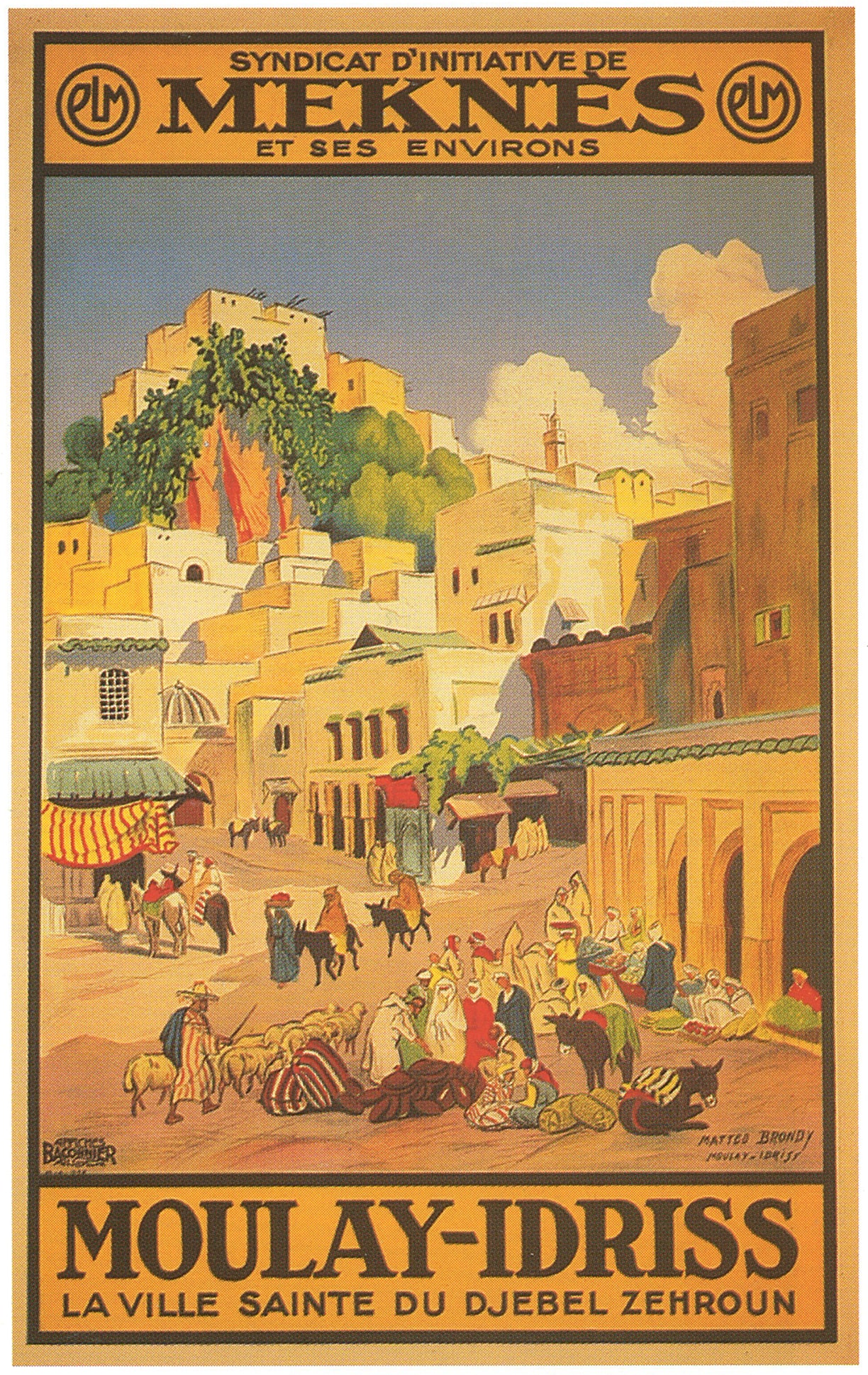
Moulay-Idrissi, La Ville Sainte du Djebel Zehroun, Matteo Brondy, 1930
Translation of messages (Top to bottom):
The Initiative Syndicate of Meknes and its Region, Moulay-Idriss Zerhoun, the sacred city of Djebel Zerhoun, Matteo Brondy, 1930
Matteo Brondy was a painter, illustrator, and veterinarian who lived in Meknes. He was also the president of the Initiative Syndicate of Meknes and, as a result, created multiple posters to promote the region around the city of Meknes. In this particular lithograph printed by Baconnier in Alger, Moulay-Idriss Zerhoun is advertised as a sacred city. Idris 1 Ibn Abdellah, the founder of the Idrisi dynasty, being the first Islamic dynasty in Morocco, is buried there. Every summer, Moulay-Idriss Zerhoun attracts thousands of pilgrims in search of the benediction of Idris 1 because he is a descendent of the Prophet Muhammad. Instead of illustrating this unique event, Brondy painted an everyday life scene, as Jacques Majorelle did with Tangier, where we see a few merchants, some buyers, a shepherd, and a couple of donkeys. The light is similar to Majorelle’s as it could be either sunrise or sunset. Once again, life in Meknes is romanticized and idealized in this advertisement which makes it another object of colonial perspective.
Healing starts by acknowledging faults and offering repair. The fact that design history overlooks orientalist posters on Morocco does not offer any kind of repair. Hopefully, writing about this topic to make oppressive depictions—whether deliberate or subtle—visible can be a call for repair.
References
Arama, Maurice. 1991. Itinéraires Marocains: Regards de Peintres. Jaguar.
Dina Benbrahim is an Arab multidisciplinary creative who uses a feminist lens to focus on illuminating the power in human beings to be transformative forces in society. She is currently an Endowed Assistant Professor of Graphic Design at University of Arkansas.
This is the first of a series of posts on Arabic justification. It begins by setting out some basic – but rarely expressed – observations about the subject which underpin the following discussion. It will then consider the typographic legacy of justification in a very short history. To understand the current situation, and to consider an informed way ahead, we have to know how we came here.
A second post will review current software implementations, the available options, and discuss their approaches, qualities, and shortcomings. Having established current typographic justification of Arabic, a further post will examine exemplary historical practice from the Middle East with the aim of identifying clues that may contribute towards the advancement of current practice.
The basics of Arabic justification
Arabic justification, i.e. the filling of a line of text to achieve uniform lengths for all lines of a column, uses different concepts to those that are widely known from the Latin script. Because most Arabic letters connect, hyphenation, i.e. the breaking of words at the end of a line, is generally not practised (there are some exceptions, notably the modern Uyghur orthography which adopted word-breaks across lines in typography).1
In Arabic texts, handwritten and typographic alike, the remaining space of a line is principally filled using a combination of three techniques: (1) the variation of letterforms (principally elongation and alternative letterforms), (2) changes in the density of black and white, and (3) the configuration of words, including the vertical stacking of letters, reduction of size, and extension of the line into the margins. In the context of typography, the latter is of marginal relevance, and this post will only consider the first two techniques.
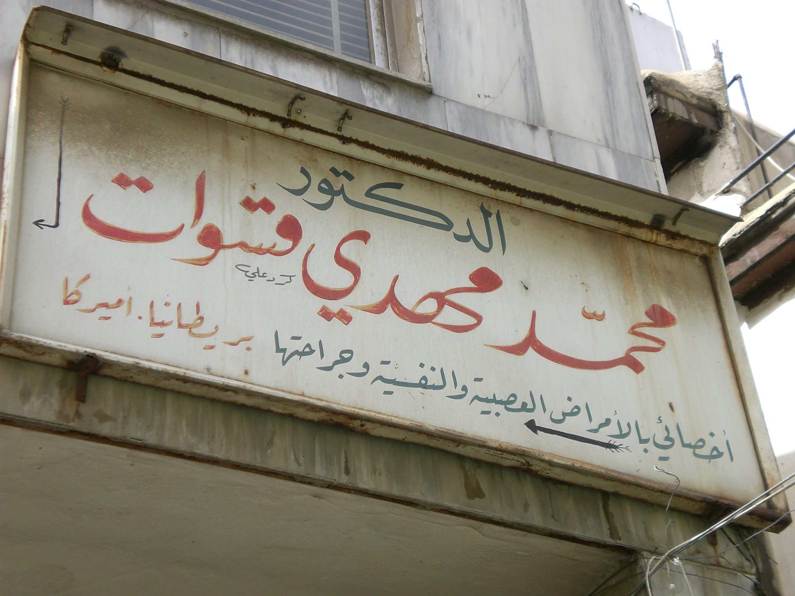
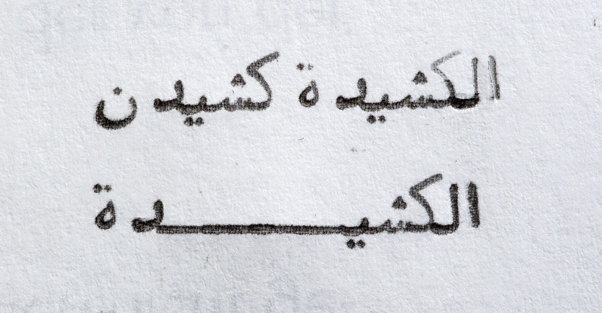
Hand-lettered shop sign of a doctor’s surgery illustrating elongation principles of Arabic writing styles. From top to bottom: Naskh style using a swash variant of kāf, Nast‘alīq style employing kashīda elongation, Ruq‘ah style foregoing any elongation because of the ambiguity it would create with medial sīn. Damascus, Syria, 2007. Photograph by the author.
The most prominent technique for Arabic justification is elongation, and it is known by various terms with ambiguous usage, including notably kashīda, madd, and taṭwīl.2 Whilst kashida (in the simplified English spelling) is most frequently used, it often lacks precision of meaning. However, amongst authors engaging the subject of justification there appears to be growing consensus that kashīda is the preferred term for the elongation of letter parts, agnostic of technological implementation.3 This post employs the more elaborate distinction that Thomas Milo established in the context of DecoType’s technology,4 in which kashīda relates to the elongation of letterforms by means of curvilinear strokes following conventions observed in manuscript practice, and taṭwīl refers to the Unicode character U+0640 Tatweel.5 A further, specialised case of elongation are swash variants of letterforms. Although also used for justification (amongst other uses), they are governed by different rules to kashīda elongation, and will be referred to here as swash variants.
By contrast, the Tatweel extension stroke, although widely seen as the standard means of justification in Arabic, is an artefact of typographic technology and should be considered separately. The Tatweel is discussed more below, but suffice it to say at this stage that it should not be regarded as a feature inherent to the script. It is important to note that the elongation of letterforms does not mean stretching (which implies a simple distortion), but a reconfiguration of the whole letterform, and that only some letters, and only certain parts of them may be elongated – and that much only in specific, style-dependent contexts.
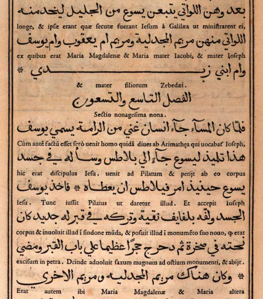
Arabic manuscript demonstrating various justification techniques in a Naskh hand. Note how subtly the justification means are used: apart from the red subsections, which are meant to stand out, the main text appears to have equal line lengths without apparent elongations. Only careful observation reveals elongation (lines 1, 3, 8), letter-stacking (lines 1, 3, 13), and changes in the density of the writing, the latter being the preferred technique in this manuscript. Taqī al-Dīn Muḥammad ibn Ma‘rūf, Treatise on watchmaking, Nablus, 1701–1800, 27,5 cm by 17,5 cm, 85 pp. Courtesy of BnF Gallica,ark:/12148/btv1b8406163s
From Arabic manuscript to letterpress justification
When printers adopted typography to compose Arabic texts, justification principles had to be translated into the new medium. In manuscript production a scribe could use his experience to approximate the number of words he could fit in a given line. Whether he needed more or less space he could tweak the proportions of letter shapes, the width of white spaces, the vertical arrangement of letters and words etc., all before resorting to the more visible justification means: swash letterforms and elongations. Scribes thus had a range of tools to make a written line fit the column.
In letterpress printing not much of this malleability remained. Although white space could be modified too, it was not as flexible. Adding quads to fill a line was easy enough, but reducing the space between sorts required a disproportionately bigger effort by the compositor than by the scribe. Letterforms, on the other hand, could not be modified at all, considerably reducing the margin of manoeuvre. Metal type thus left the compositor with three means to quickly justify a line and lock the forme:6 (1) increase the width of word spaces, (2) use swash sorts if contained in the font and applicable in the given line, or (3) insert specialised sorts between letters to mimic the elongation of letter parts – enter the Tatweel.
Although technically possible, it was economically inconceivable for compositors to create elongated letters as they were needed. In principle typesetters had to work with the font at hand, employing its sorts to the best effect, and as quickly as possible. Rather than making custom sorts for every justified line, typography’s modularity was therefore used to imitate Arabic elongation by means of a dedicated typeform: the Tatweel.7 It was first used by European type-makers and printers when they began composing Arabic in the sixteenth century. Straight extension strokes can be found at least as early as 1516 in a multilingual volume of the gospels published in Genoa, and henceforth it remained a feature of European Arabic typography.8 The utility of the Tatweel is obvious, and would have been appreciated by the compositors of Arabic type. A uniform, straight line that could be repeated as desired and inserted between any connecting letterform greatly facilitated their work. If setting Arabic was laborious, at least its justification was easy.
An example of the excessive use of the Tatweel sort in early Arabic letterpress typography. From Bashārat yasū‘ al-masīḥ kamā kataba mār matī wāḥid min ithnaī ‘ashara min talāmīḏihi, Rome: Typographia Medicea, 1591, 137, Austrian National Library, 255499-D,http://data.onb.ac.at/rec/AC09709138
Yet, the compromises of Arabic typography justified with what amounts to a horizontal rule may not have been appreciated by sixteenth century compositors.9 Although the basic principle of elongation could be readily observed and explained by Oriental scholars, typically involved in the context of European typography, the more elaborate rules underpinning it remained opaque to the first printers of Arabic texts. This discrepancy is well illustrated in books produced at the Medici Oriental Press in Rome. Backed by considerable political and economic clout, its Arabic volumes were widely regarded as hallmarks of scholarly and artistic achievement.
The renowned French punch cutter Robert Granjon, then at the height of his career, was commissioned to cut new Arabic types specifically for the task, and produced five fonts in various sizes.10 Their influence was considerable as they were widely copied and until recently held up as role models of Arabic type-making.11 The fonts achieved somewhat greater fidelity with the Arabic script than their precursors, and included swash variants and some elongated letterforms that Granjon may have intended for justification. Yet the publications of the Medici Oriental Press are dotted with instances in which the compositors still resorted to inserting straight Tatweel sorts, with predictably alien results. Whereas Granjon’s fonts had a lively appearance, with a multitude of curves and rounded strokes, justification by means of the Tatweel introduced a geometric linearity nowhere else to be found – excepting the margins surrounding the column. The unrestrained use of this sort stretched words beyond recognition, and created blank spaces without apparent function, undermining a central tenet of typography for reading: lending shape to meaning.
Mechanical justification and the Tatweel: made for each other
Notwithstanding these shortcomings, the Tatweel remained in use. Indeed, rather than disappearing with advances in technology, it appears as if increasing mechanisation contributed to its proliferation. Machinery and industrial manufacturing processes favoured modular concepts, and systematic organisation. Point sizes and the organisation of type widths into repeatable units are but two elements of type-making that had resisted uniformity and consistency for hundreds of years, but were standardised soon after mechanical processes supplanted manual techniques. The Tatweel fitted very well into the systematisation of type-making and typesetting, whereas the formal variety expressed through swash characters, for example, did not.
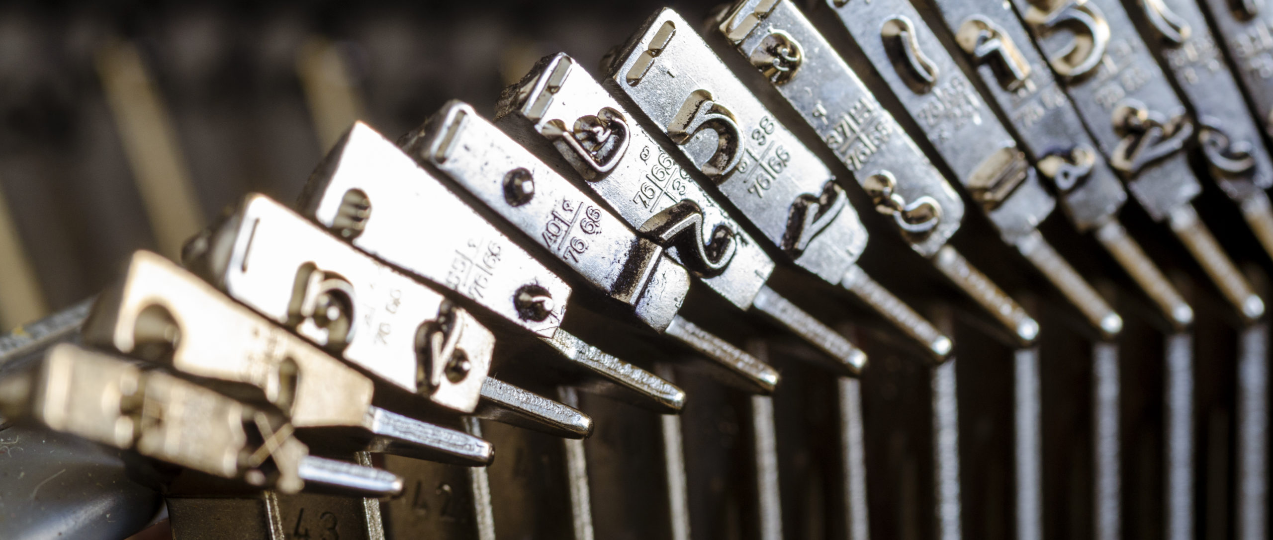
With the emergence of the typewriter in the nineteenth century, the segmentation of the Arabic script into recurring elements reached a new low. Although the repertoire of forms that could be represented with 90 keys required a drastic cull of letterforms, the Tatweel kept its place in the characterset. Thus it attained unprecedented prominence, and today justification using the Tatweel, although historically inaccurate, is often associated with the typewriter and its drastic simplification of the Arabic script.
Close-up of the type petal carrying the Tatweel on an Olympia SM-8 typewriter. Photograph by the author.Typewritten sample using the Olympia SM-8 typewriter, illustrating the function of the Tatweel. Photograph by the author.
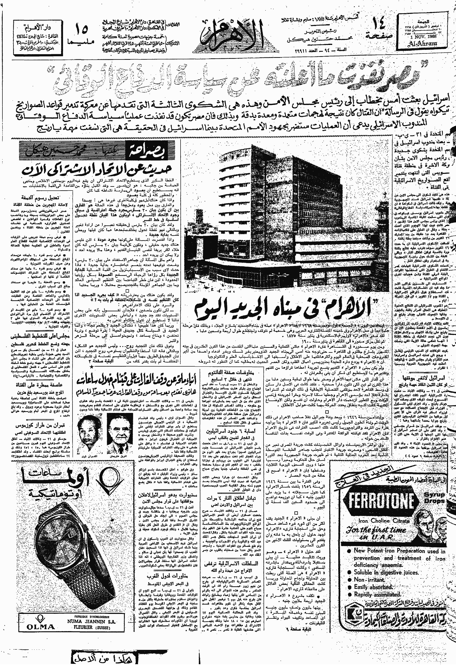
Throughout the twentieth century, and across the numerous technological changes that it saw, the Tatweel retained its place. From the first Arabic Linotype (1911), to the first Monotype system for Arabic composition (1939), photocomposition devices, and computer-assisted typesetting, the Tatweel was included in fonts, and used in typography. When Linotype & Machinery and Compugraphic co-developed the first automated Arabic justification computer in the second half of the 1960s, the role of the Tatweel was firmly established.12 Hrant Gabeyan, at the time L&M’s representative to Egypt and Sudan, became responsible for the design of the substitution tables that governed the justification ‘choices’ of the computer. We know that Gabeyan consulted a range of professionals in the field, including calligraphers, teachers and Linotype operators, to inform his task, yet the exact process and the rationale that guided the resulting specifications are difficult to reconstruct today. Probably the prospective customer of the system, the Al-Ahram newspaper, had considerable influence on its design, tailoring it to the needs of newsprint composition. The Arabic JusTape justification computer was built around the Tatweel as the principal means for justification, and modification of white space and elongation of letter shapes were disregarded. Indeed, the patent that L&M filed to protect its invention lists the term ‘kashida’ 64 times across its 12 pages.13 Although the JusTape primarily automated what newspaper compositors in the 1960s already did, it also codified practice, and thereby established a precedent for subsequent automated justification systems.14
Front page of Al-Ahram newspaper from 1, 4, 7, and 8 November 1968, showing the transition from hand-lettering to automated type composition. On 1 November, all headlines were hand-lettered in the Ruq‘ah style; on 4 November, the main heading was written in a ‘typographised’ Naskh style, anticipating the upcoming change; three days later, the main header kept its typographic look, whilst more sub-headlines also changed from Ruq‘ah to Naskh; by 8 November, the new equipment from Linotype and Compugraphic was installed and first put to use, replacing all hand-lettered headlines with hot-metal composition type. This issue of Al-Ahram probably is the first ever publication using automatically composed Arabic type with automatic Tatweel insertion. Illustration made by the author using images obtained from the Internet Archive, https://archive.org/details/AlAhram1968EgyptArabic, accessed 8 November 2019.
Tatweel today
Over time, and through continuous, uncritical repetition of previous practice the Tatweel secured its place in contemporary typography. A place that was cemented, for the time being, through the inclusion of a discrete Unicode codepoint in version 1.1 of the Standard in 1993. ‘U+0640 Arabic Tatweel’ is defined as a modifier letter with the ‘join causing’ property. The Standard notes that this differs from the ‘dual joining’ property in that characters of this class ‘do not change shape themselves’. Thus, according to the standard that encodes nearly all contemporary text, the Tatweel is a solid rule, in shape and behaviour identical to the sorts that European type-founders used in the sixteenth century. Unicode therefore assigns semantic meaning – a codepoint – to what should be a purely graphical device, demonstrating one of the many inconsistencies of the Standard. After all, a central tenet of Unicode is the distinction between semantics and form, between characters and glyphs. Yet because many of its principles derive from typographic legacy, technological artefacts such as the Tatweel entered its conceptual framework.
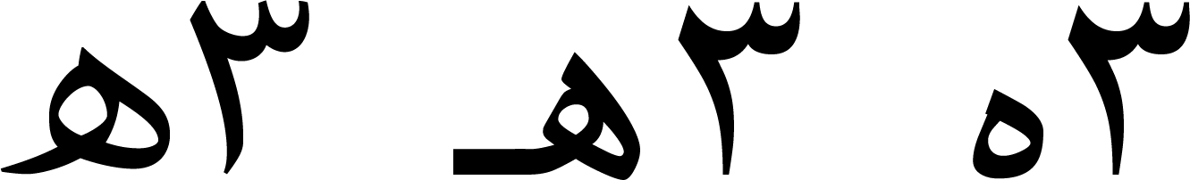
The pronounced technological bias is also manifest in the inclusion of the Tatweel on most contemporary Arabic keyboards.15 One of the unintended consequences of the hard-coding of a graphical elongation device is that users employ it for purposes that it was not meant to be used for. For example it is common that users key Tatweel characters in order to trigger joining behaviour. Because some fonts fail to make the expected isolated form of Heh accessible, users frequently key Heh followed by Tatweel to give them the initial form of Heh, visually more similar to the required isolated shape, but then followed by the straight Tatweel bar.
Illustration of unintended usage of U+0640 Tatweel to trigger joining behaviour in poorly programmed fonts. From right to left: (1) Arial does not provide the isolated Heh form that is expected for the abbreviation of the Hijra date; (2) a frequently used workaround is to insert U+0640 Tatweel after the Heh to trigger joining, resulting in a make-shift approximation of the desired shape; (3) the expected letterform as shown with the Adobe Arabic font.
Another problem of hard-coded elongation is searchability. Because a Tatweel inserts a character into a string of characters, albeit only for graphical purposes, in some environments searching a particular word won’t yield results. Although present in the text, a word that contains Tatweel characters will not be found by the search again if the user keys the word in non-elongated form. Thus a search for طويلة cannot be found if the text contains an elongation using Tatweels such as here طويــلة. Examples of this problem can be found in Mozilla’s Firefox browser, or Apple’s default text editor TextEdit.
Today, we are thus left with an ambiguous situation. Although we have at our disposal sufficient computing power that could easily reproduce the Arabic script without recourse to inadequate simplifications, advance is hindered by the continuation of legacy practices, and concerns for backwards compatibility. The Tatweel is a particularly clear example of the influence that legacy practice, rooted in obsolete technology, remains in use today. It only provides a coarse approximation of a central requirement of basic shaping in Arabic. Whereas limitations of technology may historically have provided the explanation or rationale for such a compromise, today there is no reason to accept inadequate representations of any script in type. If we imagine for a moment that an equivalent shortcoming in the typography of the Latin script – say the distinction between capitals and minuscule letters – could not be handled by layout engines, we can be sure that the industry would rush to address this shortcoming.
In the following post I will review the state of Arabic justification in various software environments. I will discuss the options of the most wide-spread professional design applications, word processors, and browsers, and consider their strengths and weaknesses.
Corrections
An earlier version of this post published on 15 Nov 2019 at 09:31 incorrectly stated that any browser-search would be handicapped by the use of Tatweel, when in fact this problem pertains only to software that is based on the Gecko engine that is used notably for Mozilla’s Firefox browser.
Notes
In early manuscripts word-division at the end of lines was common, but this practice fell into disuse. Gacek, Adam, Arabic Manuscripts: A Vademecum for Readers, Leiden ⸱ Boston: Brill, 2009, 146.
Kashīda derives from the Persian کشیدن, to draw, pull; to extend, protract.
See e.g. Elyaakoubi, Mohamed & Azzeddine Lazrek, ‘Justify Just or Just Justify’, The Journal of Electronic Publishing, Volume 13, Issue 1, Winter 2010, http://dx.doi.org/10.3998/3336451.0013.105; Benatia, Mohamed Jamal Eddine & Mohamed Elyaakoubi & Azzeddine Lazrek, ‘Arabic text justification’, TUGboat, Volume 27, No. 2, Proceedings of the 2006 Annual Meeting, pp. 137–146.
Milo, Thomas, Tasmeem: The Spirit of Arabic Writing, Grenoble: WinSoft, 2006, 23.
The Unicode Standard considers the two terms as synonymous. The Unicode Consortium, The Unicode Standard, Version 12.1.0, (Mountain View, CA: The Unicode Consortium, 2019. ISBN 978-1-936213-25-2), http://www.unicode.org/versions/Unicode12.1.0/
Locking the forme, ensuring that all sorts and furniture stayed in place during printing, was significantly easier if text was justified, rather than ragged. Similarly it was much faster to cut a paper frisket for a justified block, and re-use it on every page, than it was for a block with different line lengths which could only be used once. Both aspects contributed to the prevalence of justified setting in letterpress printing.
I am not aware what term was used for this sort in the first Arabic letterpress fonts. In this post Tatweel is used for consistency.
The polyglot Psalterium, Hebræicum, Græcum, Arabicum, & Chaldæum emerged from a collaboration between the orientalist and Bishop of Nebbio in Corsica, Agostino Giustiniani (1470–1536), and the printer Pietro Paolo Porro.
As any cursory review shows, neither do many contemporary practitioners.
For a thorough analysis of Granjon’s Arabic types see Conidi, Emanuela, ‘Arabic Types in Europe and the Middle East, 1514–1924: Challenges in the Adaptation of the Arabic Script from Written to Printed Form’, PhD thesis, University of Reading, UK, 2018.
See for example Yasin H. Safadi, “Printing in Arabic,” Monotype Recorder no. 2, New Series (October 1981): 4.
Note that L&M’s system used the term ‘Kashida’. See also Titus Nemeth, Arabic Type-Making in the Machine Age: The Influence of Technology on the Form of Arabic Type, Boston ⸱ Leiden: Brill, 2017, 183–204. https://doi.org/10.1163/9789004349308
Lamberti, Sergio. Means For Controlling Typographic Composing Machines. UK Patent GB1162180, filed 24 December 1966, and issued 20 August 1969. This patent may have contributed to establishing the term ‘kashida’ in the trade: In Gabeyan’s documents the term ‘kashida’ was always set in quotation marks, whereas the author of the patent removed them, using kashida without explanation or qualification.
Gabeyan developed another justification system for Compugraphic’s own Arabic typesetting system in the late 1970s when the company tried to enter the Middle Eastern market. At that time it also developed Arabic fonts which, in line with its catalogue of Latin typefaces, were clones of the commercially most successful designs by the competition. In 1988 the Compugraphic Corporation was bought by Agfa Gevaert. The new owner subsequently licensed Compugraphic’s Arabic fonts to the Microsoft Corporation, where they were used as the default Arabic script fonts of the Windows operating system for more than a decade. Although this is pure conjecture, it appears plausible that Microsoft, at that time without any experience in developing Arabic typesetting software, built on Compugraphic’s justification system. Should this be the case, a direct line can be traced from the justification system that was developed for a hot-metal line-caster to those in use in today’s digital devices.
By contrast, one of the letters that are required for the correct spelling of Allah, U+0670 Arabic Letter Superscript Alef, is not accessible on common Arabic keyboards.
Titus Nemeth
Type designer & typographer, historian, occasional teacher and perpetual student. Marie Curie fellow. Author of 'Arabic Type-Making in the Machine Age'.
This piece was first published on University of reading Blog
by Titus Nemeth. The author have given Design Repository permission to republish and translate the essay.
We use cookies on our website to give you the most relevant experience by remembering your preferences and repeat visits. By clicking “Accept”, you consent to the use of ALL the cookies.
This website uses cookies to improve your experience while you navigate through the website. Out of these, the cookies that are categorized as necessary are stored on your browser as they are essential for the working of basic functionalities of the website. We also use third-party cookies that help us analyze and understand how you use this website. These cookies will be stored in your browser only with your consent. You also have the option to opt-out of these cookies. But opting out of some of these cookies may affect your browsing experience.
Necessary cookies are absolutely essential for the website to function properly. This category only includes cookies that ensures basic functionalities and security features of the website. These cookies do not store any personal information.
Any cookies that may not be particularly necessary for the website to function and is used specifically to collect user personal data via analytics, ads, other embedded contents are termed as non-necessary cookies. It is mandatory to procure user consent prior to running these cookies on your website.