Preloader
Critical WritingEssaysInterviews
Moe Elhossieny
Dark Mode

Scratching the Surface
of Ellabbad School – Part I

Prologue

I began working on this essay not knowing how industriously I would have to research it, nor how long it would turn out to be. The text you are presently reading is much longer than I had anticipated, and it is for this very reason that, as you will soon take note of, it ends rather abruptly. Consider it a work in progress, this article being the first iteration of many more to come.

Intro:

The recent history of Euro-American design is marked by three major events that have shaped the overall discourse around the discipline’s very history.

Symposium Publication, 1983. Courtesy of the Vignelli Archive.

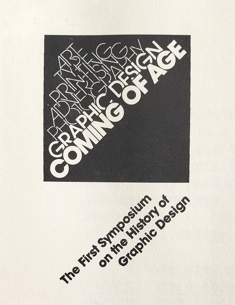
The first is “Coming of Age: The first symposium on the history of graphic design” at the Rochester Institute of Technology (RIT) in 1983. This symposium brought together academics, practitioners, and educators to highlight the already available events, individuals, and forces that contributed to what was defined as graphic design at that point. The organizers of the symposium Barbara Hodik and Roger Remington stated:

“The history of graphic design has been scattered among the pasts of art, printing, typography, photography, and advertising.”[1]Teal Triggs, Graphic Design History: Past, Present, and Future

The symposium marks a pivotal point in how the field conceived itself, and acknowledged the need to move away from art history as the underpinning foundation of design, and to consider a design history that takes into account other disciplines, including “sociology, anthropology, aesthetics, politics, economics”[2]Ibid – as Massimo Vignelli expressly called for in his keynote lecture. History, theory, criticism, documentation, and technology, he maintained, were all crucial for the progression of the design field.

Video and audio tape catalogue, possibly 1987. Courtesy of the Heller Books Website.

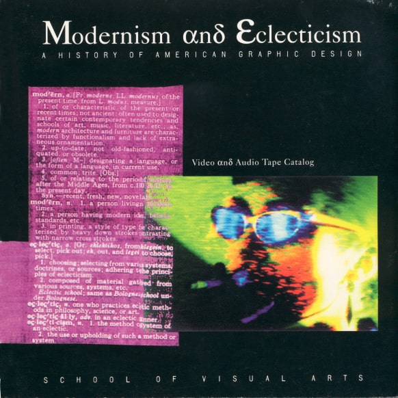
The second event was a series of conferences titled “Modernism and Eclecticism: A History of American Graphic Design,” which were organized in late 1980s and early 1990s [3]Ibid by Steven Heller, the art director of the New York Times, and Richard Wilde, then-chair of the BFA Advertising and BFA Design departments at the School of Visual Arts. These conferences were mainly focused on what Andrew Blauvelt called a “biographical hagiography,” which described the dominant focus, in this moment in Western design history, on the evolution of graphic styles, as seen in the works of canonical (mainly white male) designers [4]Blauvelt. Designer Finds History, Publishes Book, 2010. Both Andrew Blauvelt and Rick Poynor refer to Meggs’ A History of Graphic Design (1983) as the ultimate embodiment of this view of history.[5]Poynor. Out of the Studio: Graphic Design History and Visual Studies, 2011

The third event was a two-day symposium titled “New Views: Repositioning Graphic Design history,” which took place at the London College of Communication in 2005. The symposium questioned the dominant narratives of design history, which were mostly informed by the Western canon, and posed a few important questions: Whose history is it? And who gets to write it? The symposium presented several papers exploring the richness of graphic design history in countries such as Germany, Greece, India, Iran, and Mexico[6]Triggs. Graphic Design History: Past, Present, and Future, 2011 .

Since then, we have seen a shift in the prevailing discourse around the history of graphic design, and with it, another shift in the language used to broach the topic. We now speak of graphic design “histories” to reflect the plurality of narratives around the discipline, which exist beyond the Western design canon. This realization caused a renewed interest in not only our own history of design in the Arab region, but in many other graphic and visual histories globally. This consequently sparks the curiosity of not only the people to whom this history belongs, but a wider scope of research rangers.

While the debate around whether or not Western design history has the scholarly potential to stand on its own and be a field in and of itself – as opposed to being annexed to another, such as “visual studies,” which Rick Poynor, among others, argues is requisite for it to grow [7]Poynor. Out of the Studio: Graphic Design History and Visual Studies, 2011– we, in the Arab region, are still attempting at building the foundational historical knowledge that the field requires.

And so, now, the question for Arab designers, historians, and scholars is: will they adopt a responsible and dedicated apparatus for being involved in the creation of the discourses around our own history, or will they witness their own history being documented, studied, and interpreted by the West as part of its larger efforts of expanding its canon?

Over the past several decades, knowledge production around graphic and artistic practices in our region has been predominantly Eurocentric, with very few homegrown efforts to further explore or document our own cultural production. Let us consider, for example, the recent work in Islamic manuscript studies by the scholar François Déroche, author of the seminal book Islamic Codicology: An Introduction to the Study of Manuscripts in Arabic Script (2005), and Adam Gacek, who wrote Arabic Manuscript: A Vademecum for Readers (2009), to name a few.

Yet another the question for educational, governmental, private, and cultural institutions is: will they support these efforts if/when they arise?

Curious readers may read up on some challenges that faced the field in its early stages in these books: A History of Arab graphic design (2020) by Haytham Nawar and Bahia Shehab” ; Yara Khoury’s Nasri Khatar, A Modernist Typotect (2014) and Titus Nemth’s valuable Arabic Type-Making in the Machine Age (2017). Suffice to say that the challenges faced in those early days have been instrumental to where we are today. One of the main challenges that we continue to face to this day, and which is addressed in this essay, is the question of identity and that of continuity, and how one informs the other.

Some clues that may be able to help us formulate answers to these questions can be vaguely detected in our blurred visual memory, scattered deep within it. They are coded in the graphic work itself (or whatever remains of it). Designers’ attempts to engage with such questions rarely found their way in writing. Therefore, we are in the blind, for the most part, when it comes to how these designers conceived of these questions.

This, of course, doesn’t necessarily mean that such design writings are detrimental to us today, as we can surely formulate a reading of these design works in retrospect. But first, it would have given us a reading upon which we can juxtapose our readings today, and second, it would have given us historical context and insight on this moment from the point of view of design as it was practiced.

This early nonchalance towards documentation (of the work and in writing) made the prospect of progress or continuity extremely taxing. Indeed, anyone engaging with documented Arabic design work would attest to the fact that much of the work of designers born in the 1940s and 1950s was not well documented, nor was it preserved as it should have been, and therefore we find ourselves today tasked with doing historical patchwork.

Haytham Nawar and Bahia Shehab aptly put it in their survey book:

“Some designers simply refused to allow their work to be published. Still other designers have passed on without leaving behind an archive of their work; many of them were also artists who prioritized their art over their design practice, or their work was lost due to political unrest in their home countries.”

Mohieddine Ellabbad was one such person who lived this moment and had a sense of the importance of these practices to the future of the field of design. He said:

“New generations always start from Zero.”

Here, he was referring to the virtually nonexistent documentation and archival practices – not only of physical objects, but of thoughts and ideas – which are contributing to this rupture in history. That is one of the main reasons that Mohieddine Ellabbad wrote about design: to document his ideas, reflections, and observations.

This generation was comprised of mostly trained artists, a lot of whom wouldn’t fully embrace or commit to their design practice, as most scholars rightfully assert. Few were the ones who did.

This, of course, is not to say that there were no graphic productions taking place during the 1940s, a time that saw the dawn of modern Arabic graphic design. On the contrary, the region was exploding with great graphic engagement despite the latency of both individual and institutional acknowledgment of the field.

Now that the field is recognized and embraced, we are thus presented with a few pressing questions today: how can we move forward in the field of graphic design? What are these modes of progress?

Let’s take literature as an example. Would literature progress without the modes of both practice (literature) and thinking (literary theory)? No, it cannot. What literary theory offers, in very simple terms, is thinking about writing, reading, and language – the very thing that is missing in design and design writing.

One of the major challenges that Arabic design is facing today is that it is currently soaked in practice and lacks the kind of reflective thinking and historical context that is offered by writing. We should think of both practice and writing as the two main pillars on which the domain of design can erect and writing is where this mode of thinking about designing can be fully explored. One could also argue that the field of Arab design cannot ever reach its full potential until we reach technological independence, and progress in other domains that are linked or overlap with design.

Therefore, one need not to make a case for the importance of writing in the progression of any domain. Yet despite its undeniable importance, the field of graphic design still suffers from an acute deficit in writing.

That is not to say that there are no writings about Arab design at all – I reference some good examples at the end of the essay – but what is already published is not merely enough, let alone thorough or comprehensive. Even good sources or studies exist, though not without their baggage and limitations, and each with some degree of inaccessibility to the wider design community. Most of these can only be found on:
۞ Membership-based academic platforms (mostly Western).
۞ University portals or university libraries under Ph.D. titles.
۞ Books which, depending on where you reside in the Arab region, can be beyond reach due to logistical or economic difficulties, and are thus only accessible to some.
۞ The offshoot magazine or article.

Despite the abundance of visual – both current and historical – output we have, the field in Egypt and the region at large is left with textual production that is insufficient, as evidenced by a ratio of design writings to design productions that is ineffably tilted.

There is also something important to clarify before delving further. When I say writing, I don’t just mean writing books, which we have started to see glimpses of, but I also mean all other forms of writing, as numerous as they may be, but especially the kind of writing that is self-reflective and research-based.

One of the greatest examples in recent history of how design and writing can be in unison is the school of Mohieddine Ellabbad (1940-2010), a school that valued and integrated design writing as an integral part of being a designer. Yet, we know very little about it. The present essay will merely scratch the surface of this school, and will focus on expanding what we know about it through an inquiry into Mohieddine Ellabbad’s establishment of the “Arab Graphic Centre” and the Arab workshop for children’s books in 1976.

A thorough understanding of this initiative is of essence, especially because it attempts to engage with the questions I raised above, which we are still grappling with to this day.

Anyone who knew Mohieddine Ellabbad would submit that his life was particularly challenging. On the one hand, his was a generation that experienced myriad socio-political challenges – the global complications of the cold war; the Arab Israeli war; the rise of the Palestinian resistance; to name a few – and on the other, his rigorousness and criticality were a double-edged sword, often relegating him to the sidelines.

Despite these challenges, Mohieddine Ellabbad remained committed to his work ethic, and to what he believed was vital to the profession. So, the best way to start this essay is by echoing Mohieddine Ellabbad’s spirit of criticality, humbleness, and skepticism and by letting those be my guiding principles throughout the essay.

In his spirit, I write.

Mohieddine Ellabbad sitting on his desk at the arab graphic center in cairo

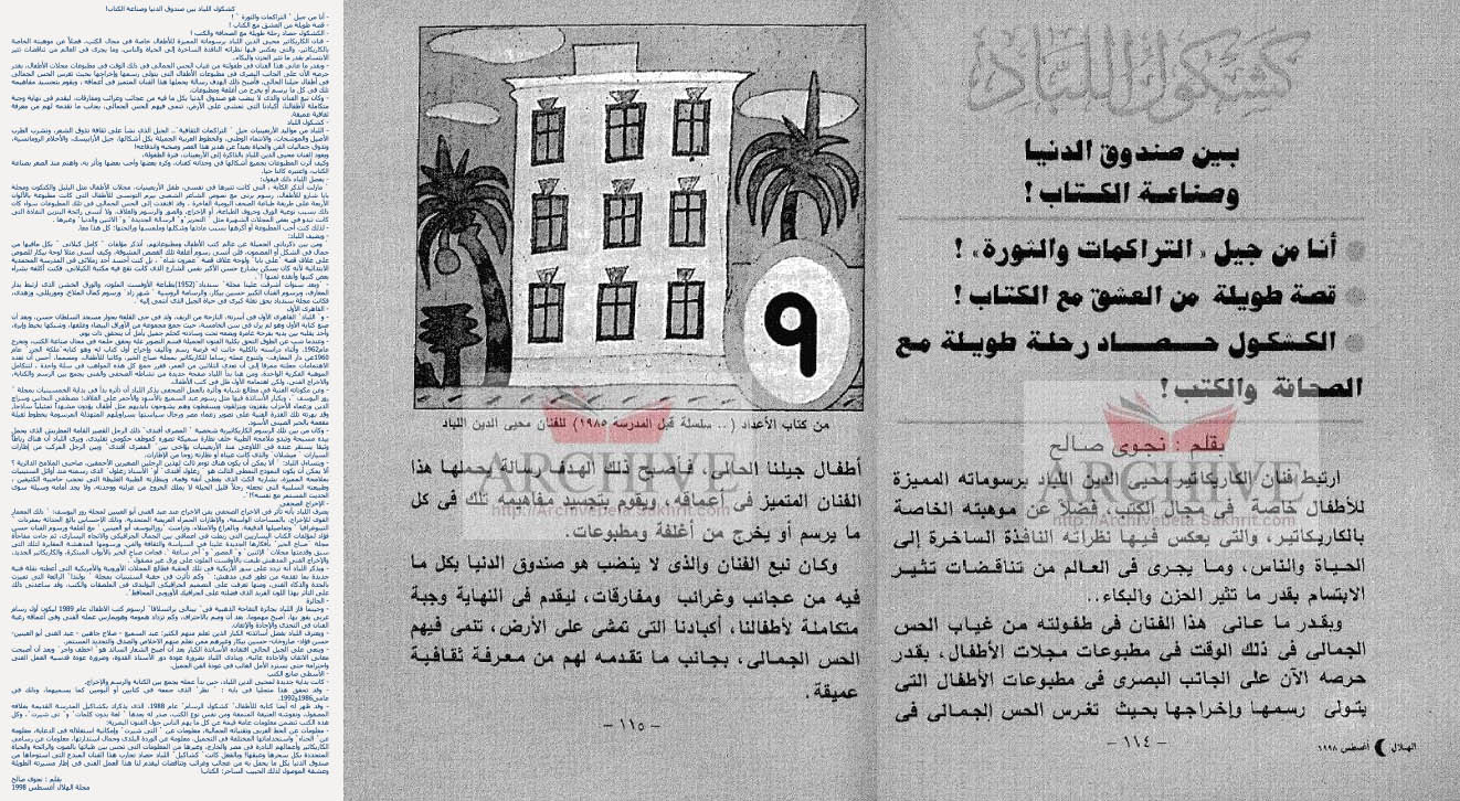
First, let’s take a closer look at the current landscape of writing available about Mohieddine Ellabbad. One such repository of writings can be found on the Faculty of Fine Arts’ portal, where every “supposed artist” is featured i.e. everyone who comes out of the academy, despite the fact that some of them may identify as designers or otherwise. On this portal, everyone has an entry page with different tabs you can toggle between: their CV, some of their work, and a “Their vision” section.

The “Their vision” section is a crucial one to question and unpack, as this is where writing about Mohieddine Ellabbad lives – or more accurately, dies, because these texts are given eminence that assumes false totality and comprehensiveness through the sense of legitimacy bestowed by the academy. On this page, readers are presented with a plethora of piled written texts, which at first glance, can be exciting but, upon closer reading, all but disappoint. The Faculty of Fine Arts curated a selection of written pieces about Mohieddine Ellabbad, and we, as readers, are supposed to synthesize his vision in and through these writings. This is not to say that there is anything at fault, per se, in the featured writings themselves; but rather, that this part of the essay ought to question the mode of inquiry deployed in these writings – the selection criteria, the republishing method, and structure of these pieces.

Here you can view the written pieces on the portal.

To summarize, the list above includes a total of 32 pieces, 25 of which were written in 2010 – the year he passed away, amounting to a staggering 75% of the total – another one of which written in 2016, and yet another which is repeated twice, once under the year 1998, and once under the year 1988.


Mode of Inquiry: Is there even any?

The term “modes of inquiry” is used within research practices to describe the systems and methods deployed by researchers and scholars to investigate, explore, or identify questions of interest about their topic. These modes, as numerous as they may be, often lead to a conclusive outcome or contribute to the discourse in the field by giving rise to more questions. And so, when viewing these pieces, readers can conclude that none of them contain any actual mode of inquiry that is derived from a question of interest.

Astute readers will quickly register that the writings featured on the Faculty of Fine Arts portal are journalistic productions, and not research-oriented writings. This very fact is indicative of one of two conjectures: either this is what the academy considers to be “good” design writing; or there is a genuine lack of more critical, in-depth writing, especially in graphic design.


Criteria of Selection: A Broken logic

Attentive readers will also be able to deduce that the overarching method of selection is predicated on the following logic in curating these pieces:

  1. If the author of the piece is well-known, then the piece is by default a good one, and is allowed admission to this pantheon.
  2. Should that prove to be the case, the text does not undergo any editing, fact checking, or revision (given the many inaccurate facts, spelling mistakes, and even the inclusion of the same text twice).
  3. That these pieces can fulfill their function without providing a wider context to readers.
  4. That there is no need to consider these texts together and see if they are providing a multiplicity of readings or diverse understanding of the subject.
  5. That the academy has the authority to alter the original form that the text appeared in – including removing images or changing the formatting – and that this won’t affect the reading of the piece (which is not the same as editorial revisions).
  6. That quantity trumps quality.

These assumptions are manifested in the curated pieces available on this page. What the Faculty of Fine Arts has essentially done is dump these texts in one space, without questioning their content, nor whether or not this kind of writing is appropriate to both the subject or where it is being republished.


The structure
Language (Title and Titles)

The form or structure of these pieces falls under one or more of these categories:

  1. Testimonials
  2. Eulogies
  3. Commemoration letters
  4. Personal stories and anecdotes
  5. Quotes
  6. Paraphrasing

Most of these categories are replete with recycled information. They utilize ready-made modules that constitute an invisible writing structure, in which different fragments are sometimes combined or rearranged to give the illusion of novelty when this “new” text is presented.

Language:

Most of these texts use ambiguous, loaded, and packed language, while refraining from unpacking or elaborating on them. They are assertive in nature, not propositional, which is to say that information is presented as definitive and not as material of discourse. This kind of language deploys hyper-poetic forms of empty rhetoric that can bestow the text with an enchanting, albeit ultimately empty, quality.

This kind of poetic approach to writing can be said to be used as a medium for masking a poverty of knowledge and inaction. It is more concerned with linguistic acrobatics than the subject itself. Ultimately, such writings do not offer much, if any, substance, and do not stand up to intellectually rigorous scrutiny.

Titles:

Another important part of the structure is the language employed in the titles of these pieces. When we juxtapose the titles with the actual content, one notices a tendency to hyperbolize the title in relation to the content of the piece.

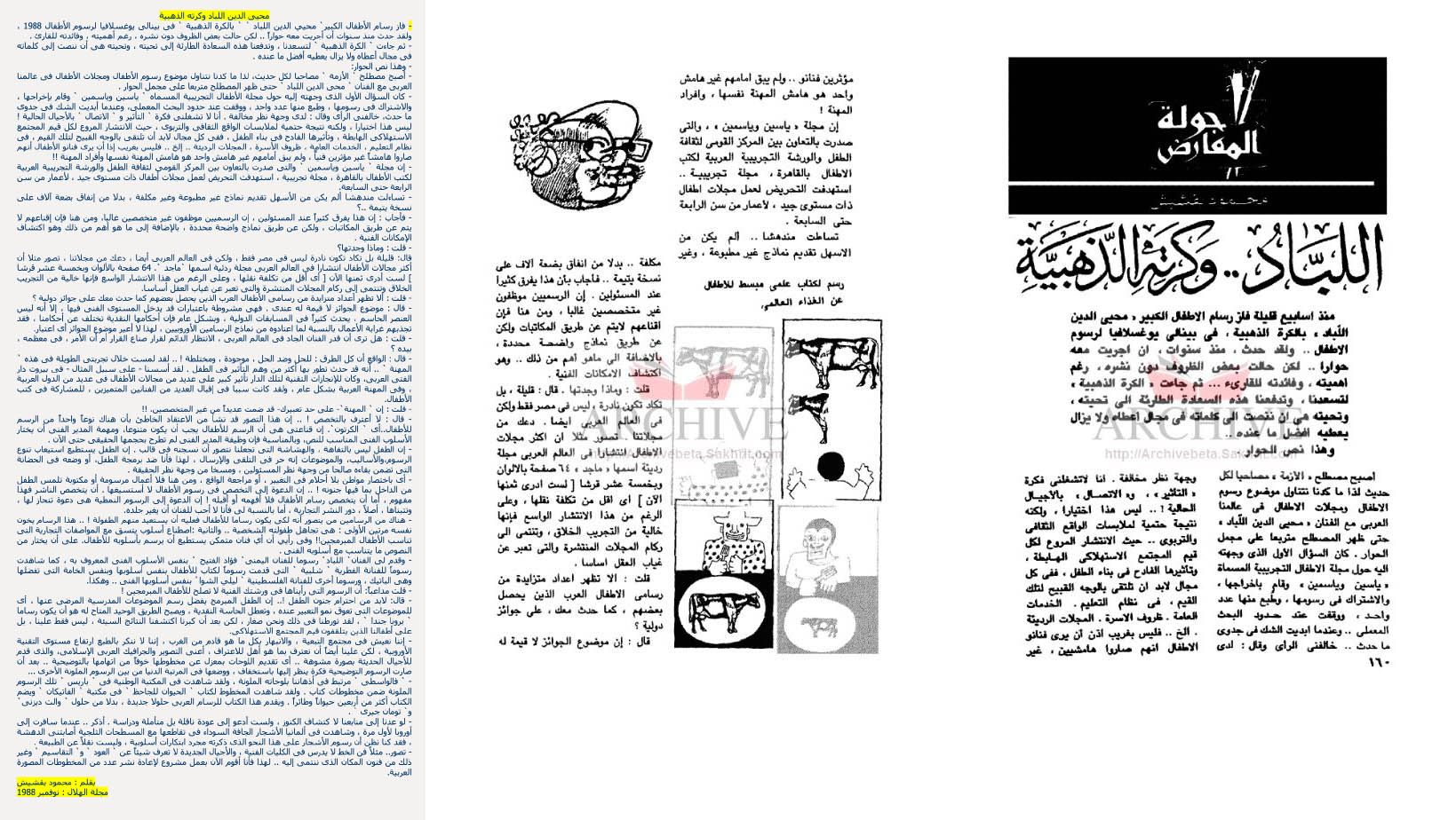
To illustrate, let’s extract one piece that perfectly embodies this point.

a screenshot of text

Translation:
Title:

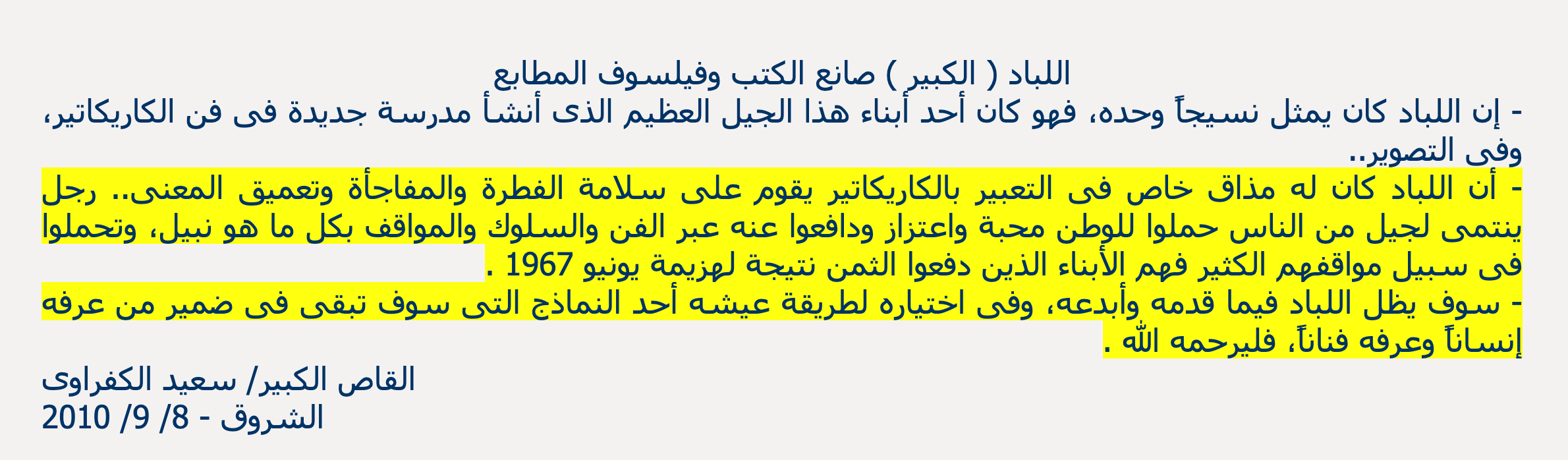
Ellabbad (The Great), bookmaker and printmaking philosopher

Body text:

Ellabbad alone constituted a fabric. His was a great generation, and he managed to establish a new school in the art of caricature and painting.

Ellabbad was unique in his ability to create caricatures that draw on instinct, a sense of surprise, and a deepening meaning. He belonged to a generation that had great regard and pride for their country, and defended it through art, mannerism, and noble stances. They endured much for the sake of these stances. They are the ones who paid the price as a result of the June 1967 defeat.

Ellabbad lives on through his innovations and all that he had to offer, and in how he chose to live his life, which will be seared in the memory of those who knew him both as a man and as an artist.

The title suggests that something of great significance is about to be conveyed, but only a few sentences follow that use a form of eulogy, which does not address or elaborate on the grand statements put forward in the title: How was Mohieddine Ellabbad a philosopher of printmaking? What is this philosophy?


Republishing:

Many of the pieces featured here were initially published elsewhere, so the previous critique is of the version that is re-published on the Faculty of Fine Arts portal. Still, there is something to be said about what happened to these pieces when they move from their original publishing platform to the Faculty of Fine Arts portal. One would assume that nothing should happen to them, or, if anything, that maybe some extra quality control measures were taken by the academy. But somehow, these texts were downgraded even further in that process.

The original form that these articles appeared in, whether a magazine or a newspaper, might have had images that accompany the piece, and thus the academy, for whatever reason, have excluded these images when reproducing these texts on its portal, which would in turn compromise these already fragile articles. This, in a way, exposes the text even further. The written pieces now appear naked to the eye of the observer.

Let’s also illustrate.

Left: A given text as it appears on the Faculty of Fine Arts portal. Right: The same text as it originally features in Al Hilal Magazine, August, 1998. Courtesy of Al Sharekh Archives

Here is another example:

Left: Another text as it appears on the Faculty of Fine Arts portal. Right: The same text as it originally features in Al Hilal Magazine, November, 1989. Courtesy of Al Sharekh Archives

After a close scrutiny of these texts, we can now gauge the general characteristics of writings on the Faculty of Fine Arts website. The portal becomes a graveyard of design writing, and what is missing there is writing that sets an example: the kind of writing that can spark a discourse and offer a multitude of viewpoints, which in turn makes way for a plurality of readings about a person or subject, that exhibits how writing can illuminate ideas and meaning in design work.

Think about the different kinds of visitors of the portal. The kind of writing that is found there does not present the subject in a way that can spark curiosity – not because the subject itself isn’t interesting, but because the writing about this very subject is flat in and of itself.

What do we get out of any piece we are reading? What makes a good piece of writing?
A helpful set of questions are suggested by the designer Khoi Vinh, which you can view here.


Another locus where you can find an account about Mohieddine Ellabbad is A History of Arab Graphic Design (2020). Though by no means comprehensive nor without fault, this publication nevertheless comprises an important inventory – perhaps the first of its kind – of practitioners who contributed to Arab visual culture. Far from being encyclopedic, the book has been praised by design practitioners, the media, and scholars.

Evidently, the book features Mohieddine Ellabbad among its list of designers. However, what it offers is a slightly more organized assortment of the scattered pieces found online, with a few extra images here and there, though without adding any real nuance to Mohieddine Ellabad’s work.

The book is celebrated as the first of its kind – and it is – but on its own, it is not enough. A close and curious reading of Mohieddine Ellabbad’s entry reveals some shortcomings, especially the part about his attempt to establish the Arabic Graphic Centre. The authors of the book claim that:

In 1976, he established the first graphic design center in Egypt: al-Warsha al-Tajribya al-‘Arabiya li-Kutub al-Atfal (the Arab Experimental Workshop for Children’s Books).

This excerpt presents this information as factual, but this can be contested. What is understood from this statement is that the Arab Graphic Centre is the same entity as the Arab Experimental Workshop for Children’s Books.

back cover of a book with logos on it
Modern Thought Volume II – back cover, undated. Courtesy of The Arabic Design Archive.
Left: Modern Thought Volume II, undated. Courtesy of The Arabic Design Archive. Right: Modern Thought Volume I – sketch, 1979. Courtesy of Mohieddine Ellabbad Archive.

Translation:

“Over the past three years, the Arab Graphic Centre produced many essential works in the field of graphic design and publishing of art prints, from books, booklets, covers, posters, annual reports, calendars, brochures, postcards, ad campaigns, and logos for international, regional, and local institutions.

The centre consists of a team of artists, designers, photographers, and technicians. It features an in-house studio equipped with the newest machinery at the time to help make photolithography, color separation process, montage, and visual effects.

Since this studio is located in the vicinity of artists’ studios, it is the first of its kind in the graphic design field in Egypt. The Arab Graphic Centre is thrilled to offer these technical tools at the service of the artists, designers, publishers, and printing houses in Egypt.”

The accuracy of this statement in A History of Arab Design can be questioned when we read this ad for the Arab Graphic Centre, written on the back of the book Modern Thought, published by the Arab Graphic Centre, and whose cover was designed by Mohieddine Ellabbad. The ad makes no mention of the Arab Experimental Workshop for Children’s Books being a part of the centre or synonymous with it.

A History of Arab Graphic Design, much like the portal of the Academy of Fine Arts, claims to be an authority on the subject – its supposed legitimacy stemming from both its authors and the publishing institution – and presents this information as factual, even if it may not be. The relationship between the Arab Graphic Centre and the Arab Experimental Workshop for Children’s Books is uncertain, and the book ought to reflect this uncertainty.

Some examples from the stationary coming out of both the Arab Graphic Centre and the Arab Experimental Workshop for Children’s Books help us speculate a few possible relationships between the two entities:

  1. The Arab Experimental Workshop for Children’s Books was a sub-entity under the Arab Graphic Centre.
  2. The Arab Graphic Centre and the Arab Experimental Workshop for Children’s Books were two separate entities headed by Mohieddine Ellabbad.
arabic graphic design
Left: Letterhead for the Arab Graphic Centre. Middle: Letterhead for the A1. Right: Envelope for both entities.
arabic graphic design
Left: Business card of Mohieddine Ellabbad. Middle: Receipt for both entities. Right: Receipt and map for A1. Courtesy of Mohieddine Ellabbad Archive

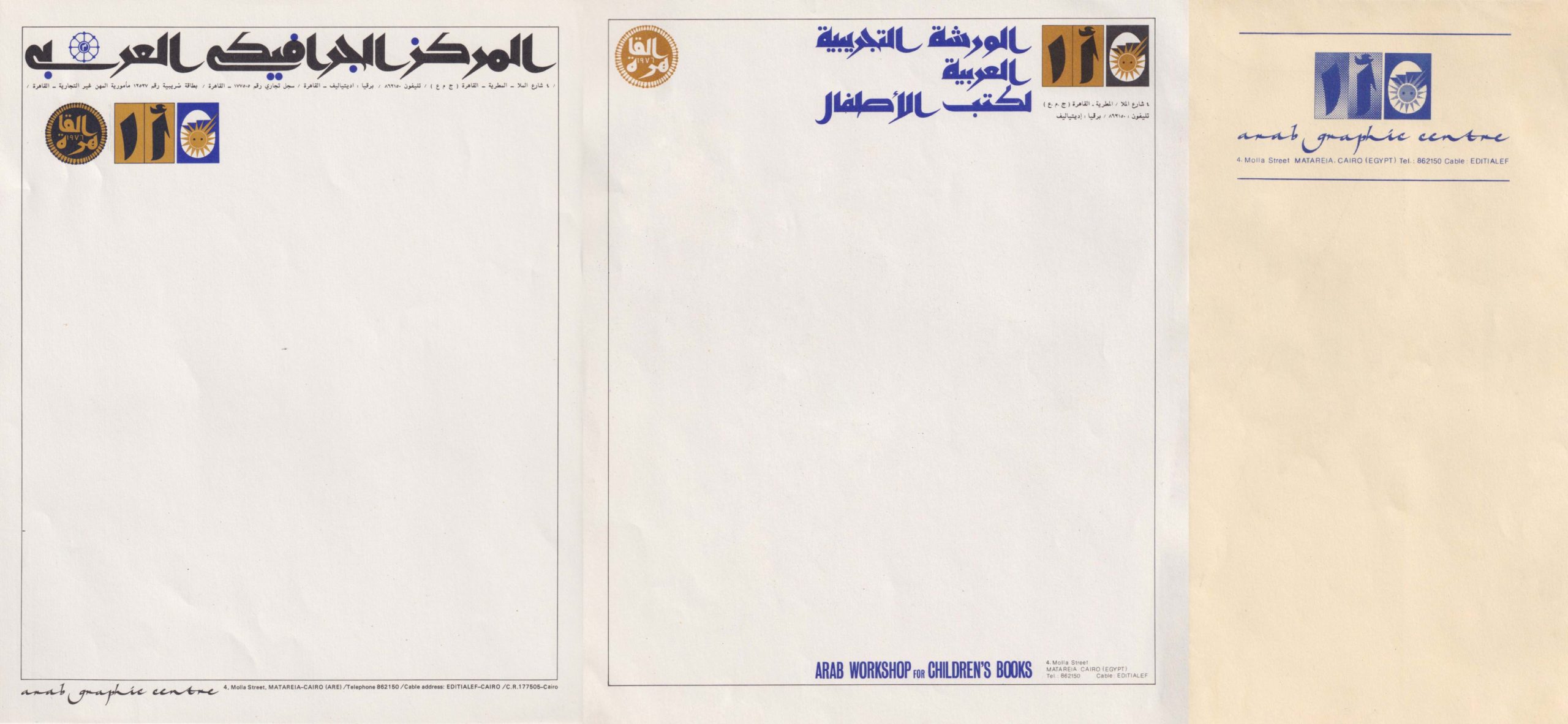
Indeed, they both shared the same space and were headed by Mohieddine Ellabbad, but that does not mean they were interchangeable entities. Looking at the stationery alone is not enough to identify a clear relationship between the two. If we consider size, scale, and typographic hierarchy – as an indication of the relationship between these two entities, then a close examination only leads to more ambiguity about the connection between the two. Perhaps Mohieddine Ellabbad himself had not established the exact distinction between the Arab Graphic Centre and the Arab Experimental Workshop for Children’s Books – we cannot know. Yet, the book presents this information with the definitive language of the certain.

Another faux pas that the authors of the book make is that they erroneously refer to the Arab Graphic Centre as the “Graphic Center in Egypt.” Though an image of the AGC logo is indeed included, it is captioned “The Arab Graphic Center,” which is not how Mohieddine Ellabbad had chosen to spell it himself, opting instead for British spelling (Centre) in the logotype. We do not know why the book’s authors refer to the AGC by another name. It could either be an innocent oversight, or a conscious choice to be dismissive of this detail.

The rest of the entry in the book seems to reiterate things that are already available online in a number of different sources, and surely, such a book has to be reductive if each entry must be limited to 2-4 pages. Hopefully, this essay can help fill in this gap in later editions.

Another important resource for those who are interested is a dedicated section about Mohieddine Ellabbad in the magazine “The world of Books,” which features a few a few interesting reads, one of which is written by the Syrian Theater director, Osama Ghanam, and titled: “My name is Labbad: If drawing speaks.”

The present essay is and will remain a work in progress, through which I hope to reveal some of the nuances about someone who is akin to a mentor whom I never met. It could also be viewed as an exploration of an alternative kind of writing about design. Readers are advised to critically read this essay, and maybe use Khoi Vinh’s lens to view it.

The Arab Graphic Centre (AGC):

the arab graphic centre logo in arabic
Logo design for the Arab Graphic Centre Designed by Mohieddine Ellabbad, 1976 Courtesy of Mohieddine Ellabbad Archive

The Arab Graphic Centre was established in 1976 by Mohieddine Ellabbad when he returned from his journey with Dar Alfata Al Arabi in Beirut (1974-1976). Alongside the AGC, he also established the Arab Experimental Workshop for Children’s Books (A1), though the exact relationship between the two remains unclear. They both were located at 4 El Molla Street, Mataria, Cairo, Egypt. Mohieddine Ellabbad left Dar Alfata Al Arabi for various reasons, not least among them was the increasingly alarming danger of the Lebanese civil war[8]نص ملتقي شرم الشيخ. He and Nabil Shaath also had differing visions about the place’s future.[9]Khan. Revolution For Kids: Dar El Fata El Arabi, Recollected, 2010 He then returned to Cairo, ultimately establishing both the AGC and A1.

The centre aimed to establish an authentic modernist Arab graphic design practice, grappling with what was a pressing issue at the time: the relationship between tradition and modernity, or the double claim of authenticity and modernity (التراث والحداثة) through mass printed media. When he was asked in an interview with Salah Issa about the idea of authenticity in children’s books, his answer – that authenticity and modernity are one – captures his overall standpoint on the matter.

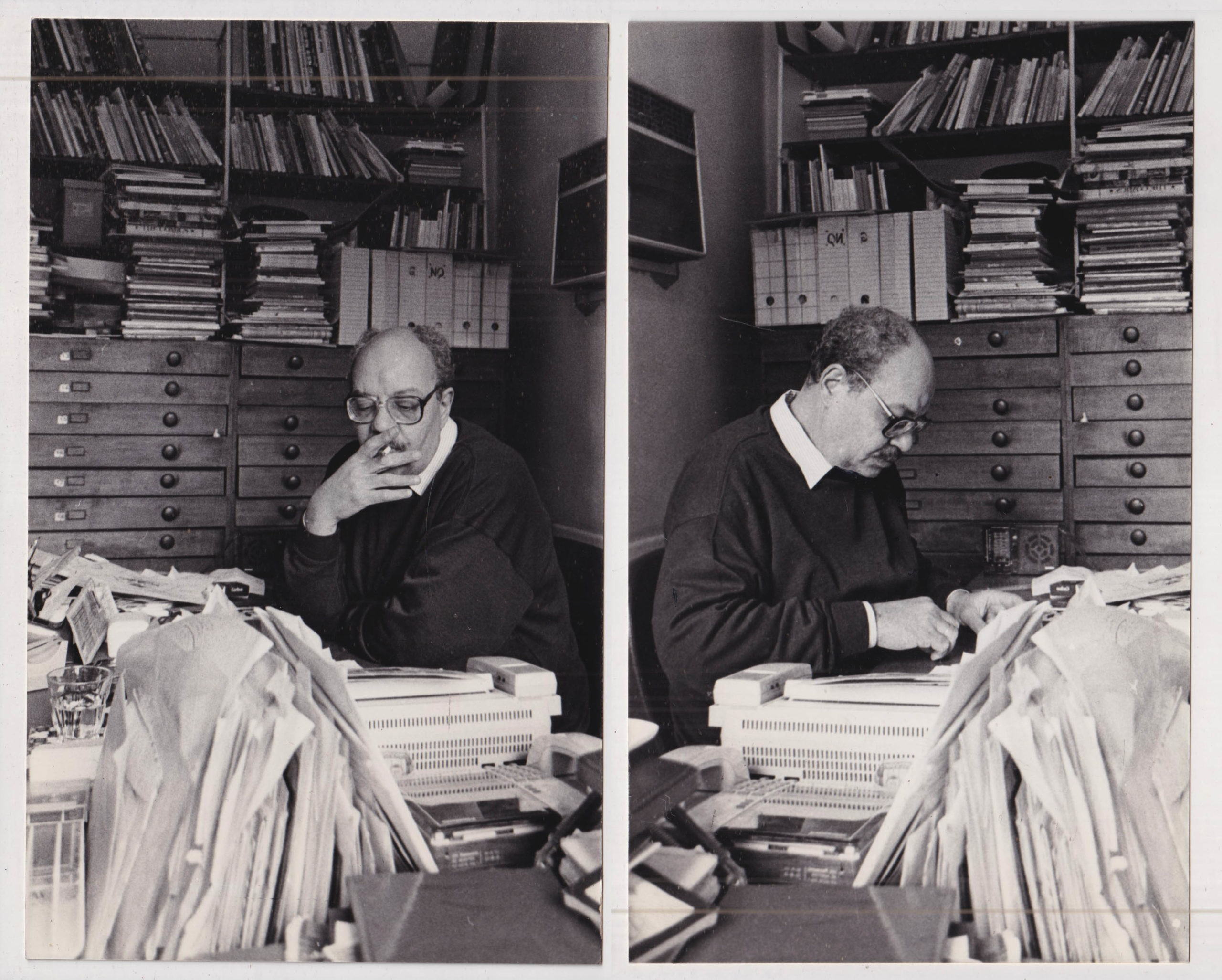
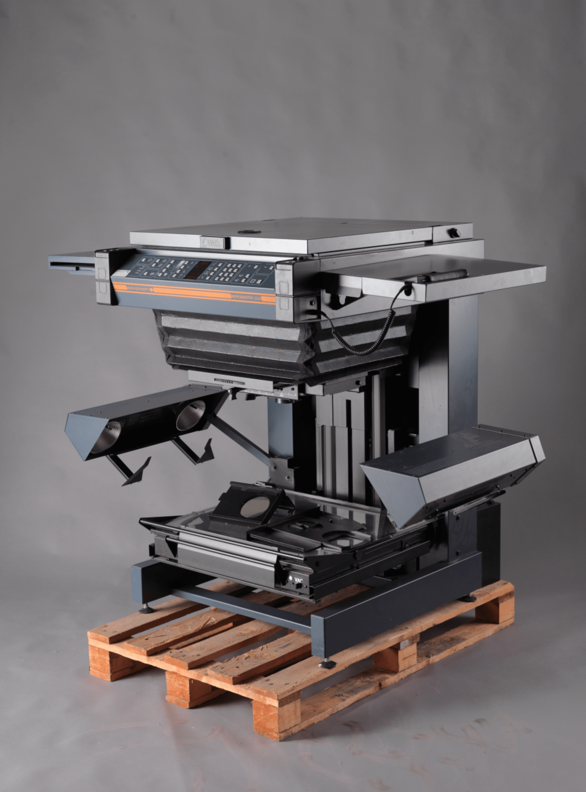
The AGC consisted of a small apartment in Mataraya, a very small space according to his son, Ahmed Ellabbad, who confirmed that Mohieddine turned it into his studio after the AGC was no longer operating. One of the rooms was designated for production, and had either an Afga Repromaster 3500 (see Fig. 1) or 2200, either one of these models or a similar one confirmed by both Ahmed Ellabbad and Moody Hakim, an old colleague of Mohieddine Ellabbad’s. The machine is a photomechanical transfer, also known as PMT. It offered a multiplicity of functions, including photolitho for special effects and other prepress functions.

a poster and a publication designed by Mohieddine Ellabbad
Left: Catalogue advertising photolito effects available at the AGC, undated. Courtesy of Mohieddine Ellabbad Archive. Right: The Palestinian Resistance Poster with halftone effect done with Repromaster. Courtesy of Mohieddine Ellabbad Archive

Mohieddine Ellabbad equipped the machine with Japanese made layers (contact films) of filters, which were used to emulate what we now know as photo filters or effects in Photoshop. These filters created halftone effects, circles, color overlays, mezzotint, and more. Both the machine and the films were a significant investment, but for him it was an inevitability if he wanted to succeed in having ultimate control over the design process, as well as present the AGC as a true collaborative space. This machine was accessible to anyone who needed it away from the complexities and bureaucracy of publishing institutions, which were the sole provider of such a service at the time. He created a catalogue with samples of these effects, which were used to showcase the possibilities that can be achieved through the machine. He also presented it to clients to display its technical capacities, and distributed it to other graphic design practitioners who wanted to use the machine or know more about it.

A spread from Z. A. Prust’s Photo-offset Lithography (1977). Courtesy of the internet archive.
Fig. 1 Repromaster 2200 (1970s, 1980s) . Courtesy of the Norwegian Technical Museum.

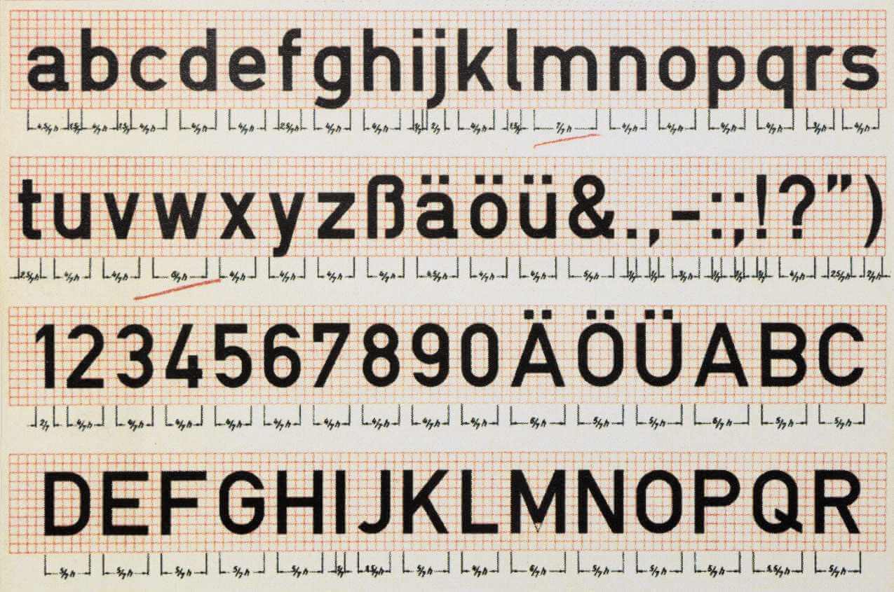
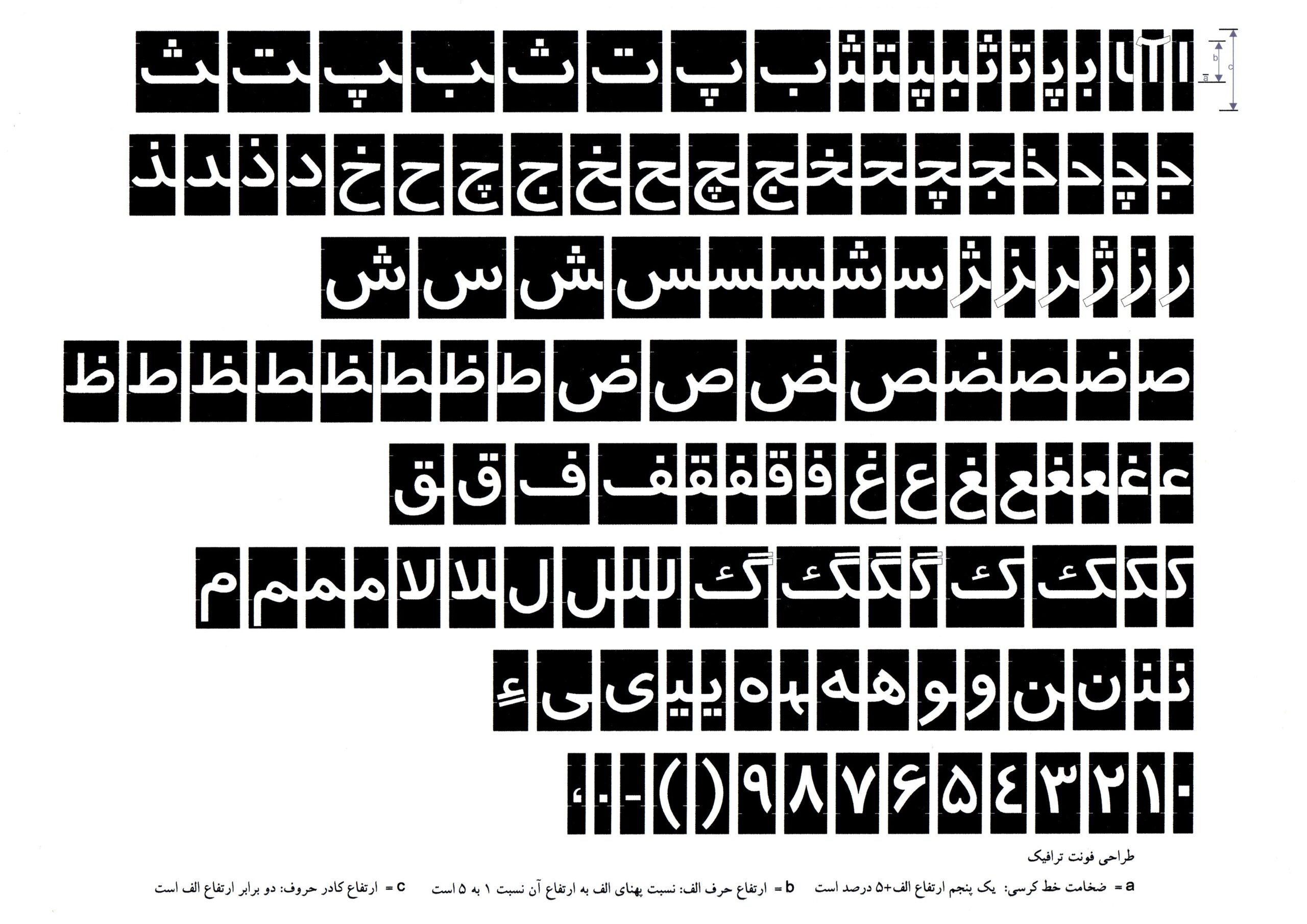
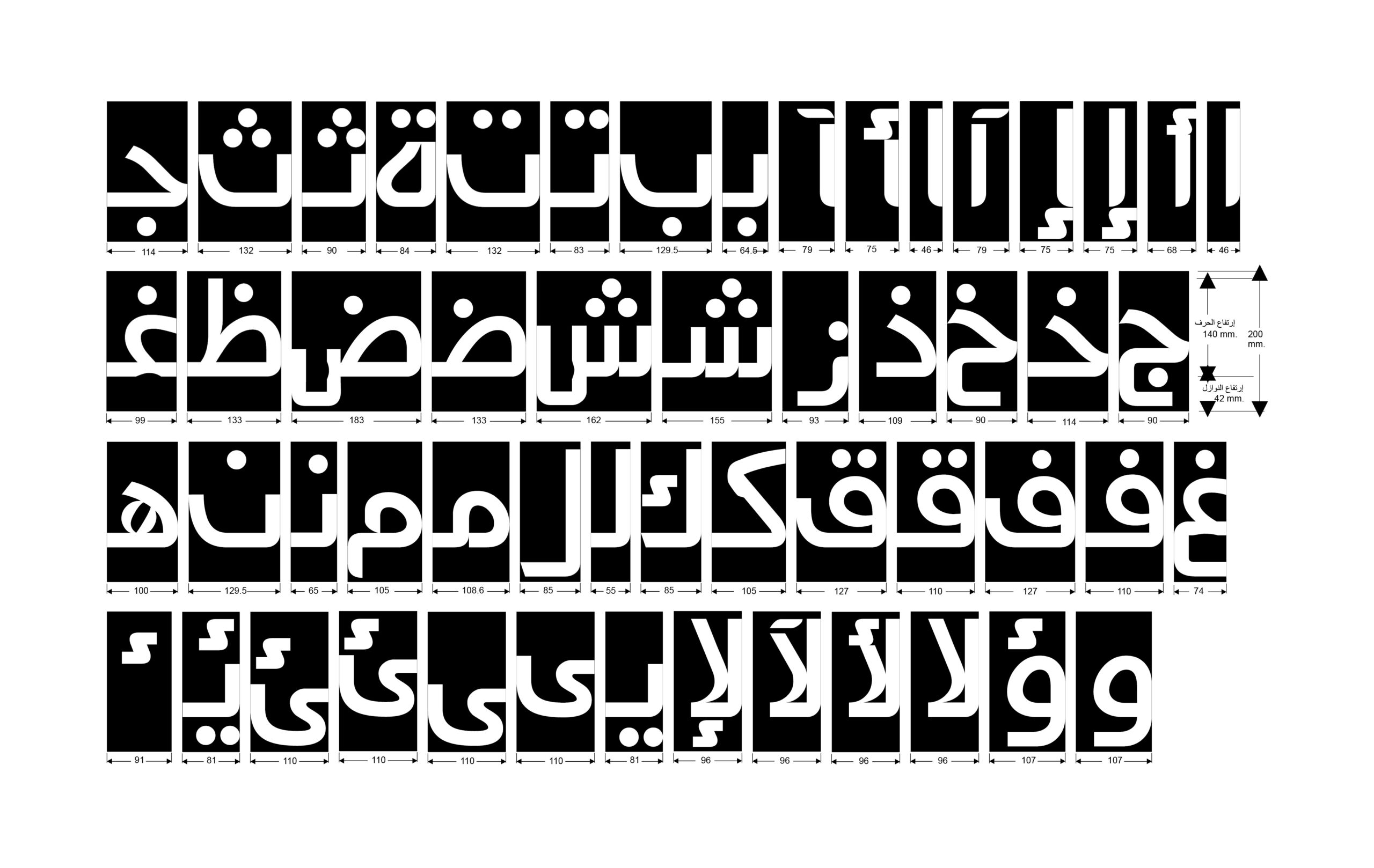
The history of prepress (design before the computer) in the region remains a mystery to us to this day, as there is very little documentation of this period about the design, printing, or publishing process with its technical aspects and practices.

At the time, this machine was considered to be an advanced machinery which required special technical competence. A few years prior, Mohieddine Ellabbad had met the Ethiopian-Italian print specialist known as Mr. Louigy through Ros Alyousef. Mr. Louigy came to work in Egypt and was praised for being meticulous in his work, a trait that he shared with Mohieddine Ellabbad, and which also explains why they gravitated towards one another. Mr. Louigy played an important role as a technical consultant for the AGC. Mohieddine Ellabbad took his advice on which machine was better and then got a Danish-made photo transfer machine. Soon after, Mohieddine Ellabbad asked Mr. Louigy to be in charge of running the machine at the AGC on a project basis. Eventually, Mr. Louigy trained a person who would be permanently located at the centre to handle the machine to facilitate the day-to-day workflow.

This ensured that almost all prepress work happened in-house which, to a great extent, guaranteed the reduction of any mistakes that could happen in the process, and that the work would directly go from the AGC to the client.

Mr. Louigy, undated Head of printing at Ros Alyousef Courtesy of Mr. Mimi Khalifa.

The AGC aimed to be both an experimental and practical space for the design practice. According to Nabil Tag, who joined the AGC in 1977 as a permanent designer and Illustrator, the centre also engaged with client briefs and projects, providing services such as brand identity, editorial design, brochures, flyers, and posters.

When asking both Ahmed Ellabbad and Nabil Tag to identify one of the most important projects undertaken by the AGC, they both agreed that it was what Mohieddine Ellabbad jokingly referred to as the “Black Box” project: a limited-edition series of classical Islamic works published in 7 volumes, that features the works of people such as Ibn Fadlan, Ibn Hazm, and Ibn Khaldun. The series was published in 1981 by Les Éditions Kitaba & Les Éditions Kitab. One can try to reconstruct the thinking process of the AGC from the clarity of direction in the outcome. The AGC attempted to explore the possibility of infusing something traditional with a sense of contemporariness. However, it shows that it was not intended for it to be an equal balance between those two ingredients, as the AGC vigorously favored the traditional side – with good reason.

Label sticker in Arabic and French from the aforementioned book, 1981. Courtesy of Mohieddine Ellabbad Archive.

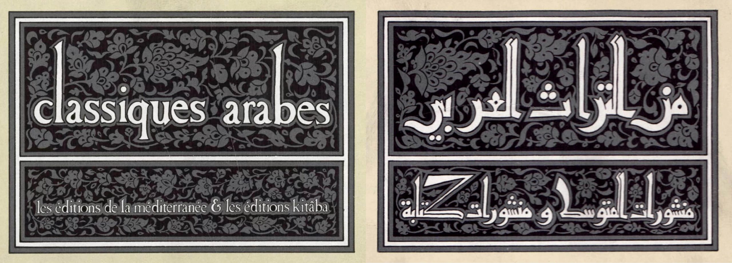
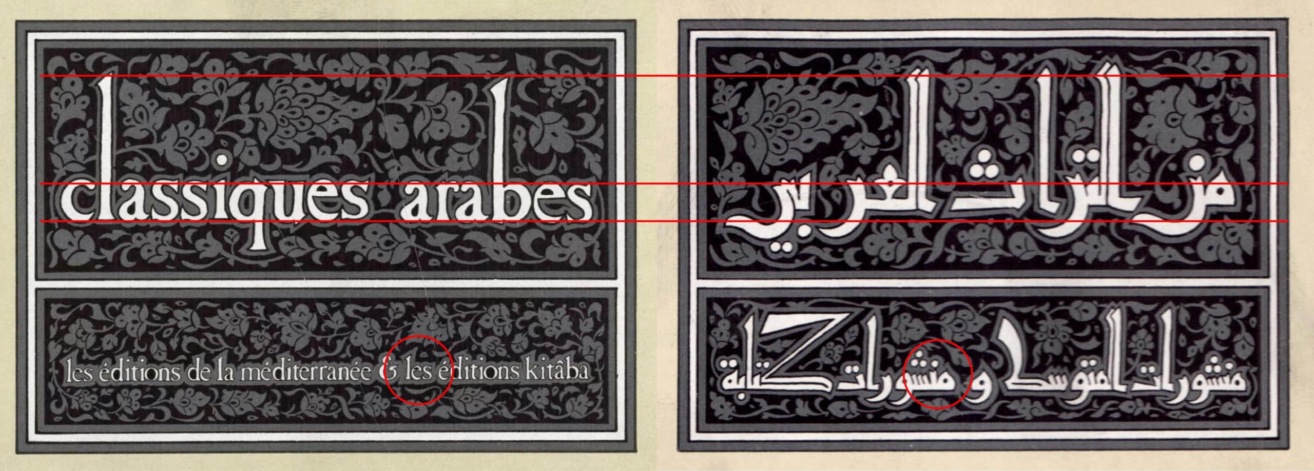
The 7 books are nested in a cardboard black box with a sticker on it that features the name of the series and publisher, written in a meticulously-crafted variation of Eastern Kufic script. Both the title and publisher’s name sit inside a rectangular compartment. When juxtaposing both the Arabic and French versions, we can see that Mohieddine used an all-lowercase serif typeface for the Latin, while making sure that some distinct features from the Kufic script spill over the the Latin script. This can be observed in the extended stems of the “l” and the “b,” where they are forcefully stretched to match the height of the Alef Lam in the Arabic, a feature that is unique to this kind of Kufic. We can also notice that some counters in the Latin are almost closed to match those in the Arabic. This may initially appear to be nothing more than a graphic treatment for consistency, but this deliberate design decision carries a more radical underpinning. The reversal of influence between the Arabic and Latin in the script echoes a much deeper decolonization project that Mohieddine Ellabbad was adopting.

This decolonization project was the substrate upon which all of Mohieddine Ellabbad’s work sits. Only when we consider the totality of his body of work, we can discern the thread weaving through this project. We could attempt to analyze one piece he did that couldn’t be more straightforward and emblematic of this project.

Logo design for the publishing house “The Arab Future.”

Three logo sketches for the publishing house – Almostaqbal Alarabi, undated. Courtesy of Mohieddine Ellabbad Archive.

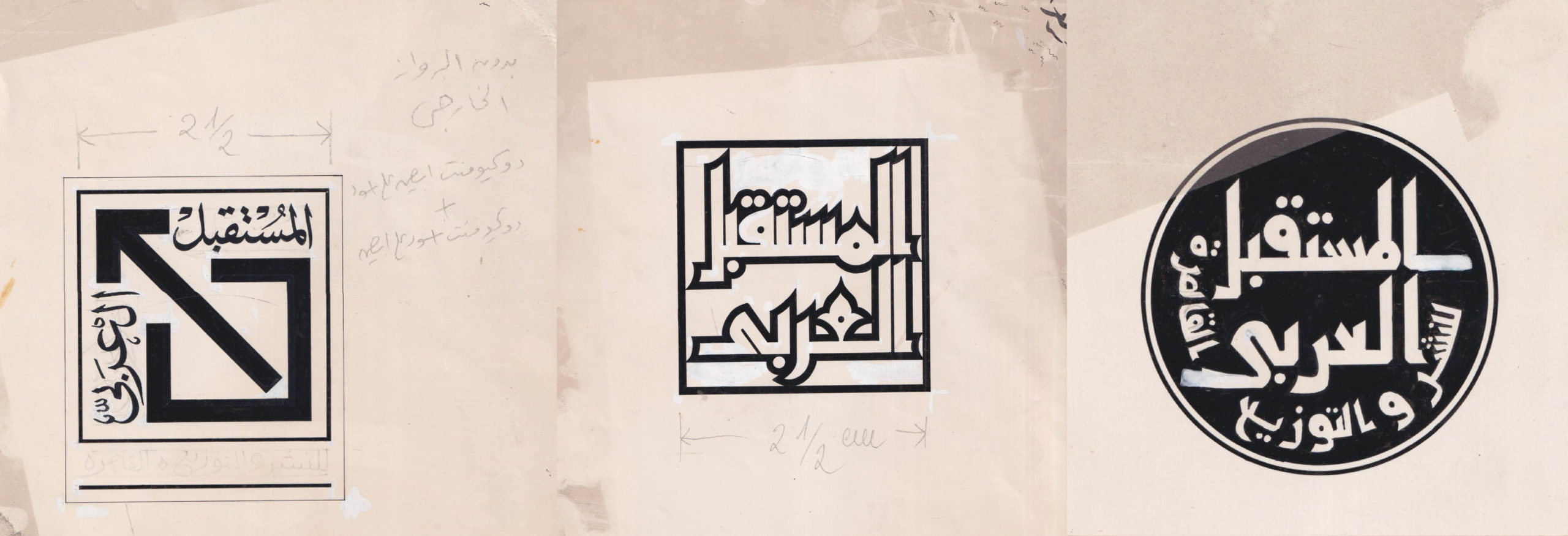
Here, we see the evolution of the design of the logo, the iteration on the left being the final one. The logo has both a linguistic message and a symbolic one. The linguistic message only requires a knowledge of the Arabic language to comprehend. However, the symbolic one seems to have a multitude of meanings. The signs included here are a broken square – which implies that there square was once whole – with an arrow coming out of it. For the sake of understanding the meaning of this symbol, if it is captured in motion, then there must have been a starting point. Let us try to imagine this starting point (see animation below).

Author’s animation of the original logo, 2022.

The initial state of this symbol would have been a closed square, with a diagonal line dividing it into two equal spaces. The enclosed square may suggest a hegemonic space. When this is thought of as a simplification of a much larger structure, one could claim that it could represent the (Euro-American) hegemony that Arab intellectuals were trying to break from. Then we have the arrow that breaks out of the square. The arrow is a universal sign for moving, force, and direction. The arrow moves from right to left, emulating the Arabic writing direction as it breaks out from the square. Then the linguistic message of “The Arab Future” is attached by means of alignment to the head of the arrow, where the force is condensed. It could then be read as: The future of Arabs lies beyond the Euro-American cultural imperial project.

There is more than one reading that can be drawn from this symbol, but this will suffice to illustrate how this decolonization project found itself in a different avenue.

Back to the blackbox project: we see behind the titles what seems to be a variation of a Mamluk-inspired floral ornament. This book series was specifically inspired from Islamic manuscript traditions, which Mohieddine Ellabbad was particularly interested in, believing them to contain a wealth of graphic practices related to book-making which, for him, corresponded to what an Arab design might start from.

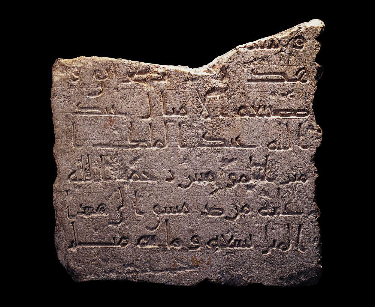
From the obvious cover design of these books to the subtler traditions like Khatm (colophon), Tatmim (closing formulae), a form of Isnad (ascription), and unwaan (title page)[10]Gacek. Arabic Manuscripts, 2009, he researched Islamic Manuscript traditions extensively. According to Ahmed Ellabbad:

“He had a wealth of references from different libraries to study, the likes of the Vatican, Italy and The National Library, France. He used to be always curious to look for their original copies and buy the slides when possible.”

Right: Case cover for the aforementioned above, 1981, AGC. Middle and left: Book covers of two volumes, 1981, AGC. Courtesy of The Arabic Design Archive.
Detached folio from a dispersed copy of the Qur’an, Egypt, Mamluk period. Courtesy of National Museum of Asian Art.

The layout, ornament and script style has staggering similarity with this Mamluk manuscript from Egypt. One might assume it could have been one of his many references while working on this project.

Mohieddine Ellabbad was not only interested in exploring these traditions for his own practice, for he was first and foremost a design populist, seeking to introduce the public to these traditions. He refused the notion of belittling the public’s ability to apprehend sophisticated visual communication, and he saw that this perception of the viewers lowers the standards of the profession.

Among his attempts to bring attention to these manuscript traditions was through A1.

a poster showing manuscript illustrations
Poster for an exhibition organized by the Arab Experimental Workshop for Children’s Books, Cairo, 1982, at Cairo International Book Fair. Courtesy of Mohieddine Ellabbad Archive.

The Latin logo of the center is itself a statement of and on this approach. Subverting the foundation of the Latin written word, Mohieddine Ellabbad reinforces the Arabic reed pen to write the Latin logo, and to suppress the Latin characters by imposing the Arab characteristics onto it. The result is an “Arab Graphic Centre” that is Arabized.

the arab graphic centre logo in english
Final sketch of the logo for the Arab Graphic Centre, designed by Mohieddine Ellabbad, undated. Courtesy of Mohieddine Ellabbad Archive.

This inspiration can be detected across his practice, with many different experimental and practical works that attempt to start from these traditions, incorporating them when possible. One example is a series of books published by Dar Ibn Rushd in 1981. In this series, Mohieddine Ellabbad experiments with the visual vocabulary of Islamic manuscripts. He skillfully uses decorative elements and visual devices not only for aesthetic purposes, but also to guide the viewer through the design, emphasizing certain parts by placing them in medallions. We can also see the utilization of the “circular medallion,” known as the Shamsah element, as a text divider between the author’s name and other pieces of information.

Book covers for Dar Ibn Rushd designed by Mohieddine Ellabbad, produced by the AGC. Courtesy of The Arabic Design Archive.

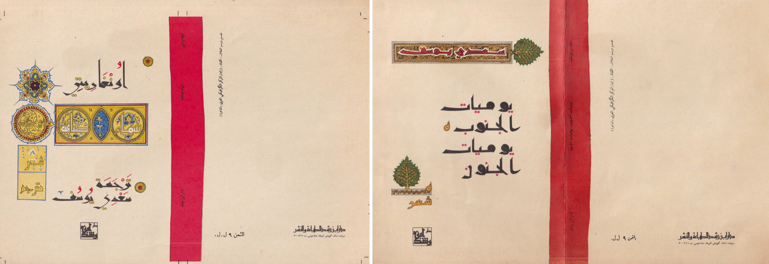
The Shamsah element was commonly seen in illuminated Quranic manuscripts as verse-counting devices, verse-markers, or verse-ending markers. Their highly decorative botanical shapes were meant to force the reader to take a pause at the end of each verse, as well as a reminder of the point that the reader reached in the text.

This shows that Mohieddine was knowledgeable with the function of these elements in their original context, which requires extensive research and study. Moreover, the liberty in positioning the design elements and their proximity, orientation, and placement in some of the covers, challenges the idea of an authoritative understructure grid perpetuated by the Swiss style of design, which had a significant influence on the Western modernist movement. Rather, he chooses to free some elements from this grid, which creates organic- looking designs.

My investigation into the AGC is still undergoing, and this essay will be followed by as many more texts as needed to shed light on the Arab Graphic Centre and its founder Mohieddine Ellabbad.


Resources to consider for Arabic design writings:

  1. The Arabic Design Library: Here
  2. On Arabic Justification: Here and Here
  3. Safar Magazine: Here
  4. Cosmopolitan Radicalism: Here
  5. Signs of Conflict: Here
  6. A History of Arab Graphic Design: Here
  7. Arabic Type-Making in the Machine Age: Here
  8. Arabic Typography History and Practice: Here
  9. Arabic Typography: Here
  10. The Abbasid Tradition: Here
  11. Qur’ans of the Umayyads: Here
  12. Arabic Manuscript: Here

Special Thanks to the following people:

1. Mr. Ahmed Ellabbad
2. Mr. Mimi Bisher
3. Mr. Mohsen Refaat
4. Mr. Moody Hakim

Footnotes

Footnotes
1 Teal Triggs, Graphic Design History: Past, Present, and Future
2, 3 Ibid
4 Blauvelt. Designer Finds History, Publishes Book, 2010
5, 7 Poynor. Out of the Studio: Graphic Design History and Visual Studies, 2011
6 Triggs. Graphic Design History: Past, Present, and Future, 2011
8 نص ملتقي شرم الشيخ
9 Khan. Revolution For Kids: Dar El Fata El Arabi, Recollected, 2010
10 Gacek. Arabic Manuscripts, 2009
Critical WritingEssaysTranslations
Dark Mode

On Arabic justification: part 1 – a brief history

Introduction

This is the first of a series of posts on Arabic justification. It begins by setting out some basic – but rarely expressed – observations about the subject which underpin the following discussion. It will then consider the typographic legacy of justification in a very short history. To understand the current situation, and to consider an informed way ahead, we have to know how we came here.
A second post will review current software implementations, the available options, and discuss their approaches, qualities, and shortcomings. Having established current typographic justification of Arabic, a further post will examine exemplary historical practice from the Middle East with the aim of identifying clues that may contribute towards the advancement of current practice.

The basics of Arabic justification

Arabic justification, i.e. the filling of a line of text to achieve uniform lengths for all lines of a column, uses different concepts to those that are widely known from the Latin script. Because most Arabic letters connect, hyphenation, i.e. the breaking of words at the end of a line, is generally not practised (there are some exceptions, notably the modern Uyghur orthography which adopted word-breaks across lines in typography).1

In Arabic texts, handwritten and typographic alike, the remaining space of a line is principally filled using a combination of three techniques: (1) the variation of letterforms (principally elongation and alternative letterforms), (2) changes in the density of black and white, and (3) the configuration of words, including the vertical stacking of letters, reduction of size, and extension of the line into the margins. In the context of typography, the latter is of marginal relevance, and this post will only consider the first two techniques.

Hand-lettered shop sign of a doctor’s surgery illustrating elongation principles of Arabic writing styles. From top to bottom: Naskh style using a swash variant of kāf, Nast‘alīq style employing kashīda elongation, Ruq‘ah style foregoing any elongation because of the ambiguity it would create with medial sīn. Damascus, Syria, 2007. Photograph by the author.

The most prominent technique for Arabic justification is elongation, and it is known by various terms with ambiguous usage, including notably kashīda, madd, and taṭwīl.2 Whilst kashida (in the simplified English spelling) is most frequently used, it often lacks precision of meaning. However, amongst authors engaging the subject of justification there appears to be growing consensus that kashīda is the preferred term for the elongation of letter parts, agnostic of technological implementation.3 This post employs the more elaborate distinction that Thomas Milo established in the context of DecoType’s technology,4 in which kashīda relates to the elongation of letterforms by means of curvilinear strokes following conventions observed in manuscript practice, and taṭwīl refers to the Unicode character U+0640 Tatweel.5 A further, specialised case of elongation are swash variants of letterforms. Although also used for justification (amongst other uses), they are governed by different rules to kashīda elongation, and will be referred to here as swash variants.

By contrast, the Tatweel extension stroke, although widely seen as the standard means of justification in Arabic, is an artefact of typographic technology and should be considered separately. The Tatweel is discussed more below, but suffice it to say at this stage that it should not be regarded as a feature inherent to the script. It is important to note that the elongation of letterforms does not mean stretching (which implies a simple distortion), but a reconfiguration of the whole letterform, and that only some letters, and only certain parts of them may be elongated – and that much only in specific, style-dependent contexts.

Arabic manuscript demonstrating various justification techniques in a Naskh hand. Note how subtly the justification means are used: apart from the red subsections, which are meant to stand out, the main text appears to have equal line lengths without apparent elongations. Only careful observation reveals elongation (lines 1, 3, 8), letter-stacking (lines 1, 3, 13), and changes in the density of the writing, the latter being the preferred technique in this manuscript. Taqī al-Dīn Muḥammad ibn Ma‘rūf, Treatise on watchmaking, Nablus, 1701–1800, 27,5 cm by 17,5 cm, 85 pp. Courtesy of BnF Gallica, ark:/12148/btv1b8406163s

From Arabic manuscript to letterpress justification

When printers adopted typography to compose Arabic texts, justification principles had to be translated into the new medium. In manuscript production a scribe could use his experience to approximate the number of words he could fit in a given line. Whether he needed more or less space he could tweak the proportions of letter shapes, the width of white spaces, the vertical arrangement of letters and words etc., all before resorting to the more visible justification means: swash letterforms and elongations. Scribes thus had a range of tools to make a written line fit the column.

In letterpress printing not much of this malleability remained. Although white space could be modified too, it was not as flexible. Adding quads to fill a line was easy enough, but reducing the space between sorts required a disproportionately bigger effort by the compositor than by the scribe. Letterforms, on the other hand, could not be modified at all, considerably reducing the margin of manoeuvre. Metal type thus left the compositor with three means to quickly justify a line and lock the forme:6 (1) increase the width of word spaces, (2) use swash sorts if contained in the font and applicable in the given line, or (3) insert specialised sorts between letters to mimic the elongation of letter parts – enter the Tatweel.

Although technically possible, it was economically inconceivable for compositors to create elongated letters as they were needed. In principle typesetters had to work with the font at hand, employing its sorts to the best effect, and as quickly as possible. Rather than making custom sorts for every justified line, typography’s modularity was therefore used to imitate Arabic elongation by means of a dedicated typeform: the Tatweel.7 It was first used by European type-makers and printers when they began composing Arabic in the sixteenth century. Straight extension strokes can be found at least as early as 1516 in a multilingual volume of the gospels published in Genoa, and henceforth it remained a feature of European Arabic typography.8 The utility of the Tatweel is obvious, and would have been appreciated by the compositors of Arabic type. A uniform, straight line that could be repeated as desired and inserted between any connecting letterform greatly facilitated their work. If setting Arabic was laborious, at least its justification was easy.

An example of the excessive use of the Tatweel sort in early Arabic letterpress typography. From Bashārat yasū‘ al-masīḥ kamā kataba mār matī wāḥid min ithnaī ‘ashara min talāmīḏihi, Rome: Typographia Medicea, 1591, 137, Austrian National Library, 255499-D, http://data.onb.ac.at/rec/AC09709138

Yet, the compromises of Arabic typography justified with what amounts to a horizontal rule may not have been appreciated by sixteenth century compositors.9 Although the basic principle of elongation could be readily observed and explained by Oriental scholars, typically involved in the context of European typography, the more elaborate rules underpinning it remained opaque to the first printers of Arabic texts. This discrepancy is well illustrated in books produced at the Medici Oriental Press in Rome. Backed by considerable political and economic clout, its Arabic volumes were widely regarded as hallmarks of scholarly and artistic achievement.

The renowned French punch cutter Robert Granjon, then at the height of his career, was commissioned to cut new Arabic types specifically for the task, and produced five fonts in various sizes.10 Their influence was considerable as they were widely copied and until recently held up as role models of Arabic type-making.11 The fonts achieved somewhat greater fidelity with the Arabic script than their precursors, and included swash variants and some elongated letterforms that Granjon may have intended for justification. Yet the publications of the Medici Oriental Press are dotted with instances in which the compositors still resorted to inserting straight Tatweel sorts, with predictably alien results. Whereas Granjon’s fonts had a lively appearance, with a multitude of curves and rounded strokes, justification by means of the Tatweel introduced a geometric linearity nowhere else to be found – excepting the margins surrounding the column. The unrestrained use of this sort stretched words beyond recognition, and created blank spaces without apparent function, undermining a central tenet of typography for reading: lending shape to meaning.

Mechanical justification and the Tatweel: made for each other

Notwithstanding these shortcomings, the Tatweel remained in use. Indeed, rather than disappearing with advances in technology, it appears as if increasing mechanisation contributed to its proliferation. Machinery and industrial manufacturing processes favoured modular concepts, and systematic organisation. Point sizes and the organisation of type widths into repeatable units are but two elements of type-making that had resisted uniformity and consistency for hundreds of years, but were standardised soon after mechanical processes supplanted manual techniques. The Tatweel fitted very well into the systematisation of type-making and typesetting, whereas the formal variety expressed through swash characters, for example, did not.

With the emergence of the typewriter in the nineteenth century, the segmentation of the Arabic script into recurring elements reached a new low. Although the repertoire of forms that could be represented with 90 keys required a drastic cull of letterforms, the Tatweel kept its place in the characterset. Thus it attained unprecedented prominence, and today justification using the Tatweel, although historically inaccurate, is often associated with the typewriter and its drastic simplification of the Arabic script.

Close-up of the type petal carrying the Tatweel on an Olympia SM-8 typewriter. Photograph by the author.
Typewritten sample using the Olympia SM-8 typewriter, illustrating the function of the Tatweel. Photograph by the author.

Throughout the twentieth century, and across the numerous technological changes that it saw, the Tatweel retained its place. From the first Arabic Linotype (1911), to the first Monotype system for Arabic composition (1939), photocomposition devices, and computer-assisted typesetting, the Tatweel was included in fonts, and used in typography. When Linotype & Machinery and Compugraphic co-developed the first automated Arabic justification computer in the second half of the 1960s, the role of the Tatweel was firmly established.12 Hrant Gabeyan, at the time L&M’s representative to Egypt and Sudan, became responsible for the design of the substitution tables that governed the justification ‘choices’ of the computer. We know that Gabeyan consulted a range of professionals in the field, including calligraphers, teachers and Linotype operators, to inform his task, yet the exact process and the rationale that guided the resulting specifications are difficult to reconstruct today. Probably the prospective customer of the system, the Al-Ahram newspaper, had considerable influence on its design, tailoring it to the needs of newsprint composition. The Arabic JusTape justification computer was built around the Tatweel as the principal means for justification, and modification of white space and elongation of letter shapes were disregarded. Indeed, the patent that L&M filed to protect its invention lists the term ‘kashida’ 64 times across its 12 pages.13 Although the JusTape primarily automated what newspaper compositors in the 1960s already did, it also codified practice, and thereby established a precedent for subsequent automated justification systems.14

Front page of Al-Ahram newspaper from 1, 4, 7, and 8 November 1968, showing the transition from hand-lettering to automated type composition. On 1 November, all headlines were hand-lettered in the Ruq‘ah style; on 4 November, the main heading was written in a ‘typographised’ Naskh style, anticipating the upcoming change; three days later, the main header kept its typographic look, whilst more sub-headlines also changed from Ruq‘ah to Naskh; by 8 November, the new equipment from Linotype and Compugraphic was installed and first put to use, replacing all hand-lettered headlines with hot-metal composition type. This issue of Al-Ahram probably is the first ever publication using automatically composed Arabic type with automatic Tatweel insertion. Illustration made by the author using images obtained from the Internet Archive, https://archive.org/details/AlAhram1968EgyptArabic, accessed 8 November 2019.

Tatweel today

Over time, and through continuous, uncritical repetition of previous practice the Tatweel secured its place in contemporary typography. A place that was cemented, for the time being, through the inclusion of a discrete Unicode codepoint in version 1.1 of the Standard in 1993. ‘U+0640 Arabic Tatweel’ is defined as a modifier letter with the ‘join causing’ property. The Standard notes that this differs from the ‘dual joining’ property in that characters of this class ‘do not change shape themselves’. Thus, according to the standard that encodes nearly all contemporary text, the Tatweel is a solid rule, in shape and behaviour identical to the sorts that European type-founders used in the sixteenth century. Unicode therefore assigns semantic meaning – a codepoint – to what should be a purely graphical device, demonstrating one of the many inconsistencies of the Standard. After all, a central tenet of Unicode is the distinction between semantics and form, between characters and glyphs. Yet because many of its principles derive from typographic legacy, technological artefacts such as the Tatweel entered its conceptual framework.

The pronounced technological bias is also manifest in the inclusion of the Tatweel on most contemporary Arabic keyboards.15 One of the unintended consequences of the hard-coding of a graphical elongation device is that users employ it for purposes that it was not meant to be used for. For example it is common that users key Tatweel characters in order to trigger joining behaviour. Because some fonts fail to make the expected isolated form of Heh accessible, users frequently key Heh followed by Tatweel to give them the initial form of Heh, visually more similar to the required isolated shape, but then followed by the straight Tatweel bar.


Illustration of unintended usage of U+0640 Tatweel to trigger joining behaviour in poorly programmed fonts. From right to left: (1) Arial does not provide the isolated Heh form that is expected for the abbreviation of the Hijra date; (2) a frequently used workaround is to insert U+0640 Tatweel after the Heh to trigger joining, resulting in a make-shift approximation of the desired shape; (3) the expected letterform as shown with the Adobe Arabic font.

Another problem of hard-coded elongation is searchability. Because a Tatweel inserts a character into a string of characters, albeit only for graphical purposes, in some environments searching a particular word won’t yield results. Although present in the text, a word that contains Tatweel characters will not be found by the search again if the user keys the word in non-elongated form. Thus a search for طويلة cannot be found if the text contains an elongation using Tatweels such as here طويــلة. Examples of this problem can be found in Mozilla’s Firefox browser, or Apple’s default text editor TextEdit.

Today, we are thus left with an ambiguous situation. Although we have at our disposal sufficient computing power that could easily reproduce the Arabic script without recourse to inadequate simplifications, advance is hindered by the continuation of legacy practices, and concerns for backwards compatibility. The Tatweel is a particularly clear example of the influence that legacy practice, rooted in obsolete technology, remains in use today. It only provides a coarse approximation of a central requirement of basic shaping in Arabic. Whereas limitations of technology may historically have provided the explanation or rationale for such a compromise, today there is no reason to accept inadequate representations of any script in type. If we imagine for a moment that an equivalent shortcoming in the typography of the Latin script – say the distinction between capitals and minuscule letters – could not be handled by layout engines, we can be sure that the industry would rush to address this shortcoming.
In the following post I will review the state of Arabic justification in various software environments. I will discuss the options of the most wide-spread professional design applications, word processors, and browsers, and consider their strengths and weaknesses.


Corrections

An earlier version of this post published on 15 Nov 2019 at 09:31 incorrectly stated that any browser-search would be handicapped by the use of Tatweel, when in fact this problem pertains only to software that is based on the Gecko engine that is used notably for Mozilla’s Firefox browser.


Notes

  1. In early manuscripts word-division at the end of lines was common, but this practice fell into disuse. Gacek, Adam, Arabic Manuscripts: A Vademecum for Readers, Leiden ⸱ Boston: Brill, 2009, 146.
  2. Kashīda derives from the Persian کشیدن, to draw, pull; to extend, protract.
  3. See e.g. Elyaakoubi, Mohamed & Azzeddine Lazrek, ‘Justify Just or Just Justify’, The Journal of Electronic Publishing, Volume 13, Issue 1, Winter 2010, http://dx.doi.org/10.3998/3336451.0013.105; Benatia, Mohamed Jamal Eddine & Mohamed Elyaakoubi & Azzeddine Lazrek, ‘Arabic text justification’, TUGboat, Volume 27, No. 2, Proceedings of the 2006 Annual Meeting, pp. 137–146.
  4. Milo, Thomas, Tasmeem: The Spirit of Arabic Writing, Grenoble: WinSoft, 2006, 23.
  5. The Unicode Standard considers the two terms as synonymous. The Unicode Consortium, The Unicode Standard, Version 12.1.0, (Mountain View, CA: The Unicode Consortium, 2019. ISBN 978-1-936213-25-2), http://www.unicode.org/versions/Unicode12.1.0/
  6. Locking the forme, ensuring that all sorts and furniture stayed in place during printing, was significantly easier if text was justified, rather than ragged. Similarly it was much faster to cut a paper frisket for a justified block, and re-use it on every page, than it was for a block with different line lengths which could only be used once. Both aspects contributed to the prevalence of justified setting in letterpress printing.
  7. I am not aware what term was used for this sort in the first Arabic letterpress fonts. In this post Tatweel is used for consistency.
  8. The polyglot Psalterium, Hebræicum, Græcum, Arabicum, & Chaldæum emerged from a collaboration between the orientalist and Bishop of Nebbio in Corsica, Agostino Giustiniani (1470–1536), and the printer Pietro Paolo Porro.
  9. As any cursory review shows, neither do many contemporary practitioners.
  10. For a thorough analysis of Granjon’s Arabic types see Conidi, Emanuela, ‘Arabic Types in Europe and the Middle East, 1514–1924: Challenges in the Adaptation of the Arabic Script from Written to Printed Form’, PhD thesis, University of Reading, UK, 2018.
  11. See for example Yasin H. Safadi, “Printing in Arabic,” Monotype Recorder no. 2, New Series (October 1981): 4.
  12. Note that L&M’s system used the term ‘Kashida’. See also Titus Nemeth, Arabic Type-Making in the Machine Age: The Influence of Technology on the Form of Arabic Type, Boston ⸱ Leiden: Brill, 2017, 183–204. https://doi.org/10.1163/9789004349308
  13. Lamberti, Sergio. Means For Controlling Typographic Composing Machines. UK Patent GB1162180, filed 24 December 1966, and issued 20 August 1969. This patent may have contributed to establishing the term ‘kashida’ in the trade: In Gabeyan’s documents the term ‘kashida’ was always set in quotation marks, whereas the author of the patent removed them, using kashida without explanation or qualification.
  14. Gabeyan developed another justification system for Compugraphic’s own Arabic typesetting system in the late 1970s when the company tried to enter the Middle Eastern market. At that time it also developed Arabic fonts which, in line with its catalogue of Latin typefaces, were clones of the commercially most successful designs by the competition. In 1988 the Compugraphic Corporation was bought by Agfa Gevaert. The new owner subsequently licensed Compugraphic’s Arabic fonts to the Microsoft Corporation, where they were used as the default Arabic script fonts of the Windows operating system for more than a decade. Although this is pure conjecture, it appears plausible that Microsoft, at that time without any experience in developing Arabic typesetting software, built on Compugraphic’s justification system. Should this be the case, a direct line can be traced from the justification system that was developed for a hot-metal line-caster to those in use in today’s digital devices.
  15. By contrast, one of the letters that are required for the correct spelling of Allah, U+0670 Arabic Letter Superscript Alef, is not accessible on common Arabic keyboards.
This piece was first published on University of reading Blog by Titus Nemeth. The author have given Design Repository permission to republish and translate the essay.
Critical WritingEssays
Dark Mode

The Gradual Disappearance

Cairo is a city where the only constants are change and randomness. The fluidity of traffic regulations, deficiency of pedestrian sidewalks, lack of structure of residential models, the rapid sprouting of organic clusters of brick units occupied by people all come together to produce a chaotic, dysfunctional, shifting tapestry of stimuli. The inhabitants of this city find themselves surrounded by signs, symbols and visual abstractions of ideas all manifest in different styles and mediums. Up to the 1980s this visual landscape was dominated by typefaces and hand lettering representing various design trends and directions, that appeared on facades of buildings from different architectural schools all across the city. Though the process through which the designer’s ideas are formalised is largely shaped by the double influence of tradition and technology, manually produced typography that went beyond the rigid constraints of Arabic calligraphy was very common in the public space before the advent of the digital age. Examples include unconnected letters, modular and mono-spaced typography, bilingual signage and organic typographical treatments. Graphic signs were always more than just carriers of their primary information, allowing us to witness the close relationship between the different visual disciplines coexisting in the urban context; mainly graphic design, typography, architecture and illustration. Architects, who at the time were also largely in charge of creating the identities of the spaces they were designing from store fronts to printed elements, were the primary shapers of this visual language and their roles overlapped largely with typographers, aided by the invention of Arabic Letraset dry transfer sheets in the mid-1960s. It was an inspiring place to grow up in in the 1980s.

Engy Aly
Baron Hotel Check-in Desk Heliopolis, Cairo
2015

At the time, the relationship between city and citizen was well reflected in the tactile connection between the related disciplines of design and architecture. Many other sister cities, like Beirut and Amman, functioned under similar conditions. The public production of the designers of the period were well documented in these multi-layered cities offering several viewpoints, solutions and degrees of complexity. Their interests and refreshing tendency for experimentation were visible in an urban visual language that bore witness to modern, complex and multilingual societies. This dense, visual panorama opened up a space for stimulating debates about form, function, praxis, and aesthetics. A debate that remains pertinent to this very day.

Engy Aly
Bilingual ‘Modern Physical Medicine Clinic’ signage Zamalek, Cairo
2015

However, now there is a gap between context and occupant that is constantly expanding, turning citizens into strangers that are desperately trying to either belong to the city, or to escape it completely.

In the late 1990s and early 2000s there was a search for spatial memories. This drove the development of new visual languages that produced new memories. These developments were most visible in printed mediums that suddenly blitzed the walls of the city, especially posters communicating and documenting cultural activities, music, film screenings and contemporary art exhibitions. Such manifestations showcased the possibilities of the translation of ideas in diverse fashions, revealing the presence of a new generation of designers and a public that was open and receptive to new visual languages.

Over the past 15 years the visual impressions of the past decades have been slowly replaced by new materials and forms; inconsistent grids of fluorescent tubes locked in stretched plastic for example – design primarily driven by new technologies. What that led to was an amnesia of the visual production of the recent past; our memories of those streets are gradually disappearing. Although those contemporary mediums offer speed, flexibility, the possibilities of maximalism and a democratisation of practice that sometimes leads to surprising kitsch visuals, they also – due to their ease and speed – make it easy to avoid thinking conceptually about the design process as well as glossing over the aesthetic qualities of the form.

“No design can exist in isolation. It is always related, sometimes in very complex ways, to an entire constellation of influencing situations and attitudes.”

– George Nelson

By questioning our common delusions and allowing our questions to take an organic form that embraces the possibility of error and surprise, we begin new conversations. This process attempts to rigorously observe, and track trends, discovering commonalities and differences in the world of graphic design and illustration in the region. We aim to produce new memories, to initiate a conversation with our surroundings and to point towards a possible alternative future.

Engy Aly
Letraset Boutros Bold, Mourad Boutros, 14.0mm Scan
Personal Archive

“Take your pleasure seriously.” 

– Charles Eames

The Gradual Disappearance was published on the occasion of the exhibition Delusions and Errors, Dubai November 2017.
Delusions and Errors is a collaboration between: Engy Aly + Möbius Design Studio + Tashkeel + Weltformat and was supported by: ProHelvetia Cairo.
Critical WritingEssays
Moe Elhossieny
Dark Mode

Visual Means:
Archaeology of Traffic Control Systems

In the Russian science fiction classic “Roadside Picnic,” the brothers Arkady and Boris Strugatsky depict a story of an extraterrestrial event called the Visitation that takes place in half a dozen separate locations around the earth. Neither the visitors themselves nor their means of arrival or departure were ever seen by the local inhabitants living inside the six Visitation zones. These zones exhibit strange and dangerous phenomena not understood by humans and contain artifacts with inexplicable, seemingly unreal properties. Supposedly in the zone, nothing is what seems to be. Looking at it from outside, it seems okay. But as you experience being in the zone, nothing is ever quite right in a perverting, confusing and sometimes uncanny kind of way.

It would not be too far-fetched to say that Cairo shares a few attributes with the zone from Roadside Picnic. Both earn their spot as places where reality is intangible, where strange things occur and nothing is what seems to be. Objects have strange functions or no function at all. Everything is almost always nudged, sometimes slightly, sometimes by a lot. As you experience Cairo, you could not quite grasp any one thing to its fullest.

The disorder you experience is profoundly disorienting which consequently, requires a great deal of mental processing. That is because your brain is constantly struggling to reverse this disorder to make sense of the environment. At times, merely existing in it can cause most people to feel depleted and overwhelmed. If you are like me in that you are infected with the curiosity bug, you would have this question lurking beneath the surface that would arise at every possible chance: What is going on here? You may even attempt to answer that question in your head and internally iterate: if only we do this, this particular problem would be solved.

This process of constant questioning naturally unfolds in the mind as you go about your day. Although to arrive at any meaningful answer to the question posed is a task that is far from self-evident, nor is it simple. The answer to this question is bound to be complex precisely because this question is always contextual (historically, socially, and politically) and interconnected.

This essay is the first in a long series that examines the different aspects of what constitutes the visual identity of Cairo. Subsequently, this will involve delving into history to provide a basic foundation and context for our understanding of how and why things are the way they are. Investigative and, at times, speculative. Throughout this series, I will attempt to examine the city’s visual environment through its physical forms and functions.

None of these different aspects exist in isolation or detached from their surroundings -ourselves included. Therefore, we shall not consider ourselves as mere observers but rather as part of the ongoing spectacle.

Each essay will pin down a corpus and work towards an understanding of it by deconstructing, mapping, and decoding its systems which would hopefully help us untangle the complexities embedded in these aspects. Some of these essays might be broken down into smaller ones if they end up being too long. Additionally, it is worth noting that these essays should be considered a preliminary exploration, an attempt to examine, frame and reframe ideas and problems in order to talk about them in-depth – not to prove a fact in a determinate way.

The city is a hyper-complex and dense urban organism with infinite sub-organisms that simultaneously coexist, correspond, and interact with each other’s morphological characteristics and systems at all times.

There has been a wealth of literature written about “cities”; one important and seminal piece among these writings is the book titled “The Image of the City” by Kevin A. Lynch, who opens the book by saying:

“Like a piece of architecture, the city is a construction in space, but one of vast scale, a thing perceived only in the course of long spans of time. City design is, therefore, a temporal art.”

― Kevin Lynch

This analogy of the city is helpful as it breaks the perceptual impossibility embedded in thinking about the totality of the city. Compared to something that is more or less familiar and smaller, it is then made easy to perceive and conceptualize. The book examines the visual quality of the city by studying the mental image that its inhabitants hold. Kevin focuses on one attribute, which is what he calls the legibility of the cityscape.

He defines legibility as:

“The ease with which its parts can be recognized and can be organized into a coherent pattern/Just as this printed page if it is legible can be visually grasped as a related pattern of recognizable symbols, so a legible city would be one whose districts or landmarks or pathways are easily identifiable and are easily grouped into an overall pattern.”

1. Aerial view of Cairo, 2021
Source: Google Earth

This is an exercise worth engaging with: what kind of clear mental images does the city of Cairo imprint on us?

Here is mine; its narrowest and widest streets always contrast with one another, often congested with people, cars, and things (as ambiguous as the word “things” might mean). Where sidewalks exist, they are either crooked, unusable, populated with commercial messages and traffic signs or interrupted by garage entrances. The sky is blocked with a boundless horizon of aggressive billboard structures that are always asking, demanding, or suggesting something. The pedestrian crossing is a dangerous sport that, when observed from a distance, resembles the ridiculousness of the famous Japanese telematch games. There are no clear traffic lights nor road marking systems. Seldom does one find vegetation spaces or open spaces. The abundance of the fortified fragments defines the landscape. It has more enclosed spaces such as fences and walls of compounds than open communities and social spaces. An abandoned, rickety billboard in the desert, bent polls on the sidestreet. Cold concrete walls are used as barriers and territory borders, often used as advertising spaces for local goods and services—popped bricks on the sidewalks. The overall color is brown, and its Nile is dark green. Not only is it the city of the thousand minarets, but it is also the city of the thousand everything, i.e., the speed pump variations. Public school buildings look precisely like prison buildings, which look exactly like hospitals. Last but not least, there is garbage everywhere, all the time.

What mental image/s do you have of your city?

We can say that one of the first inventions in the history of cities was road networks for both human and non-human mobility. As human beings progressed, traffic organization was inescapable. Thus, the complex road systems, traffic control devices, and signs that we are now familiar with (vaguely in Egypt) have emerged over hundreds, if not thousands of years.

Archaeology of traffic control systems:

Traffic control systems are supposed to be one of the most visible and foundational elements in the urban city infrastructure. These systems contain many elements such as traffic signs, signaling devices, and road markings.

To understand the problem that we currently have in Egypt regarding traffic control, you would first have to experience a functioning system (as functioning as it can be) to compare it to. Second, we have to understand the history of the system we have as it is, which is, more or less the same in most places, or at least we toggle between two extensive systems that most places derive theirs from while altering as needed.

Let us focus on history since it is more plausible to write about. Nonetheless, with a close reading of “A history of” traffic control systems, one can still come to understand why the current system in Egypt does not work. Traffic control systems in Egypt are merely a facade and appear to be more of a memorized answer to a question than a thoughtful, planned or calculated one. In a mindless application of a system, we do not understand how it works nor are we able to apply it adequately.

Here, one shall say “A history” because while investigating the dominant narrative that traces the history of these systems from different sources, there seems to be an obsession to identify and pinpoint the first instance of traffic signs. An obsession that is not so foreign to the West as we can see in some of Derrida’s work. This gets manifested in what seems to be either an intentional or possibly unconscious neglect of anything that stems from the global south. This dominant narrative starts with a confident and somewhat arrogant conviction that the first glimpse of a traffic sign manifested in what is known as “milestones”, coming allegedly from the Romans.

However, we must contend with this claim because identifying and structuring the environment is an innate human ability we share with all animals; thus, why would that start with the Romans and not previous civilizations?

Therefore, with a skeptic’s attitude, one can notice that this history presentation is unilateral as it surpasses all preceding ancient civilizations like Mesopotamia, the ancient Egyptian and Chinese civilizations. For example, the early and impressive archaeological work on the ancient Egyptian civilization revealed early roads constructed and used for mobility on land. Though they depended heavily on the Nile for their trade and mobility, they also used constructed roads. Specific archaeological discoveries show two routes that begin near the Mastaba El-Faraun at Dahshur and lead to the northern, southern Fayoum, respectively.

These were first discovered in 1887 and were, on average, over 25 meters in width. It has been identified that the more southerly road was furnished with distance markers placed at intervals of about 3.3 kilometers.

Therefore, the Romans may have inherited this from the ancient Egyptians or other former civilizations. Or perhaps not. But the fact remains that it is not certain that they did.

Nevertheless, it is fair to say that the Romans certainly made great use of those distance markers and designed an excellent road system at the center of the Roman empire’s legacy.

These distance markers were called milestones. They were generally cylinder-like columns of stone that spread across the Roman empire and distributed away from Rome to measure the distance to the city. Their primary function was to bring armies back faster and bring in people and goods. At the time, this constituted a robust road system that contributed to the flourishing of the Roman empire.

2. A Roman milestone
120-211
Source: British Library

The inscription reads:

“The Emperor Caesar Trajan Hadrian Augustus, pontifex maximus in his fifth year of tribunician power, father of his country, thrice consul: from Kanovium 8 miles.”

The number of miles relative to the road it was placed on was inscribed at eye level, and information about who had commissioned, constructed, or repaired the road was added on the milestone, helping passer byers identify the distance to Rome. That is why all roads led to Rome because all roads had indicators that led anybody back to the city.

Back then, the way that people traveled was different. Travel was either by walking or horseback, in carts pulled by oxen. So, there was not a dire need to regulate traffic or conceive of it as traffic at all.

Moving forward, we also find that the prevailing narrative available on the history of traffic signs pays no heed to the Islamic civilization, immediately moving from the Romans to Europe’s middle ages, as though the Islamic golden age did not occur. As I read through the relevant Wikipedia page, there was no mention of distance markers in the Islamic civilization, which can only be characterized as either uninformed or disingenuous.

3. Comparative before and after, 2021
Source: Wikipedia

So my intervention here was to dig out these distance markers (also known as milestones) and include them on the Wikipedia page. It was removed again by the Wiki admin for reasons that had to do with the copyright’s declaration of the image, which I am currently working on obtaining.

As we identify these historical gaps and Eurocentric biases, we should not take the matter lightly or gloss over it. Instead, it provides an opportunity to examine how our history is being overlooked, feeding into the unidirectionality of the global historical narrative and, therefore, lending us the chance to fill that gap.

4. Marbel distance marker (milestone), Umayyad Dynasty, near Jerusalem
Source: Here

Another reason why it might always remain “A history” is that archaeological discoveries happen every day. So, any writing of history should be open-ended and non-definitive.

Soon after, wooden and metal multidirectional signs were appearing and commonly used to indicate the different directions of villages, towns, and markets.

In 1686, the first known traffic regulation instance in Europe can be traced and attributed to King Peter II of Portugal. This marble plaque can be considered the first available placement of priority signs as we know them. See it in google street view here.

5. Oldest known street sign
Lisbon, 2021
Source: Medium

This plaque had this inscription on it, which translates approximately to:

“THE YEAR OF 1686 / HIS MAJESTY COMMANDS / THAT COACHES, SEGES, AND LITTERS THAT / ARE COMING FROM THE GATEWAY OF SALVADOR STREET / TO RETURN TO THE SAME WAY”

As mobility on the roads became more prevalent, with people, animals and vehicles sharing the same space, things started to take a complex form. That became clear with the invention of one of the best technologies we have so far, the bicycle.

With the gradual introduction of the bicycle as a mode of transport, an apparent problem emerged that would only worsen over time: street traffic and the lack of a system of organization. As most of the inventions we will come across in this essay, the bicycle did not develop overnight, and there has been much controversy as to who exactly is the sole inventor, if it can be said that there is one. It is fair to say that it was not invented by one person only; it was developed over hundreds of years by different people who iterated on the same idea.

Some early sketches of the bicycle are said to date back to 1418, by the Italian engineer Giovanni Fontana. He invented what was known as the human-powered device, a 4-wheeled “bike” with a rope connected by gears. Later sketches can be found, but their authenticity is not fully verified, and some historians consider them a hoax.

1817 is when the more common bicycle started to take shape, known as Draisienne by the German inventor Karl von Drais. It goes by a few other names, some of which are the “running machine” and “the hobby or dandy horse.” This version of the bicycle had no pedal, and a handle steered the front wheel. The rider had to move the bicycle by moving the feet and pushing against the ground, which gave it a gliding effect. The Draisienne was the first appearance of the two-wheeler bicycle idea.

As with most inventions in the history of humankind, it came out of a necessity to address a human problem. The Draisienne responded to a need for an alternative mode of transit that did not rely solely on horses for many reasons including the Napoleonic wars and the Year Without a Summer (1817), wherein a widespread crop failure and food shortage resulted in mass starvation and the death of thousands of horses in Germany. So, the bicycle was created to aid the movement of people and ultimately eliminate the sole reliance on horses which were commonly used for movement at the time. The Draisienne, however, went out of popularity not long after because of its inefficient use.

6. A blueprint illustrating Karl von Drais moving on the bike, unknown
Source: RNZ
7. Velocipede
France, 1867-1869
Source: Wikipedia

Almost 50 years later, the idea was picked up again and reintroduced with the addition of pedals. This new iteration on the Draisienne was known as the Velocipede. Again, it is also not clear who invented the Velocipede, but Pierre Lallement, a French carriage maker, obtained its patent in 1860.

This version of the bicycle was also short-lived because of the damage it did to its riders. It made for a bumpy ride, thus given the name “Boneshaker”. That was primarily because of how it was produced. It was made out of a stiff iron frame, wooden wheels, and surrounded by tires made of iron.

8. Left: High Wheel
England, unknown
9. Right: Safety Bicycle Unknown, 1891

Then came the famous “High Wheeler,” an improved iteration of the Velocipede. Quickly after, the “Safety bike” was introduced in 1885 by the Englishman Harry John Lawson. With pedals and “two equally-sized wheels,” it looked very similar to modern bikes we are familiar with today. Indeed, there have been many variations in between, but these were the most recognizable milestones we can draw on.

The 19th century bore a few revolutionary inventions in transportation indeed. By the end of it, bicycles were being mass-produced, and with the growing number of bicycles on the streets, traffic began to be congested and arbitrary, consequently leading to more accidents. Cycling organizations and local authorities began to erect signs to help warn cyclists of steep hills, mainly, and other street hazards.

10. Danger board
National Cyclist Union
UK, unknown
Source: The online cyclist museum

The automobile, once introduced, started to gain popularity as the new mode of transport. As with the invention of the bicycle, the automobile also took some time to be fully realized. The same controversy as to who is the sole inventor of the automobile is glaring. However, it is widely accepted that Karl Friedrich Benz is the one who invented the first gasoline-powered automobile around 1885/1886.

11. The Benz patent
1886, Germany
Source: Here

In 1893, brothers Charles Edgar Duryea and Frank Duryea established the first automobile manufacturing company in the United States, which led to a boom in manufacturing automobiles and using them, hence their ubiquitous existence on the roads.

The picture below can help readers visualize what it was like in the 1900s, U.S. It was a bizarre experience to the extent that the period between 1900-1930 was often referred to as the years of driving dangerously.

12. Downtown Detroit, 1917
Source: The Detroit Archive
13. Auto accident
USA, After WWI
Source: Library of Congress

Jamming automobiles with bicycles, carts, trolleys, wagons, horses, pedestrians into the already narrow and chaotic roadmaps that existed at that point meant that the speed on the road started to vary. Points of friction multiplied, accidents were prone to happen, making the road a dangerous place. For that, there was a greater need for some order as matters started to get out of hand.

At that point, the traffic crisis was particularly amplified in the United States unlike Western Europe, where automobility spread slower. The reason being that incomes were less than the United States, cars more expensive and fuel was heavily taxed. The United States was one of the central places where automobiles were rapidly manufactured. Therefore, it suffered the most from this chaos. One might say, quite controversially, that the United States 120 years ago looked like how Cairo looks today to some degree, if not worse. We will examine why that is later in the essay.

The slightest suggestion to address traffic problems was considered novel. One of these was the STOP sign. Although subject to general uncertainty, in 1914, Detroit installed the first STOP sign, a two-by-two-foot sheet of metal with black lettering on a white background. In the same year, the first electric traffic signal (not the first traffic signal – there had been many iterations before that) was installed in Cleveland. Here it is worth noting that the early traffic signal development built on the practices of railroad signal as the basis for traffic applications, practices such as the Semaphore signals and mid-intersection towers with police in them. These practices also informed the colors of traffic signals which were derived from maritime signals and maritime signals from lighthouses.

14. Left: The first stop sign news article, unknown, 1914
15. Right: Red and green traffic signal with a Mercury statue on top, Brooklyn, 1931

That is why the first traffic signals did not have a yellow light on them. Instead, it was a simple STOP and MOVE in the image of railroad signals, with a manually controlled buzzer to announce the switch between the two. On New York’s Fifth Avenue, the stop lights were adorned with small statues of Mercury, the Greek god of speed, which has its own story that readers can check here.

The STOP sign faced much pushback, creating controversy and debate regarding its effectiveness in reducing accidents. There are competing claims about who invented it, but its invention is attributed to William Eno, who is considered the first traffic expert and, at the same time, ironically an amateur enthusiast and philanthropist from New York. He was also credited with the invention of the one-way street, the traffic circle, pedestrian sidewalks, and the taxi stand. At the time, these were no small feat. They were genuinely brilliant steps. It can be easy to dismiss these as trivial or self-evident now, but they were not at the time. Ultimately, it is the iterative and cumulative process of these seemingly small steps that shape our modern understanding of cities, mobility, and real-world navigation. Even the simple line in the middle of the street that divides lanes was something of a revelation.

16. Traffic Regulations New York City, 1909 by William Phelps Eno
Source: Wikimedia Commons

Eno’s thinking lives beyond his name. A close reading of this traffic regulation code he published in 1909 can give readers a deeper insight into this point in time and the significance of these steps. The outcome of this code is still in use to this day in some places.

From as early as 1899, there had been a need for traffic signs. This need, subsequently, created a void that got often filled by individual interventions from motor clubs. Indeed, like most individual intervention that is not part of a well-thought-out system, these attempts hurt more than helped and over-time, became part of the problem by adding more clutter to the overall environment. Eventually, this defeated the purpose of organizing, creating confusion amongst people rather than clarity.

There was an aggressive competition between different motor clubs to sign famous routes. In many instances, passing along a route, one could find multiple signs warning you from essentially the same danger but sponsored by different clubs— each with its distinct design, colors, shapes, fonts, and positioning. One study concluded that it was common for 40 to 50 percent of the more traveled roads to encounter as many as 11 different signs for one single trail or route.

It can be said with certainty that standardization and uniformity were urgently needed, and it took years to start finding and refining this sought-after uniformity. The United States embarked on a journey towards that standardization and uniformity where the American Automobile Association (AAA) played a crucial role in the overall development of the traffic control system.

As these rules were developing, many significant design decisions had to be made, for instance, regarding the sign’s shape, color, and size. Most of these decisions were made by engineers who were glorified for their importance in this process as the profession of Design was still in its very early stages. Nonetheless, it can be said that these engineers were designers too. An article published in the NYT states that the engineers (designers) making the call wanted to create and reinforce associations between geometry and safety. The decision to associate geometry with the different levels of messages is an eminent one. They decided to classify geometry according to the level of danger presented to drivers on the road. It was decided so that drivers were given a chance to respond to the sign’s shape before reading it. Here we can detect a glimpse of a systematic approach that seeks order, consistency, and organization. It was not an arbitrary assigning of shapes to messages, as what we see now in Cairo, for instance. In Egypt, any message can be in any shape. A STOP sign can be inside a round, an octagon, or whatever shape that might be available. Having no set meaning and function ascribed to shapes and colors makes them meaningless. They change with every sign haphazardly with no prior thought process.

According to Hilary Greenbaum and Dana Rubinstein, authors of the article:

“The recommendations were based on a simple, albeit not exactly intuitive, idea: the more sides a sign has, the higher the danger level it invokes. By the engineers’ reckoning, the circle, which has an infinite number of sides, screamed danger and was recommended for railroad crossings. The octagon, with its eight sides, was used to denote the second-highest level. The diamond shape was for warning signs. And the rectangle and square shapes were used for informational signs.”

The initial shapes of traffic signs started in 1922 when three men, W. F. Rosenwald of Minnesota, J. T. Donaghey of Wisconsin and A. H. Hinkle of Indiana, roamed through several states seeking to come up with some standardization and uniformity to mark and sign roadways to counter the fast-growing clutter.

They reported their findings at the 1923 annual meeting of the Mississippi Valley Association of State Highway Departments (MVASHD). After some debate, the organization agreed on some distinct shapes to be used for various situations. Some of the results are still in use today. The shapes were as follows:

  • Round: Railroad crossing warning
  • Octagon: Stop
  • Diamond: Precautions needed in a specific area
  • Square: Some care needed occasionally
  • Rectangular: For directional or regulatory information

All signs were to have white backgrounds with black letters or symbols instead of being hand-painted on wood, as they were in the past. The border and the lettering or symbols would be embossed — or pushed into metal. The signs were then dipped into paint, and the lettering, symbol and border were painted black. This process allowed signs to be made in larger quantities. However, the technology at the time could only make signs a size of approximately 61 cm, so this was taken to be the standard size of a sign.

In 1924, the first National Conference on Street and Highway Safety (NCSHS) was held in Washington, D.C. The Secretary of Commerce called the conference to devise means and make recommendations to lessen the numberless accidents that now kill so many of their citizens.

The conference made many recommendations for improving highway safety, including recommendations for improving signs, signals, and markings. It was one of the first that called for sign uniformity throughout the United States. The conference report recommended adoption of the code of colors for both signs and signals as indicated below:

  • Stop: red for signals, white on red for signs
  • Proceed: green for signals, white on green for signs
  • Caution: yellow for signals, black on yellow for signs
  • Cross Roads: purple or other distinctive colors for signals, white on purple for intersections.

In 1925, the American Association of State Highway Officials (AASHO) created the Joint Board on Interstate Highways to formulate and promulgate a system of numbering and mark highways of interstate character in this report.

17. Compiled illustrations from the appendix of the report of Joint Board on Interstate Highways, USA, 1925
Source: WIkisource

This report informed important distinctive iterations like the one in 1927, which suggested the distinctive shield used to designate U.S highways.

18. Left: Diagram of the US highway shield shape, 1927
19. Right: Us highway shield signs, unknown

The national conference and the joint board ultimately led to parallel efforts in the United States, which got compiled to create one national manual, which would eventually lead to the first Manual of Uniform Traffic Control Devices (MUTCD) in 1935.

20. Compiled signs from the MUTCD, 1935, USA
Source: MUTCD

After that, each iteration of this traffic manual in the United States would have a significant new step towards solidifying the whole system. Some manuals did not add much, while others had what can be considered profound additions or exclusions.

During modern wartime, particularly WWII, an event known as “The Blackout” was often enforced. Much of traffic sign manuals had to rethink their strategies and codes under new circumstances imposed by wartime.

The United States released a War Emergency Edition of the MUTCD in 1942 to address these issues. This manual was essentially a condensed version of the 1935 one while re-examining production material of signages to address the lack of material during the war and moving during blackout conditions.

21. Left: Road safety “Look_out_in_the_blackout”, Pat Keely, probably 1940
22. Right: Cross only at the lights, Pat Keely, 1939 and 1946

It would be interesting to dwell for a moment on what The Blackout is and look at some examples of traffic control alterations that resulted from it. A blackout referred to the common practice of minimizing outdoor lights to prevent crews of enemy aircraft from identifying targets on the grounds by sight during wartime. Different countries had their specific advertising campaigns (public-interest propaganda) – some of them were awareness campaigns, and others were to warn people about the dangers of moving during blackouts. The blackouts posed a real problem because they forced the people on the streets to attempt to find their way in the complete darkness, which led to many civilian casualties.

That is why the United Kingdom, for instance, enforced what is known as blackout regulations. Among them were regulations like blocking all windows and doors with heavy thick material that ensures no glimmer of light slips out from inside the house.

23. Diagram illustrating the blackout regulation, UK, unknown
Source: Here

Street lights were immediately switched off or dimmed by deflecting the light downward. The same applied to automobiles. Most of the time, these blackouts would happen abruptly, and when they did, all lights had to be turned off instantly. That meant that people using the roads had to move with extreme caution and in line with the regulations in place. Only a few automobiles would be able to move with an approved blackout light installed and even then, it was still challenging and would often cause accidents.

The blackout condition for vehicles was a candle-like light that extended to about 6-30 meters. All light was deflected downwards on the ground, so seeing traffic signs at their regular height was nearly impossible. So, during that time, signages were adjusted slightly and lowered to ground level. They still used the same poles but added the same sign at ground level so that drivers could see them. This tiny adjustment was made to address the traffic difficulties caused by wartime.

In the 1954 U.S versions of the MUTCD, which were initially a revised version of the preceding one, contained a transformative suggestion. It suggested changing the colors of the STOP sign from black letters on a yellow background to white letters on a red background.

24. Design of stop sign, MUTCD, 1954
Source: MUTCD

This version of the MUTCD also contained a few other significant changes. For instance, it prohibited using secondary messages with the STOP sign, a clear move towards simplicity and clarity.

25. Design of stop sign, MUTCD, 1954
Source: MUTCD

The 1971 version introduced the color orange for construction signs and work zone devices. This is also the first time school areas were addressed, and the pentagon-shaped school sign was introduced.
The 1988 MUTCD (Gene Hawkins’ site at Texas A&M) manual shall be noted as it is the one mentioned as the reference for the Egyptian code published in 1998.
2000 MUTCD (FHWA website)
2003 MUTCD (FHWA website)

Since then, there have been many versions of the MUTCD. The latest one was in 2009, which was effective from 2012 with a comprehensive guide on standard highway signs.

It took an incredible amount of work to arrive at this highly complex manual. At the moment, the manual goes through revisions rather than changes as it stabilized over time. The MUTCD influences a big part of the world’s traffic control and sign systems and continues to do so as people relentlessly continue to work towards making it better. The most recent MUTCD revision process in a webinar talk in 2021 can be seen here.

A comparison of MUTCD-influenced traffic signs can be found here, and a comparison that illustrates the slight variations in color, fonts, shapes and symbols within road systems in Europe can be found here.

These comparisons will show the nuance and flexibility in using, adapting and adopting these systems in different countries. However, every country usually alters the systems slightly to fit its environment and may introduce its specificity to the system.

When it comes to specifics of the system’s design, throughout this essay, we will pay particular attention to the British system as it had the most influence on the Egyptian one.

As the United States was progressing, the United Kingdom was also working on its system in a lagged parallel.

Let us rewind to the 50s for a moment. What the United Kingdom created (derived from the European and American systems) would soon become one of the two main and comprehensive systems we know today alongside the American one.

Before uniformity or pre-standardization, roads and signages in the United Kingdom were a total disaster.

26. Victoria Station
London, 1950
Source: (Photo by Ron Case/Keystone/Getty Images)

The most transformative steps started with an advisory committee, known as the ‘Anderson Committee‘ assembled in 1957 to design signages for the United Kingdom as previous signage practices had proved inadequate. The committee took inspiration from the United States and some parts of Europe, including France and Germany, for their approach. The British designer Jock Kinneir was asked to detail the committee’s recommendations. After winning this project, he employed the designer Margaret Calvert as his assistant, who eventually became his partner.

The committee was formed to develop designs for the United Kingdom’s motorways before the first main motorway road Preston By-pass opened. It was a chance to test out the system that the committee suggested. The result was a report, and one of the transformative points on that report was the use of mixed-case letters, something that went against the conventional practices at the time. This decision was based on learnings from European and American practices.

For the United Kingdom, the road sign system happened between WWII, 1945 and the Worboys committee report in 1963. After the successful installation of motorway signage on the Preston By-pass, another committee known as the Worboys committee also commissioned Kinneir to design a signage system for all UK roads.

The committee closely examined the standard European designs and the protocols of the Vienna Convention (which established international standards in traffic signs) and came up with several ideas of its own.

27. UK traffic sign,UK
Source: Wikipedia
28. New Traffic Signs Poster
UK, 1965
Source: Flicker

Kinneir and Calvert grew up in a time in the United Kingdom. when there was no “Graphic Design” per se; it was called the Commercial Arts. Nevertheless, at the time, the two designers showed great conceptual and design rigor and precision in their process and study of the subject. Phil Bains said, on the system that was designed:

“The road signs, like the protocol, comprise a hybrid set: part iconic, part alphabetic and part symbolic. What ties them together and makes them distinctive is the quality of their drawing. Diagrammatic road layouts are ruthlessly concise, while the pictograms give both people and vehicles a personality that in no way detracts from their efficiency.”

29. Detail from DIN 1451 correction sheet
Germany, 1931
Source: Typo 17 magazine

Throughout developing the designs for traffic signs, Kinneir had been presented with a few challenges. One of them in the form of a suggestion to use the German DIN typeface for the signs, which he rejected on aesthetics grounds, favoring a letterform that had open counters and clearer shapes. According to Phil Bains, he could not find that in any of the typefaces that existed at the time; so, he and Calvert ventured out to design one themselves. The result was the now-famous typeface: Transport, which would come to be known as the handwriting of Britain.

30. Left: Transport typeface
31. Middle: Johnston Underground typeface
32. Right: Kindersley serif typeface

At the time, there was a lot of pushback and heated debates within the design community from outraged typographic traditionalists. To settle the debate in the most democratic fashion, the Road Research Laboratory conducted what now seems like a rather comical legibility test. Several volunteer airmen from Benton airport in Oxfordshire were to sit on a platform in the middle of the airfield while a car drove towards them with alternate combinations of signs mounted on the roof. The signs were composed of names of places in three different fonts: Kindersley, Transport, and for good measure, the 1933 Johnston-based standard, still to be found in parts of central London. After a while, Jock and Margret’s typeface won.

33. Legibility by the Road Research Laboratory, Benton Airport, 1959
Source: A2-TYPE
34. Left: Transport typeface sketches, unknown, UK
35. Right: Sign for Britain motorway, 1958, UK

Transport was adopted and/or adapted in Hong Kong, Spain, Iceland, Portugal, Greece, Italy, the majority of the Middle East and elsewhere. Adopting the typeface for similar languages based on Latin letters does not sound problematic if proved effective; however, adapting it to the Arabic script is where it can become troublesome. Some examples of the adaptation to Arabic letters can be found in Iran and Egypt. The Persian typeface was named “Traffic” and was designed by Mohammad Reza Baghapour. According to the Iranian designer, Amir Mesbahi Reza was assisted by Jock Kinner himself. Another adaptation (or, as we will come to realize, more of an unplanned match) in Egypt, where it was given the name “Fathi” after the designer who worked on it.

36. Persian alphabet for the typeface traffic by Mohammad Reza Baghapour, unknown, Iran
Source: Amir Mesbahi, published at Tehran Special Report in 1993
37. Sketch for Traffic typeface by Mohammad Reza Baghapour, unknown, Iran Source: Amir Mesbahi, published at Tehran Special Report in 1993
38. Arabic alphabet for “Fathi” typeface by Fathi Gouda, Cairo, unknown
Source: Fathi Gouda

The result of many years of studying, learning, experimenting, failing, iterating, careful planning, constantly revising and designing is a traffic system that remains essentially the same almost 70 years later and is still met with much acclaim.

Equivalent to the United States’ MUTCD, the United Kingdom has the TSRGD (Traffic Signs Regulations and General Directions) with a very comprehensive companion, a manual comprising eight different documents.

Since 1965, the acclaimed system has been tweaked several times, but no need has ever been identified to change anything on a larger scale. If anything, this proves that the system was a success and serves its purposes to this day. Indeed, the system is not without criticism but for better or for worse, it works.

Like most countries, the United Kingdom. relied heavily on the Vienna Convention on Road Signs and Signals in 1968, which defined the categories of signs as follows:

A. Danger warning signs
B. Priority signs
C. Prohibitory or restrictive signs
D. Mandatory signs
E. Special regulation signs
F. Information, facilities, or service signs
G. Direction, position, or indication signs
H. Additional panels

These categories changed depending on their location. Sometimes, other categories were added to address specific location problems, but these are the more generic, widely spread ones. Egypt did not sign the Vienna convention but signed the Geneva convention in 1957. However, the grounds upon which the Egyptian authorities base their code seem to be mutated and raises confusion as sources state contradictory information.

In Roadside Picnic, the strange, inexplicable phenomena that the zones exhibited were caused by extraterrestrial beings who visited and departed the earth. In Egypt, these phenomena are caused not by alien beings but by the inhabitants themselves.

As will be argued in this series of essays, the people working within the institutions connected to traffic control in Egypt who are tasked with making decisions can be diagnosed with an inability to comprehend, engineer, design and execute complexity.

Consequently, to answer the question of why things are the way they are, it is imperative to examine the competence of the decision-makers that shape the current environment in Egypt as it is to examine the environment itself.

In the broadest sense, if anything can be said about the current traffic system in Egypt, it would be that it is a non-system. To a great degree, it cannot be perceived according to uniformity but can only be perceived and defined by that which is not similar, not cohesive and not consistent. If we consider pattern recognition to be the lens by which we attempt to understand the current traffic system, this lens will prove inadequate as it is virtually impossible to identify any pattern within its structure.

Every cluster of elements within the system appears to be in a realm of its own with no guiding principles to unify them, and nothing connects with anything. To top it all, there seems to be no sign (pun intended) to identify this as a problem, let alone address it. So, an alternative mode of understanding and examining that system can be to deconstruct the different elements, find and expose its contradictions and relentlessly exhaust and question the information provided. That is, a shift in the method of questioning. From the horizontal overview (which seems to be a popular mode nowadays and should be denounced as arbitrary) to the vertical archeological view.

Over time, Egypt’s visual environment has become a bizarre landscape of meaningless arrangements and what can be described as hesitant, incompetent or unthoughtful accumulations of historical developments (Remember the U.S in 1900?). This includes, but is not limited to, the elements that constitute the traffic control system adjacent to architectural developments, shop signages, bridges and most of all, urban sprawls.

The traffic control system in Egypt has even reached the status of being a candidate for the famous joke format “what something means and what someone thinks it means.” Of course, in this article, the joke utilizes exaggeration to amplify the absurdity of the meaninglessness of the system with an embedded underpinning mockery of society.

To understand further why this is the case, we have to examine our modern and relatively short history with traffic signs. Unsurprisingly, like most things that have to do with history broadly and design history specifically, the history of the traffic control system in Egypt is a little bit foggy, uncertain and entangled. That is why there will be a slight shift in language, from factual to speculative only where plausible—stitching historical events narrated by different people and sources. This fogginess is a little bit less than ideal if we are after a comprehensive understanding; that is why it is helpful to articulate some of the reasons that are causing this fogginess.

  1.  The poor documentation and organization practices of the parties involved in that history
  2. The stiffness of facilitating access to documents and information by governmental and private institutions
  3. The lack of understanding of the field of Design as separate from the arts by local authorities
  4. The almost shameful retreat of designers in investigating, engaging and writing about that history as it was happening. That is primarily why the practice of writing history is such a rusty space.

A lot of the below information is extracted from two separately conducted interviews. One is with Dr. Fathi Gouda and the other, with his assistant professor Reham Mohsen from the University of Applied Arts in Cairo.

39. Left: Personal photograph of Fathi Gouda, Cairo, unknown
40. Right: Fathi Gouda working
Source: Fathi Gouda’s personal archive

Fathi Gouda Saad Hassan is an Egyptian designer, educator and artist. He was born in Beni Suef and then moved to Asyut to attend middle school. Soon after, he moved and settled in Cairo, where he studied and currently teaches at the University of Applied Arts in the Decorative Arts department. According to Reham Mohsen, he received a scholarship to study at Ravenna, Italy, between 1977-1980, where he studied sign formation design, sign design in recent terms.

He described himself as a passionate educator and practiced artist. According to him, he was the first to adapt traffic signs that adhered to international standards. When he was a student, he worked at Al Joumhouria newspaper where it was in his fourth year working at the national printing and publishing house when he encountered problems using the Arabic script in publishing. At the beginning of his career, he was doing many experiments with Arabic lettering (and still is) and type design that was a reaction to his direct experience and a response to the challenges he faced with Arabic in modern printing. Most of his early experimentations were simplified—reductive Arabic letterforms. These forms were, according to him, “modern” and inevitable modifications of Arabic letters. Reham Mohsen adds that he excelled in using grids and experimented with shape-based forms of the letters much before working on traffic signs. How he worked on traffic signs was a bit of a coincidence, a divine serendipity, if you will. Which is not so different from how Jock Kinneir got the job to work on the British sign system. He says that his neighbor had recommended that he meet someone from the Ministry of Transport to show them his designs. When he went, he met with Mr. Mohamed Shaker, who led the Egyptian design department at the General Authority for Roads, Bridges, and Land Transport (GARBLT). At the time, they used to design and manufacture traffic signs by hand, mostly using Ruqʿah, Naskh and Nastaʼlīq styles combined with randomly chosen English typefaces.

When Mr. Mohamed Shaker met Fathi, he realized the similarity between Fathi’s typeface and the one designed in the United Kingdom (Transport) in that it felt almost as geometrical (simplified) as the Latin and matched both the X-height and descenders. Somehow, this also solved what was considered a problem: the height of the existing Arabic letters had to be 1.5 bigger to match the strength and presence of the Latin letters on the sign. This caused a problem when the department tried to apply the sign size matrix initially designed for Latin letters. Before Fathi, the signs were made by calligraphers, who treated signs primarily as commercial calligraphic pieces with little consideration to spacing, consistency, layout, composition or Design.

The department then had a small project of making new signs in Hurghada, in which they decided to use Fathi’s designs to test his font there on the signs. They must have thought it was a success because Mr. Mohamed Shaker then commissioned Fathi to design the Cairo – Alex road as a start in 1983. From that point on, Fathi designed many highways and roads in and out of the city. Many of the directional signs at that point were sponsored and installed by the Egyptian Auto Club, in which they made sure their contribution to the urban environment was visible. They usually branded (signed) the signs they produced.

41. Directional signs produced by the Egyptian auto club
Designed by Fathi Gouda, Cairo, 1980
Source: Fathi Gouda’s personal archive

Once Fathi Gouda was the go-to designer for traffic sign design, he expanded his offering by becoming a designer and producer of his signs.

44. Directional sign
Cairo, unknown
Source: Fathi Gouda’s personal archive
45. Sign design
Fathi Gouda
Source: Fathi Gouda’s personal archive

He also left his signature on the signs he produced- a common practice in the arts and, more importantly, to distinguish himself and enforce ownership and authenticity unto the signs. Competition trying to capitalize on this new business opportunity had started to appear. As Fathi gained popularity, the competition started to emulate signs that Fathi did with a hybrid font based on the Fatimid Kufic Script and Fathi’s font.

46. A collection of photographs for signs not designed by Fathi Gouda Source: Fathi Gouda’s personal archive

Eventually, Fathi Gouda and the Egyptian department decided to send the typeface to the United Kingdom for legibility approval, according to Reham Mohsen, wherein it was (supposedly) approved. This was an attempt to further legitimize the government’s choice of Fathi’s font versus others.

47. An official document claiming that the typeface “Fathi” has the same legibility as its British companion “Transport”, 1980-1990, Cairo
Source: Fathi Gouda’s personal archive

Between 1982-1987, the Cairo Metro was under construction by a French company that demanded that the signs used be designed by a specialized academic. As Fathi Gouda was the only one who met these standards, he was brought in for the task. He did half of the first metro line and questionably used the same typeface and other graphic elements that he was using for traffic signs. Some of these signs are still in use today, while others got replaced by newer versions in the name of renovation.

According to Fathi, they have considered the British research and standards to be the best practice and, therefore, borrowed a lot of the thinking and conclusions arrived at by the road research laboratory, specifically when it comes to typeface legibility. Nonetheless, he says that it was by sheer coincidence that what he was already working on matched the Latin typeface Transport.

He named the Arabic type he designed “Fathi” and designed a few landmark icons for the signs alongside the typeface. Many of them are still in use today, along with some quirky new additions accumulated by other designers that appeared over time. According to Reham Mohsen, he also altered the Latin typeface (Transport) to follow the same typographic anatomy of having a fixed stem width across all and named it “Gouda.”

48. Left: A photograph of a directional sign
1980-1988, Cairo
49. Right: Fath’s typeface alphabet with some landmark icons
1980-1988, Cairo
Source: Fathi Gouda’s personal archive
50. A construction of Al Azhar tunnel, Cairo, 1998
Source: Vinci
51. Al Azhar Tunnel
Cairo, 2001
Source: Fathi Gouda’s personal archive

In 1998, the French construction company VINCI began working on Al Azhar tunnel project in which they also demanded (according to R.M.) that a specialist would design and execute the signs. Once again, Fathi Gouda was commissioned.

52. Al Azhar Tunnel
Cairo, 2001
Source: Fathi Gouda’s personal archive

One might think that we were off to a good start with these signs. Surely, they are not without criticism (into which we will dive into it in the following essay). Nevertheless, it could very well have been a foundation to build the system further and develop it for the better. However, with the explosive urban sprawls since the 80s, it is now very apparent, and we can confidently say that the system aged poorly.

There is more to this story which we will continue in another part of this essay.

In the spirit of not wanting this to be a painstakingly long read, this piece will have a follow-up essay where we can continue this exploratory journey through Egypt’s traffic sign system.
As new information appears, the essay will be reframed accordingly.
I have received an email from the British Ministry of Transport to inquire about the authenticity and accuracy of approving the Arabic typeface “Fathi” as a match to “Transport,” which might alter the content of this essay.


* Donate and help us translate this piece to Arabic so that it is accessible to everyone. Email us Here

Acknowledgment
A thank you for some people who helped bring this essay forward:
- Karim Fouad for helping in the interview with Fathi Gouda
- Dr Fathi Gouda for the interview and some resources from his personal archive
- Dr Reham Mohsen for providing information in an interview
- Amir Mesbahi for providing images for the Iranian typeface
Critical Writing
Arabic Cover Archive
Dark Mode

Last Things First: A Manifesto

A MANIFESTO DECLARED BY: THE ARABIC COVER DESIGN ARCHIVE
January 1st, 2021

We are designers, artists, and thinkers from the Arabic-speaking lands with an intertwined foundational thread that connects us.


Prologue

Our supposed identity is in a dormant state. Even the pursuit of what it might be has been obscured and obfuscated. Even the scarce traces of our history have been distanced from us, fragmented, scraped, and dumped. The challenge for us is far greater than it has ever been and, thus, will be far more glorious when overcome.

Once again, we are coerced into witnessing our identities being shaped by a Western gaze upon our societies and cultures. Forces are dictating what and how we should learn, what has aesthetic value, what framework to use to extract meaning from our own experiences, what is interesting, what is accepted, what is civil, what sounds nice in our language, how to think, thus, shaping both our identities and our cultures. These forces are not currently being contested in any effective way.

“Can we intervene and affect the variables that contribute to the formation of our being?”

This manifesto is a promise that we will, at the very least, TRY. To our future selves and future generations, we will resist, counter, and subvert the current order of things which is far more ingrained and damaging than it may appear. We then hope to hand you over something a little more tolerable. We promise we will try to regain our ability to represent and define ourselves. We will be gregarious, relentless, passionate, skeptical, critical, and vigilant and invite everyone to be too.

an ink illustration of a central figure with hands grabbing his face done for the arabic design archive manifesto
Untitled
Melissa Chalhoub
2021

The reality being mass-produced daily is hideous: the language doesn’t belong to us; we don’t even like it in that it doesn’t feel like it’s ours – it’s alien and crude. It assaults us as it is imposed upon us by the current unmediated flow of visual, textual, and conceptual hyper-production.

We have become mindless consumers of our identities, a by-product of a new hybrid form of colonialism. A form; far more intrusive and pervasive that shape-shifts on the body it inhabits, infects it, and incrementally terraforms it. Think of it as The Thing of social phenomenons, an extremely hostile shape-shifting organism with the ability to exploit the specific systems of its host to survive and proliferate.

an ink illustration of shape shifting creatures done for the arabic design archive manifesto
Ya Lahwiti
Ganzeer
2021

Everyone is to blame, including ourselves.

Our Universities Nurture It

  1. Hiring Western talents with disproportionate salaries to their equivalent and sometimes more qualified Arabs.
  2. By relying on Western standards and education while positioning Western thinking and language as the pinnacle of progressiveness and modernity.
  3. By contributing to the inaccessibility of information: by locking away historical materials in their private, exclusive, classist, elitist archives that are only reserved for their benefits and then selling itself back to us.
  4. And by falling behind the times, becoming rusty, and conforming to how things always have been rather  than looking forwards and leading the way to change. In doing so, they have become the tool that ensures we reproduce conformity.

We Accept and Facilitate It

The definition of we in this context is used loosely

  1. By participating in the mechanisms that lead to its validation.
  2. By not opposing it.
  3. By not criticizing it at all or even worse, by criticizing whoever is criticizing it. We have created the perfect panopticon.

The Marketplace Rewards It

  1. By paying us for it.
  2. By maximizing profit at the expense of considering the wider culture.

Societies Legitimise It

  1. By not addressing the far reaching and harmful inferiority complex.
  2. By losing the ability to self-reflect and mediate challenges.
  3. By not demanding a more relevant culture.

a colored illustration of a shattered mirror done for the arabic design archive manifesto
Untitled
Céline Raffy
2021

Thus, we are detached from reality and forcefully shaped into something that we deem ugly. We have looked into the mirror and we are horrified by the spectacle of our being. Yet it’s also the reason for our awakening.

a digital illustration of an eagle holding snakes done for the arabic design archive manifesto
The Red Falcon
Muhammad Mustafa
2021

We declare rejection of these things in their totality, and we will look for something that belongs to us. What is ours is out there; we have seen it, touched it, and heard it. It’s calling for us, when we pay enough attention, we can hear it scream. Locked from the public eye, it lies in cold, deserted rooms, mistreated and/or inaccessible. Between it and us are the WALLS of bureaucracy, discrimination, paranoia, exploitation, rigidness, classism, regressivism, suspicion, oppression, hypocrisy, commercialism, and distrust.

Our inherent right is for that material to be preserved and made accessible to all those it may concern, THE PUBLIC.

A Manifesto Within a Manifesto:

When we started, there were little to no archiving initiatives, but since we’ve progressed, we have seen a burst of similar regional approaches. This makes us thrilled and hopeful about the future. But we need more.

Methods For Others Who Are Aiming to Archive:

• Don’t archive what is already being archived. If you find someone who is archiving what you want to archive, reach out and join forces.
• Remember that ARCHIVES SHOULD NOT HAVE AN AUTHOR.
• Remember that archiving is not a gimmick.
• Prioritize quality, rigor, and inclusiveness.
• Remember that archives are not images and videos, they are information and context.

Start to gravitate, cluster, group, collaborate and unify.


For Practicing Designers, Artists, or Their Relatives:

If you have work that is yours or of one of your family members, get in touch with us; we can redirect you or help you preserve it.

• Please don’t discard or lock these away; get into the habit of archiving and documenting your work as you create it. Let us see it and make sure that future generations see it too.


For Private Collectors, Institutions, and Universities:

Some of you are using cultural heritage material that originally belonged to EVERYONE, and you are locking it away.

• Open up your collections and archives.
• Facilitate visits and research for EVERYONE. You have the capacity to do that, so do it.


For Designers, Researchers, Educators, Thinkers, and Artists:

We need all of you

• Reach out to younger individuals and mentor them.
• Create alternatives, counter cultures, and question everything.
• Assemble small communities, not bubbles, and open up access to other communities.


For Students:

• Be curious about your history and dust it off.
• Rethink everything.
• Seek mentorship.
• There are more ways designers can function in society – commercial work is not your only hope. If you can’t find what you like, create it.


For Cultural Institutions, Non-profits (National and International), and Philanthropists:

• Support archival projects, design research projects, and writing. Our societies truly need it.


We are finding ways to reconnect and assemble a response beyond borders and the physical. Together we will harness what is ours. We will free history from its archons, hypocrites, and dictators of documents and information.

WE DEMAND ACCESS TO OUR HISTORY

What We Need:

We need a change in protocol. A collective mindset shift. A radical rethinking of how we look at history and the criteria we use to define historical or cultural heritage materials.

Call to Action

We are calling for a regional movement for creating both physical and digital archives and a reimagining of the existing ones. We are calling for a reconfiguration of how we define cultural heritage material; a preservation of not just archaeological finds, but language itself, books, magazines, art, and culture. We should perceive all printed matter as historical documents.

An Open Ending:

Archives are our collective memory.
Archives are not just the past; they constitute the present and help us form the future.
Archives are a way for us to gain sovereignty of and autonomy over who we are and heal.


* To sign this manifesto, write your name and location in Arabic and English in the comments below or send your information HERE

Signed This Manifesto:

Moe Elhossieny - Egypt
Sophia Alami - Morocco
Omaima Dajani - Palestine
Karim Fouad - Egypt
Yaman Tomeh - Lebanon
Muhammad Mustafa - Egypt
Sarah Al Adayleh - Jordan
Areej Atallah - Saudi Arabia
Engy Hashem - Egypt
Nourhan Elbanna - Egypt
Ganzeer - USA
Huda AbiFarès - Netherlands
Dana Al-Sheyyab - Jordan
Maria Habib - Lebanon
Ra'fat Ali - Netherlands
Haya Halaw - Syria
Fenna Zamouri - Belgium
Tewa Barnosa - Libya
Sarah Saleh - Netherlands
Kinda Ghannoum - Belgium
Ahmed Foula - Egypt
Mohamed Farahat - Germany
Magd Elsherif - Egypt
Ali Raafat - Egypt
Hessa Lootah - UAE
Nada Abdallah - UAE
Fai Ahmed - Saudi Arabia
Randa Hadi - Kuwait
Mona Bashir - Palestine
Roï Saade - Lebanon
Basma Hamdy - Egypt
Mohamed FELLAH - Morocco
Aya Tarek - Egypt
Munirah AlShami - Kuwait
Mohamed Gaber - Netherlands
Naïma Ben Ayed - England
Sulaiman Alomar - Kuwait
Moneeka Thakur - England
Nour Hamade - England
Med Be - Morocco
Dahlia Mahmoud - Sudan
Rawand Issa - Lebanon
Amira El-sheikh - Egypt
Serena Safieddine - Morocco
Batoul Bennani - Morocco
Yzza Slaoui - Morocco
Ines Tazi - Morocco
Raya Shaban - Jordan
Rosy Tahan - Syria
Haneen Nazzal - Palestine
Yazan Mohammed - Saudi Arabia
Reina Akkoush - Lebanon
Farah Al Souri - Palestine
Mariam El Ashmawy - Egypt
Noha Zayed - UK/Egypt
Razan Basim - Jordan
Thikra Ahmad - Saudi Arabia
Hadeer Omar - Egypt
Hana Shokr - Egypt
Yazan Al Ghraowi - Syria
Yasir Abdullah - Egypt
Salma Fahmy - Egypt
Habiba Fouad - Egypt
Mahmoud Marzouk - Egypt
Hana Shokr - Egypt
Dala Itani - Lebanon
Sam Abillama - Lebanon
Acil Benamara - Algérie
Muhannad Helvacı - Turkey
Joud Tanta - Turkey
Yasmine Nabli - Switzerland
Anas Alaa - Egypt
Talal Moualla - Czechia
Celine Raffy- Egypt
Rami Abu Shakra - Lebanon
Waad Ahmed Atia - Egypt
Amjad hameed - Iraq
Salma Abdelrahman - Egypt
Shaima Elbardawil - UAE
Nada Elsibaey - Egypt
Somayah Alzahrani - Saudi Arabia
Pascal Zoghbi - Spain/Lebanon
Yasmine Taan - Lebanon
Critical WritingEssays
Karim Fouad
Dark Mode

A Transitory Conservation

a 3d render of pharaonic elements

The objective of this essay is to bring forward the topic of heritage management, erasure and ruination in the Nile river delta as a result of sea level rise and societal collapse. It is an investigation into a possible community resilience through the deep adaptation agenda, a term coined by Professor Jem Bendell in his now well-known paper “Deep Adaptation”. Bendell is a professor of sustainability leadership and has written about monetary economics and the need for ‘Deep Adaptation’ in response to environmental crises. Parallel to that, the essay will highlight the importance of heritage, specifically the numerous ancient ‘tells’ (meaning small mounds) to a population historically dependent on it, yet presently disenfranchised from. One could speculate that there should be new ways to preserve heritage rather than just maintain it as a staple of memory.

The paper aims to highlight the factors affecting the delta’s long heritage and how sustainable archaeology and tourism can benefit the landscape and not align itself with the mainstream archaeology practiced in Upper Egypt, which will be mentioned later in the essay. How can we develop an acceptance of geological and climate change to the region, and channel that into alternative methods of prosperity in the forgotten archaeological realm of the nile Delta?

Another question is raised around how the tell can benefit from local archaeology by becoming more accessible to non specialists in order to raise awareness of a deteriorating landscape as well as amplify its outreach.

a map
The hidden ‘tells’
of the Nile Delta

Introduction

Formed by branches of the Nile in the prehistoric period, the Delta floodplain has seen continuous human occupation and is now is one of the most populated regions in Egypt. Responding to fluctuations in the flood discharge of the Nile, incursion and retreat of the Mediterranean shoreline, as well as subsidence of the land, the floodplain of the Delta is a showcase of how climate change and geological processes can shape landscapes. It was in the context of this moveable, changeable and dynamic landscape that Egyptian civilisation was forged, fuelled by countless external groups from the Levant, Mesopotamia, Persia, Greece, Rome, and Europe, interacting with Egyptians through trade, invasions or population movements. Levantine trading posts, Greek industrial cities, monasteries, mosques, royal tombs, forts, shipyards, orchards, cemeteries, capital cities and much more are witness to a procession of world events. Yet this precious world heritage is now threatened by coastal erosion, fishponds, expanding settlements, and runaway development. Originally inhabited by no more than a million people, the Delta is now home to as many as 43 million, a figure expected to double in the next thirty years. Thousands of villages, hamlets, towns and farmsteads are spreading so fast that they are threatening sites of all periods, from Rosetta with its famous medieval architecture to barely known archaeological sites that were once the majestic capitals of ancient Egypt, such as Sais and Buto. The physical expansion of the Delta dwellers is accompanied by an array of activities that threaten the very existence of ancient sites, from building to the removal of soil, sand and gravel for construction, drowning sites with sewage and effluent water, and turning sites into fish farms. Moreover, the temptation of illicit digging is often irresistible. Climatic changes in the form of sea level rise and fluctuating Nile flood regimes also pose a threat to this vulnerable area.

Archaeologically, the Delta contains various sites with long excavation histories, including Alexandria, Bubastis, Buto, Merimde Beni Salame, Naukratis and Tanis, amongst many others. Despite this wealth, however, the Delta is comparatively unexploited by tourists, as these sites lack the accessibility and high profile enjoyed by Upper Egyptian sites such as the Valley of the Kings, Kom Ombo, Dendera and Abu Simbel. While a challenge, however, the Delta holds rich rewards, not just archaeologically but culturally, socially and environmentally and in the realm of archaeology considered to be as relevant to its counterparts in Upper Egypt. 

Apart from those few sites named above, the Delta has traditionally been overlooked by archaeological investigation, and has hindered archaeology due to local land disputes and its geographical remoteness, and while the balance of archaeological excavation and survey has started to be redressed in recent years, it is now more vital than ever that work be increased in this threatened area. Coastal erosion, expanding settlements and runaway development by a population exceeding 40 million (a figure expected to double in the next thirty years) are threatening sites of all periods and types. Thousands of villages, hamlets, towns and farmsteads are spreading in an unprecedented tide of human swell, threatening sites of all periods from Rosetta with its famous medieval architecture to the barely known archaeological sites that were once the majestic capitals of ancient Egypt like Sais and Buto. The physical expansion of Delta dwellers comes with an array of activities threatening the very existence of ancient sites – urban sprawl and land reclamation building over sites, increased agriculture, removing soil, sand and gravel for construction, drowning sites with sewage, and looting.

a map
Top left: Looting
Top right: Overbuilding by development projects
Bottom left: Subsidence
Bottom right: Overbuilding Subsidence by towns and cemeteries

Environmental Threats

The Delta holds two-thirds of the country’s rapidly growing population, and produces more than 60% of its food supply. It is the breadbasket of the nation. Pressure is starting to tell, both economically and environmentally. The increasing urbanisation of the Nile Delta is having an adverse effect on the environment. With more people living in the Delta it means more cars, more pollution and less land to feed them all on, just at a time when increased crop production is needed most. Yet the desertification of land through human habitation is only the beginning of the problem. The freshwater of the Nile – which has enabled Egypt to survive as a unified state longer than any other territory on earth – is creaking under the strain of this population boom. Salinity is creeping into the Delta, with one of the worst-affected regions being Kafr El Sheikh. Coastal farmland has always been threatened by saltwater, but salinity was traditionally kept at bay by plentiful supplies of freshwater flushing out the salt, which no longer occurs due to the Aswan High Dam. As the Delta substratum becomes more porous seawater has begun to infiltrate the Nile Delta aquifer, a vast source of underground water, which is under increasing pressure from the burgeoning population. Upstream demand has increased, reducing the amount of Nile water reaching the Delta, and increasing the prevalence of sewage, toxins and other impurities in water that does so. Farmers have battled falling fertility via the use of chemical fertiliser, or have turned their plots into fish farms.

Climate change may however be the biggest threat. While controversial at every level, most parties have been forced to agree that the ice caps are melting owing to increases in average land and sea temperatures. The climate and environment of the Nile Delta has been constantly changing throughout the Holocene and before; with an intensification of anthropogenic impacts from the Pharaonic period onwards. ‘The Nile Delta has a particularly long history of vulnerability to extreme events (e.g. floods and storms) and sea-level rise, although the present sediment-starved system does not have a direct Holocene analogue’. In the twenty first century climate change is set to alter the Nile Delta yet further. The Arab Climate Resilience Initiative (part of the United Nations Development Programme (UNDP) state that these continuing increases in temperature and sea level will negatively affect biodiversity, food security, water availability, agriculture and tourism, while the Intergovernmental Panel on Climate Change (IPCC) declared the Nile Delta to be in the top three of the world’s regions most threatened by rising sea level: ‘even the most optimistic predictions of global temperature increase will still displace millions of Egyptians from one of the most densely populated regions on earth’. The IPCC (2013) predicts a rise of 0.28 to 0.98 metres by 2100; this would destroy at least 12.5% of Egypt’s cultivated areas, and displace about eight million people. The higher estimate would see a much more serious result, perhaps in line with McGrath’s estimate of 20-30.% of the Delta being submerged (2014). Given that much of the Delta coastline lies between zero and 1.0 m at above sea level, any rise in the sea level would see farmland and cities – including Alexandria – transformed into an ocean floor.

Sea level rise projections in the Nile Delta, indicating severe landing reduction as soon as the next century, threatening the welfare
of agricultural and archaeological communities.

Deeper inland, the threat of climate change slightly thins whereas the threat of overpopulation, sewage, looting and agricultural levelling puts the ‘tell’ (could also be named ‘kom’) in a condition of rapid deterioration. The ‘tells’ unfortunately become vandalised by the very same population that occupies it and inhabits the landscape surrounding it. Perhaps climate change affects local farmers more than others at the moment with the increase of soil salinity and a slow decline of the delta’s fertility (hence the government’s agricultural expansion into the desert). This has led to an interesting phenomena of robbing the ‘tell’s’ soil and ancient mudbrick that lies beneath. This is because the mudbrick walls that once were settlements, villas, and remnants of an earlier dynasty, amazingly still contain minerals and moisture which deems it highly fertile. What is interesting is that of course, any found artefacts may be of value – but in dire conditions and the possibility of a societal decline in the region has labeled even soil as another advantage the ‘tell’ has.

Furthermore, these small landscapes, ones that are surveyed but not yet excavated, usually fall under private land ownership. As a result, this has led to serious tensions. Local populations are frustrated at their inability to farm what appears to them to be unremarkable ‘archaeological’ land, while archaeologists are confounded in their efforts to understand these sites by land disputes and a lack of resources. Neither side can be utterly victorious yet the Delta’s heritage must be preserved. Locals must continue to prosper. And the ‘tell’ must escape its own erasure.

Land disputes surrounding
the ‘tells’. Diagram.

Deep Adaptation and Resilience as a Community

Today, you are left with a dormant mound, a sign of unfulfilled archaeological and social potential with a lost sense of belonging to the locality and vice versa. A population disenfranchised from its own landscape. The Delta has traditionally failed to benefit directly from the tells and its tourism. However, if a site has been fully excavated or not, and is not a touristic or archaeological draw, should it be kept from cultivation indefinitely?

We do not know for certain the disruptive extent and impact of climate threat and where it will be most felt, especially as economic and social systems will respond in different and complex ways. But the evidence is accumulating that the impacts will be catastrophic to our livelihoods and the societies that live within. Our norms of behaviour, may also degrade. And when we contemplate this possibility, it may seem abstract. In his paper, Jem Bendell argues that “we do not know what the future will be. The evidence before us suggests that we are set for disruptive and uncontrollable levels of climate change.” This highlights, as much of the paper does in fact, a strong and required sense of acceptance of what is to come. The paper is written in a way to make you feel uncomfortable and emergent, yet with a feeling of understanding rather than despair at such a colossal force like climate change, which Timothy Morton calls a “hyper-object”, an object or a concept so large and threaded in so many ways it cannot be tangible. This essay does not focus on such effects globally, but rather looks at one microscopic repercussion to a specific region and that is the nile delta, as well speculating on new methods of preservation. Indicating that an erasure of heritage and the concept of ruin to dust will in fact hinder many aspects of daily life for inhabitants of the delta. All the factors mentioned above ultimately hinder local and international archaeology, thus hindering youth and employment in the archaeology and tourism sector. So a system of denial would not help us, in fact it would create a sense of hopelessness among the general public. Indeed, we as the general public and the inhabitants of the delta must adopt resilience. Resilience as a means of developing or using such disturbances to spur and trigger innovative thinking. In the case of this essay, the question that resilience raises is one of longevity. How could the locals begin using the ‘tell’ to reinstate cultural tradition, create a sustainable archaeology, and create a positive social effect for the population?

Bendell further supports such an argument by saying that “resilience is the capacity of a system, be it an individual, a forest, a city or an economy, to deal with change and continue to develop. It is about how humans and nature can use shocks and disturbances… to spur renewal..” There are currently more than one hundred ‘tells’ and ‘koms’ scattered around the delta, from east to west. Utilising these mounds by implementing a sustainable architecture, a universal and cohesive language, could then initiate income and seriously benefit the region in different ways to traditional archaeology and tourism.

The Case of Upper Egypt and the Aswan High Dam

By thinking of new ways of preservation in Egypt, one that would bring communities together rather than displace them, as well as think of a decentralised and sustainable way to do so, one must understand and acknowledge previous examples of preservation in the land. One must also grasp the scale, resources and effort put into such projects when faced with catastrophe, be it natural or man made. Most notably, the rescue of twenty three monuments in Upper Egypt in the 1960s by the state and UNESCO. In 1959, an international donations campaign to save the monuments of Nubia began: the southernmost relics of this ancient human civilization were under threat from the rising waters of the Nile that were about to result from the construction of the Aswan High Dam. The most famous of the monumental project was the salvage of Abu Simbel. The salvage of the Abu Simbel temples began in 1964 by a multinational team of archeologists, engineers and skilled heavy equipment operators working together under the UNESCO banner; it cost some US$40 million at the time. Between 1964 and 1968, the entire site was carefully cut into large blocks (up to 30 tons, averaging 20 tons), dismantled, lifted and reassembled in a new location 65 metres higher and 200 metres back from the river, in one of the greatest challenges of archaeological engineering in history. Some structures were even saved from under the waters of Lake Nasser. Today, a few hundred tourists visit the temples daily. Such an example demonstrates the meaning of preservation in the face of flooding, in this case from Lake Nasser. It further demonstrates the positive effect preservation can have. The temple stands alone above the reservoir but has generated a huge income and cultural definition for the inhabitants and their future generations.

A sketch of Abu Simbel

The dismantling and relocation of Abu Simbel, 1964. (UNESCO)

The delta is different. It is truly forgotten. One major aspect that puts the delta second to Luxor and Aswan is what is found there. People stand in awe in the midst of large temples all around Egypt, yet the ruins of the delta do not match that scale. Or at least not yet. With the exception of the ancient city of Tanis, many of the found objects could be quite small. It ranges from pottery shards to mudbrick walls, and rarely some precious fragments of limestone statues. Although it doesn’t seem like a lot, the ‘tells’ actually have an abundance of such objects and therefore provide detailed insights on the past, and help archaeologists and conservationists stitch up fragmented perceptions of these times.

Tanis and Tell el Daba

Upon a site visit in 2019, the eeriness and disregard of the ‘tell’ resonated. Two sites were visited, and both very different from each other. The first was Tell El Dab’a, an ancient ‘tell’ sitting on top of what was a settlement and port city for the Hyksos; an Asiatic dynasty that rivalled Egypt. It became clear also that ‘tells’ are highly censored, yet mildly protected. Photography was only allowed with a permit, and if there are no excavations, there is nothing to see. If there are excavations, it is not publicly accessed and closed off.

The second site, was Tanis; an open air museum sitting on the largest ‘tell’ in the delta. It is open to the public but is not fully utilised. However, it contains the largest scale of artefacts and perhaps is why it attracts the most local and international tourists in the delta. This site became evident upon observation of what limited benefit locals have made of the landscape. The delta cannot be considered as an open air museum, the large statues there being left to decay. We must rethink museology and curation of what is extracted from the mound. What if we can juxtapose current excavations, with educational and outreach programmes and also exhibit various artefacts? Such ideas should be discussed in order to reshape the components of daily life in the delta.

Tanis, eastern
Nile Delta 2019
Tell Retaba 2019


Kom Bunduq 2019

Conclusion

The Nile delta, and generally tourism has been damaged by recent events in Egypt, and while numbers are now beginning to increase again, there must be a visible change in the way that the past is perceived, handled and benefitted from. The Delta has traditionally failed to benefit directly from tourism, the revenues from which are diverted away, leaving local populations not only socially disenfranchised from their past, but indisposed to protect and embrace their own heritage. Opportunities often present themselves. It is obvious that not every site can be a tourist attraction; sustainable tourist management needs to be formulated within the state, to identify the kind of sites that will appeal to visitors and develop these into a Delta-wide network that ensures fair distribution of financial rewards. Positive adaptation consists in fashioning a work to resemble traditional models. Negative adaptation opposes it, and consists in fashioning a work not to resemble them, in setting it in contrast with them. In both cases, the work stands in a determinate relationship to tradition, whether positive or negative.

A new material system should be proposed, one that provides an architecture in which the process of excavation and conservation becomes the sight, parallel to exhibiting and publishing the findings. So in conclusion, the condition of deep adaptation in this essay expresses how residents of the rural nile delta should begin to innovate and mobilise the tell, a small patch of land that is highly contested and will deteriorate with sea level rise. Resilience will restore a sense of dependence on the heritage and and will have a positive social effect. Such would be an indirect response to the climatic changes in the region as a means of maintaining the landscape for everyone. If a project is deployed in all possible sites, it can begin to establish a common language of local thriving, be it archaeological or even agricultural, a place where farmers could trade and sell goods to visitors and those who would be transforming the ‘tell’

Visualising the juxtaposition and layering of local daily life and archaeology.
Mobilising the site. The plan here indicates the juxtaposition of conservation spaces, learning spaces and market places where the grid is to be a method of unification for these programs.
Possibilities of an architecture revolving around the excavation. The grid acts as an
architectural universal language on the ground. Drawing and collage – 2020
References (and further readings)
Archaeology, Abydos. Outreach. Abydos Archaeology, 2019, abydos.org/outreach.
Bendell, Jem. Deep Adaptation: A Map for Navigating Climate Tragedy. IFLAS, University of Cumbria, 2018, Deep Adaptation: A Map for Navigating Climate Tragedy.
Egypt Exploration Society. 2019. https://www.ees.ac.uk
Reid, Donald. Indigenous Egyptology: The Decolonization of a Profession? American Oriental Society, 1985, pp. 1-14, Indigenous Egyptology: The Decolonization of a Profession?
Shenker, Jack. Nile Delta: 'We Are Going Underwater. The Sea Will Conquer Our Lands'. The Guardian, Guardian News and Media, 20 Aug. 2009, www.theguardian.com/environment/ 2009/aug/21/climate-change-nile-flooding-farming. Stanley, Jean-Daniel. Submergence and Burial of Ancient Coastal Sites on the Subsiding Ni... / Journal of Mediterranean Geography, Presses Universitaires De Provence, 26 Jan. 2009, journals.openedition.org/mediterranee/2282. Stoler, Ann Laura. The Rot Remains. Imperial Debris: on Ruins and Ruination, Duke University Press, 2013, pp. 2-20. Strategies of Innovation. On the New, by Boris Grois and G. M. Goshgarian, Verso, 2014, pp. 51-67. Tassie, Geoffrey, and Joris Van Wetering. The Nile Delta in Peril: Cultural Heritage Management in the Delta. Golden House Publications and ECHO, 2015, pp. 101-121, The Nile Delta in Peril: Cultural Heritage Management in the Delta. Zayed, Dina. Sea Level Rise Threatens Alexandria, Nile Delta. Reuters, Thomson Reuters, 14 Nov. 2010, www.reuters.com/article/us-climate-egypt/sea-level-rise-threatens-alexandria-niledelta- idUSTRE6AD1DI20101114.
* All images in this essay are by Karim Fouad
Critical WritingEssaysInterviews
Moe Elhossieny
Dark Mode

The Culture of Dummies:
A Mapping of Tutorialism

Over the past year, I have observed a flow of crude visual output, making debuts on several platforms ranging from social media and websites to billboards. They are what is technically known as kinetic typography, i.e. a fancy term for moving text. These images and clips appeared visually striking and had bold typographic treatments; contrasted with black/white backgrounds and, in some cases, wrapped around an arbitrary geometric 3D object. The swirling visuals had a hypnotic trait in that they were animated in space. They were either rotating, moving across the screen in delayed intervals, or maintaining a POV that granted a deep sense of immersion. With the visual’s design and aesthetic direction geared towards a distinct all-embracing feel, the viewer gets an Op Art-esque treatment to the moving typography.

tutorial
A screenshot from
a Youtube tutorial

The Op Art movement arose in the early 60’s. It used a framework of purely geometric forms as the basis of its effects. It also borrowed inspiration from color theory and the psychology of perception. It was primarily concerned with creating optical illusions through the use of certain visual attributes, thereby tricking the viewer’s eyes to perceive depth or an illusion of movement.

Time Magazine, where the Op Art term was first coined, claimed that it simultaneously pulled the viewer in and attacked their eyes. This movement is also considered a form of Kinetic art, wherein artists began exploring the idea of how time can potentially be experienced in an art piece. Op Art had strong and fresh visual results, alas, short-lived. By the end of the 60’s, it gradually integrated itself into pop art and minimalism. But its influence can be discernibly observed to this day.

Blaze 1964
Bridget Riley

Untitled 1965
[Fragment 5/8]
Bridget Riley

Above are a set of visuals, one taken from YouTube and another from Bridget Riley, a prominent figure from the Op Art movement. By a simple juxtaposition of the two, one can see the resemblance these visuals have to Op Art. An art enthusiast with an eye for design can easily bridge the connection between the two. However, upon further inspection, this resemblance is not the result of a deliberate decision that said designers came to revisit the Op Art and Kinetic movements. It was not by the natural means of drawing inspiration from the movements, examining the visuals further, and consequently, experimenting with the visuals in a modern context, on Adobe After Effects. It is rather sobering that this familiarity we are noting is the mere doing of these designers following the same YouTube tutorials.

These so-called “designers” have entered a rabbit hole of uniformity. On the one hand, there is the designer that put together the tutorial and curated most of the design choices that brought about a particular visual aesthetic, leaving countless designers, on the other hand, to use that same tutorial that may as well be dummy text – filling in their material and claiming it as their own. This is evident in a tutorial posted around a year ago on a YouTube channel called Dope Motions. The channel is owned by Nikhil Pawar, a Motion & Graphics Designer, according to the About section on his website. He released a series of tutorials demonstrating how the coupling of particular After Effects functions can lead to the creation of several visual languages.

Throughout the past year, a few more tutorials of the same nature were released by the same channel, now, with packs of ready-to-use templates available for purchase from a variety of websites.

What struck me was the heaps of young designers racing to imitate these tutorials, only to produce carbon copies of the original visuals. To make matters worse, the outcomes are then shared as novel design experimentation or as actual work.

Similarly, contrasting colors have shown a recent spike (coincidentally, the black and white trend is gradually dimming) following the introduction of a new flow of tutorials involving C4D and AE from a channel by the name of madebytiger. It goes by the same concept, except it features more 3D objects from C4D, pop colors and better lighting.

screenshot of a youtube tutorial
Youtube tutorial
Madebytiger

The same approach can be seen, but with more technical sophistication. Presenting bold typography and 3D effects, these tutorials have shown to be useful in my experience; upon watching a few, I have grasped a great deal of technical prowess and seen the untapped potential of After Effects and C4DI took the liberty to interview Tiger Zhang, the Boston-based designer behind the channel madebytiger, to gain insight into why he is creating these tutorials.

Q: What made you start creating these tutorials in that specific visual aesthetic? What was your inspiration behind it?

I shared my short videos about kinetic typography, and viewers asked for the tutorials in the comments. So, I started recording videos when designing the kinetic typography in After Effects or Cinema 4D.Frank Gehry’s work inspired me because there is movement in his architecture.

building perspective
MIT Stata Center
Frank Gehry

building

building architecture
Lou Ruvo Center
Las  Vegas
Frank Gehry

Were you influenced by the Op Art movement from the 60’s?

I got insight from Op Art. The tutorials that I uploaded to YouTube are my experiment projects with the question of how I can imitate a three-dimensional environment in two-dimensional form.

Do you intend for your tutorials to be replicated exactly as they are? If not, what is the purpose of your tutorial?

No, I do not. Through my tutorials, I hope I can show that the combination of typography and motion design can deliver more value and express emotions to our audiences.

Is there anything you would like to advise people watching your tutorials in terms of how they should include that in their workflow?

I think technologies such as After Effects and Cinema 4D are easy to learn. The tool is not the answer, the designer is the answer – so, stop following the herd.

In a humble 4 questions to Tiger Zhang, one can deduce the intention behind these tutorials and better understand the inspirations he drew from.

Taking a glimpse at the lackadaisical attitude of today’s designers, one can easily speculate that this technology will gain traction and give rise to a new trend. The culture of mimicry will transpire leading one to anticipate the impressions of seemingly identical designs.

Now, let us examine what it means to imitate with little consideration, curiosity to investigate, or desire to build on technical skills learned. To begin with, this suggests that the mere act of following steps has the capability to produce work that possesses aesthetic or conceptual properties. On the contrary, it can be the dreariest, if not the most degenerative, activity a creative can perform. It may as well be done by a computer programmed to follow the same sequence with the permission to alter a few extra variables. The product would be roughly the same.

What is the value a designer brings to the table when sharing such work? What is the work’s inherent worth? The posed questions deserve some reflection. It is a cynical reality in which the creative industry is a passive bystander to these primitive propositions, only to be met with praise that is, quite frankly, out of place. In fact, it reflects a deeper flaw in the grounds upon which one defines ‘design’ and how the field respectively measures creativity.

With the lack of better education and the deficit in design criticism, both internal and external, these templates are deemed the one-stop-shop for a creative process. The outputs they create, unobstructed by much-needed criticism, subsequently leave unrelenting scars on our design history. The widely accessible blueprint opens the door to the general adoption of this practice, giving it false credibility as a means of creation.

A few keywords that could define this new wave are: Skimming, scanning, hover over, scroll, and swipe.

All terms that deal with the surface-level inspection of the subject in question.

All too often, designers look to the work of others as the source of inspiration while scouring the internet for visual references. Rarely was the source of inspiration art itself. It comes as no surprise that this practice was adopted by many designers in Egypt, dictating a style that appeals to anyone without the exposure necessary to detect the banality of the work in the eyes of designers and non-designers, alike.

It is crucial to highlight the risks that the lack of sufficient internal design criticism have posed, leaving visual culture to a roll of the dice, perpetuating poor critical thinking and peer reviews with no substance.

Instead of shaping a designer with a clear-cut, distinct style, it is leading to the prototype of a designer with short bursts of style that come and go with the seasons.

Design criticism is a dodged practice in Egypt and more often than not, it is taken as a personal attack, rather than professional, constructive feedback. One reason I wrote this essay is to break the taboo of design criticism and normalize it as a practice that I believe is to the benefit of visual culture. Another reason is in efforts to develop the healthy practice of critical thought, analysis and understanding of design. Through this, I aim to question myself and challenge my own thought processes and practices.

I believe that design criticism is aimed at untangling the mysteries and intricacies of design for oneself, first and foremost – given the designer harbors a keen sense of curiosity. Secondly, for the community of design in creating a healthy discourse surrounding given topics. And lastly, for the public, in making design more understandable and accessible to the untrained eye.

Going back to the matter at hand; in parallel to Op Art, where patterns, shapes and colors were selected for their illusory qualities rather than for their substantive content, there is the general aesthetic treatment of these tutorials. The designers originally producing these tutorials know the exact reason behind every choice made, be it the high contrast, the bold typography, or the particular shapes. They are carefully designed to attract the viewer’s attention, even hypnotize, as they reveal themselves on the thumbnail of a video on YouTube.

And so, designers fall prey to the allure of the visuals, follow the allocated steps and possibly pick up a few pointers about the software. The designer produces a work and plays with a couple of trivialities to more closely represent their identity, and proceeds to share it with their ecosystem. Some may credit the source where they arrived at this visual style from, while others hope that this aspect goes unnoticed, as they edit “Your Text Here” to “Summer Vibes”, or appropriate Arabic text as an effective concealer.

One of the arguments in favor of this practice is that it is considered as experimentation, and therefore, should be tolerated under that. The fact of the matter is, it should not be.“The word ‘experiment’ has come to justify a multitude of sins”, as Steve Heller, the design critic, pointed out. He was referring to the indifference that arises as a result of inadequate definition of ‘experimentation’ in university projects.By definition, creative experimentation is the process by which a designer engages with an idea in exploration of its full potential, through the utilization of the tools available at hand or new ones.

The process can involve several different methods; to mention a few: repetition, tracing, juxtaposing, alteration, association, adjustment, filtering down, clarifying amongst others. All of which usually happen simultaneously unless the designer intentionally designates specific attributes to work with.Experimentation, as most skilled designers know, is essential to any successful project. It can often be ugly and messy but other times, deeply intriguing. It is the fuel of the design process. Steve defines its formula as a mixture of elements, to which I will contribute some of my own:
Intuition, intelligence, creativity, discipline, curiosity, and constraints.

Take the Ames’ Guide to Self-Instruction in Practical and Artistic Penmanship as an example of commitment and dedication in experimentation.

inked monograms
Check out the full book
of hand lettering and type experimentation HERE

Another example of this exercise that was made by the Italian designer Bruno Munari, aiming to expand a person’s idea of what a face looks like using variation and repetition. Munari used a familiar icon and asked a simple question: how many variations of the front of the human face can I imagine?

sketches of faces
Design as art
Bruno Munari

sketches of facessketches of faces sketches of facessketches of faces

The results are fascinating, to say the least. Such an exercise was useful in that it involved a process of deep vertical thinking of a myriad of possibilities that could arise from zeroing in on one visual element. It also challenged the normative image of the face in the mind, using repetition to force the brain to find new relationships, juxtapositions and displacements that led to unorthodox results. These results would not have been possible had this exercise not been explored in its totality.

Comparing this definition and execution of the creative experiment to that of following a tutorial, exposes the superficiality of the process and outcome of the latter. So, the main problem of this argument is that it flattens the definition of what experimentation is. These visual reproductions are starved of intention, curiosity, constraints, rigor, or creativity. They are predesigned templates that use dummy text and a dummy visual language that is only intended to showcase a way of working and not to impose aesthetic choices.This fault is not only limited to the definition of experimentation, but, to a disconcerting extent, reflects the state of the Egyptian designer; one that uses pre-cooked formulas, scans visual elements horizontally and never digs into one symbol vertically. The current culture of mockups is one that places more emphasis on the designer’s portfolio than their actual work. It creates fictional parallels of visual outputs: The designer’s portfolio including clean 3D mockups and predesigned templates vs. The actual work. It also goes to say how modern-day Egyptian designers place unwarranted value on how their work performs in the real world as well as their skewed perception of the design process, where it begins and ends.If the presentation of the work in a designer’s portfolio matched that of their acumen in reality, we would witness a much higher-caliber visual environment, but that is a topic to cover in depth in another essay.

“It is said that imitation is a good start, but when imitation becomes the creation, then creativity becomes flat reproduction.”

This phenomenon is not a novel or foreign one. Remember the glitch, warp, slit-scan animated typography? or the don’t blink effect animation?

This culture has existed for years. For the sake of convenience and so that we can reference it back in the future with a name, let’s call this phenomena Tutorialism.

slit scan tutorial
Screenshot from
a youtube tutorial
slit scan tutorial
A reproduction made
by studio Akakir

The aim of this essay is not merely to highlight the problems of the current design scene but also, to give pointers that would hopefully inspire. Taking the example of Op Art, there are several noteworthy pieces that can be studied deeper. The notion of ‘study’ should be treated as intrinsic to the design process and be demonstrated consistently

by the designer.For example, the extraordinary works of artists Peter Sedgley and Victor Vasarely.

an artist working on his art with an airbrush
Glide 1966
Peter Sedgley

Gestalt 4 1970
Victor Vasarely
Dieuzeu 1908
Victor Vasarely

It could serve designers better to feed their mind the works of said artists, to deeply immerse oneself in the study of their processes and examine their mindful choices. It could even serve as a better visual stimulus than the urge to share their easy productions in return for transient external validations. I believe the real validation to be sought is an internal one; one that comes about from the knowledge of having exhausted all the possibilities for the work at hand; that it is thoughtful, experimental and perhaps original.In his book The Conduct of Life, Ralph Waldo Emerson notes:

“the secret of ugliness consists not in irregularity, but in being uninteresting”.

Tutorialism is a far cry from real ingenuity in design. It is as uninteresting in its process for the imitator as it is for the viewer. And if it is uninteresting then it is ugly, according to Emerson.Ultimately, these visual reproductions are highly dependent on the lack of criticism from within the field and receive validation from the untrained eye. By flattening the creation process to become a matter of replacing dummy text and dummy visual language, they perpetuate dummy mass visual culture which ought not be tolerated.