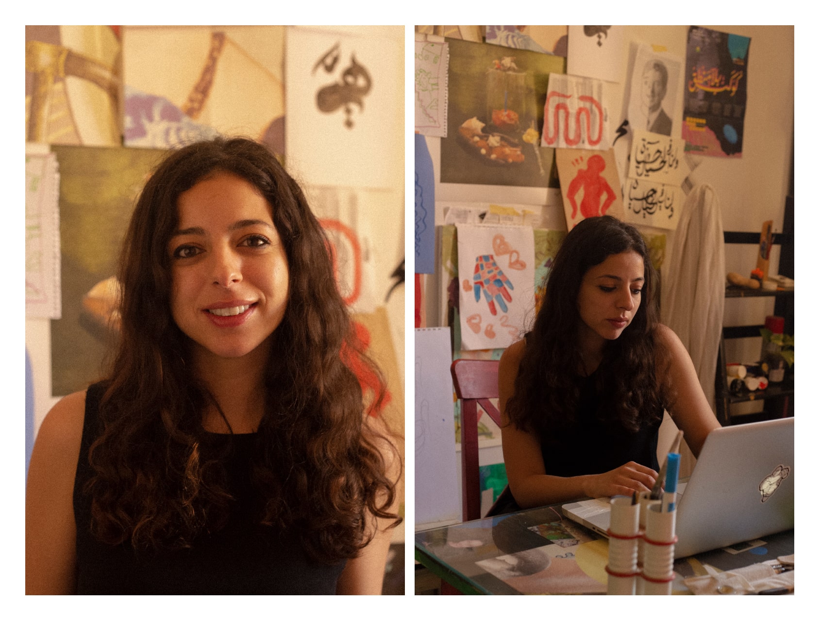
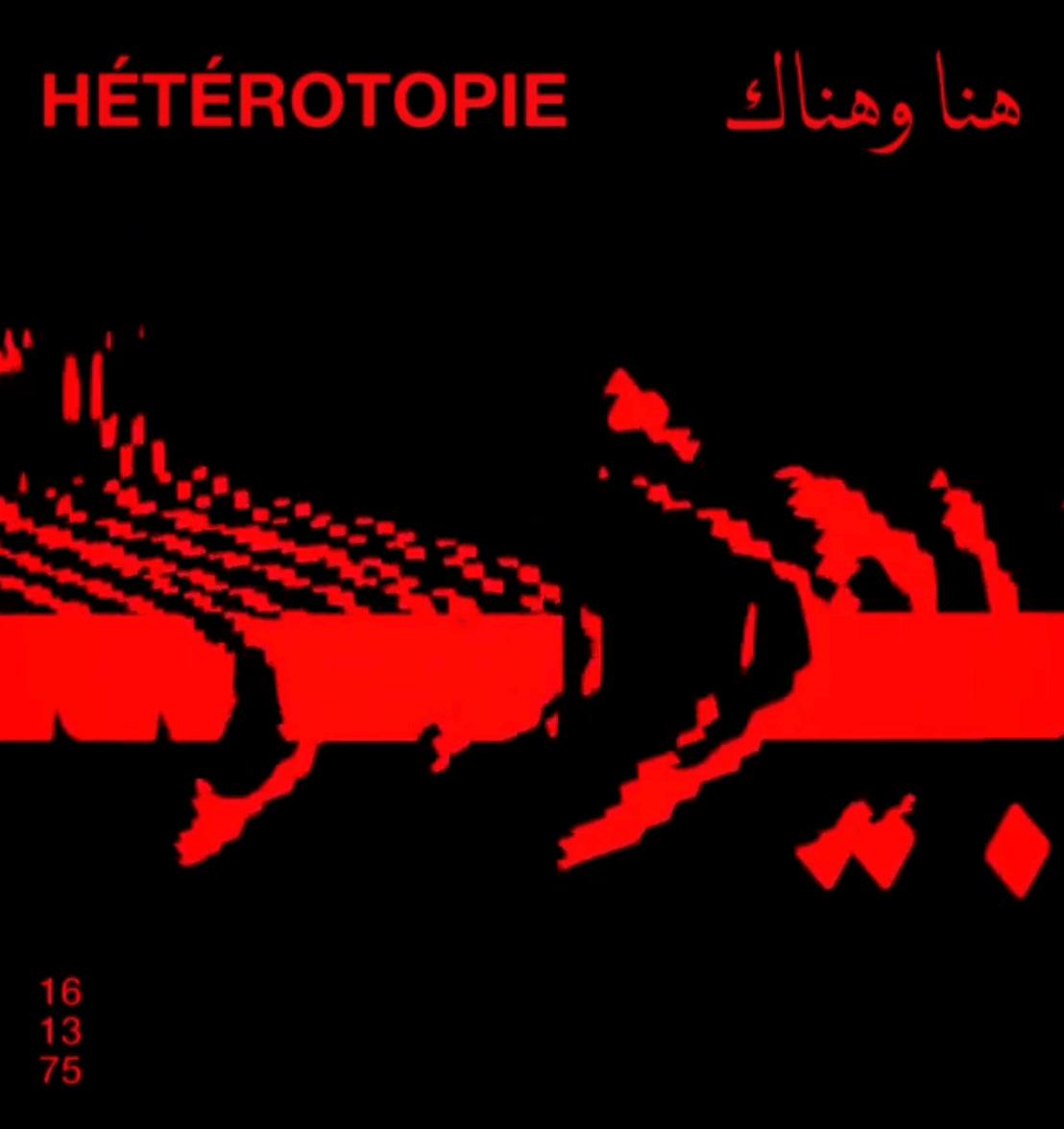
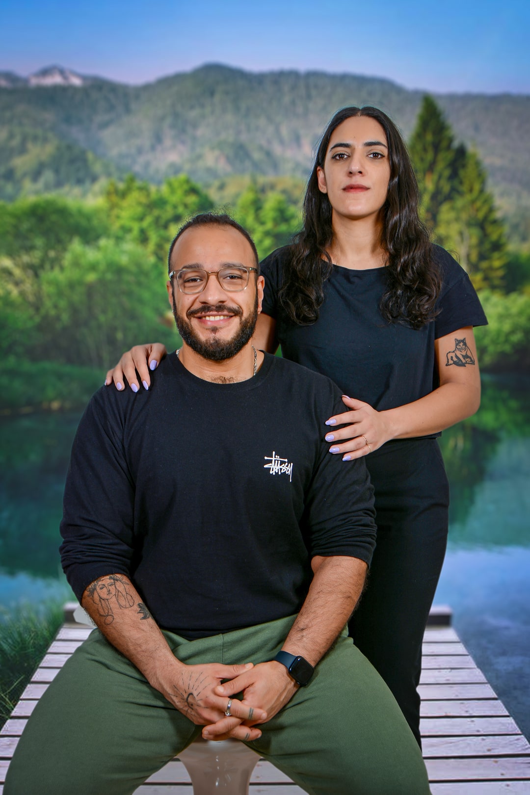
The Desk interviews is an in-depth interview series with Arab Designers and Makers taking their desks as a focal point to view their practice. This is an interview with Mohamed Gaber. The Desk’s” name is borrowed from Mark Gardner’s film of the same name. Mark’s short documentary sought to explore the relationship between a worker and their desk and how that reflects their personality. Design Repository is curious to explore the same while adding an intention of scribing these interviews in the Now and therefore attempts to record a moment in time for future generations so that they can find something about now when they look back.
The interviews will run around the year, with a new designer/maker and a new desk each month. Our next interviewee is the Egyptian type designer: Mohamed Gaber.
Q: Please introduce yourself (Name, age, nationality, and title) and what you do.
| Name | Mohamed Gaber |
| Age | 34 |
| Nationality | Egyptian |
| Title | Designer |
What you do:
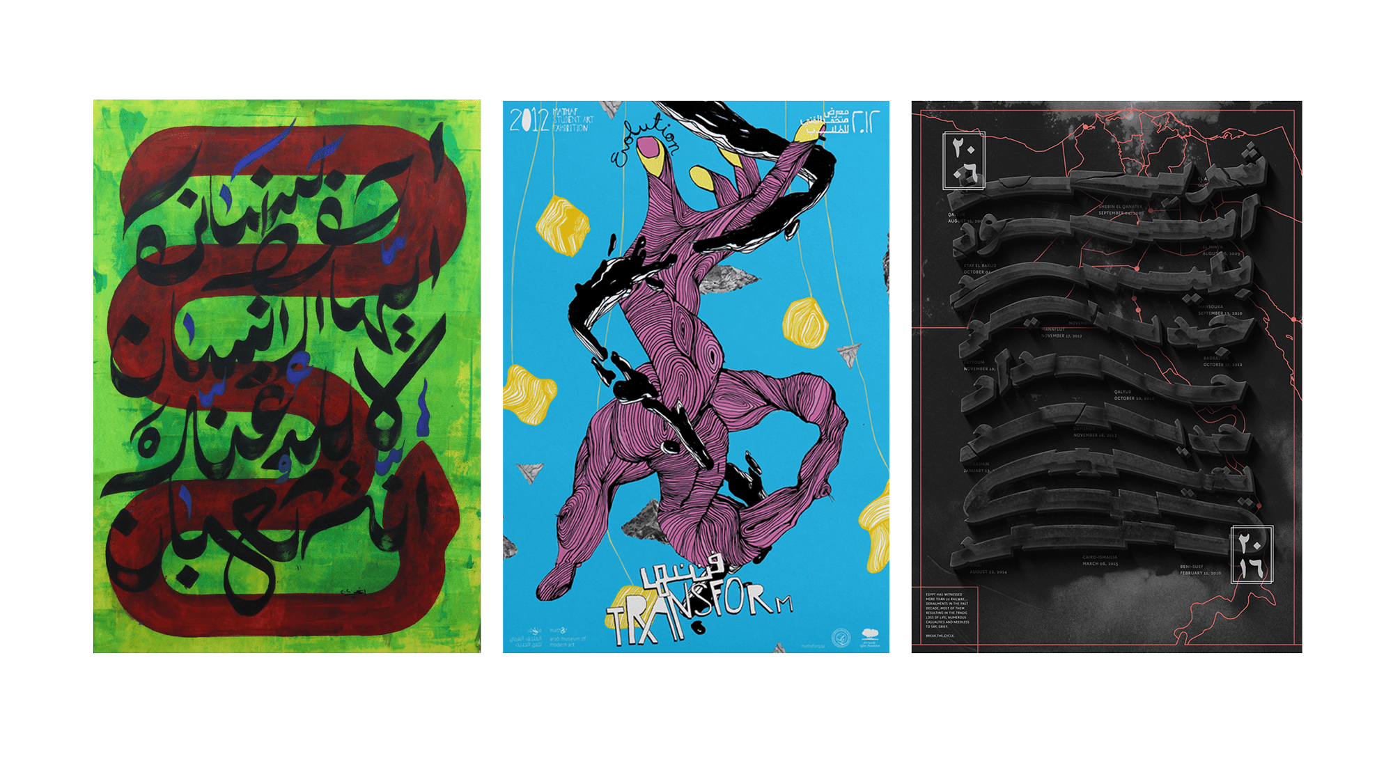
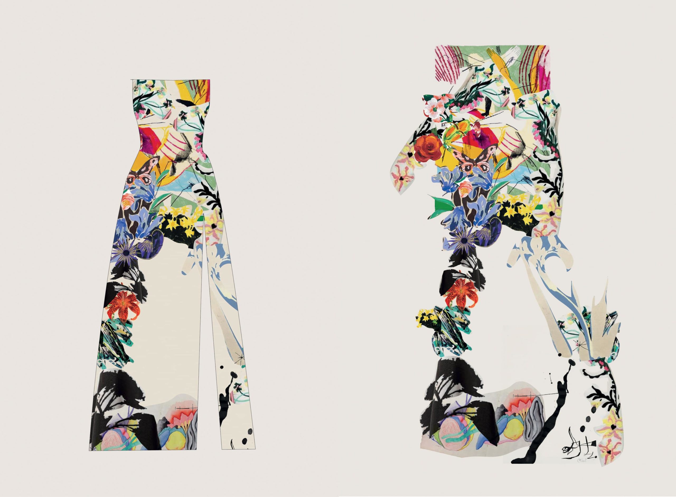
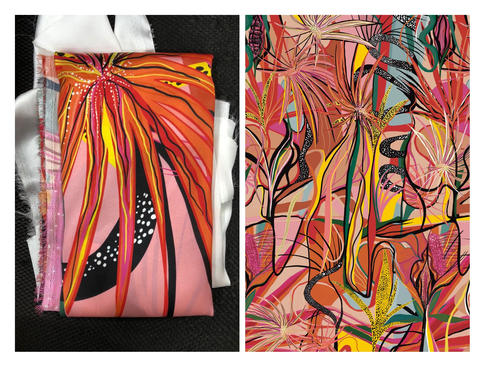
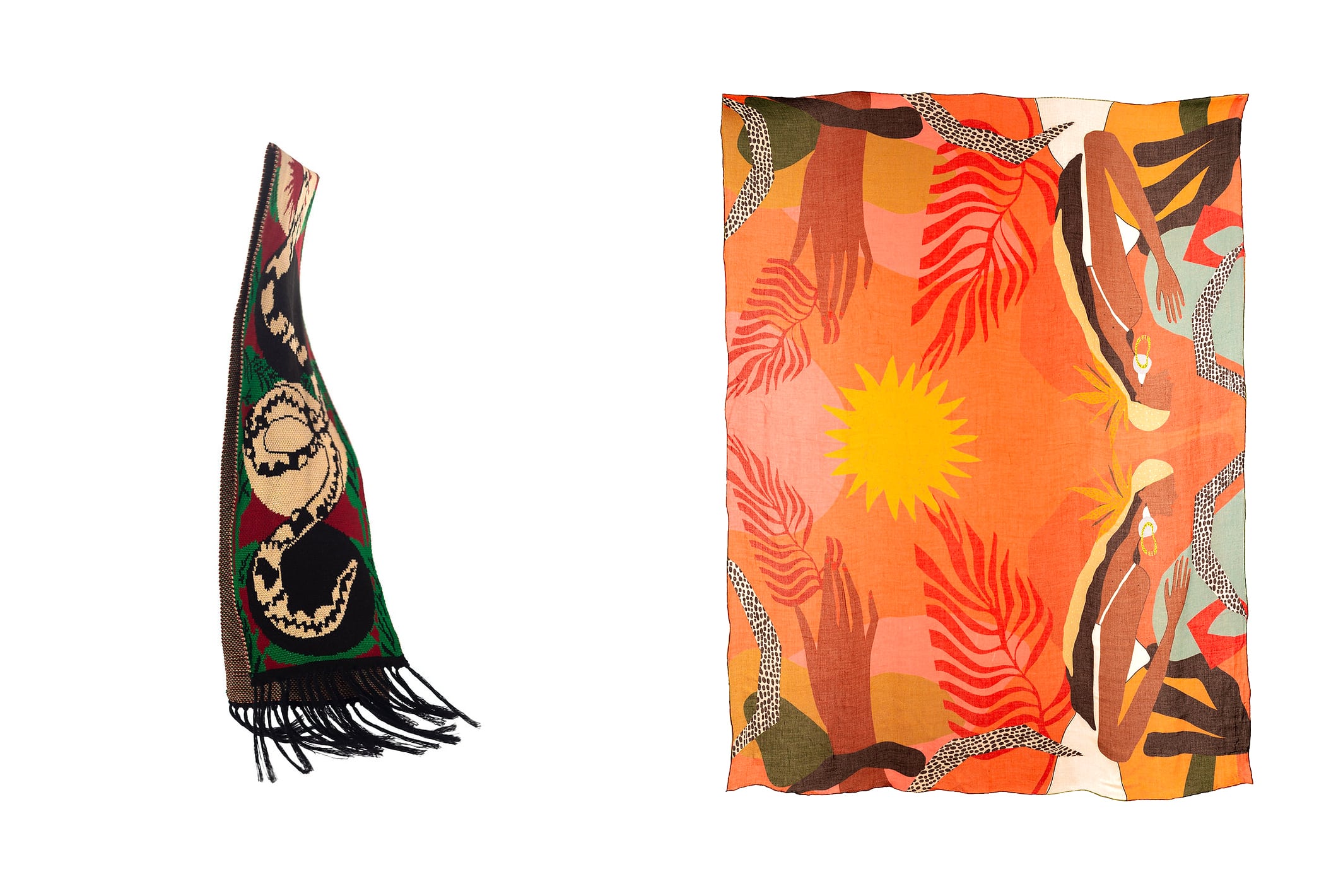
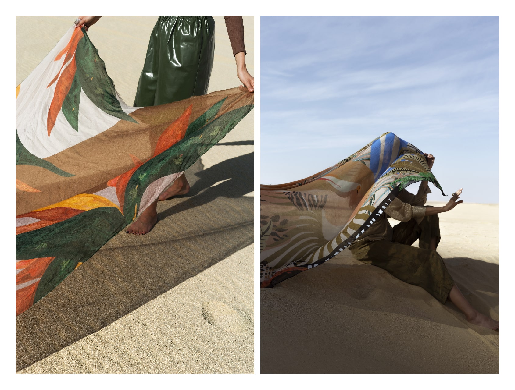
This question is an excellent opportunity to explain the title I now label myself with; A Designer. Previously I used to call myself a “Multidisciplinary designer, with a focus on Arabic type design,” but that was too long and annoying. Now, I am simply a designer focusing mainly on Arabic type making. My practice revolves around studying, researching, and designing Arabic type. I still enjoy the multidisciplinary nature of the practice of Design broadly, which allows me to work on various projects from type design, web design, graphic Design, and textile design to even footwear Design.
The broader term designer allows me to be flexible in how I engage with each project. Sometimes my work intersects with performance and technology, so I become a performer within my work. Other times it intersects with fine art, and I become a designer/visual artist.
So I stopped worrying about picking the accurate label usually attached to “designer.”
Q: What made you get into Design?
➸
I’ve been interested in Design for as long as I remember. However, I never knew how to get into it because of my upbringing. I grew up in extreme poverty with minimal access to education, let alone indulging the privilege of having interests and hobbies (which was what Design seemed to me at first). It wasn’t till the early 2000s that I had my first computer through a government initiative by Suzanne Mubarak known as the “Suzanne Mubarak Digital Literacy Initiative.” This initiative allowed me to buy a computer and pay for it on a six-years installment plan. This first device was pivotal; it allowed me access to pirated Adobe products and a slow internet connection, which helped me learn a trick or two about Design(ing) through online tutorials.
Most importantly, it opened my eyes to the early days of the opposition movement on the internet. Back then, they were known as “المدونين – The Bloggers.” A group of young activists from all kinds of political backgrounds were trying to make space for some freedom on the internet and expose the corruption and injustice of the Mubarak regime.
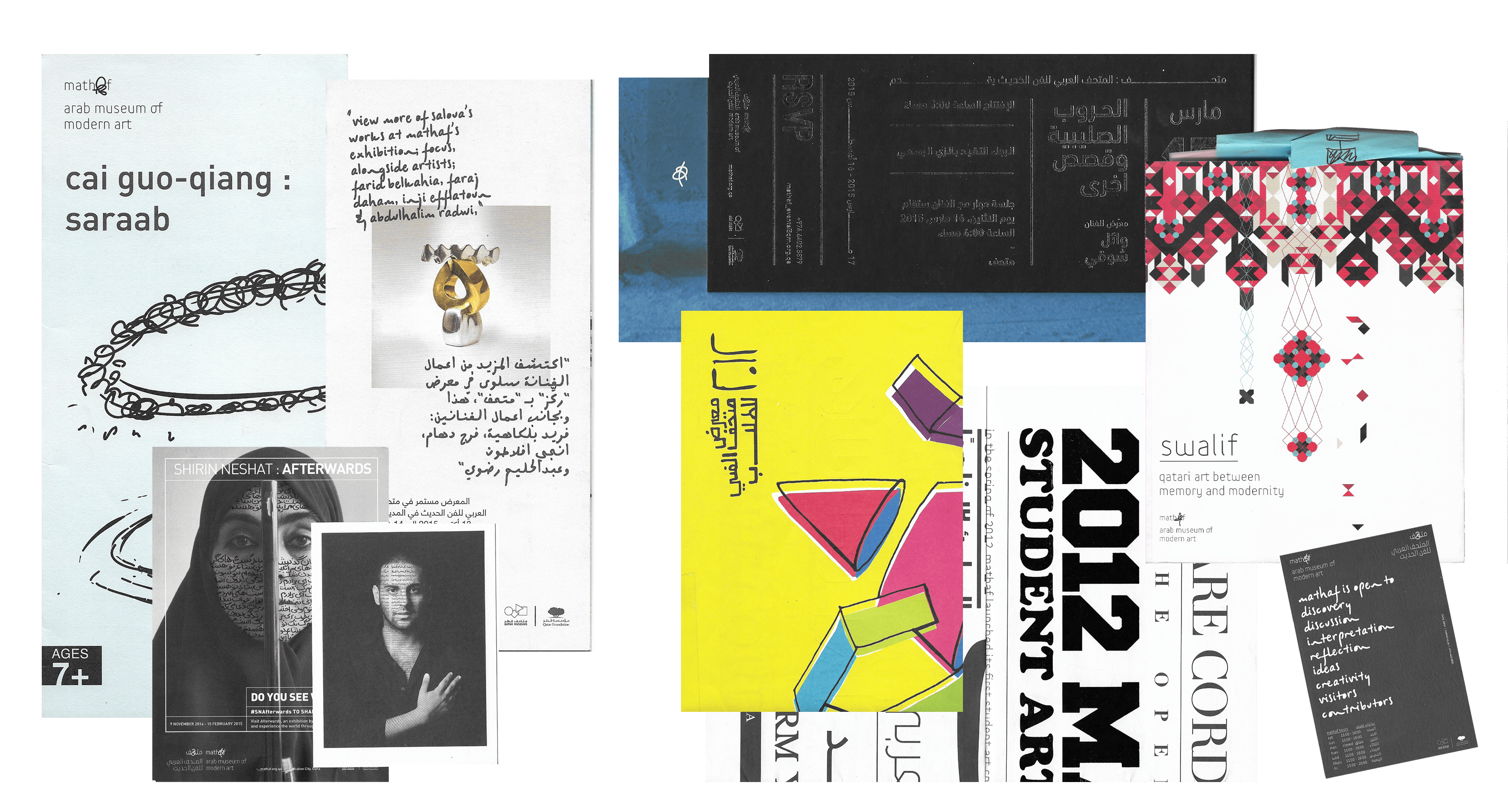
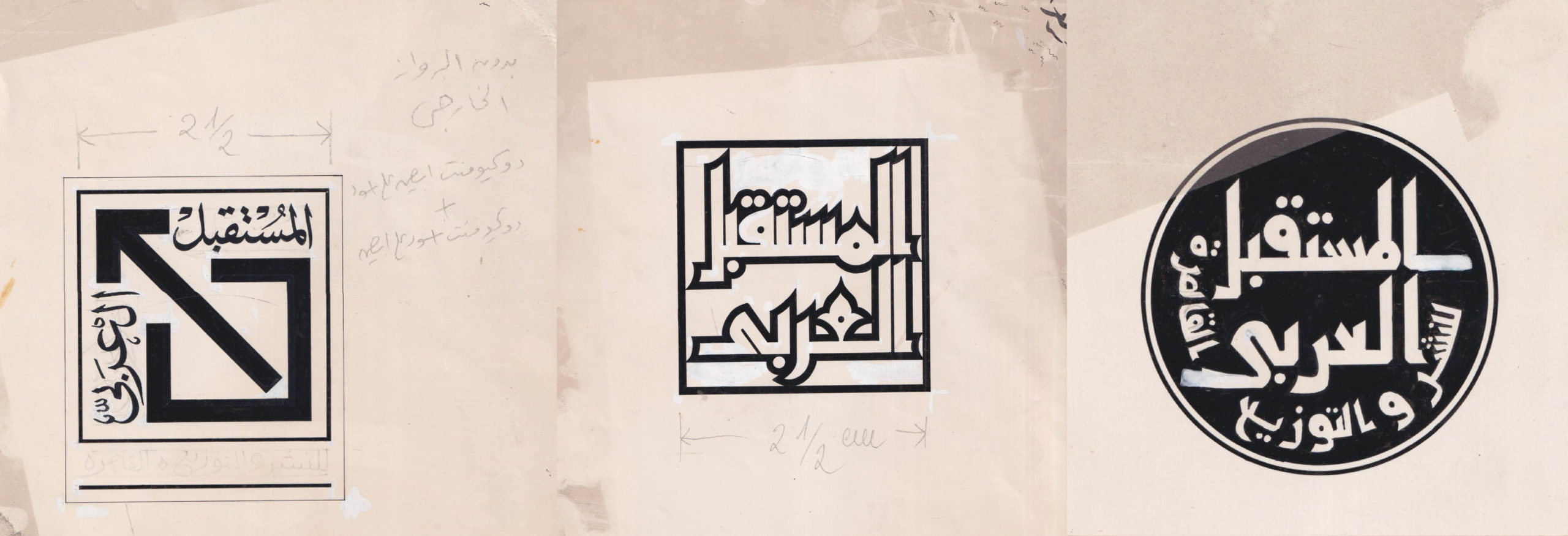
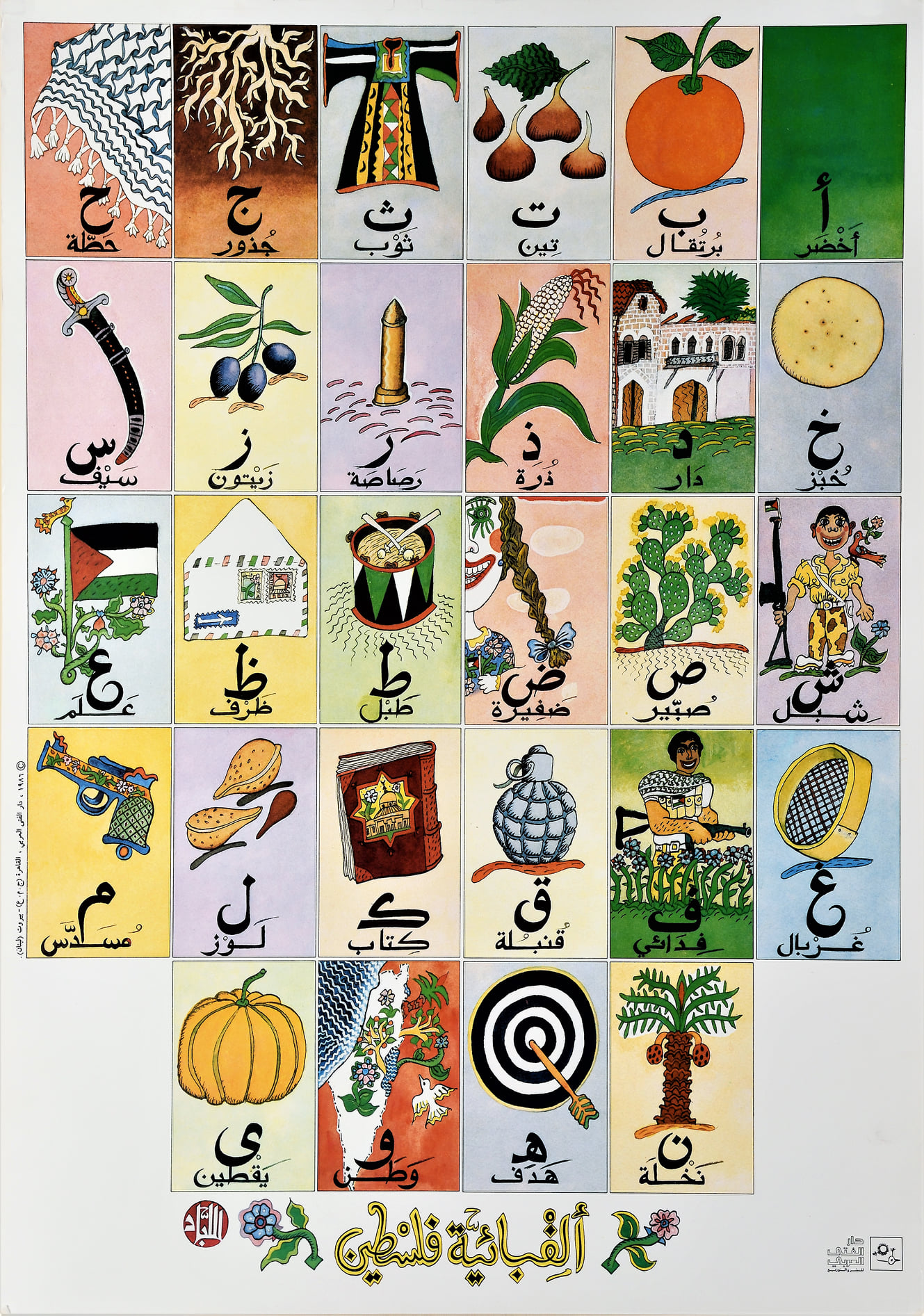
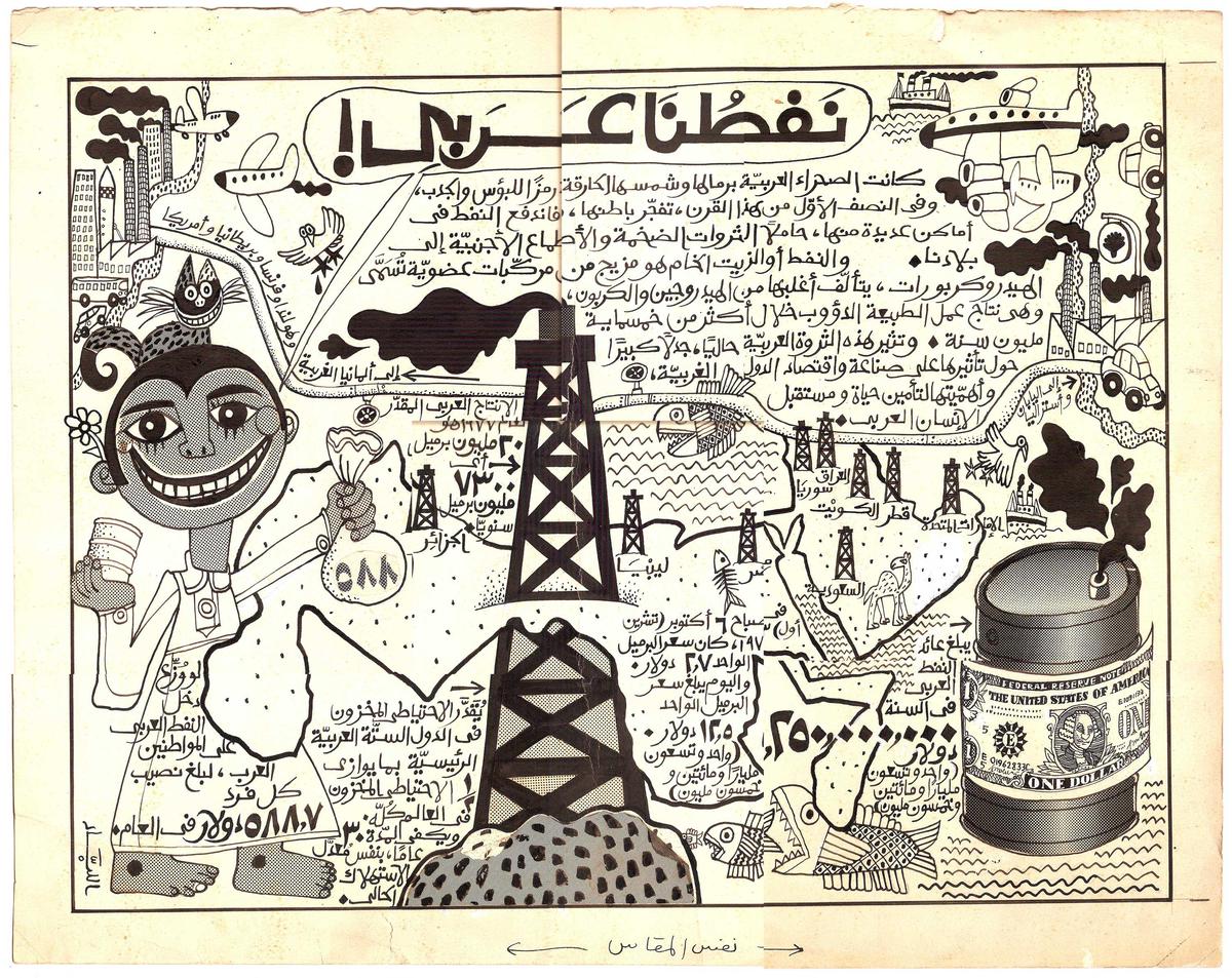
Therefore, while learning these technical skills, my awareness of the political role design can play also flourished. By the end of 2006 and early 2007, I started a blog called “يساري مصري – Egyptian Leftist” – a cheesy name I know. Through this blog, I started applying the tutorials I learned to make anti-Mubarak posters, protest calls to action graphics, and banners for the detainees. By 2008 I was known among this community as “جابر بنرات – Gaber Banarat.” During the same year, I made an emblem that practically proved to me the critical role Design play in politics.
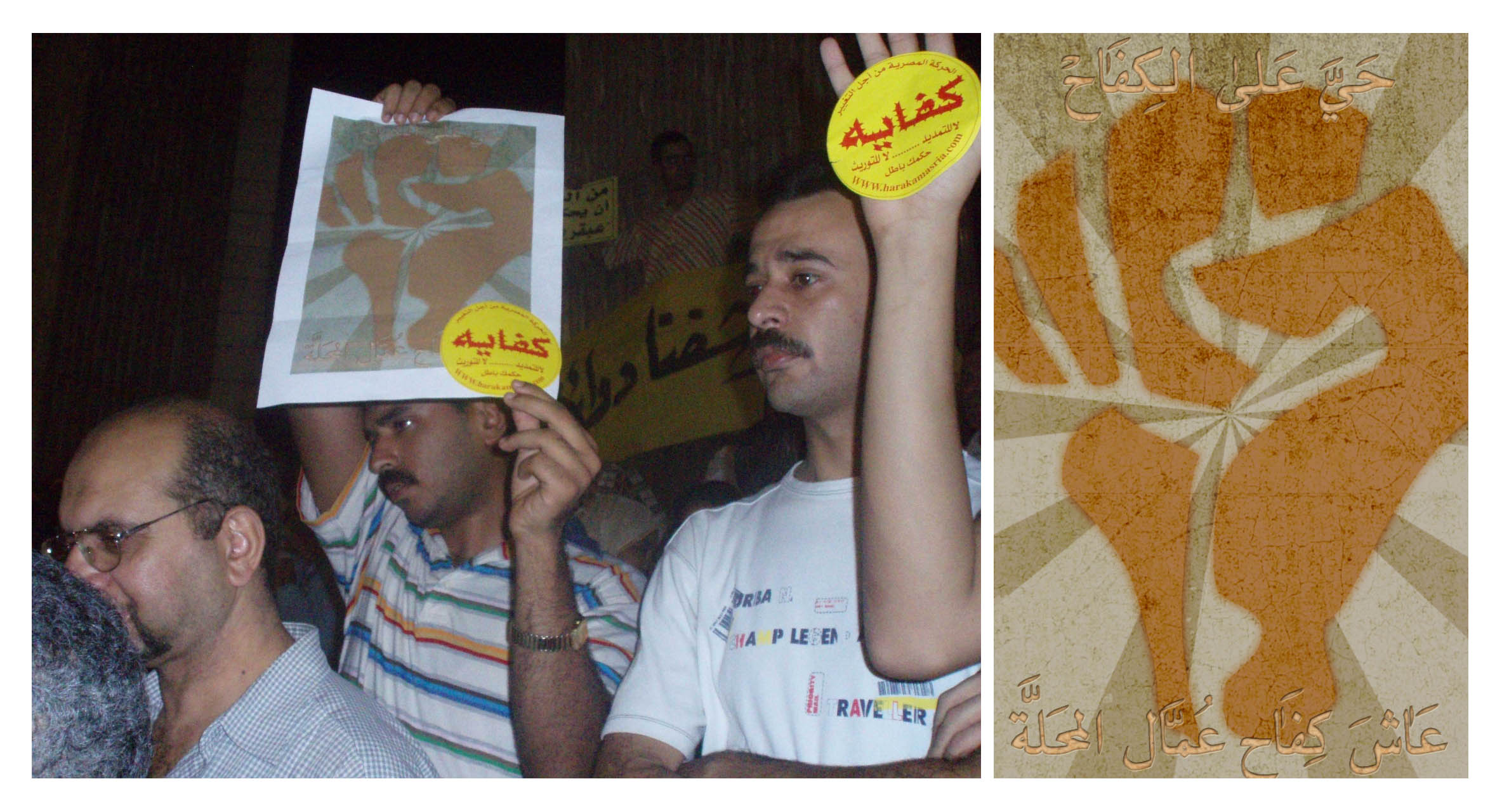
In April 2008, a group of activists and I planned a call for “The General Strike” on the 6th of April 2008. I wanted to create something for that day that was a little too ambitious, so I used the word “ثورة – Revolution” in it. Even though, at the time, the political landscape did not indicate that any political activity was possible, let alone a revolution. Nonetheless, the idealism of “Cyberspace” allowed me to go wild with my ambition.
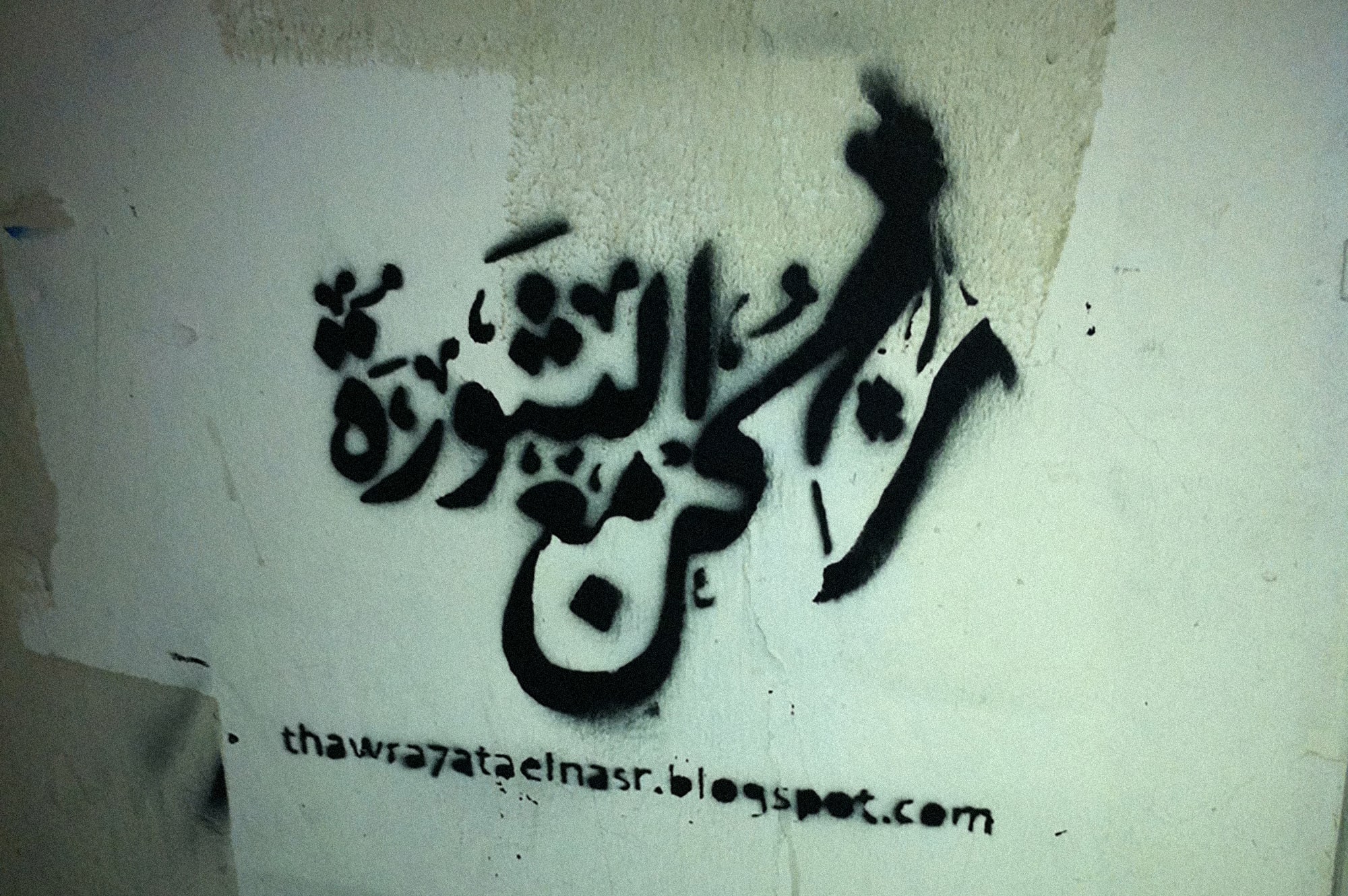
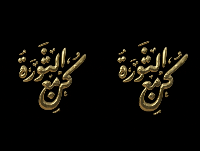
So I made a typographic lockup of the words “كن مع الثورة – Be With The Revolution,” and like any other design I made at the time, I published it on the internet under a Creative Commons license. Yet, unlike most of the design work I have created, this one went viral and became a popular slogan. Suddenly, and for whatever reason, these words started circulating rapidly and spreading on the internet; they were everywhere. Not only online but also made its way to the physical world and was found on banners in several marches that day.
This was real-time proof of the power of Design and its potential to impact society positively. It was such a profound experience that it affected all my subsequent choices to this day. I have become conscious about my choices regarding what kind of projects I get involved in and what projects I avoid.
I belong to the left side of the political spectrum. From that perspective, I started to reject the capitalist role that the graphic designer was playing—at the time, only another gear in the wheels of capitalism. That is why I was conscious about the projects I wanted to participate in. Even though I did not have the economic privilege of making such decisions readily, I had many pressing financial responsibilities, such as supporting my mother and younger sister. May her soul rest in peace.
I kept on learning through a process of trial and error. And in 2009, I came across the possibility of using custom fonts on the internet. At the time, the support of CSS3 made that possible, and the rapid wide spread of smartphones increased the demand for such a technology to move fast.
I felt inspired and motivated to design an Arabic typeface optimized explicitly for readability on the screen. With minimal knowledge about the technicality of font making, I stepped into the experiment after securing a small fund from Google (ME). To pursue the project, I invited my friend and graphic designer Mofa, known as “Ganzeer,” to be my partner. The experiment could have yielded more successful results. Yet, it was an eye-opener to the world of Arabic type making and a realization of how much work is needed to enrich what was a neglected Arabic digital font library back then. And that is how I slowly got into Design.
Q: Can you take us through your design process? Choose your favorite project, and please walk us through its process from start to finish, challenges, and learnings.
➸
I can’t talk much about my favorite project in its full scope as it is not yet released. Nonetheless, I can walk you through the process, challenges, and learnings.
I partnered with Khaled Hosney, him being the Lead engineer, and myself as the Lead designer on the project. With this project’s scope, it was essential to have consultants representing the different geographical locations of readers and users of this typeface.
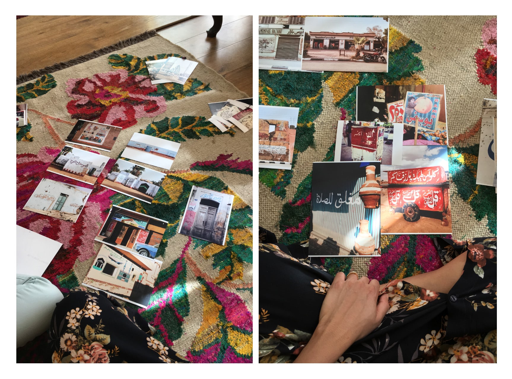
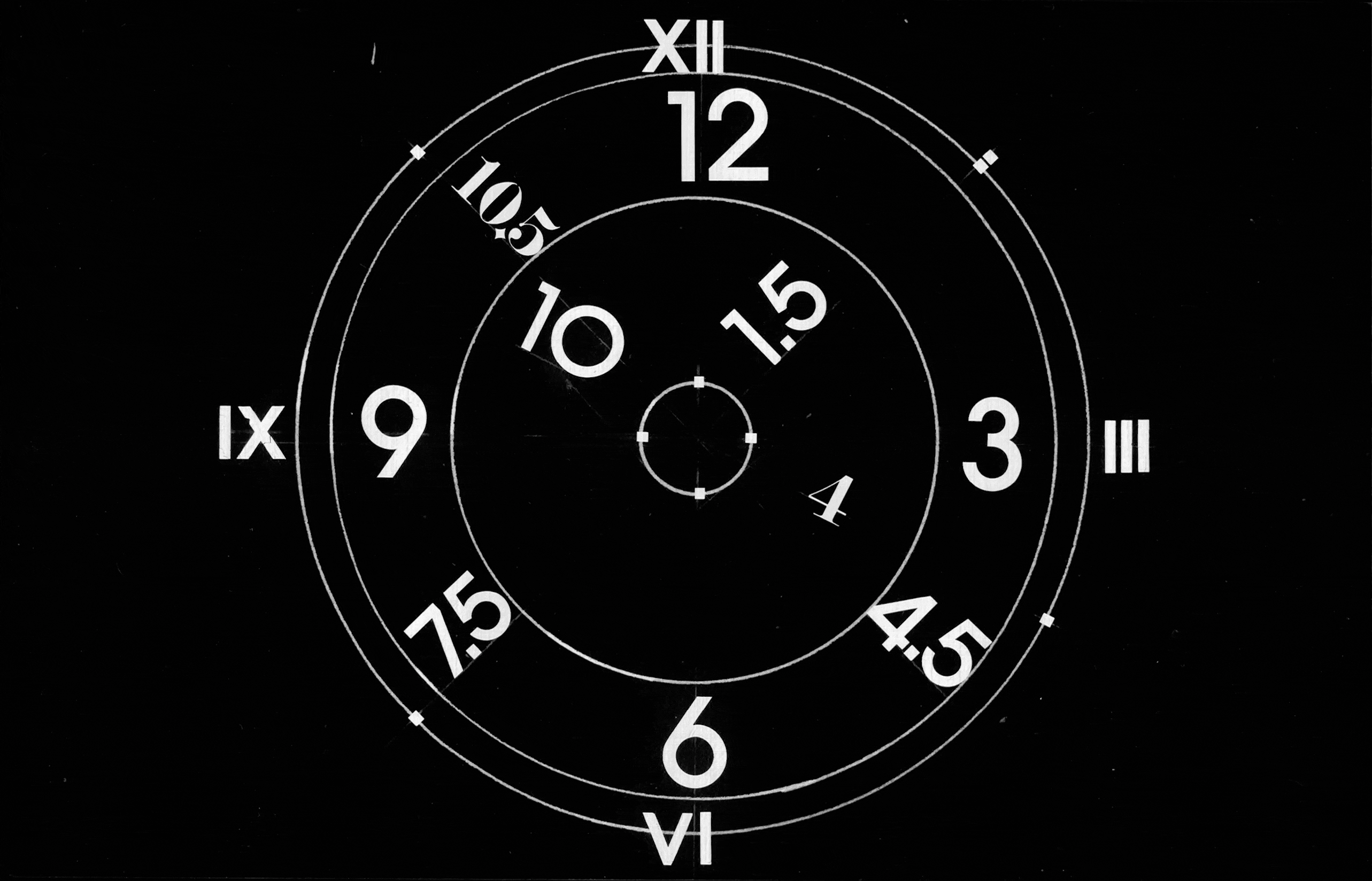
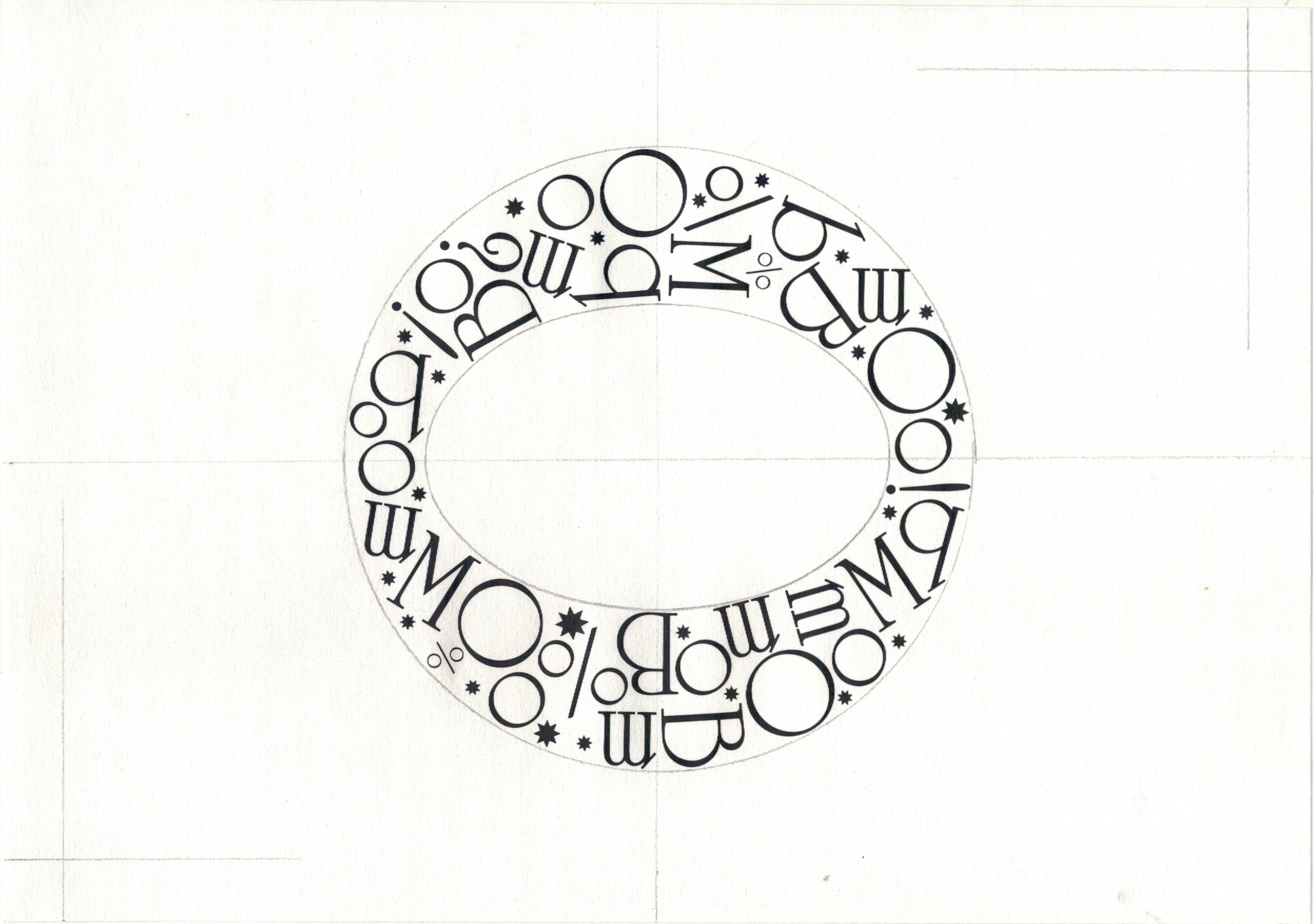
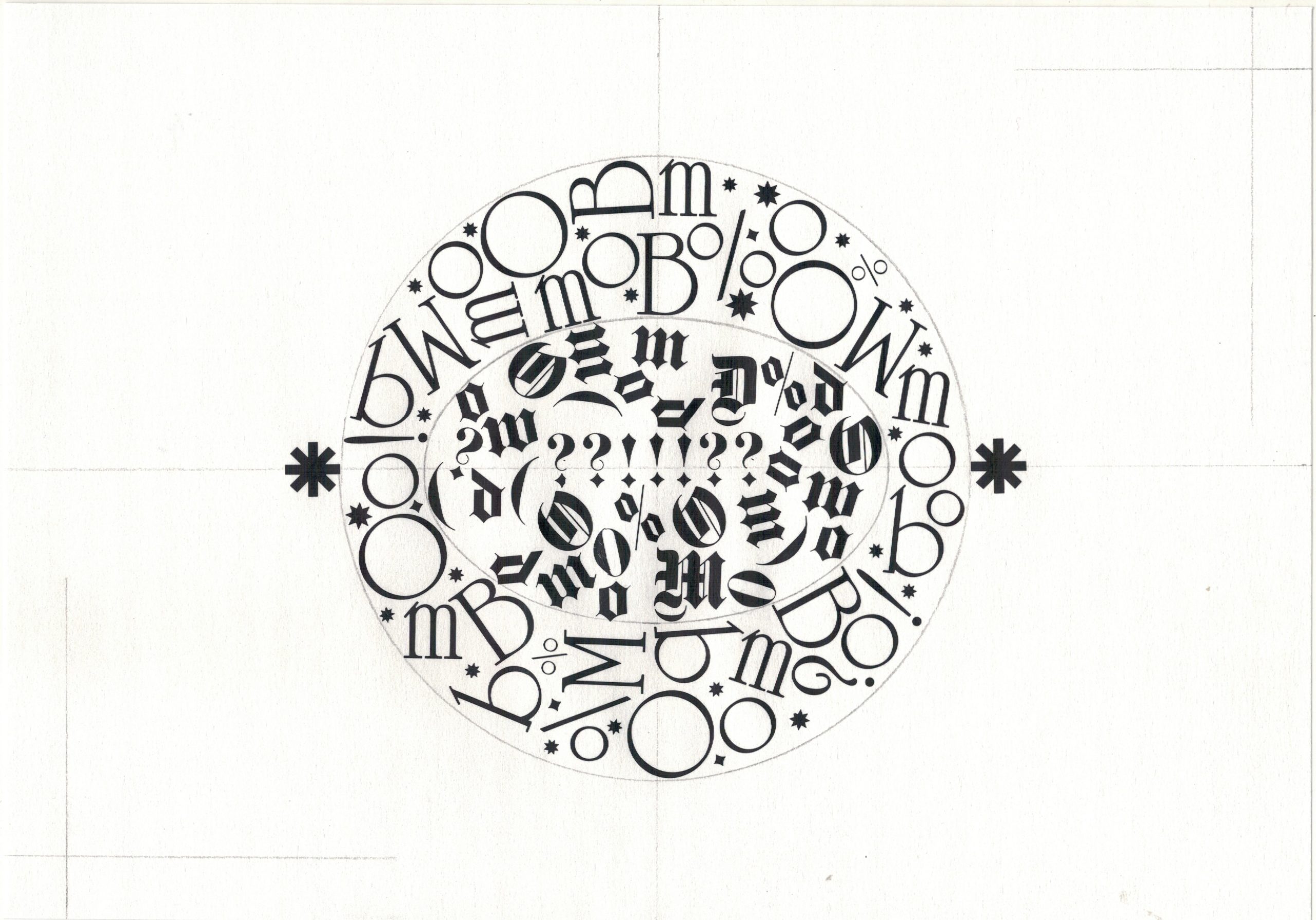
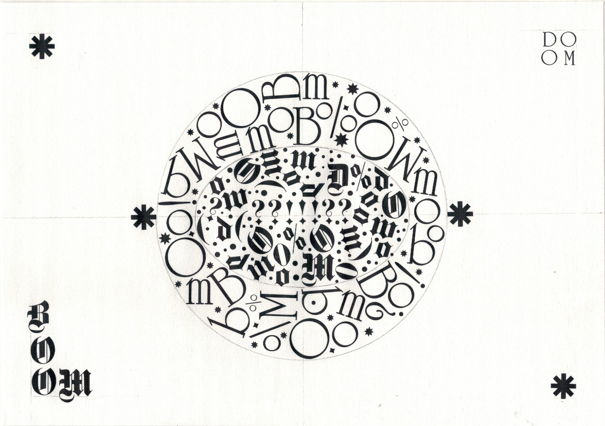
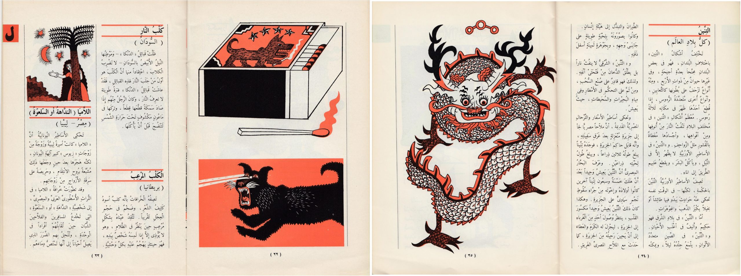
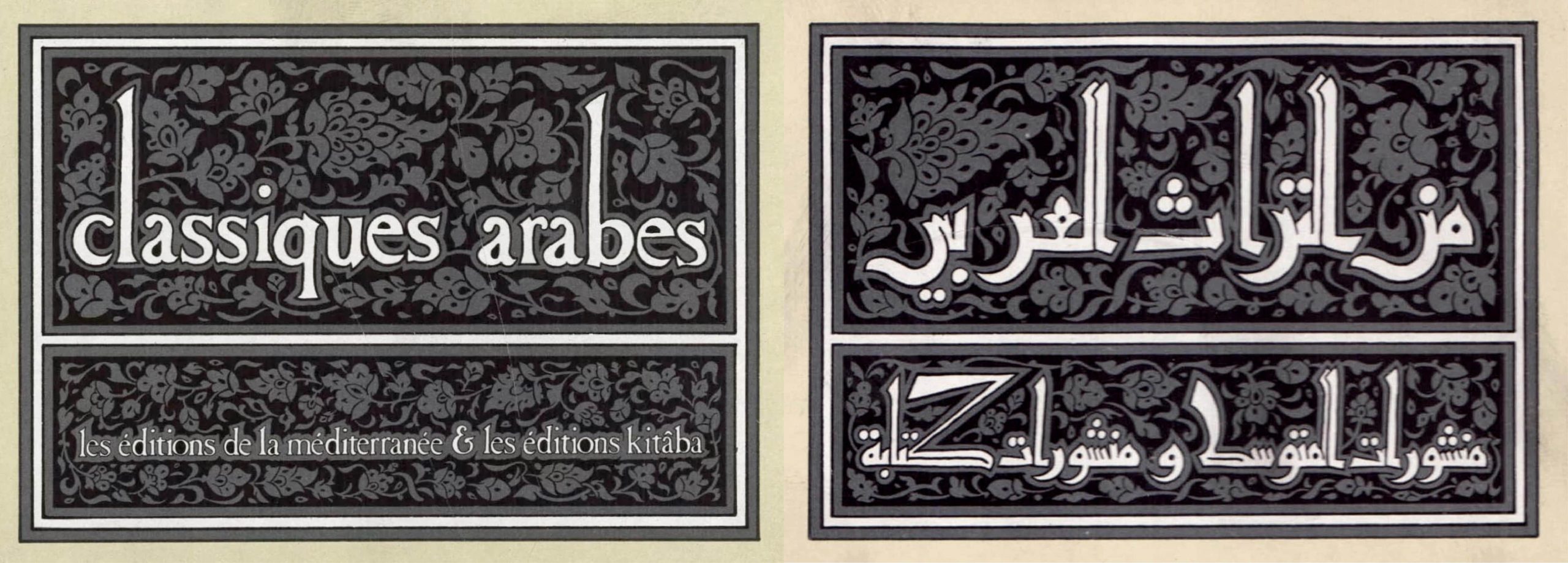
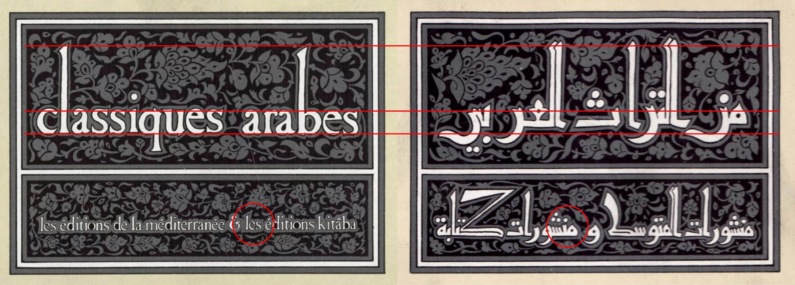
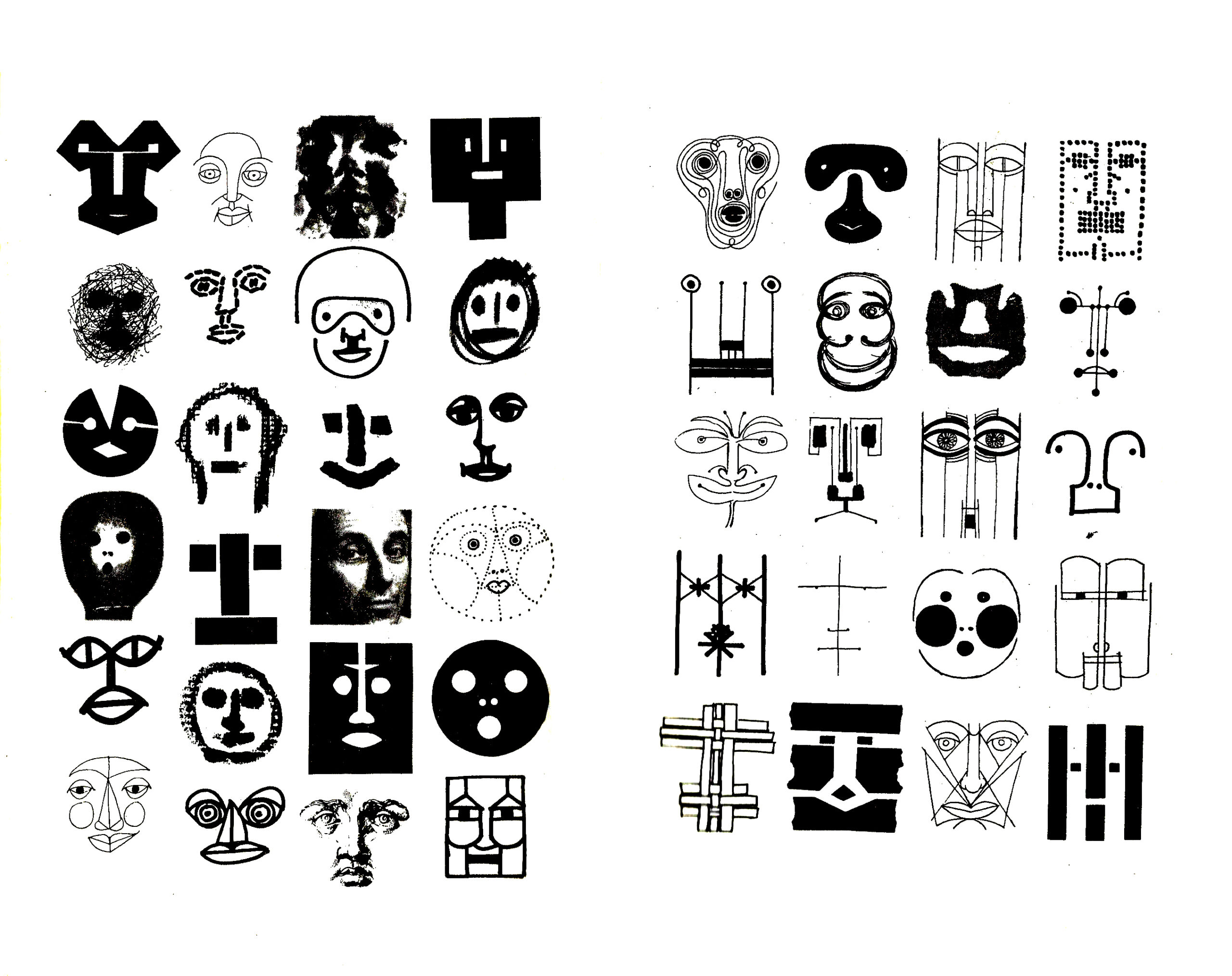
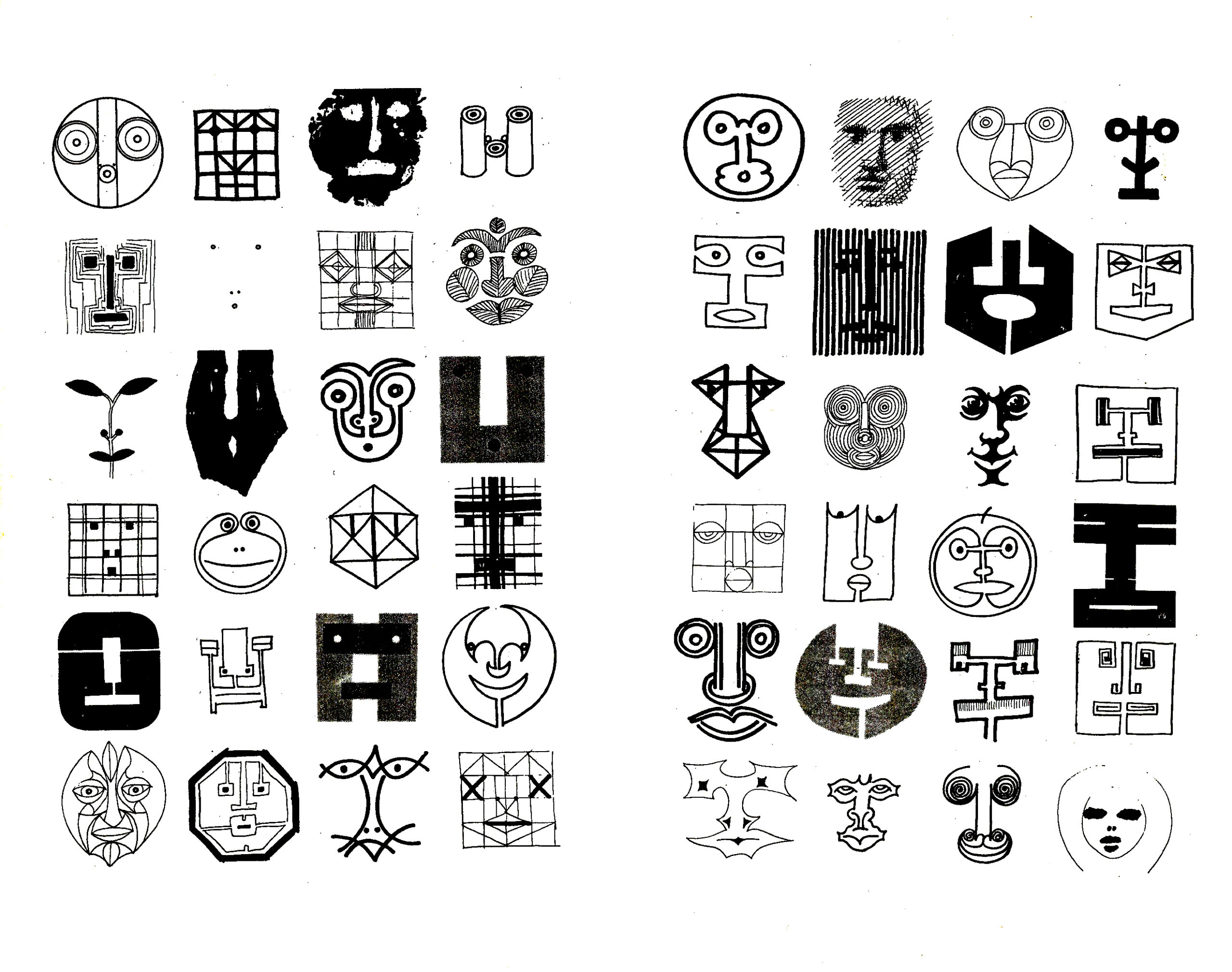
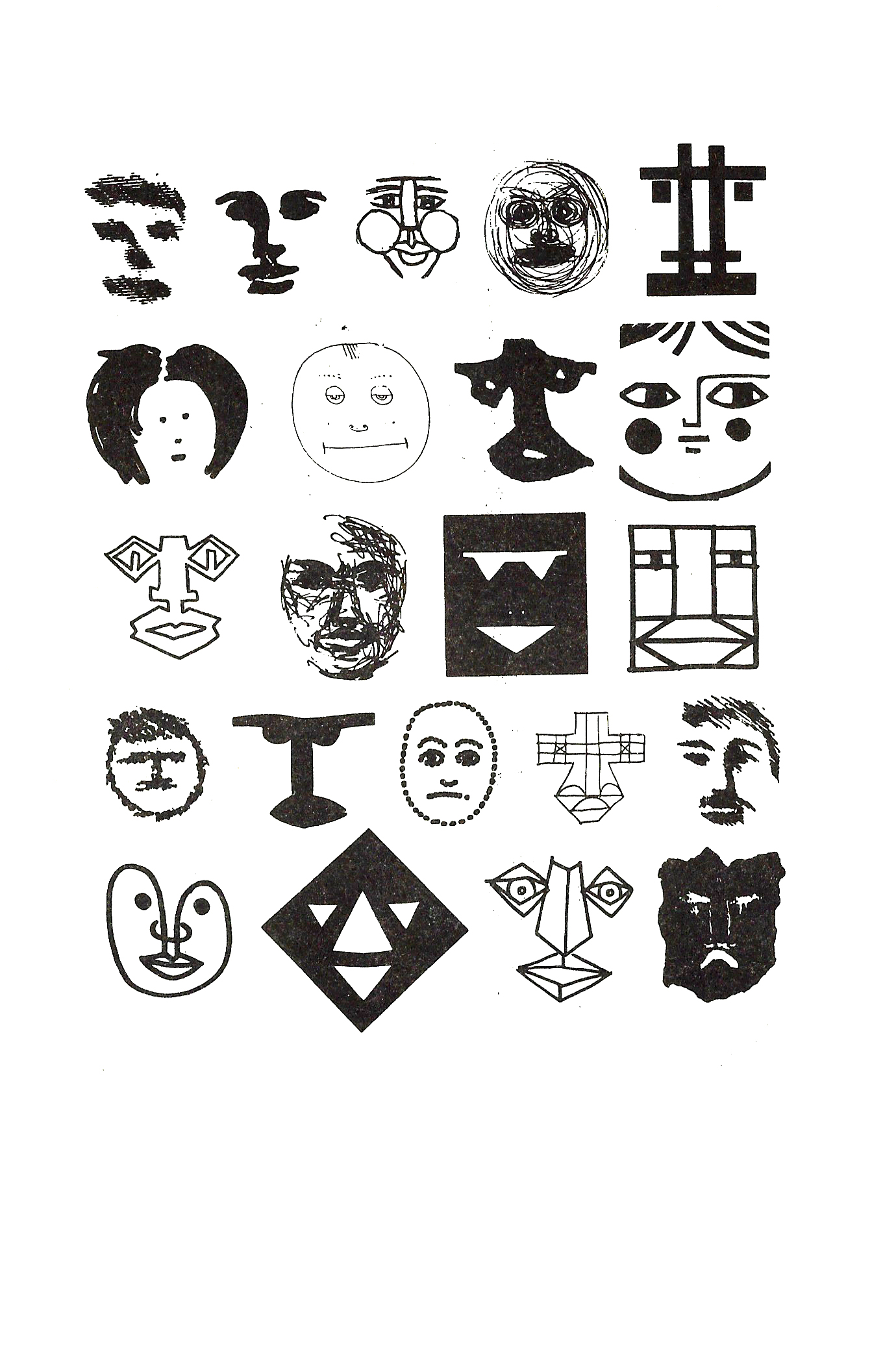
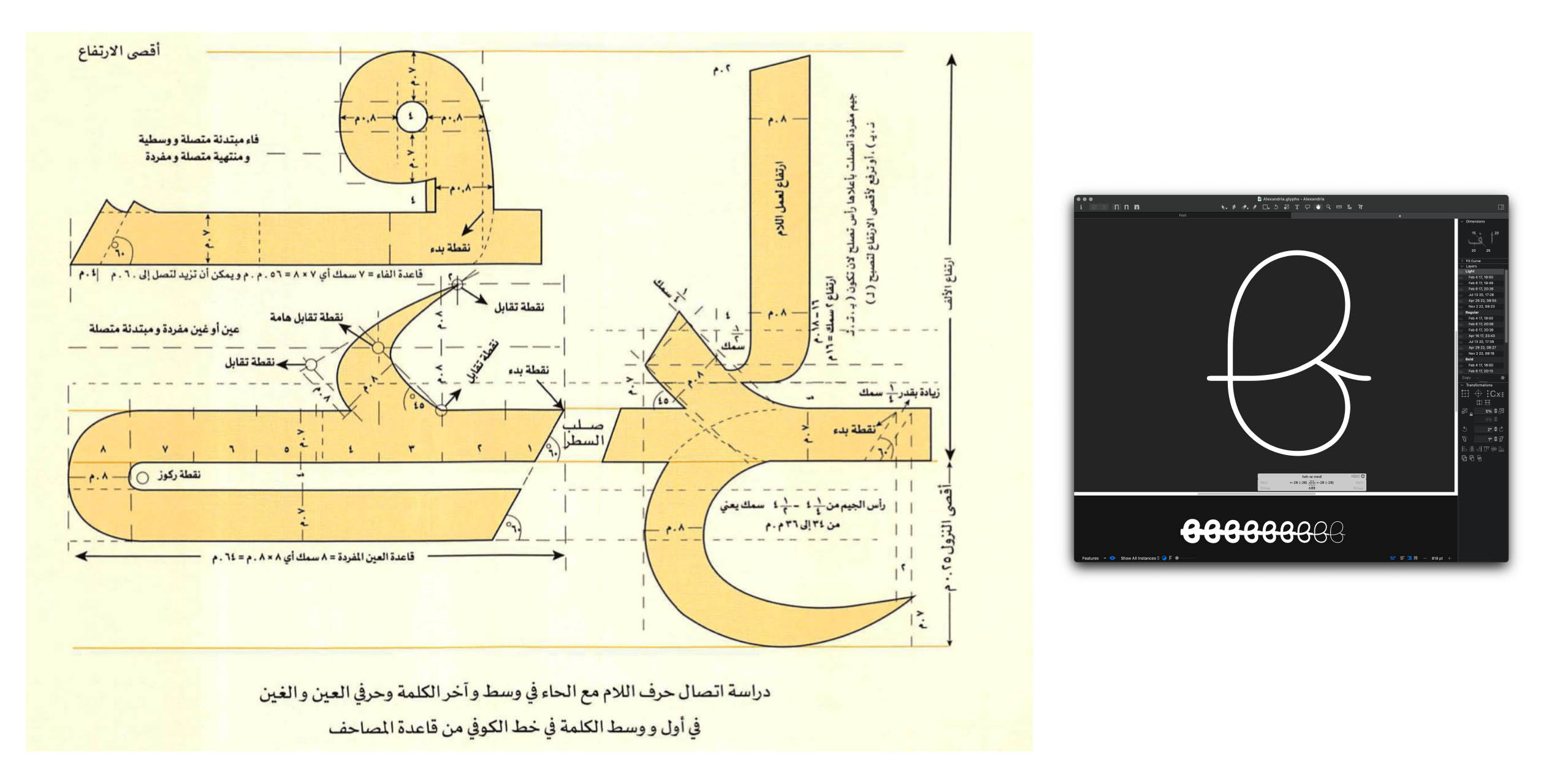
I decided early in the project to intentionally inform every design choice with archival research and manuscripts practices. This conscious decision was necessary because the project aimed to tackle a controversial topic: “type-matchmaking,” which is no longer a term I like to use.
The process of designing contemporary Arabic typefaces should be rooted in historical practices to prevent any further oversimplification of the Arabic letterform. My first proposal emphasized that the historical continuity of the Arabic letterform is far more important than just making the Arabic “good enough to stand next to the Latin.”
The proposal sparked an inspiring discussion with a former consultant around the question of “what makes an Arabic typeface modern?”.
While this might appear like a simple question, it is not. Not only for the Arabic script but in general; a consensus on what is contemporary in type design doesn’t necessarily exist. During my research, I realized that Latin type-designers also ask the same question. That made me wonder: If Latin designers are still grappling with this question, with the long history of the Latin type-making field being at the heart of the industrial revolution and extending to the digital era. Then, what makes the question of “Modern” for a script that had a few setbacks in the early days of that technology?
This question of what a “Modern” Arabic letterform looks like triggered more extensive research. While finding a definitive answer is not possible only by conducting one study, I concluded that a particular Latin influence is often imposed on developing the Arabic script and many other underrepresented scripts.
Arab type designers need to be aware of this while thinking about “Modernization” to limit the continuation of more Latinized Arabic fonts. We must end this chapter and start a new one where we question everything from the metrics used for Arabic letters required to reflect its authenticity to how the stem modulation should act as the design moves toward lighter and heavier weights. Realizing that some solutions that work for the Latin letterforms don’t suggest they will work for Arabic.
We don’t have the same technological limitations our predecessors struggled with 100 years ago. This should encourage us to break more boundaries and work on preserving our culture as we guide its evolution rather than contributing to diluting it within the Western canon.
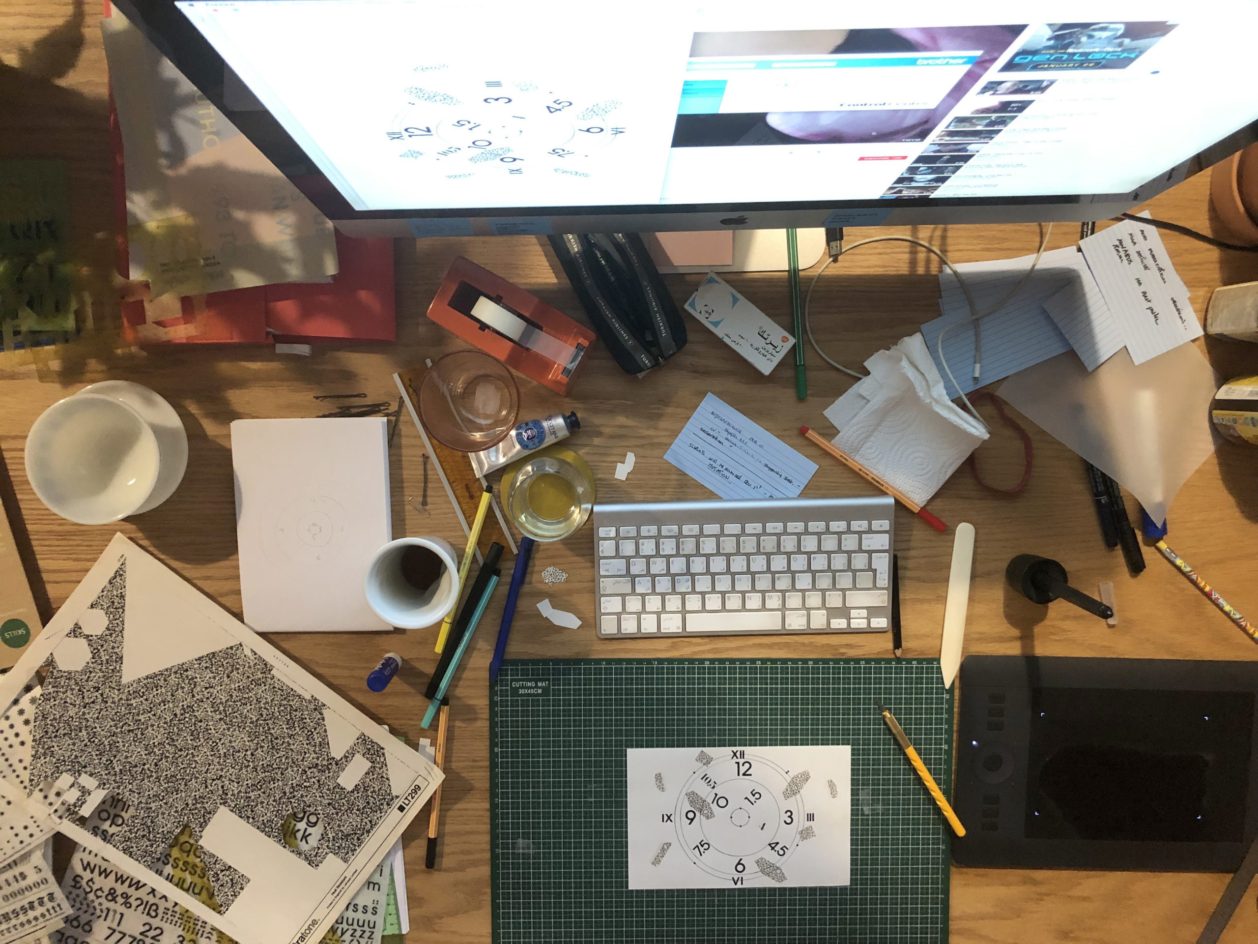
So after deciding that, even if we don’t have a clear answer to what modern is and it’s something we keep on grappling with, I knew at the very least that historical continuity is a must. So, my process has been an iterative one, looping back and forth between researching and sketching, and I continuously went back to كراسات الخطاطين for guidance.
To conclude, the challenge of engaging with this question which arose from the project process, was not a small feat. Different people will have different views on what constitutes “modern.” Yet, everyone should constantly engage with this question; at least, I will do that. This will be vital in helping the community reach a consensus (or not) about the subject of modernity which might inform our design pedagogy and help students on their critical thinking journey.
Q: If you had to write a definition of Graphic Design for academic purposes, what would that be? And would you have one for Arabic Graphic Design? If yes, what would it be, and in what ways is it different?
➸
I don’t care for the definitions used for academic purposes, and my definition of Graphic Design will be the same in any context. For me, it’s the intersection of beauty and functionality, where problem-solving meets aesthetics. The definition wouldn’t be different based on the language of the content. Nonetheless, graphic designers from the Southern part of the planet should approach Graphic Design with an awareness of its political weight and not blindly follow Northern aesthetics as if they are universal beauty standards. We should stop trying to squeeze our culture into the rigidness of Northern grids.
Q: Who are your favorite Egyptian designers/artists? One old and one current?
➸
- Nathan Doss
- Naguib Hawawini (tho he is of Syrian origins but lived all his life and died in Egypt)
- Amy Nimr
Q: Who are your favorite non-Egyptian designers/artists? One old and one current?
➸
- Yohji Yamamoto(Japan)
- Jerry Lorenzo (USA),
- Ali Al-Masry (Jordan)
Q: You received a master’s degree from Sandberg Institute; how was it studying in the Netherlands? What is the most valuable thing you learned there, and tell us briefly about your master’s thesis?
➸
I’m figuring out how to honestly share my experience about studying at Sandberg without causing more trouble than what I left Sandberg with. It has not been the most fulfilling experience; it was almost a scam. In my opinion, the reason for this is how Academia has been entirely devoured by capitalism.
I applied for this master’s program to allow myself the time to finalize a research project I had already started a year before. I wanted to devote some time to studying the evolution of the Arabic letterform.
Before Sandberg, I had no proper education as a self-taught designer who dropped out of mechanical engineering. So pursuing a postgraduate degree without a BA kept me motivated. However, it also gave me a sense of insecurity, thinking that I would need to do double the work to keep up with the level of knowledge at this Dutch institute. After a short period, that proved not to be the case, and my practical knowledge exceeded what the institute or its curriculum could offer.
So the thing I learned the most from this experience is that while an academic frame can offer you the space to focus on your field of research, you can also achieve that outside the Academia. If you are a Southern citizen, you can also save yourself the hassle of dealing with racism, fetishizing your culture, and bursting the bubble of white privilege.
Instead, you can save this energy for learning and building systems for knowledge-sharing within your community. I started then to focus on working with fellow type designers and researchers to find the knowledge and experiences I couldn’t find at Sandberg through the discussion I hosted in The Type Platform, which ended up feeding my thesis research more than what was happening in Sandberg.
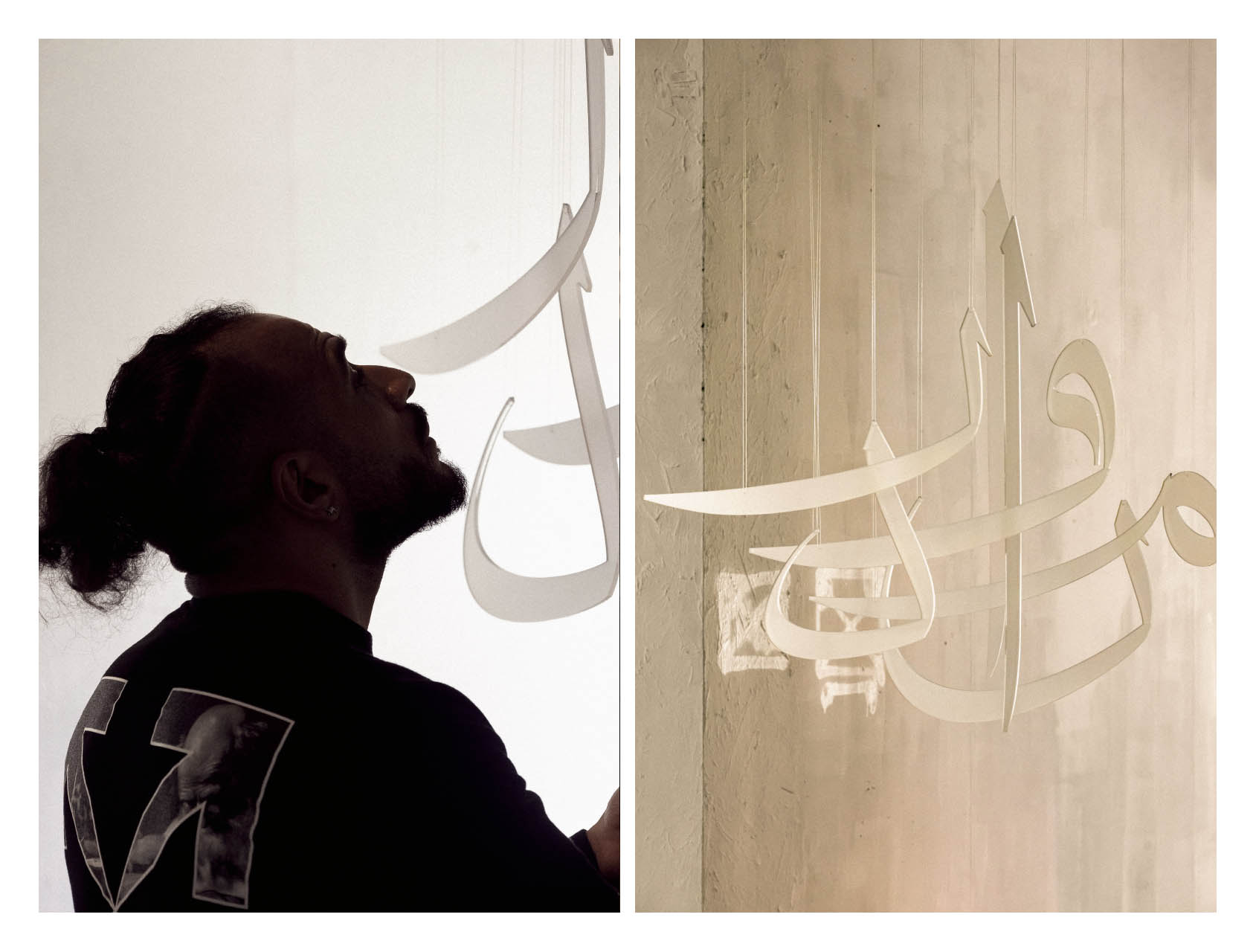
My thesis investigates the evolution of Arabic letterforms through history under the influence of changing technologies. It highlights the key moments in the history of Arabic script, from the artistic essence of medieval calligraphy to the digital age.
Informed by archival research and scrutinizing manuscripts traditions, the thesis analyzes the key elements influencing the evolution of Arabic letterforms. Highlighting the sophistication of calligraphy and the sociopolitical role Arabic calligraphy played at a certain point in history. It also looks into the technological constraints of machinery initially conceived for the Latin script and its impact on the development of Arabic letterforms in modern times.
The paper also celebrates a new era for Arabic type-making backed by rigorous disciplinary-specific research. This is helping develop a better sense of responsibility towards quality standards and a better representation of the Arabic script’s history and culture.
Q: You are the founder of Typeplatform and the co-founder of TypeLab Sandberg. Can you tell us a little about their story and ethos?
➸
In the fall of 2020, I arrived at Sandberg Institute in Amsterdam. Once I settled, I noticed that there needed to be a typography-focused space dedicated to students in Sandberg. A space where they can experiment with type. So I immediately started looking for a chance to make this available, and that’s where I met with Farah Fayyad, a Lebanese typographer and my colleague in the same department. She shared the same passion for type exploration as me, and that was one of the firmest ties that got us together.
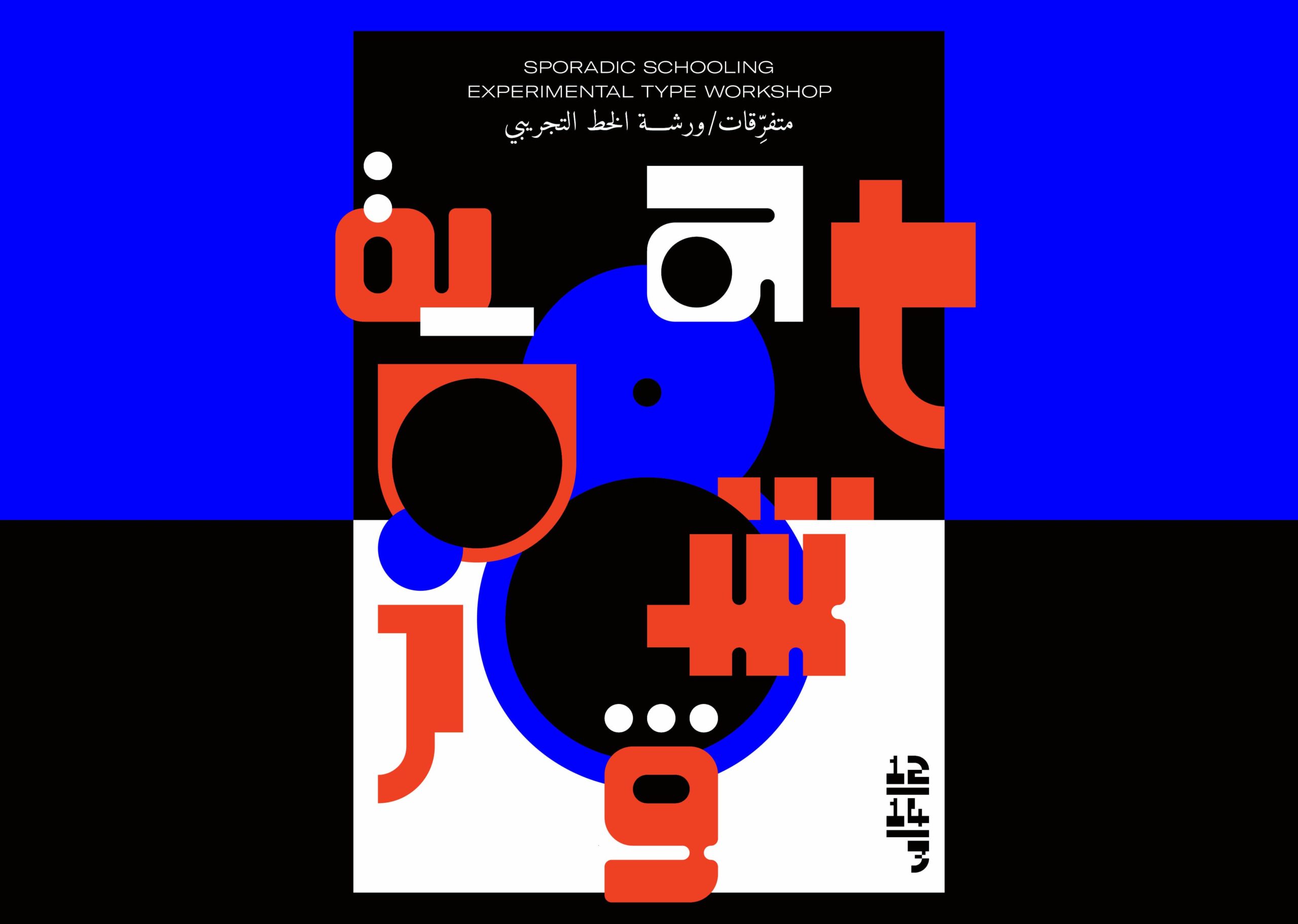
At the time, I initially thought about some typographic experiments and exercises that the space could be built around. When we first started, I shared these with Farah, and she was very supportive and worked with me on making that happen. We started TypeLab at Sandberg, where we conducted a couple of workshops. One was “Typofiction,” which explored typography as a building block in world-building practices. The workshop was very successful, so we took it outside Sandberg to the V&A and VCU in Qatar.
At the time, I initially thought about some typographic experiments and exercises that the space could be built around. When we first started, I shared these with Farah, and she was very supportive and worked with me on making that happen. We started TypeLab at Sandberg, where we conducted a couple of workshops. One was “Typofiction,” which explored typography as a building block in world-building practices. The workshop was very successful, so we took it outside Sandberg to the V&A and VCU in Qatar.
TypePlatform is an entirely different project. It sprouted while working on my thesis research. As I mentioned earlier, I wanted to make the discussions around the topic more open and engage with the community of type designers and researchers. Therefore, instead of holding these discussions in closed zoom calls, I decided to make this an open discussion.
At the core of TypePlatform is a focus on underrepresented scrips, starting with Arabic. The discussion would happen monthly with a type designer/researcher talking about their definition of “Modernity for Arabic Type.” How they approach bi-scriptual type design processes and their methodology of engaging with the calligraphic history of the Arabic script to inform and enrich their practice of modern digital type making.
The discussions were all live and recorded/shared on youtube under open licenses to create an archive for these discussions and knowledge that, in my opinion, are very important to have and make accessible.
Q: Who are your mentors, if any?
➸
I don’t think I ever had a consistent mentor throughout my life, but I met many people who impacted my growth, and learned a lot from them. Sometimes I saw them as mentors, even if we didn’t explicitly label the relationship. If I mention names, I will forget some. Still, those are some of the people (I remember): Abdo Al-Bermawy an amazing Egyptian visual artist that opened my eyes to many things, inspired me, and supported my growth during my early days as a designer.
Another is Dave Crossland, a director who describes himself as “I free fonts 💸 I work at Google on fonts.” I learned a lot from discussions with him on liberating type and the value of open licenses from practical lenses. Khaled Hosny a fantastic type designer who, in my opinion, is the most talented font engineer ever to work on the Arabic script. As I said, there are many others, but those helped me a lot through our work together and offered me chances to learn, work, and grow.
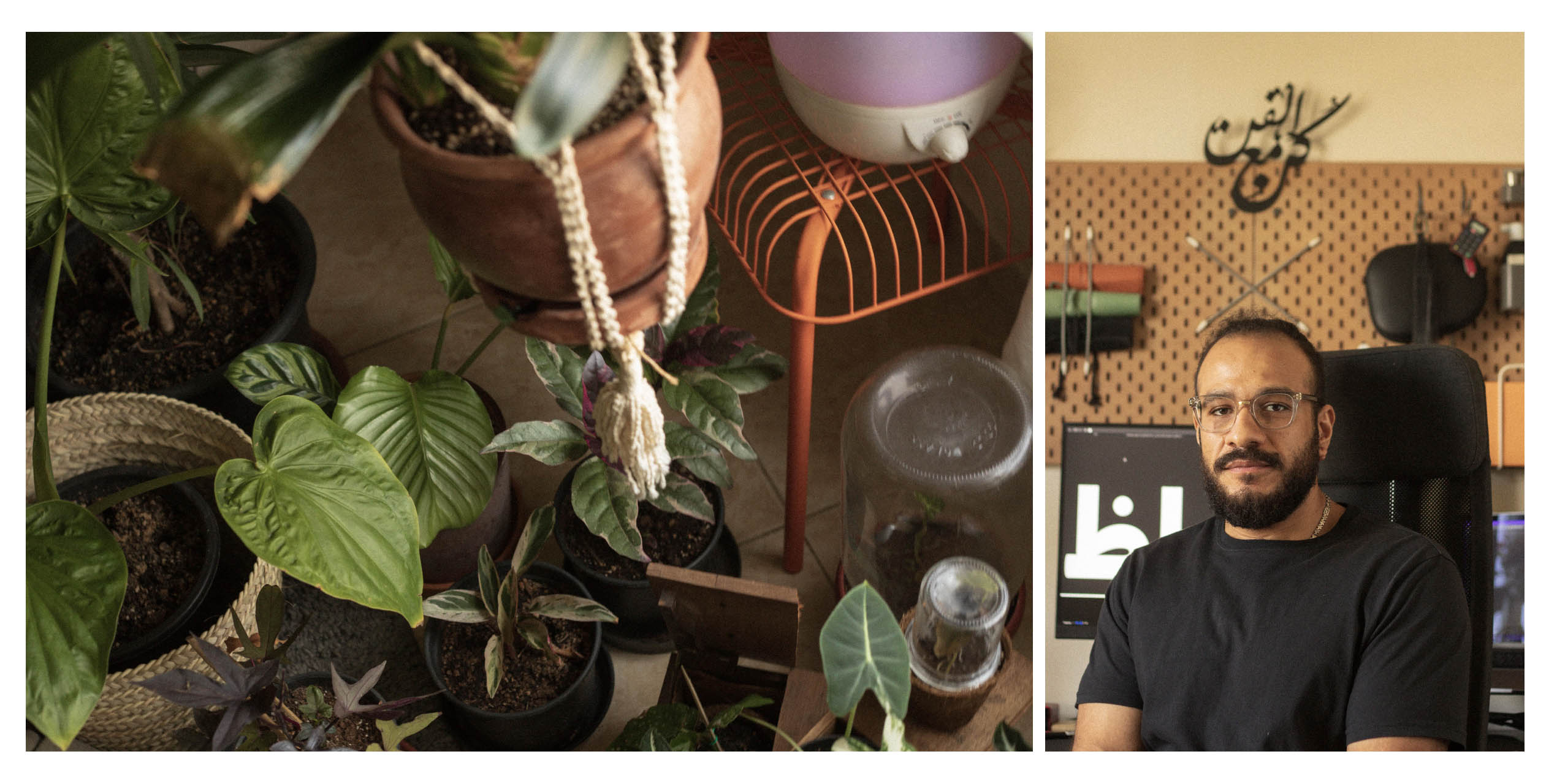
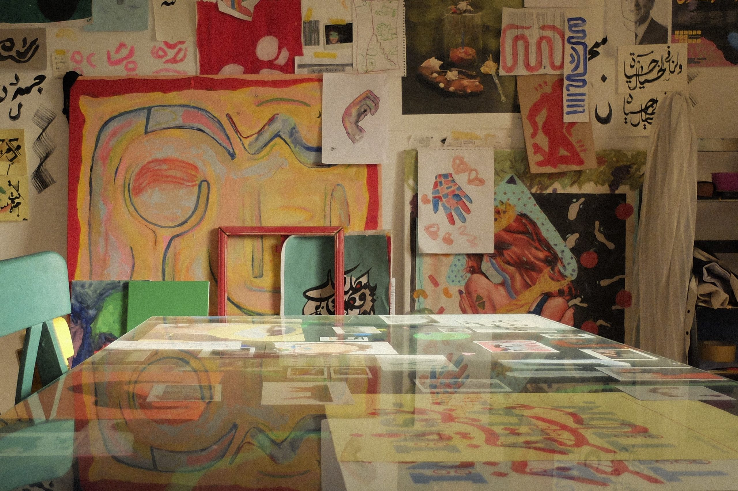
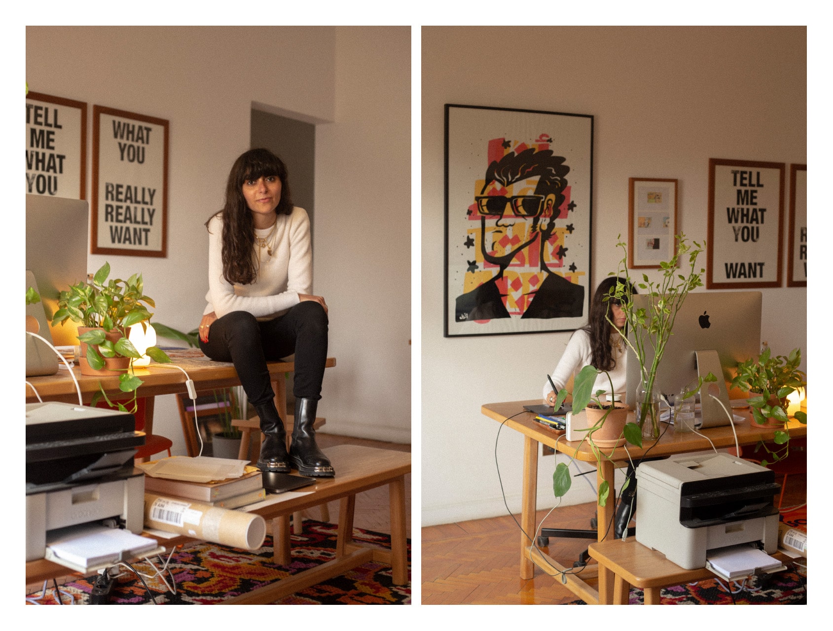
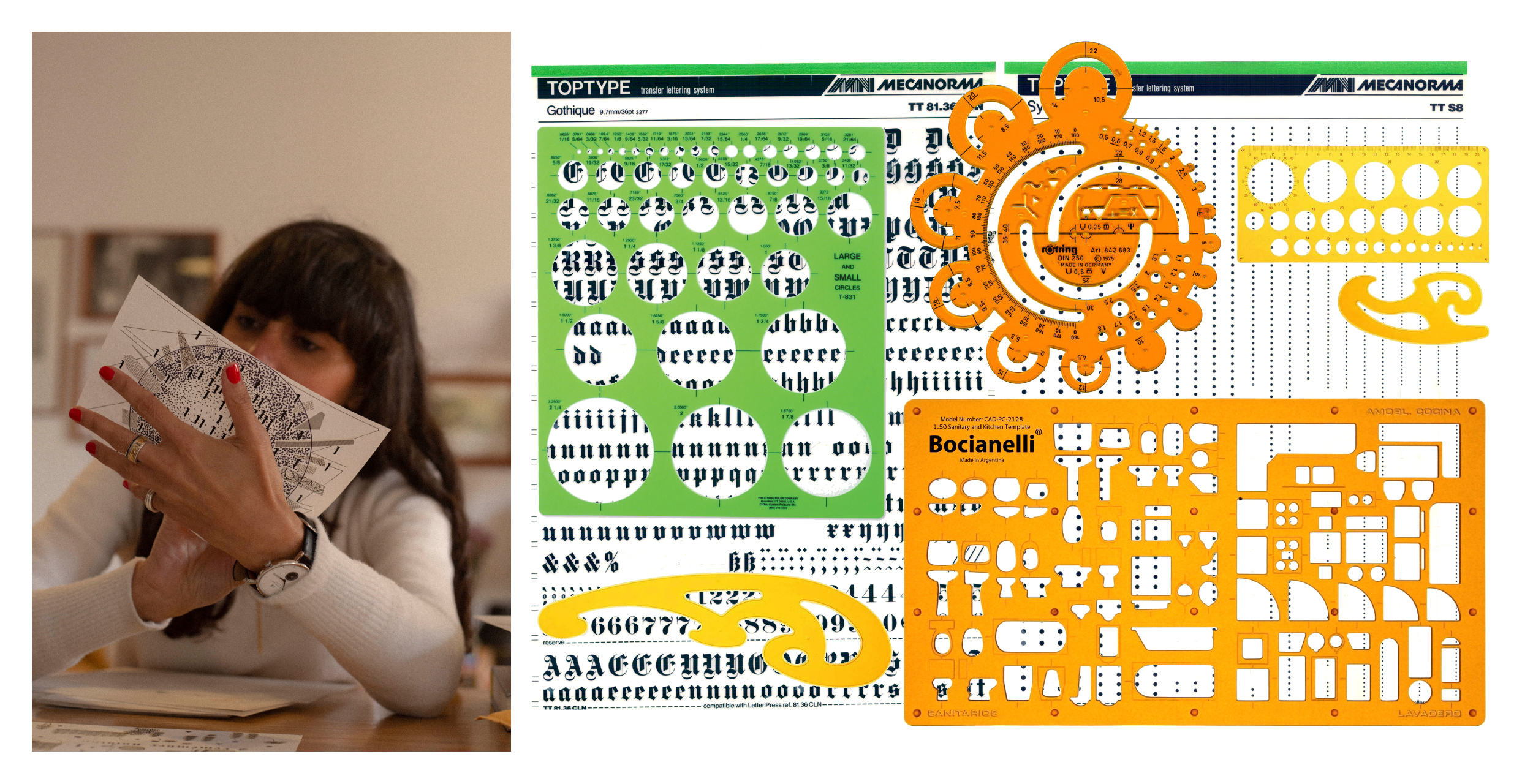
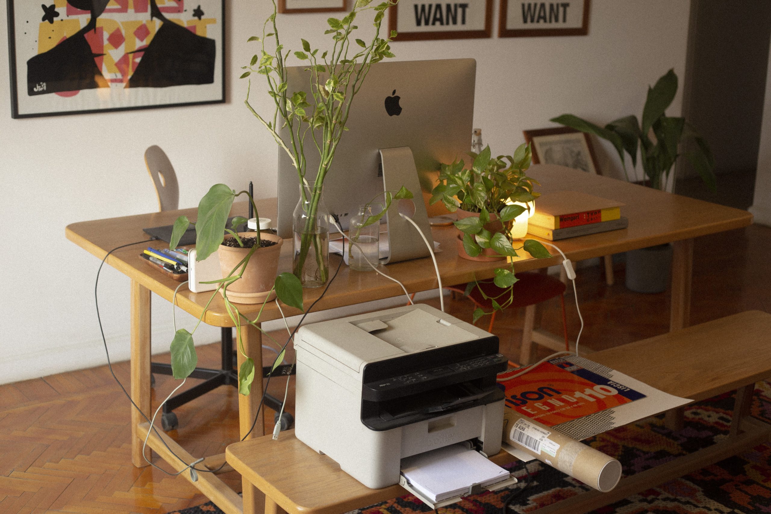
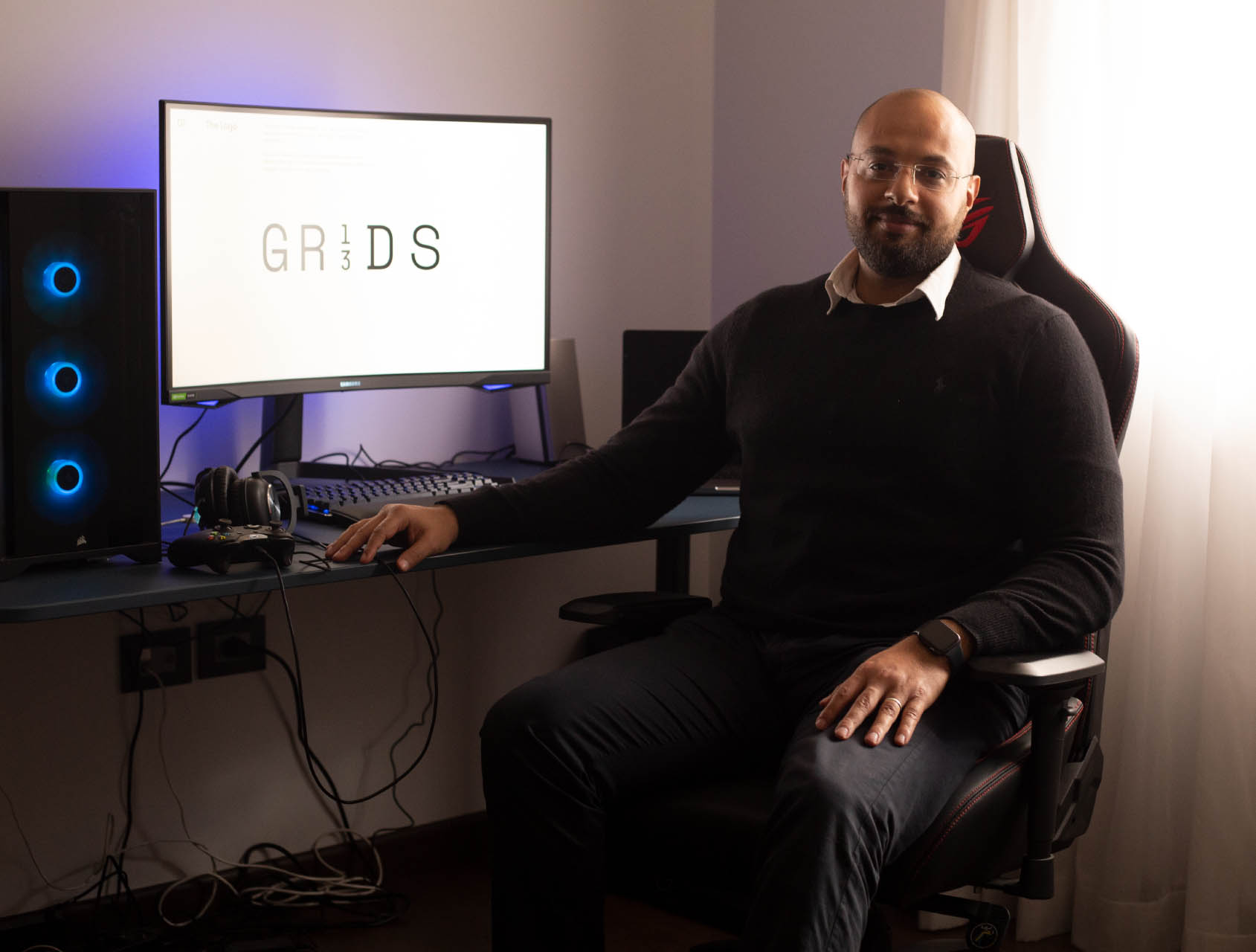
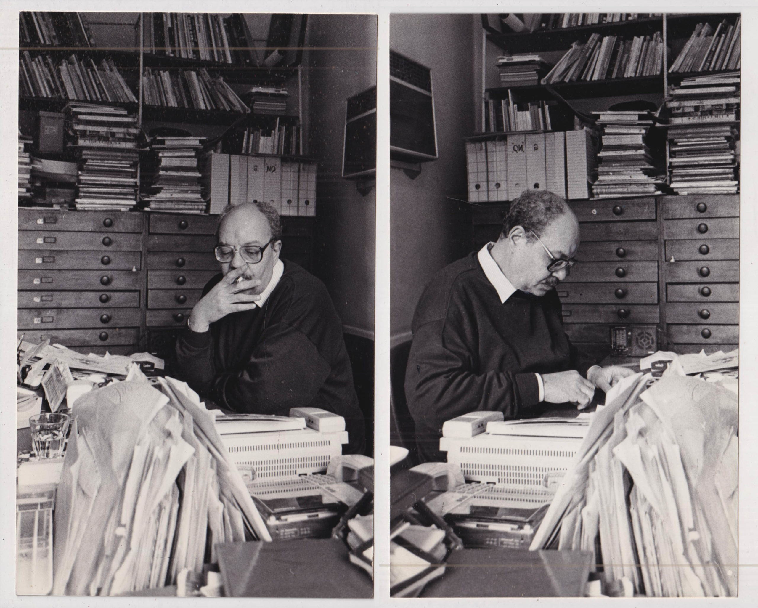
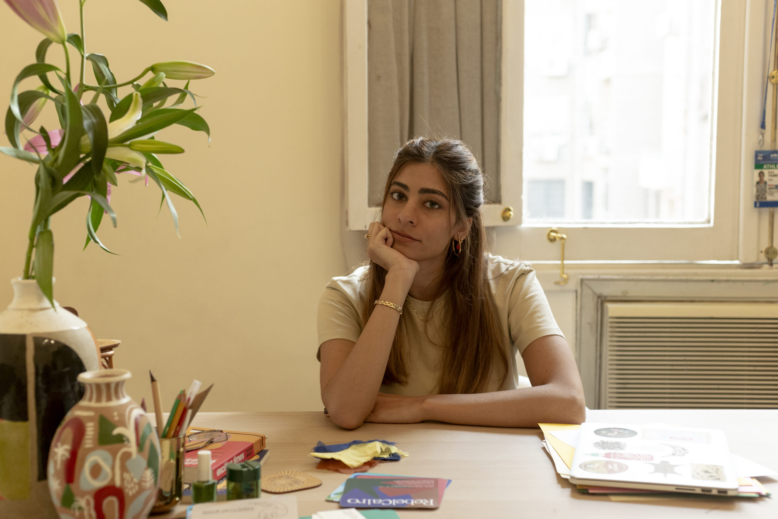
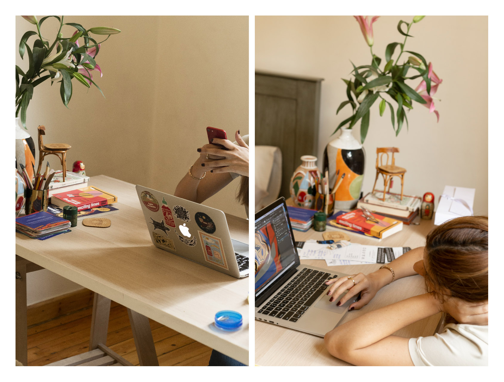
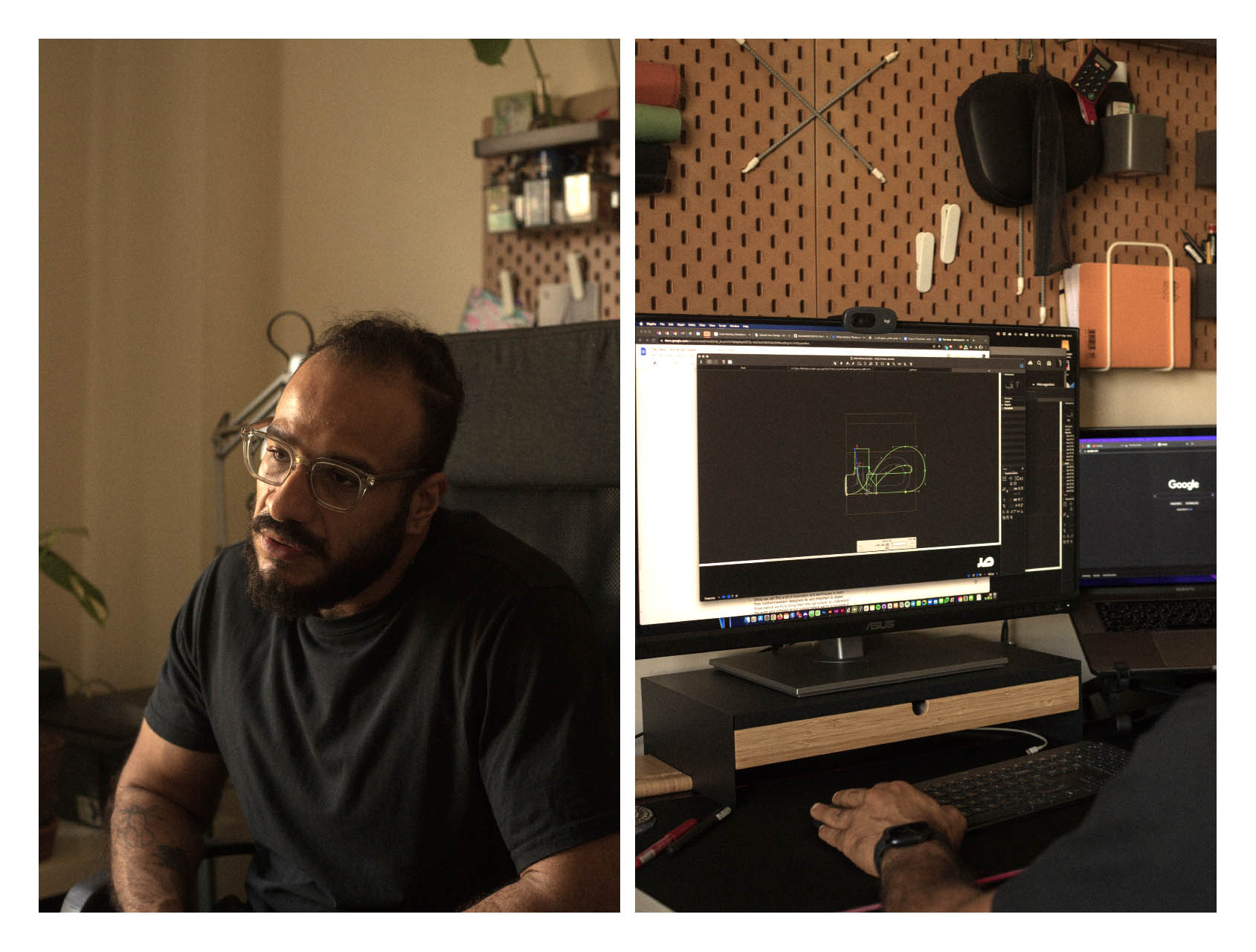
Q: Describe what does your desk mean to you?
➸
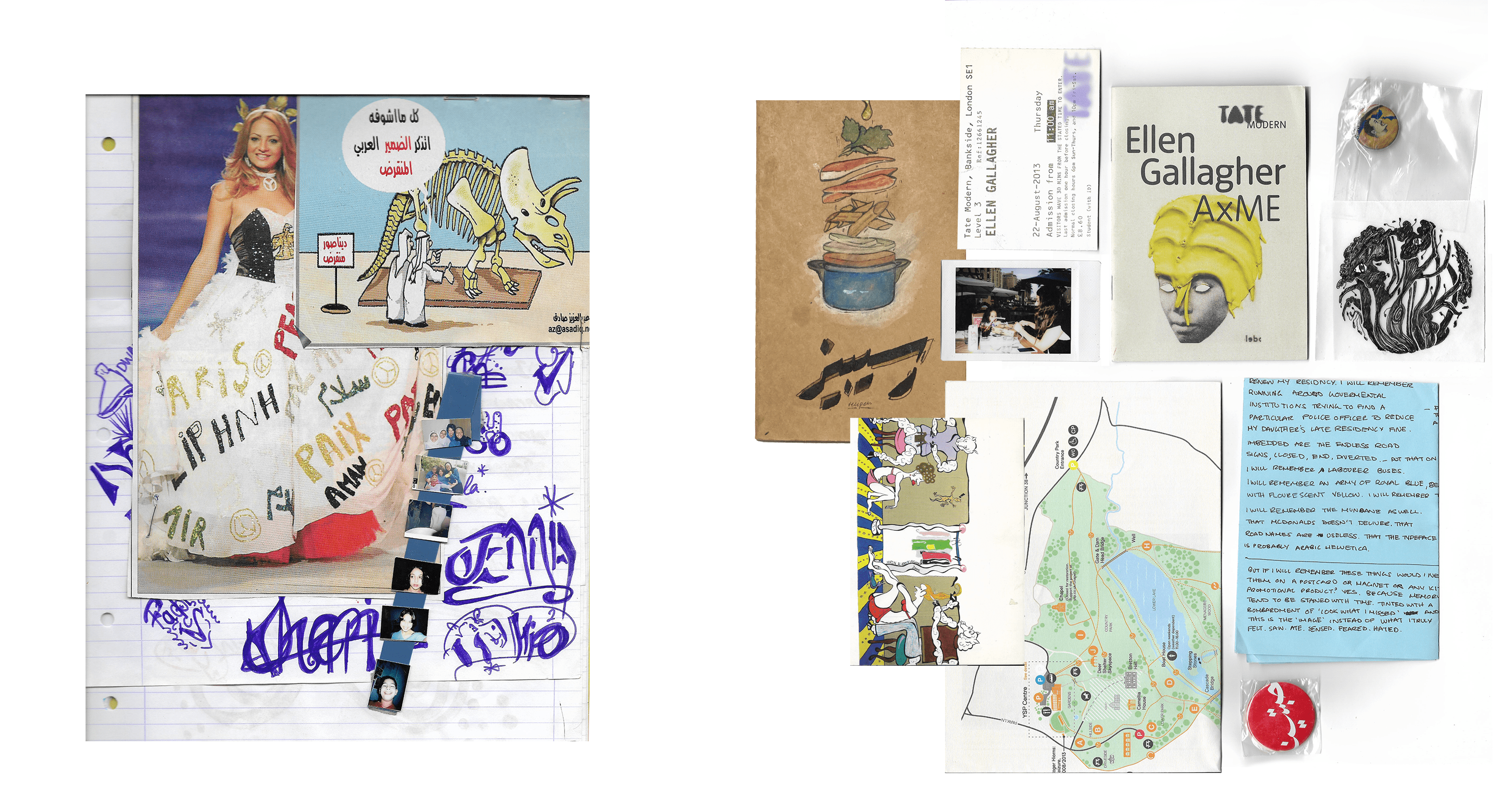
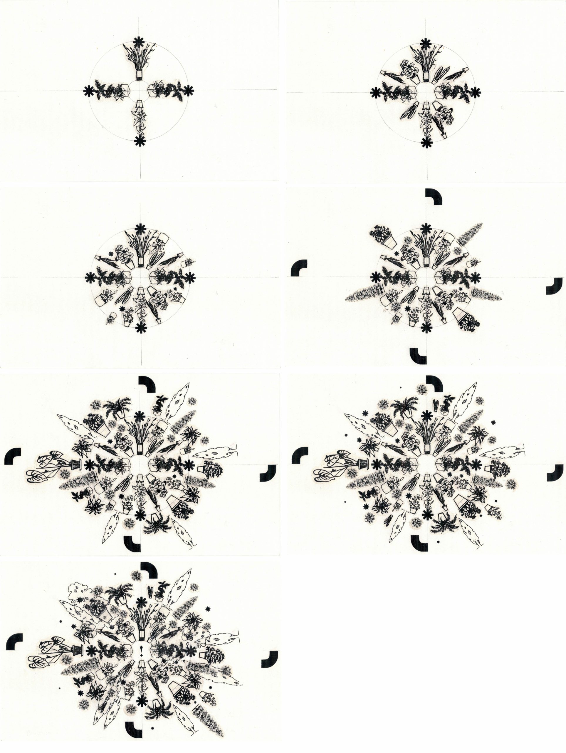
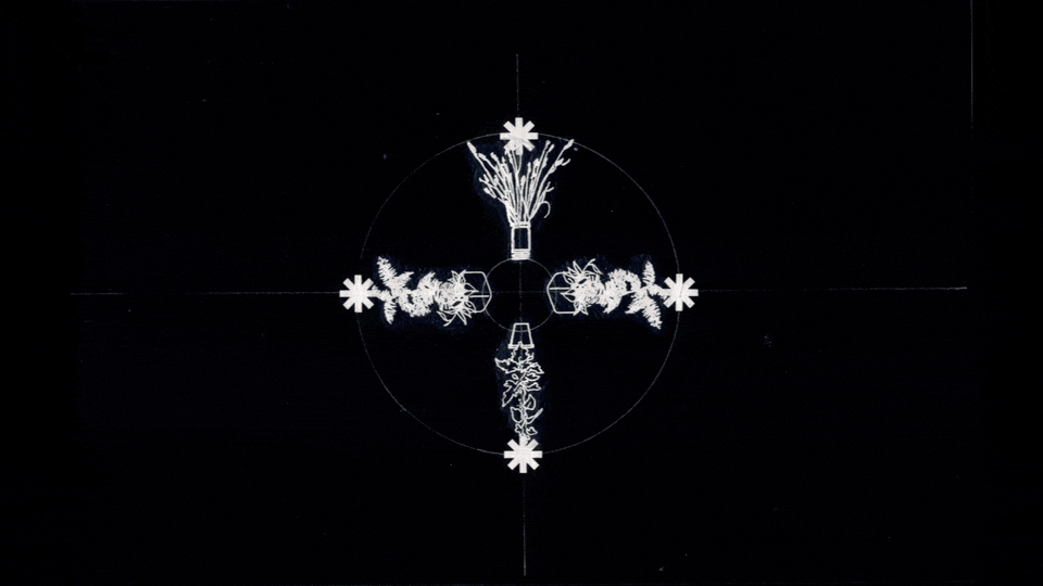
My desk hasn’t been very stable for the last four years, being between Cairo, Berlin, Amsterdam, and Beirut. In a way, I moved around a lot, which in retrospect, is surprising to me because I am someone who appreciates stability and worships routine. In fact, the lack of stability can massively affect my creative flow. Yet I have developed a trick to make myself feel settled. I surround myself with houseplants all the time wherever I go. It helps me feel grounded and rooted in my space. Most of the time, those plants are eventually put up for adoption. However, some of those plants end up moving around with me, the same way I travel with my desk.
Q: When you are creatively blocked, what are some ways you overcome this block?
➸
I don’t have one magical solution, and I try to avoid getting it in the first place. Yet, when it happens, I always watch videos of Takashi Amano working on one of his aquarium build-ups. Amano was a very inspiring Japanese Aquarist and had his own approach to freshwater aquarium layout design. His philosophy of Design is very inspiring to me as he mainly relies on the smallest grain of sand/rock or tiny grass to build his immersive layouts. He does one of the most challenging design tasks: mimicking nature within enclosed spaces. When asked, he always admitted that this is impossible to achieve. On the contrary, I believe he achieved that in many of his aquarium designs. His meticulous attention to detail makes you forget that you are looking at a man-made structure and not a piece of nature that evolved over hundreds if not thousands of years to get to be this beautiful.
Q: You work at the intersection of Graphic Design, Type Design, and Art. How does working in this intersection influence your work?
➸
The best way to describe this is to understand how I ended up at this intersection, as I didn’t necessarily make one conscious decision one day to be here.
Graphic Design was the gateway for me towards it all, to type design. Before I got into GD, I was focused on calligraphy, which can describe this intersection of Design and Art while feeding typographic knowledge, at least for the Arabic script. Over time, type design has become the lens through which I situate myself within each side of my practice. For instance, I do Web Design as a type designer who designs for the web, Graphic Design as a type designer practicing Graphic Design, and even when it comes to Visual Art, most of the topics that pique my interest come from the history of Arabic type. This benefits me; it makes me more comfortable in my practice and gives me a unique perspective on the field I am part of.
Q: What are three pieces of advice you can give to a young designer embarking on a journey similar to yours?
➸
1- Not to fear failure and mistakes. Many young designers fall for that, but it’s even more so the case for experienced designers. They get crippled by the fear of failure or making mistakes. We will make mistakes anyways, and we will fail sometimes, but the only way to find where your true passion lies is through failing. We learn through mistakes; sometimes, the lessons are immediately apparent, and in others, you will only learn the lessons in retrospect.
2- Try to be mindful of the things that inspire you. A healthy level of skepticism is essential when you are out there looking for inspiration. Question what you see and don’t accept it as it is. Almost always, things have other levels of meaning than what they reveal to you at first glance.
3- For teachers and students, question and be aware of the implications of your primarily Eurocentric design education.
4- Examining your culture is where authentic inspiration comes from. Dig deep into your visual memories, be curious about your environment, and question and investigate how its visual language change and evolve. It will teach you a lot and keep you from being trapped in a taste that doesn’t necessarily represent you.